A crochet parandi gives you a narrow but surprisingly flexible canvas for color. Unlike a blanket or garment, most of the color is concentrated along long cords, repeated flowers, leaves, and tassels, so a small accent can have a strong effect. The main challenge is keeping several colors connected from the braid attachment to the decorative ends.

These 15 ideas use different color relationships rather than simply swapping one shade for another. Some keep the cords dark and let flowers provide the contrast, while others use a bright dominant color throughout the length. You can adapt the palettes to a compatible parandi construction without assuming that the credited tutorial uses the same colors.
Quick List
- Deep Maroon, Mustard, and Olive Crochet Parandi Hair Braid Extension
- Magenta, Orange, and Yellow Crochet Parandi Hair Braid Extension
- Teal, Turquoise, and Ivory Crochet Parandi Hair Braid Extension
- Black, Red, and Gold Crochet Parandi Hair Braid Extension
- Blush Pink, Cream, and Sage Crochet Parandi Hair Braid Extension
- Lavender, Plum, and Silver Gray Crochet Parandi Hair Braid Extension
- Emerald, Fuchsia, and Cream Crochet Parandi Hair Braid Extension
- Cobalt Blue, Saffron, and White Crochet Parandi Hair Braid Extension
- Terracotta, Peach, and Olive Crochet Parandi Hair Braid Extension
- Navy, Dusty Rose, and Beige Crochet Parandi Hair Braid Extension
- Burgundy, Rust, and Camel Crochet Parandi Hair Braid Extension
- Mint, Lilac, and Soft Pink Crochet Parandi Hair Braid Extension
- Chocolate Brown, Copper, and Cream Crochet Parandi Hair Braid Extension
- Jade, Coral, and Mustard Crochet Parandi Hair Braid Extension
- Charcoal, Hot Pink, and Lime Crochet Parandi Hair Braid Extension
Give Each Crochet Parandi Color a Clear Job
A multicolor parandi usually looks more controlled when one shade creates continuity through the longest cords or repeated motifs. A second color can appear frequently enough to support it, while a third can be restricted to flower centers, leaves, tassel bands, or another smaller detail.
This hierarchy matters because a parandi is long and narrow. Three equally strong colors scattered randomly from top to bottom can break that vertical line into disconnected patches. Before joining motifs, arrange representative colors along the full hanging length and view them together rather than judging each flower separately.
Check Crochet Parandi Colors Against the Finished Braid
Contrast between the yarns is only part of the decision. A flower that separates clearly from its crochet cord may still blend into the hair behind it. Temporarily hold finished or sample motifs beside the intended hairstyle and look at them from normal viewing distance.
Also compare light and dark values. Different hues can still have similar values and merge visually. A grayscale photo is a simple way to check whether your smallest flowers and leaves have enough separation from surrounding colors.
1. Deep Maroon, Mustard, and Olive Crochet Parandi Hair Braid Extension
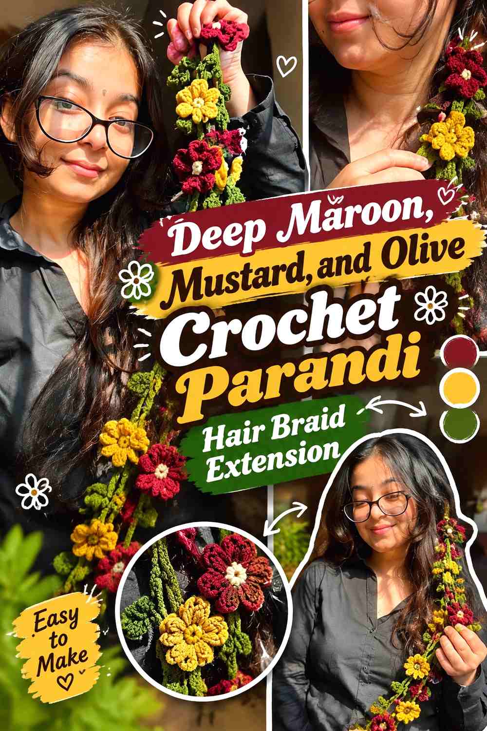
Deep maroon can form the visual backbone of this crochet parandi, especially through the longest cords and lower tassels. Mustard provides a lighter, warmer interruption that can make floral motifs easier to distinguish, while olive works well as a quieter connector for leaves or small transitional details. Keeping olive secondary prevents the floral parts from turning into equal blocks of three competing colors.
Deep Maroon Can Carry the Long Crochet Parandi Strands
Use deep maroon where you want an uninterrupted vertical line through the braid extension. Because it is the darkest color in this palette, repeating it from the attachment section toward the tassels helps separate the accessory into a clear base plus decorative motifs rather than a sequence of unrelated flowers.
If the finished piece feels too dark, increase mustard within the visible flower section instead of removing maroon from every cord.
Mustard Keeps Deep Maroon Flowers and Tassels From Merging
Mustard is most useful where small details need stronger value separation. Try it in flower centers, selected blooms, or a narrow section immediately above darker tassels.
Avoid distributing mustard everywhere in equal amounts. Its lighter appearance can quickly become the dominant visual feature, even when less yarn is used.
Olive Connects Mustard Motifs Without Competing With Maroon
Olive can bridge the two stronger colors through leaves or short connecting details. Repeating it near several flowers makes the foliage feel intentional rather than like one isolated green addition.
If substituting olive, preserve its supporting role by choosing a green that remains quieter than both the deep maroon base and the mustard accents.
Creator Credit: Crochet Diaries
2. Magenta, Orange, and Yellow Crochet Parandi Hair Braid Extension
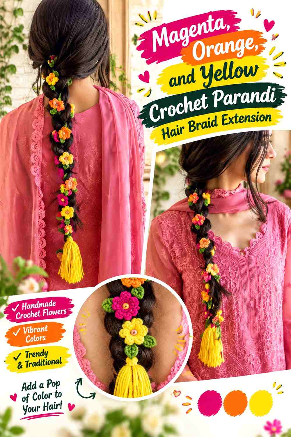
This palette is intentionally saturated, so the important decision is not how to add more color but how to prevent all three shades from competing. Let magenta dominate the cords or repeated flowers, use orange as the main supporting shade, and reserve yellow for smaller highlights. That creates a visible hierarchy even though every color is bright.
Magenta Gives the Crochet Parandi a Continuous Color Anchor
Running magenta through the longer strands gives the eye one shade to follow through the braid. It can also be repeated in the lower tassel area so the top and bottom of the accessory remain connected.
When several orange and yellow flowers are added, repeat magenta between them rather than allowing the center of the parandi to become completely detached from its base color.
Orange Works Better Beside Magenta When Their Areas Are Unequal
Magenta and orange can both command attention. Giving orange a supporting role—perhaps in alternating flowers or selected tassel details—keeps the two from splitting the parandi visually into equal halves.
If the colors appear too similar in value, place yellow between them at selected points to create a clearer visual break.
Yellow Should Highlight Magenta and Orange Rather Than Fill Every Gap
Use yellow where small crochet details would otherwise disappear: flower centers, tiny blossoms, or a repeated lower accent can be enough.
Because yellow is the lightest color here, even a small amount can attract attention. Check the complete hanging arrangement before adding another yellow element simply because an individual section appears empty.
Creator Credit: Plakshi Jain | Crochet
3. Teal, Turquoise, and Ivory Crochet Parandi Hair Braid Extension
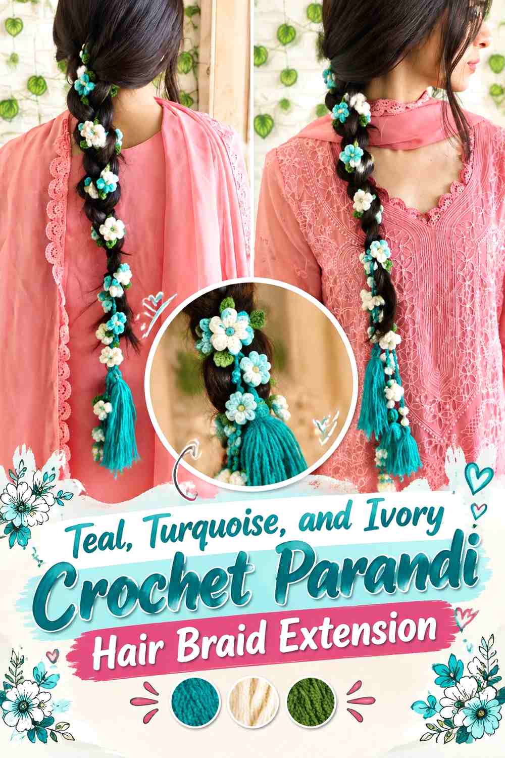
Teal and turquoise create a close color relationship rather than a sharp hue contrast, so ivory becomes important for separation. Let teal cover the main cords, place turquoise in flowers or selected lower details, and use ivory wherever you need the two blue-green shades to remain individually readable.
Teal Gives the Crochet Parandi More Visual Depth Than Turquoise Alone
Teal can anchor the longest strands and define the overall silhouette. Using the darker blue-green on the structural length also gives lighter turquoise flowers a background against which they can remain visible.
Keep some uninterrupted teal between floral clusters if you want the braid-extension shape to stay obvious.
Turquoise Can Brighten Teal Crochet Flowers Without Breaking the Palette
Turquoise works well as a supporting flower color because it remains related to teal while appearing lighter and more vivid.
Instead of alternating teal and turquoise mechanically, use turquoise at several visible points down the accessory. This creates repetition without making every section identical.
Ivory Separates Teal and Turquoise in Small Crochet Details
Ivory is especially useful in flower centers, narrow borders, or small connecting motifs where teal and turquoise begin to blend.
If you replace ivory, preserve a noticeably lighter value. Choosing another medium blue-green would remove the main contrast mechanism that makes this tonal palette readable.
Creator Credit: Nitya Uphaar
4. Black, Red, and Gold Crochet Parandi Hair Braid Extension
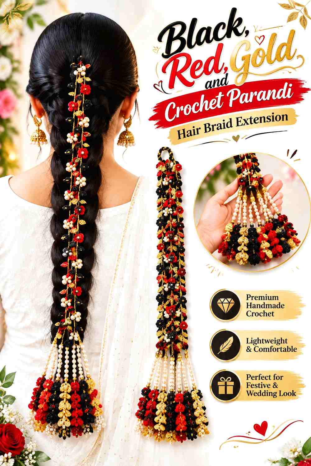
Black gives this crochet parandi a strong outline, while red supplies the main decorative color and gold-colored yarn can provide smaller warm accents. The palette works particularly well when the black remains visible instead of disappearing beneath continuous red and gold decoration.
Black Gives Red Crochet Parandi Flowers a Defined Background
Use black through the longest cords or as the repeated strand between flower groups. The dark base creates separation around red motifs and makes the extended braid silhouette easy to read.
If black begins to overwhelm the design, increase red flower coverage rather than adding more unrelated colors.
Red Should Repeat From the Black Braid Section to the Tassels
A few isolated red flowers can look disconnected from a largely black accessory. Repeat red in more than one zone—for example, through upper flowers and again near the bottom—to carry the color story along the full length.
That repetition is more useful than forcing every flower to contain all three shades.
Gold Works Best as a Controlled Accent Beside Black and Red
Use gold-colored yarn sparingly in centers, narrow bands, or selected tassel details. Small warm highlights are easier to notice against black than they would be against a lighter cord.
If gold starts covering the same visual area as red, the parandi can lose its clear dominant-and-accent hierarchy.
Creator Credit: crochet by pannu
5. Blush Pink, Cream, and Sage Crochet Parandi Hair Braid Extension
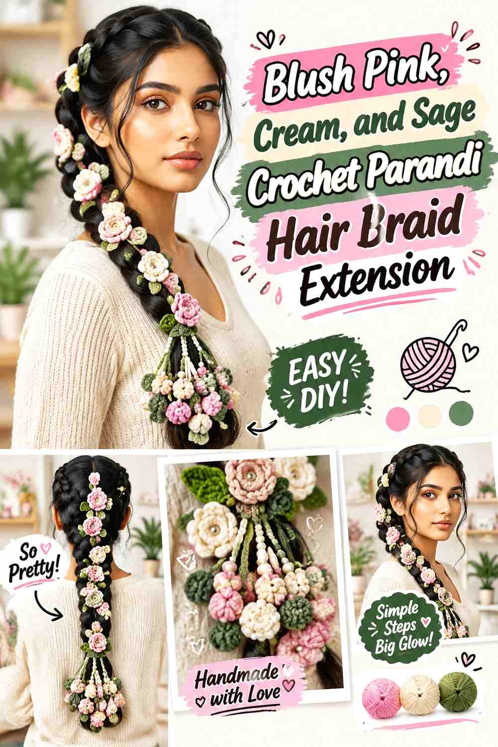
This is a softer, lower-contrast direction. Blush pink can lead the floral sections, cream can provide the lightest separation, and sage can handle leaves or narrow cords without creating the visual weight of a much darker green.
Blush Pink Can Lead the Crochet Parandi Without Covering Every Strand
Use blush pink in the flowers and repeat it toward the tassels rather than making every cord pink. That preserves the floral identity while leaving sage available to suggest stems or connecting sections.
A few larger blush areas usually communicate the palette more clearly than many tiny pink accents scattered randomly.
Cream Keeps Blush Pink Crochet Flowers Visible Against Sage
Cream can separate pink petals from green details, particularly where several small motifs sit close together.
It can also lighten a lower tassel cluster if the sage begins to occupy too much visual area. Keep cream consistent enough to look intentional rather than introducing it only once.
Sage Keeps Blush Pink From Becoming an All-Pink Crochet Parandi
Sage gives the palette a botanical counterweight without requiring a highly saturated green. Place it through leaves, connecting vines, or a restrained portion of the cords.
If substituting sage, choose another softened green that still contrasts clearly enough with blush pink when the finished accessory is viewed against hair.
Creator Credit: Crochet Forever
6. Lavender, Plum, and Silver Gray Crochet Parandi Hair Braid Extension
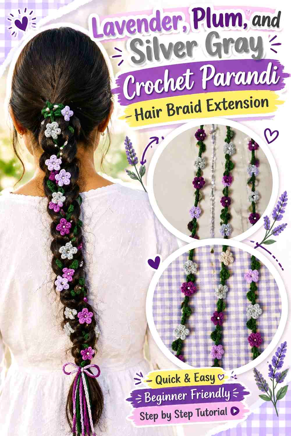
Plum gives this purple palette its darkest anchor, lavender creates the softer floral color, and silver gray provides a neutral interruption. The useful contrast comes mostly from lightness rather than from dramatically different hues.
Plum Gives Lavender Crochet Parandi Motifs a Dark Anchor
Place plum in the longest cords, flower centers, or lower tassels when you want the pale lavender motifs to remain clearly outlined.
Because plum carries more visual weight, it does not need to cover every surface. A repeated dark line through the accessory can be enough.
Lavender Should Occupy More Floral Space Than Plum
Lavender can take the lead in open flowers or repeated decorative motifs while plum remains concentrated in smaller areas.
This distribution keeps the parandi recognizably purple without allowing the darkest shade to make every flower read as a heavy block.
Silver Gray Gives Plum and Lavender a Neutral Break
Silver gray can appear in occasional flowers, narrow connecting sections, or tassel details to prevent the two purples from blending into one continuous mass.
Choose a gray that remains visibly distinct from plum. If it becomes too dark, it stops functioning as the lighter neutral in the palette.
Creator Credit: Crochet with Ritu
7. Emerald, Fuchsia, and Cream Crochet Parandi Hair Braid Extension
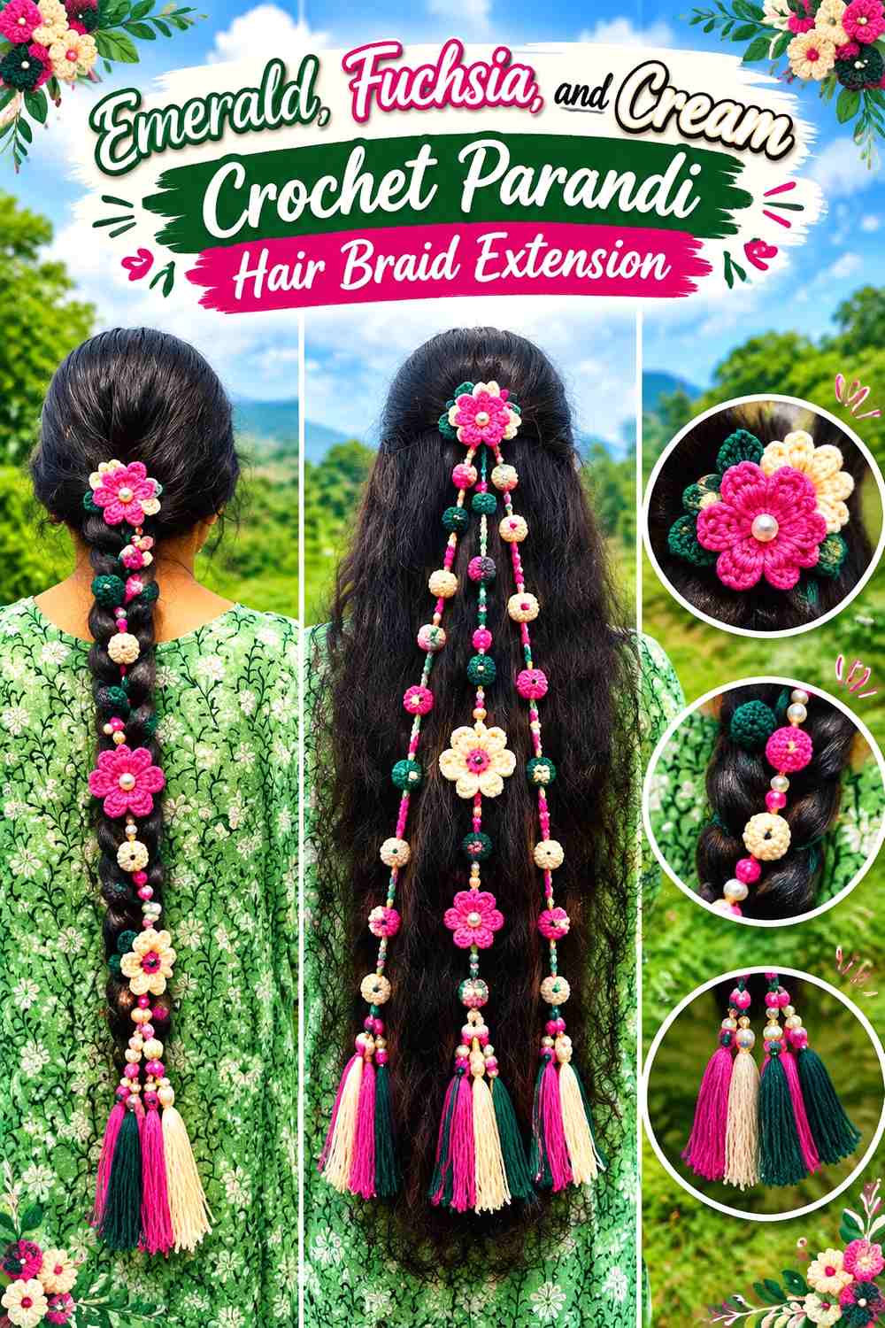
Emerald and fuchsia create a strong hue contrast, so cream should be used to organize rather than simply decorate. Emerald works naturally through vines, leaves, or cords, while fuchsia can become the principal flower color.
Emerald Should Give the Crochet Parandi a Continuous Green Path
Use emerald in enough of the strand or vine structure that the green reads as the foundation instead of a few isolated leaves.
This is particularly useful with repeated flowers: the consistent green line keeps separate fuchsia motifs connected from top to bottom.
Fuchsia Flowers Need Clear Spacing Against Emerald
Strong contrast makes motif placement more noticeable. Arrange the fuchsia flowers along the complete hanging parandi before finalizing their positions so accidental clusters do not make one part significantly heavier than another.
Leaving visible emerald between flowers can be as important as adding another bloom.
Cream Can Separate Emerald and Fuchsia in the Smallest Crochet Details
Use cream for selected centers or small flowers when emerald and fuchsia begin to compete.
Because cream is much lighter than both stronger colors, it can become surprisingly prominent. Keep it in an accent role unless a lighter overall parandi is your goal.
Creator Credit: Stuck In Loops
8. Cobalt Blue, Saffron, and White Crochet Parandi Hair Braid Extension
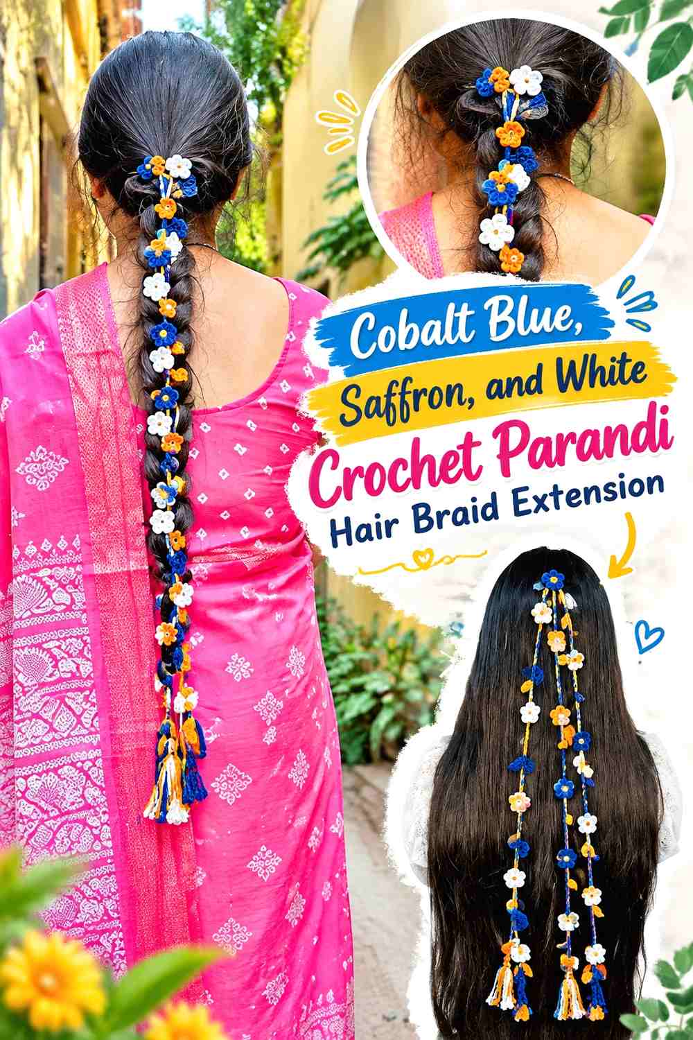
Cobalt provides a saturated dark base, saffron supplies the warm counterpoint, and white creates the strongest light/dark separation. This palette works best when white is treated as a precision accent rather than an equal third block.
Cobalt Blue Makes a Strong Crochet Parandi Cord Color
Cobalt can run through the main strands so the braid extension maintains one clear vertical direction. It also gives saffron flowers enough background contrast to remain recognizable.
Repeat cobalt below the decorative motifs if you want the tassel section to feel connected to the upper cords.
Saffron Gives Cobalt Blue Crochet Flowers a Warm Focal Point
Use saffron where you want the eye to pause—larger blooms, selected lower motifs, or repeated tassel details.
If saffron appears only once, it may look accidental. Repeating it several times at controlled intervals gives the warm color an intentional role.
White Should Clarify Cobalt and Saffron Rather Than Dominate Them
White is useful for small centers and high-contrast floral edges. It can also separate neighboring blue and saffron elements that feel visually crowded.
Check the accessory from a distance before increasing the white area; its light value can pull attention away from both main colors quickly.
Creator Credit: Cute Crochet
9. Terracotta, Peach, and Olive Crochet Parandi Hair Braid Extension
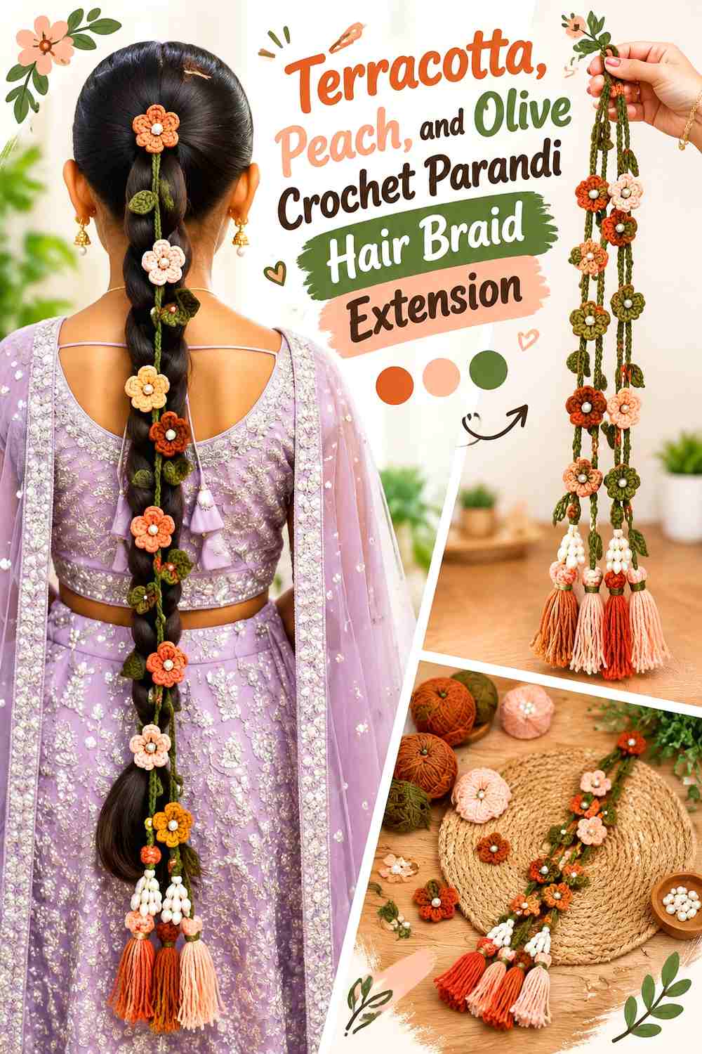
Terracotta and peach create a tonal warm pairing, while olive introduces enough hue contrast to define foliage and cords. This works especially well for a flower-led parandi where the warm shades should remain related rather than sharply separated.
Terracotta Can Give the Crochet Parandi Its Strongest Warm Blocks
Use terracotta in larger flowers or selected tassels so the palette has a clearly identifiable dominant warm shade.
Keeping terracotta in repeated zones prevents the softer peach from washing out the overall color direction.
Peach Keeps Terracotta Crochet Flowers From Becoming Too Tonal
Peach can appear in smaller blossoms, petal layers, or occasional tassel details. Its lighter value gives the eye separation without introducing a completely different hue.
If substituting peach, preserve the noticeable lightness difference from terracotta rather than choosing another similarly dark orange-brown.
Olive Gives Terracotta and Peach a Botanical Crochet Framework
Place olive through leaves and narrow connecting sections so it functions as a structural color.
Avoid using olive, terracotta, and peach in identical proportions. Let the green frame the warmer colors rather than turning every motif into a three-color block.
Creator Credit: Gharwalikahani
10. Navy, Dusty Rose, and Beige Crochet Parandi Hair Braid Extension
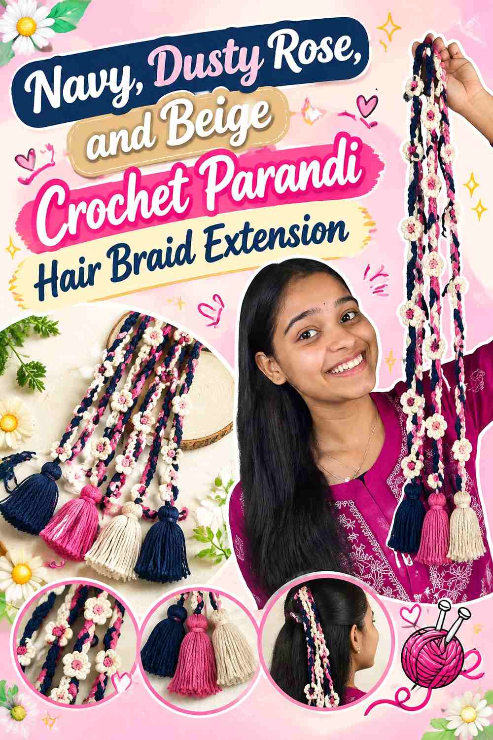
Navy creates the darkest and most continuous element, dusty rose provides muted floral contrast, and beige prevents the entire parandi from becoming too dark. Compared with bright festival palettes, this combination relies on restrained saturation.
Navy Gives the Crochet Parandi a Clean Dark Silhouette
Use navy through the longest visible cords when you want the braid extension itself to remain prominent.
Navy can also appear in the tassels, but leaving some dusty rose or beige nearby stops the lower section from becoming one solid dark mass.
Dusty Rose Works Best as the Main Flower Color Beside Navy
Dusty rose is lighter than navy without becoming highly saturated. Give it enough surface area across flowers that the muted pink remains visible from normal hairstyle distance.
If the flowers seem to disappear, increase their light/dark separation rather than simply adding more motifs.
Beige Can Open Up Navy and Dusty Rose Crochet Clusters
Use beige between darker sections, in flower centers, or in a selected lower accent.
The neutral is most useful when it creates breathing room. Covering every motif with beige would reduce the distinction between the navy base and dusty rose flowers.
Creator Credit: Crocheter priyanka W🧶ऊN
11. Burgundy, Rust, and Camel Crochet Parandi Hair Braid Extension
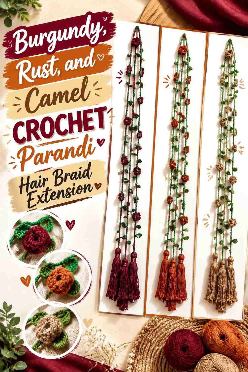
This palette stays within warm, earthy territory, so value differences need extra attention. Burgundy is the darkest shade, rust provides the middle tone, and camel should remain the lighter supporting color.
Burgundy Should Anchor the Crochet Parandi From Cord to Tassel
Running burgundy through both the upper strand and selected lower elements gives the palette continuity.
Because rust is relatively close in warmth, keep enough uninterrupted burgundy visible for the two colors to remain distinguishable.
Rust Can Bridge Burgundy and Camel Crochet Details
Rust works particularly well in medium-sized flowers because it sits visually between the dark burgundy and lighter camel.
Repeat it in several places rather than concentrating all rust near the bottom. That avoids creating two separate palettes along one parandi.
Camel Gives Burgundy and Rust the Value Contrast They Need
Use camel around small motifs or in selected flowers where burgundy and rust start to merge.
When substituting camel, maintain the lighter warm-neutral role. A dark brown replacement may make all three shades too similar in value.
Creator Credit: Devsha Textile
12. Mint, Lilac, and Soft Pink Crochet Parandi Hair Braid Extension
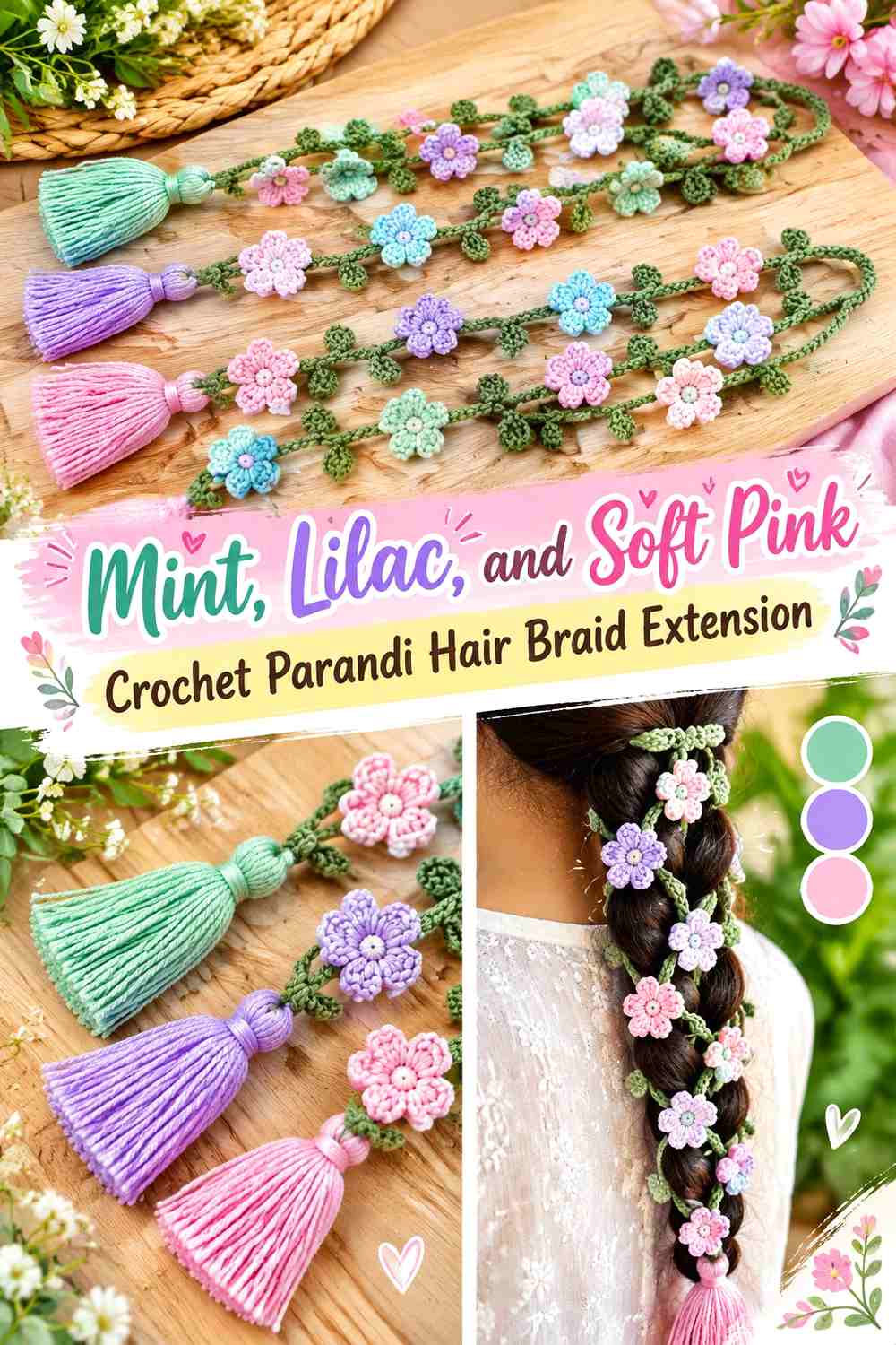
All three colors are light, so this palette creates a deliberately gentle contrast. The challenge is preventing the motifs from blending together. Giving mint the cord-and-leaf role and reserving lilac and soft pink for separate flower groups makes the color differences easier to read.
Mint Gives Lilac and Soft Pink Crochet Flowers a Consistent Base
Use mint through connecting strands or foliage rather than scattering it into every flower.
A continuous mint line helps the pale floral colors feel attached to one accessory instead of becoming a series of unrelated pastel motifs.
Lilac Should Form Its Own Crochet Parandi Repetition
Repeat lilac flowers at more than one point down the accessory. This creates rhythm without requiring an exact alternating sequence.
If lilac and soft pink look too similar from a distance, separate neighboring motifs with more visible mint.
Soft Pink Needs Enough Space From Lilac to Stay Distinct
Instead of packing soft pink and lilac flowers tightly together, allow sections of mint cord or leaves to divide them.
You can also compare the shades in grayscale. If both become nearly identical, preserve their hue contrast by keeping the motifs physically separated.
Creator Credit: Crochet with Khalida
13. Chocolate Brown, Copper, and Cream Crochet Parandi Hair Braid Extension
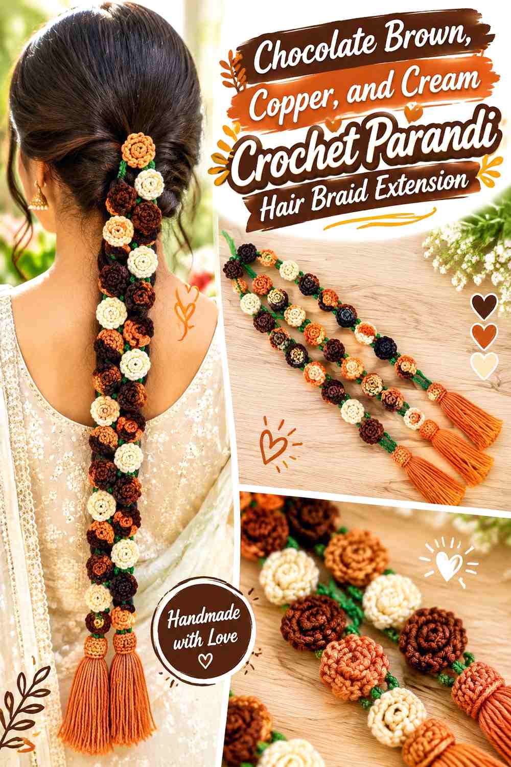
Chocolate brown provides a deep neutral foundation, copper-colored yarn brings a stronger warm accent, and cream supplies the lightest contrast. This is a useful palette when you want definition without relying on very bright hues.
Chocolate Brown Can Define the Full Crochet Parandi Length
Use chocolate brown through major cords or the lower tassel structure to keep the braid extension visually continuous.
Because it is dark, leave enough cream or copper near detailed areas so individual flowers remain recognizable.
Copper Adds Warm Crochet Parandi Accents Without Replacing Brown
Copper-colored yarn can work in flower petals, centers, or repeated lower details. Keep the amount smaller than the chocolate brown foundation if you want the darker shade to remain dominant.
Repeated copper accents are more cohesive than one large isolated copper section.
Cream Gives Chocolate Brown Crochet Flowers Their Sharpest Separation
Cream can outline small motifs or occupy selected flowers where maximum value contrast is needed.
If the cream begins to dominate the tassels, bring chocolate brown back into the lower section so the accessory still connects visually with its upper cords.
Creator Credit: sonia’s wool world
14. Jade, Coral, and Mustard Crochet Parandi Hair Braid Extension
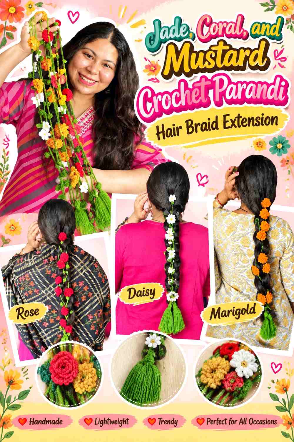
Jade provides a cool green foundation while coral and mustard bring two different warm accents. Since both warm shades can demand attention, use coral as the larger floral color and mustard in a smaller highlighting role.
Jade Should Carry the Main Crochet Parandi Structure
Jade works well through long cords, leaves, and the areas between flowers. Keeping a visible green pathway gives the two warm accents a common background.
If the parandi becomes crowded, expose more jade instead of automatically removing one of the accent colors.
Coral Can Become the Main Flower Color Against Jade
Give coral the larger decorative shapes so the palette has a clear warm focal color.
Repeat coral along the length rather than concentrating it near the top. This keeps the flower story visible even when part of the upper parandi is incorporated into the braid.
Mustard Should Punctuate Jade and Coral Crochet Details
Use mustard in centers, smaller blossoms, or narrow lower accents. Its job is to introduce brief points of contrast rather than compete with the coral flowers.
If coral and mustard begin occupying equal space, reduce one before adding more jade; hierarchy matters more than having identical quantities of every color.
Creator Credit: Sara’s Art Diary
15. Charcoal, Hot Pink, and Lime Crochet Parandi Hair Braid Extension
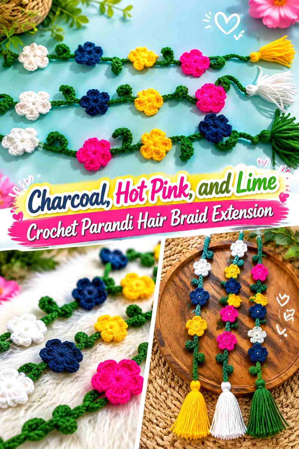
This is the highest-energy palette in the collection. Charcoal gives the bright colors a neutral foundation, hot pink can dominate the flowers, and lime should be controlled so it sharpens the design rather than creating constant competition.
Charcoal Lets Hot Pink Crochet Parandi Flowers Take Priority
Keep charcoal visible through cords and perhaps part of the lower tassels. The neutral dark background gives hot pink a clearly defined role.
It also provides useful empty visual space between bright motifs, which matters when both accent colors are highly saturated.
Hot Pink Should Be the Main Bright Crochet Parandi Color
Use hot pink in the largest or most frequently repeated flowers. Making one saturated color clearly dominant is easier to control than alternating equal blocks of hot pink and lime.
Repeat some hot pink near the bottom so the tassel area relates to the floral length above.
Lime Works Better as a Small Accent Against Charcoal and Hot Pink
Lime can highlight centers, leaves, or occasional small motifs. Its strong contrast with charcoal means it does not need much surface area to register.
Arrange all lime accents before final attachment. If they cluster in one part of the parandi, redistribute them rather than adding more simply to balance the opposite side.
Creator Credit: Crochetnook
Which Crochet Parandi Color Scheme Should You Choose?
For a deeper traditional-looking direction, start with deep maroon, mustard, and olive or burgundy, rust, and camel. Black, red, and gold gives stronger dark-versus-bright contrast, while chocolate brown, copper, and cream keeps that depth more neutral.
For softer colors, blush pink, cream, and sage has a botanical look; mint, lilac, and soft pink is the lightest pastel option. Teal, turquoise, and ivory stays more tonal while still giving small motifs enough separation.
If you want stronger contrast, emerald with fuchsia, cobalt with saffron, or charcoal with hot pink and lime will make individual flowers easier to notice. In these brighter palettes, restraint becomes especially important: give one saturated shade the lead and let the other strong colors occupy smaller, repeated areas.
Conclusion
Color placement matters as much as color selection on a crochet parandi. The long, narrow shape benefits from continuity, so begin by choosing the shade that should visually travel through the braid extension. Then decide which color should define the flowers and which should appear only in smaller centers, leaves, tassel details, or transitions.
Before committing to a full palette, crochet representative motifs and view them beside the intended hairstyle. Check whether the lightest details remain visible, whether the strongest accent repeats enough to feel connected, and whether the lower tassels continue the same color story. Follow the credited tutorials for their exact construction while treating these palettes as independent color adaptations.
Frequently Asked Questions
How many colors work well in a crochet parandi hair braid extension?
Two or three colors are enough for many designs, but the useful question is whether each color has a clear role. A dominant cord color, a flower color, and a smaller accent color are often easier to control than several shades used in equal amounts.
How can I tell whether my crochet parandi colors have enough contrast?
Place finished samples beside one another and view them from farther away. A grayscale photo can also reveal whether two different hues are very similar in lightness. For small flowers and leaves, value contrast can matter as much as hue.
Should the darkest color go on the crochet parandi cords?
It can, especially when you want the long braid-extension line to remain defined, but it is not mandatory. A lighter cord can work if the flowers still have enough separation and the accessory remains clear against the hair.
How do I keep a multicolor crochet parandi from looking too busy?
Give one color the largest visual share, repeat the second color in a controlled pattern, and restrict the strongest accent to smaller areas. Leaving visible cord between flowers also prevents every section from competing for attention.
Should crochet parandi tassels repeat the flower colors?
Repeating at least one established color can help the tassels feel connected to the decorated strands. The tassels do not need to reproduce every flower color, especially when the upper palette already contains several strong shades.
How should I substitute one color in a crochet parandi palette?
Preserve its function. If you are replacing the light accent, choose another shade that remains noticeably lighter than the dominant color. If you are replacing the dark base, maintain enough depth to keep the floral motifs separated.
Why do crochet parandi colors look different once they are beside a braid?
The surrounding hair introduces another color and a textured background. A shade that looks highly contrasted on a plain table can become less visible against the finished hairstyle, so check representative motifs beside the braid before completing the full accessory.