Granny squares and vintage color palettes are a natural match for crochet pet beds. Avocado green, harvest gold, burnt orange, faded teal, dusty rose, rust, brown, and warm cream can give a bed a distinctly retro character without requiring every square to use every color.

For a pet bed, though, color placement has to work across more than a decorative cushion. The sleeping surface, outer wall or bolster, joins, edging, and underside can each carry a different visual role. A strong palette usually has one dominant shade that repeats consistently, a supporting color that moves through the motifs, and a darker or lighter accent that defines joins and edges.
The tutorials credited below cover several useful construction routes. Some demonstrate complete crochet pet beds, including a true solid-granny-square dog bed, while others demonstrate padded granny-square cushions or a granny-square pouf that can inform the panel, joining, and insert concepts behind a pet-bed adaptation. Follow the original creator for the demonstrated construction and size your finished bed for the individual pet rather than assuming a cushion or household project is already suitable as pet bedding.
Quick List
- Avocado Green, Harvest Gold, and Cream Crochet Granny Square Pet Bed
- Burnt Orange, Chocolate Brown, and Oatmeal Crochet Granny Square Pet Bed
- Dusty Rose, Mauve, and Ivory Crochet Granny Square Pet Bed
- Mustard, Olive Green, and Walnut Brown Crochet Granny Square Pet Bed
- Faded Teal, Rust, and Cream Crochet Granny Square Pet Bed
- Denim Blue, Brick Red, and Oatmeal Crochet Granny Square Pet Bed
- Sage Green, Terracotta, and Ecru Crochet Granny Square Pet Bed
- Burgundy, Camel, and Antique Cream Crochet Granny Square Pet Bed
- Peach, Moss Green, and Cocoa Brown Crochet Granny Square Pet Bed
- Tobacco Brown, Mustard, and Faded Aqua Crochet Granny Square Pet Bed
- Olive Green, Dusty Coral, and Beige Crochet Granny Square Pet Bed
- Deep Teal, Old Gold, and Warm Taupe Crochet Granny Square Pet Bed
- Plum, Dusty Pink, and Mushroom Crochet Granny Square Pet Bed
- Cornflower Blue, Mustard, and Brown Crochet Granny Square Pet Bed
- Espresso Brown, Burnt Sienna, and Cream Crochet Granny Square Pet Bed
- Harvest Gold, Faded Teal, Rust, Olive, and Cream Crochet Granny Square Pet Bed
Plan Vintage Colors Across the Granny Squares Before Joining
A vintage palette looks more deliberate when the squares share a repeating color rule. One approach is to keep the outer round of every motif the same color while rotating the center shades. Another is to alternate two dominant square combinations and reserve a third color for joining.
For a pet bed, pay particular attention to the relationship between the sleeping surface and outer edge. If both contain every color in equal amounts, the bed can lose a clear visual frame. A darker join or repeated neutral outer round can separate the center from a raised wall or bolster.
Keep Granny Square Joins Useful as Well as Decorative
Joining color has an unusually large effect on a granny-square pet bed because seams may run across both the sleeping panel and outer structure. A high-contrast join emphasizes every square. A matching join makes the motifs blend into a larger field.
Also consider the actual surface your pet will lie on. If a very open granny motif creates gaps that seem unsuitable for the individual animal, consider a denser square variation or a secure layer underneath. Check finished seams, yarn ends, and openings for anything that could catch claws before putting the bed into regular use.
Match the Crochet Pet Bed to the Animal, Not a Generic Size
Observe how the pet normally sleeps before choosing the bed dimensions. A pet that curls tightly may use space differently from one that regularly stretches out.
Also consider entry height, removable padding, and cleaning access when adapting a granny-square cushion or pouf construction. Check the yarn manufacturer’s care information rather than assuming a particular fiber or finished bed can be washed in a specific way.
1. Avocado Green, Harvest Gold, and Cream Crochet Granny Square Pet Bed

Avocado green and harvest gold immediately establish a mid-century-inspired direction, while cream prevents the two earthy colors from visually merging. Let avocado cover the largest share of the pet bed, use gold in recurring motif centers, and keep cream around selected outer rounds or joins. That arrangement preserves a vintage look without making every square equally busy.
Avocado Green Should Unite the Crochet Granny Square Pet Bed
Repeat avocado in the outer round of most squares or across the raised edge. This gives the bed a consistent green frame even if harvest-gold centers alternate with cream ones.
On the sleeping panel, avocado can also help separate individual gold motifs without requiring a dark joining color.
Harvest Gold and Cream Need Different Jobs Against Avocado Green
Use harvest gold where you want the strongest vintage accent, such as granny-square centers or alternating motifs. Cream is better reserved for visual separation around those details.
If cream begins covering as much surface as avocado, the bed will read much lighter. Reduce the cream rounds rather than shrinking the more distinctive gold accents.
Creator Credit: The Crochet Crowd
2. Burnt Orange, Chocolate Brown, and Oatmeal Crochet Granny Square Pet Bed
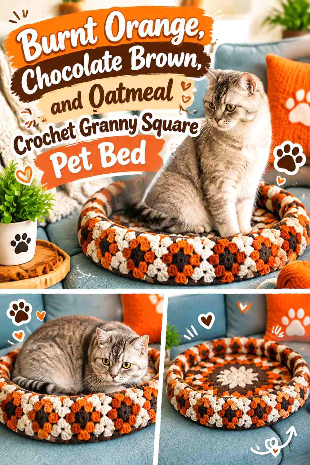
Burnt orange gives this bed its strongest visual identity, while chocolate brown can frame the individual squares and oatmeal softens the contrast. This palette works particularly well when the sleeping surface contains orange motifs and the outer wall uses more brown.
Burnt Orange Should Stay Visible Across the Granny Square Sleeping Surface
Place burnt orange in enough motif centers or middle rounds that it remains obvious after the squares are joined. If orange appears only once or twice, chocolate brown may visually take over the bed.
Repeating orange at regular intervals creates a stronger rhythm than concentrating all of it in one corner.
Chocolate Brown Can Frame Burnt Orange Better Than Covering Every Square
Use brown for selected outer rounds, joins, or the bed edge. A dark outline gives the orange more definition without making the center surface overwhelmingly brown.
Oatmeal can break up the two warm dark shades where additional light contrast is needed.
Creator Credit: Crocheted by Julia
3. Dusty Rose, Mauve, and Ivory Crochet Granny Square Pet Bed
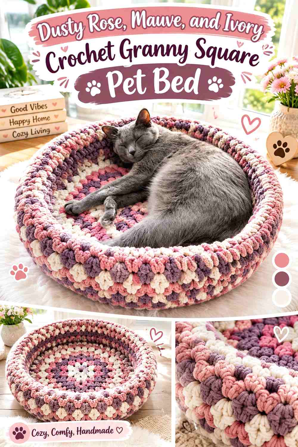
Dusty rose and mauve create a softer vintage palette, with ivory acting as the lightest point. Let dusty rose dominate the motifs, deepen selected centers with mauve, and use ivory around the square edges or joins where clearer separation is useful.
Dusty Rose Can Cover Most of the Crochet Pet Bed Without Looking Flat
Vary where dusty rose appears within the granny squares while keeping it present in every motif. Some squares can place rose near the center while others use it farther out.
That repetition gives the bed consistency without requiring identical color order in every square.
Ivory Helps Mauve and Dusty Rose Granny Squares Stay Distinct
Mauve and dusty rose may be different hues but can remain similar in value. An ivory round between them creates more visible separation.
Keep ivory controlled around the sleeping surface if you want the finished pet bed to retain a deeper, faded vintage character.
Creator Credit: Katia Creates
4. Mustard, Olive Green, and Walnut Brown Crochet Granny Square Pet Bed
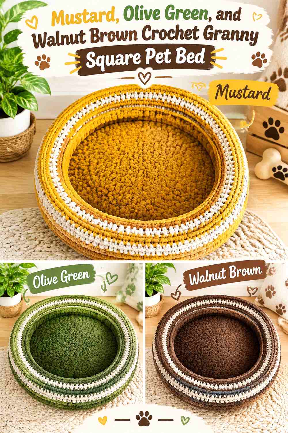
Mustard and olive produce a strongly retro combination, while walnut brown grounds the palette. Rather than distributing all three equally, use olive as the main field, mustard as the repeating highlight, and brown where the bed needs a more defined edge.
Olive Green Can Connect the Mustard Granny Squares Across the Pet Bed
Using olive in a repeated outer round is an effective way to make differently arranged motifs feel related.
It can also continue into the side wall or bolster so the surface and edge remain visually connected.
Walnut Brown Should Define Mustard and Olive Without Making the Bed Too Dark
A narrow brown join or border can frame both olive and mustard. Because it is the deepest shade, it does not need to occupy much area.
If brown starts dominating the sleeping panel, move more of it toward the outer structure and return olive to the central field.
Creator Credit: Pookie Doodle Crafts
5. Faded Teal, Rust, and Cream Crochet Granny Square Pet Bed
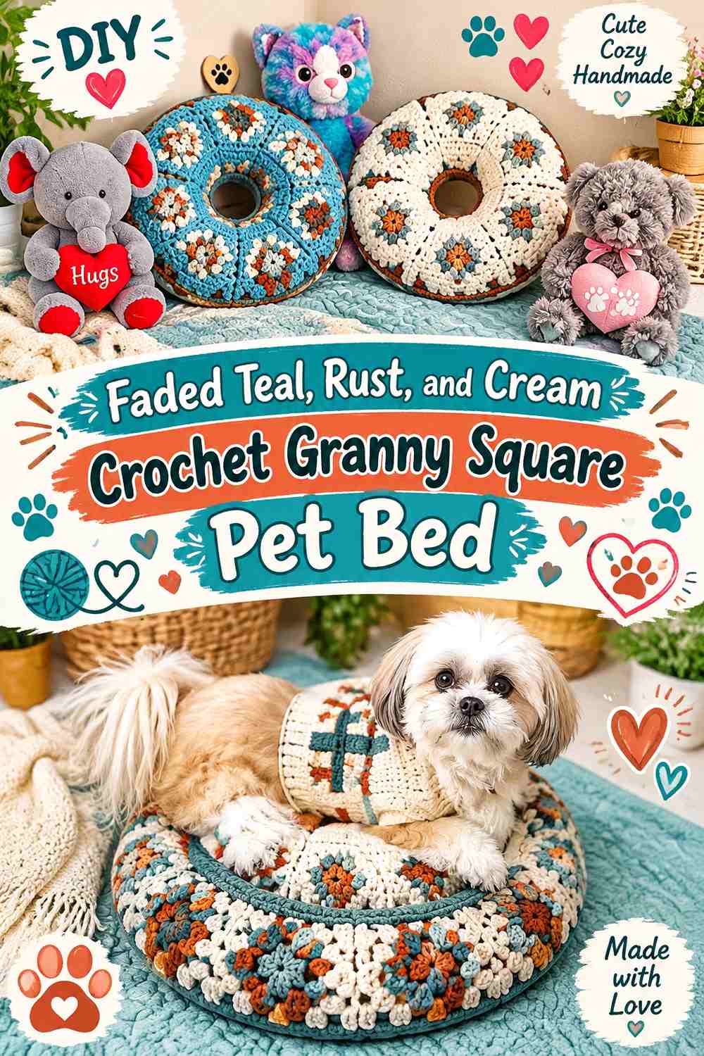
Faded teal gives this palette a cooler vintage base, while rust supplies the warm contrast commonly associated with retro textiles. Cream works as a controlled separator between those two strong hues.
Faded Teal Should Form the Main Crochet Granny Square Framework
Use teal in the outer rounds or joining areas so it visually links the entire sleeping surface. This is particularly useful if rust moves between centers and middle rounds.
A muted teal rather than a highly saturated turquoise will preserve the softened vintage direction.
Rust Needs Cream Separation Where It Meets Faded Teal
Teal and rust can create a strong hue contrast even if their lightness is similar. Adding cream around smaller motifs can make the boundaries clearer.
Keep cream in selected rounds rather than every square if you want teal to remain the dominant bed color.
Creator Credit: CrochetItForward
6. Denim Blue, Brick Red, and Oatmeal Crochet Granny Square Pet Bed
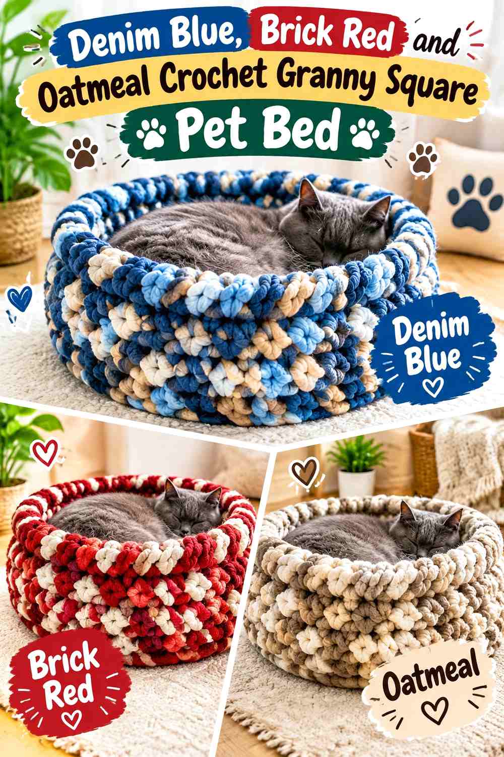
Denim blue and brick red create a faded Americana-style vintage palette without relying on bright primary colors. Oatmeal softens the contrast and works well as the repeated neutral connecting the squares.
Denim Blue Can Carry Most of the Crochet Granny Square Pet Bed
Let denim blue appear in most motifs and, if appropriate to the construction, around the outer edge. The repeated blue gives the bed a calmer overall field despite the contrasting brick-red details.
Keep some blue areas uninterrupted so the bed does not become an even checkerboard of red and blue.
Brick Red Works Better as a Controlled Accent Against Denim Blue
Brick red can occupy selected square centers or alternate rows of motifs. Using it more sparingly keeps the warm accent noticeable.
Oatmeal is useful wherever the red and blue feel too visually dense, especially around joins or an outer round.
Creator Credit: Bag-O-Day Crochet
7. Sage Green, Terracotta, and Ecru Crochet Granny Square Pet Bed

Sage and terracotta create a softer earthy palette than avocado and orange, while ecru supplies a warm neutral instead of a stark white. The combination works especially well when the pet bed uses many small squares because none of the shades needs extreme contrast.
Sage Green Can Calm a Terracotta Crochet Granny Square Layout
Repeat sage around the outer portion of multiple squares so the terracotta accents do not appear scattered.
If the bed includes raised sides, continuing sage into that structure can provide a quiet frame around the busier central motifs.
Ecru Should Clarify Sage Green and Terracotta Motifs
Use ecru between sage and terracotta when small granny-square details begin to blend. It can also serve as a joining shade when you want seams to remain visible but not dark.
If the whole bed starts feeling too pale, reduce ecru on the outer edge and return to sage.
Creator Credit: HodgePodge Crochet
8. Burgundy, Camel, and Antique Cream Crochet Granny Square Pet Bed

Burgundy brings a deeper vintage direction to the granny-square bed. Camel provides a warmer middle value and antique cream keeps the darkest motifs from becoming too visually heavy.
Burgundy Should Anchor the Crochet Granny Square Pet Bed
Use burgundy in repeated centers, outer rounds, or a defined border so the deepest color has a clear pattern rather than appearing randomly.
If your bed has a padded side structure, a burgundy outer edge can visually contain a lighter camel-and-cream sleeping panel.
Camel Can Bridge Burgundy and Antique Cream Granny Squares
Camel reduces the jump between deep burgundy and pale cream. Use it in middle rounds where those colors would otherwise meet directly.
Antique cream is most effective when reserved for the lightest highlights instead of taking over half of every motif.
Creator Credit: Tres Agujas Artesanas
9. Peach, Moss Green, and Cocoa Brown Crochet Granny Square Pet Bed
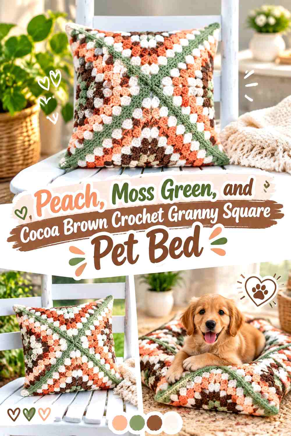
Peach adds a faded warm accent, moss supplies a botanical vintage green, and cocoa provides the darkest definition. This combination works well when you want a floral-looking color scheme without using an actual flower motif.
Peach Should Remain the Light Accent in a Moss Green Crochet Pet Bed
Place peach in motif centers or one repeated round rather than across every outer edge. Its lighter warmth will attract attention even when used in smaller amounts.
Let moss cover more area so the sleeping surface remains grounded.
Cocoa Brown Can Define Moss Green and Peach Granny Square Joins
Cocoa is useful for a darker joining seam or outer bed edge. It separates the two muted colors without introducing an unrelated neutral.
If the joins become too dominant, switch some seams to moss while keeping cocoa only around the perimeter.
Creator Credit: B.Hooked Crochet
10. Tobacco Brown, Mustard, and Faded Aqua Crochet Granny Square Pet Bed
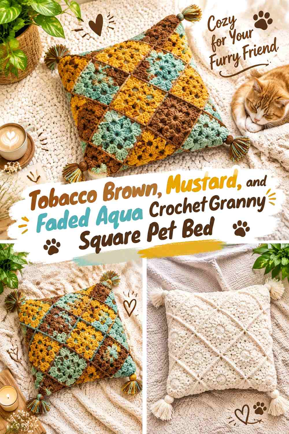
Tobacco brown provides a warm vintage base, mustard gives a golden accent, and faded aqua introduces the cool contrast that keeps the palette from becoming entirely brown and yellow.
Tobacco Brown Should Ground the Crochet Granny Square Bed Structure
Use brown around the outer rounds, joins, or side panels so the strongest neutral creates continuity.
This also allows mustard and aqua to move through different square centers without making the overall layout feel disconnected.
Faded Aqua Needs Repetition Among Mustard and Tobacco Brown Squares
Aqua can look accidental if it appears in only one motif. Repeat it at regular intervals or in corresponding rounds across several squares.
Mustard can then occupy the remaining accent positions, with tobacco brown continuing to hold the composition together.
Creator Credit: Jewels and Jones
11. Olive Green, Dusty Coral, and Beige Crochet Granny Square Pet Bed

Olive and dusty coral create a muted warm-cool contrast that feels distinctly vintage without becoming overly dark. Beige works as a quieter neutral than cream and can cover more area without overwhelming the palette.
Olive Green Can Be the Repeating Outer Round on the Crochet Pet Bed
An olive outer round around each motif makes the surface look cohesive even when coral moves between different positions.
The same olive can continue around the bed perimeter for a clean transition from motifs to edging.
Dusty Coral Should Stay Concentrated Against Olive Green and Beige
Coral works well in centers because its warmth becomes a focal point against the green.
Use beige as breathing room around those centers. If beige and coral look too close in value, deepen the coral slightly rather than adding an unnecessary fourth color.
Creator Credit: Con Punto y a lo loco
12. Deep Teal, Old Gold, and Warm Taupe Crochet Granny Square Pet Bed
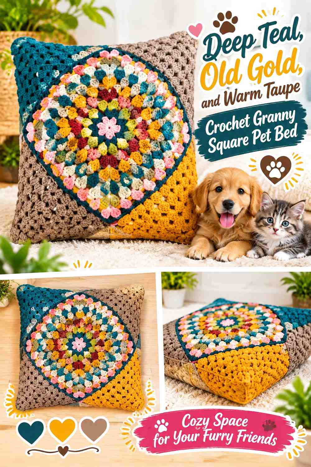
Deep teal and old gold create one of the strongest vintage contrasts in the collection, while warm taupe reduces the intensity between them. Let teal lead, gold accent, and taupe connect.
Deep Teal Can Frame the Old Gold Crochet Granny Squares
Using deep teal around square edges or across the bed border makes the gold centers appear more deliberate.
Because teal is dark, leaving some warm taupe between it and the gold can also protect the visibility of stitch texture.
Old Gold Needs Less Surface Area Than Deep Teal
Gold attracts attention quickly, so it can work in relatively small sections of each motif. Repeating those sections consistently is more important than making them large.
Warm taupe can fill the remaining rounds and prevent the bed from becoming a two-color high-contrast checkerboard.
Creator Credit: Crochet MC
13. Plum, Dusty Pink, and Mushroom Crochet Granny Square Pet Bed
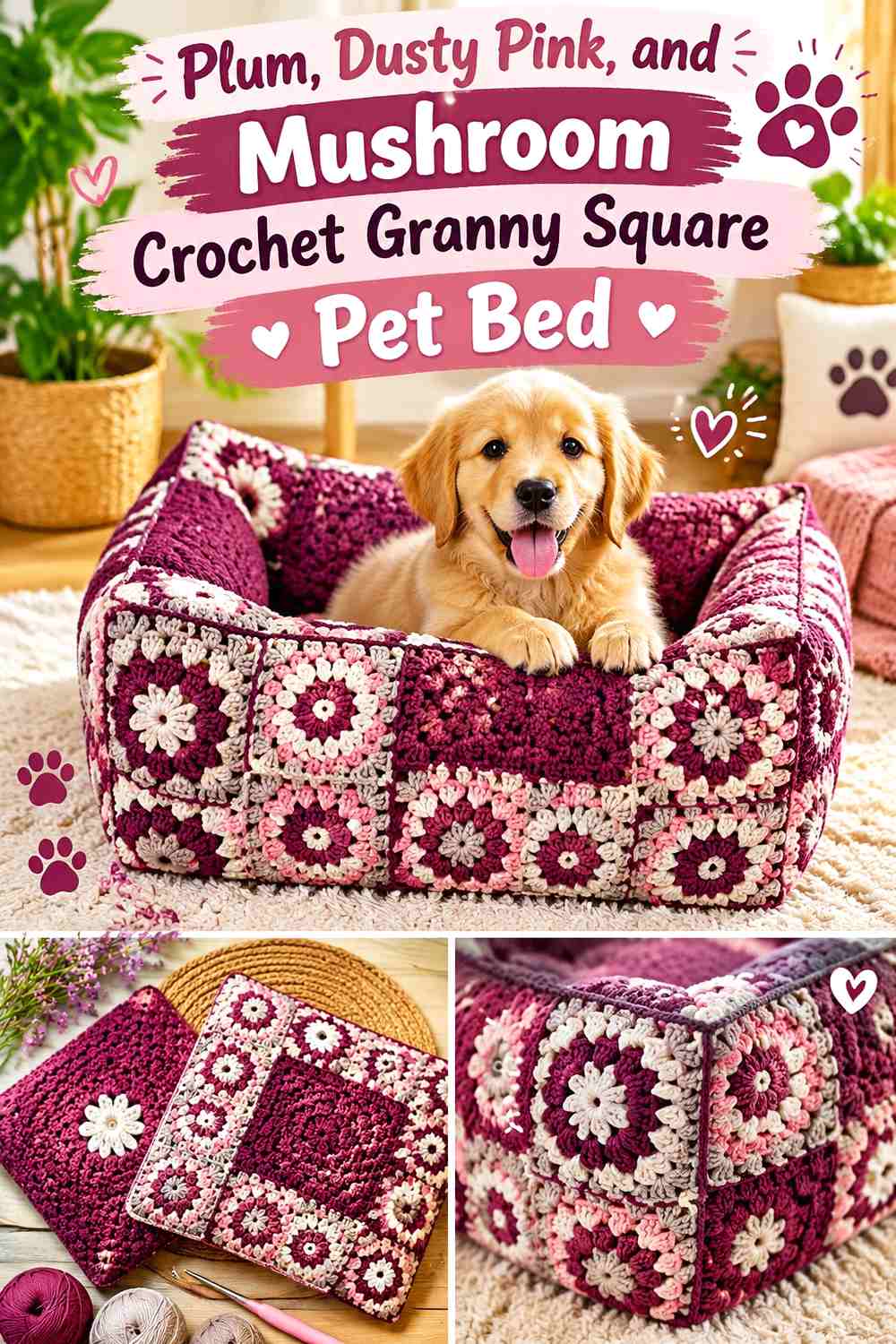
Plum and dusty pink provide a faded berry palette, while mushroom introduces a neutral brown-gray that keeps the result from becoming entirely pink and purple.
Plum Should Be the Darkest Anchor in the Crochet Granny Square Bed
Use plum in consistent motif positions or around the perimeter. A repeated deep shade helps organize softer dusty-pink squares.
If the pet bed has a padded outer edge, plum there can create a clear frame around the lighter center.
Mushroom Can Soften the Transition Between Plum and Dusty Pink
Mushroom works well as a joining or outer-round color because it is neutral enough to connect both berry shades.
Choose a mushroom shade that remains visibly different from dusty pink; two similarly light muted colors may lose the square boundaries.
Creator Credit: Ribca Crochet – ርብቃ የክር እጅ ስራ
15. Cornflower Blue, Mustard, and Brown Crochet Granny Square Pet Bed

Cornflower blue gives this vintage palette a lighter cool base than denim or teal. Mustard creates the retro accent, while brown grounds the combination and can define joins or the outer bed frame.
Cornflower Blue Should Cover Enough of the Crochet Pet Bed to Stay Dominant
Use blue across the majority of the motifs or repeat it in the same round of every square. This prevents mustard from becoming the main color simply because it is more visually assertive.
Blue can also work on the sleeping surface while brown is reserved for the surrounding structure.
Mustard and Brown Need Different Roles Around Cornflower Blue Squares
Use mustard as the highlight and brown as the anchor. When both appear in the same amount, the warmer half of the palette can visually outweigh the blue.
A small mustard center surrounded by blue and finished with brown is one simple hierarchy, but the exact motif arrangement can vary.
Creator Credit: Spreeberry
16. Espresso Brown, Burnt Sienna, and Cream Crochet Granny Square Pet Bed

Espresso and burnt sienna create a tonal brown-orange palette with a distinctly 1970s direction. Cream is important here because the two deeper warm shades can otherwise merge.
Espresso Brown Can Give the Crochet Pet Bed a Strong Outer Frame
Use espresso along the perimeter, raised edge, or selected joining seams. This gives the sleeping surface a defined boundary.
Keeping espresso away from some central square rounds also prevents the entire bed from becoming visually dark.
Cream Should Separate Burnt Sienna From Espresso Brown
Burnt sienna can carry the main accent, but its value may remain close to espresso. A cream round between them gives both shades more definition.
If you want a softer vintage result, choose a warm cream rather than increasing the amount of bright light contrast.
Creator Credit: Jenny Cate Crochet
17. Harvest Gold, Faded Teal, Rust, Olive, and Cream Crochet Granny Square Pet Bed
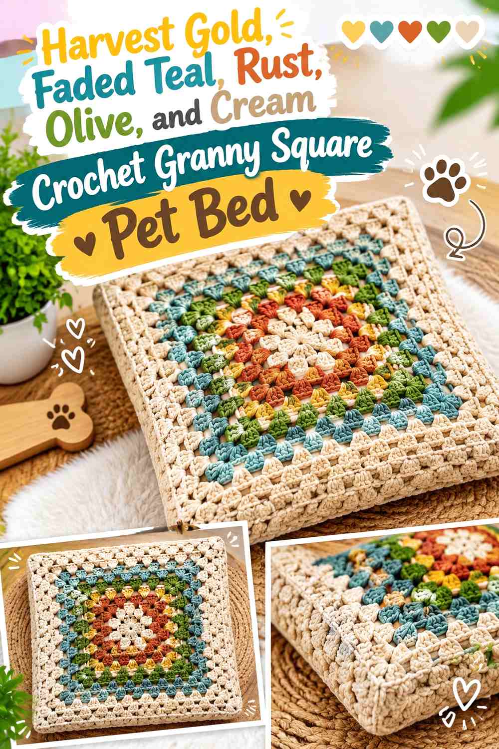
This final idea uses a fuller vintage palette, but the five colors should not receive equal visual weight. Let olive or faded teal act as the repeated framework, rotate harvest gold and rust through the centers, and use cream sparingly for separation.
Olive and Faded Teal Need to Organize the Multicolor Crochet Pet Bed
Choose one of the two cooler shades for most outer rounds and the other for selected alternating motifs. This gives the multicolor layout a system.
Without that repetition, gold, rust, teal, olive, and cream can make every square look unrelated.
Harvest Gold, Rust, and Cream Should Stay Controlled Inside the Granny Squares
Rotate gold and rust through the centers rather than placing both in every motif. Cream can appear in a middle round or joining detail where more value contrast is needed.
If the surface still feels too busy, remove one accent from alternating squares instead of adding more neutral edging around everything.
Creator Credit: Jayda InStitches
Which Vintage Granny Square Pet Bed Palette Should You Choose?
For the strongest 1960s- and 1970s-inspired direction, avocado with harvest gold, mustard with olive, or rust with avocado gives the bed an unmistakably retro palette. These combinations work especially well when one green shade repeats around most of the squares.
For a softer vintage appearance, dusty rose with mauve, sage with terracotta, peach with moss, or plum with dusty pink lowers the contrast while keeping the colors visibly aged and muted.
If you want a darker bed, burgundy, deep teal, espresso, chocolate brown, or tobacco brown can create the visual frame. Pair those shades with antique cream, oatmeal, taupe, or buttermilk around smaller motif details so the granny-square structure does not disappear.
The five-color option offers the strongest scrap-style appearance, but it also requires the clearest hierarchy. Pick one repeated outer-round or joining color before distributing the accent shades.
Conclusion
Vintage colors work particularly well with crochet granny square pet beds because repeating motifs give you many places to balance strong and quiet shades. Avocado, mustard, harvest gold, rust, faded teal, dusty rose, brown, and cream can all feel intentional when each color has a consistent role.
Start with the pet-bed structure and sleeping surface first. Then decide which shade should unite the squares, which colors belong in motif centers, and whether the join should disappear or become part of the design. If the palette feels crowded, reducing one accent usually works better than adding another neutral.
Most importantly, adapt the size and surface to the individual pet. Check joins, openings, padding, loose ends, and overall stability before regular use, and follow the credited creator’s tutorial for the construction it actually demonstrates.
Frequently Asked Questions
What vintage colors work well in a crochet granny square pet bed?
Avocado green, harvest gold, mustard, burnt orange, rust, chocolate brown, faded teal, dusty rose, mauve, denim blue, olive, camel, and warm cream all support different vintage directions. You do not need to combine all of them. Two or three well-organized shades can look more convincingly vintage than a crowded palette.
Should every granny square in a pet bed use the same colors?
No. The individual motifs can vary as long as something connects them. Repeating the same outer round, join color, center color, or border shade can make differently colored squares feel like one bed.
What color should I use to join vintage granny squares?
Use a matching join when you want the motifs to blend into a continuous sleeping surface. Choose a contrasting join when you want every square clearly outlined. Dark brown, olive, cream, taupe, or another existing palette shade can work; introducing a completely new joining color may make the palette feel less connected.
Are open granny squares suitable for a crochet pet bed?
It depends on the motif and the individual pet. Inspect the finished surface for openings or loops that could catch claws. If necessary, choose a denser granny-square variation or use a secure underlying layer so the decorative surface is more suitable for the intended animal.
Where should the darkest vintage color go on a granny square pet bed?
A dark shade can work well around the perimeter, on selected joins, or in repeated motif centers. Putting the darkest color around the outer structure can frame a lighter sleeping panel, while dark joins emphasize the grid of squares. Neither placement is universally required.
How do I make a five-color granny square pet bed look less busy?
Give one or two colors structural roles. For example, use olive for most outer rounds and faded teal for joins, then rotate rust and harvest gold through the centers with cream as an occasional separator. The important step is preventing all five colors from occupying equal amounts of every square.
Can I adapt a granny square cushion tutorial into a pet bed?
A padded cushion or pouf tutorial can provide useful guidance for granny-square panels, joins, and enclosing an insert, but it is not automatically a pet-bed pattern. Reconsider the dimensions, padding, entry height, surface openings, closures, and overall stability for the individual animal before using that construction as a bed.