A crochet cat window perch cushion needs to do more than look inviting when it is photographed on a sill. The color scheme has to work across a relatively narrow surface, remain readable in strong window light, and coordinate with the window frame, curtains, walls, and nearby furniture without making the perch look visually crowded.
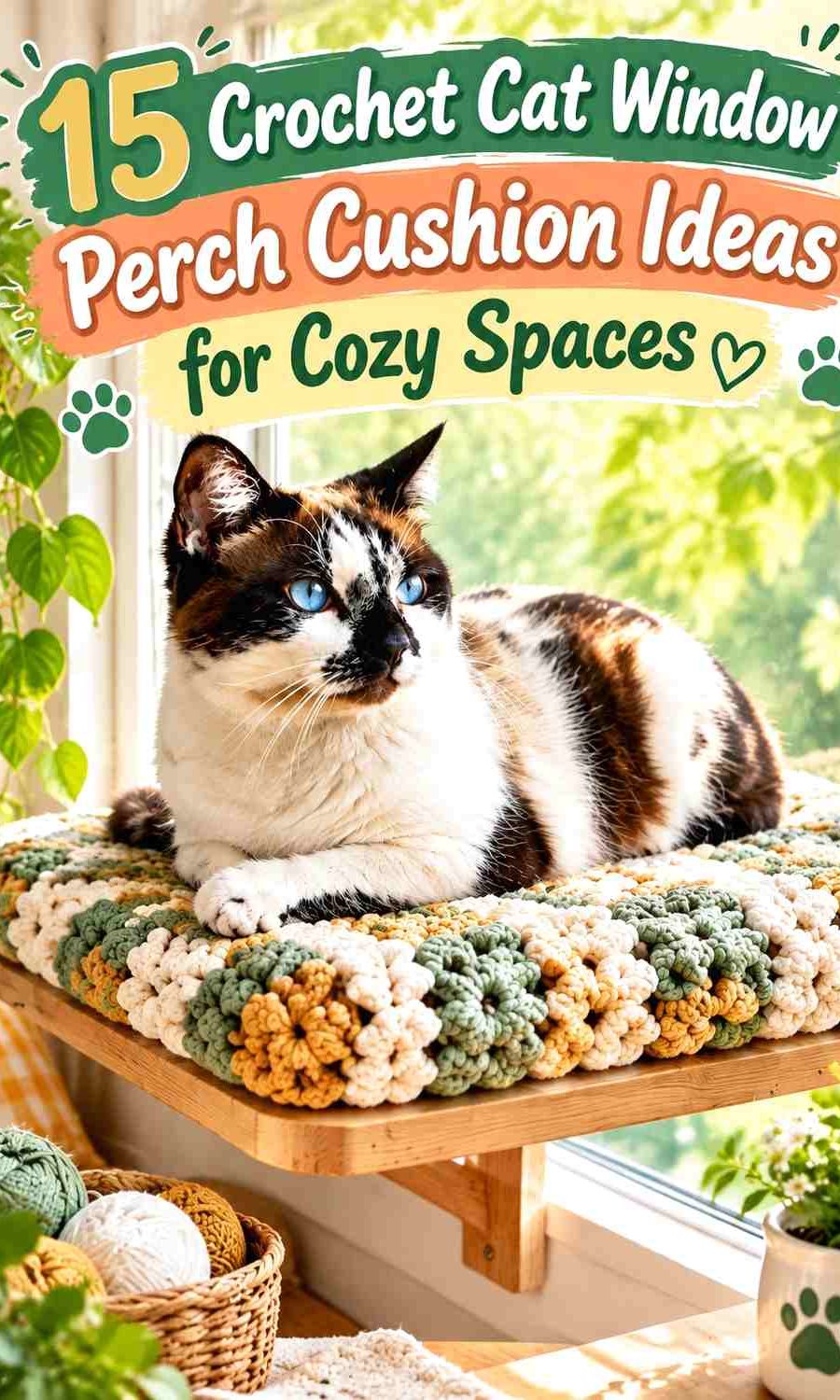
The most useful palettes give the sleeping surface one dominant shade, then use a second color for edging, side panels, or a removable cover detail. A third shade can highlight texture or frame the perimeter. Because the cushion sits directly beside a window, check your yarn colors in that actual space before committing; daylight can make subtle neutrals or pale pastels look different from how they appear under indoor lighting.
The tutorial sources below include an actual crochet cat mat, crochet pet-bed constructions, and cushion-cover tutorials that can support a window-perch adaptation. Cushion tutorials intended for home decor should be resized to the actual ledge or perch rather than treated as ready-made cat-bed dimensions.
Quick List
- Sage Green, Cream, and Camel Crochet Cat Window Perch Cushion
- Terracotta, Oatmeal, and Cocoa Crochet Cat Window Perch Cushion
- Dusty Blue, Ivory, and Charcoal Crochet Cat Window Perch Cushion
- Blush Pink, Mushroom, and Cream Crochet Cat Window Perch Cushion
- Olive Green, Mustard, and Rust Crochet Cat Window Perch Cushion
- Lavender, Soft Gray, and Cream Crochet Cat Window Perch Cushion
- Deep Teal, Camel, and Oatmeal Crochet Cat Window Perch Cushion
- Cocoa Brown, Sage, and Ivory Crochet Cat Window Perch Cushion
- Dusty Rose, Burgundy, and Taupe Crochet Cat Window Perch Cushion
- Navy Blue, Tan, and Cream Crochet Cat Window Perch Cushion
- Moss Green, Terracotta, and Oatmeal Crochet Cat Window Perch Cushion
- Charcoal Gray, Rust, and Cream Crochet Cat Window Perch Cushion
- Faded Denim, Mustard, and Brown Crochet Cat Window Perch Cushion
- Plum, Dusty Pink, and Mushroom Crochet Cat Window Perch Cushion
- Oatmeal, Forest Green, and Caramel Crochet Cat Window Perch Cushion
Plan Color Around the Narrow Window Perch Shape
A long, narrow window cushion usually looks more balanced when one shade runs across most of its length. Frequent high-contrast stripes can emphasize the narrow proportions and make a small perch look busier than it is.
Instead, use the supporting shade on the outer border, one end panel, or a restrained textured band. If the cushion is reversible or has a removable cover, the second side can carry more color without crowding the main window-facing surface.
Check Crochet Texture in the Actual Window Light
Strong daylight can reveal raised texture clearly, but it can also reduce the apparent contrast between two pale shades. Cream beside oatmeal or dusty blue beside soft gray may look distinct indoors and much closer together beside a bright window.
Place the yarns on the sill for part of the day before finalizing the palette. If a border disappears into the main surface, choose a noticeably lighter or darker supporting shade rather than adding more decorative colors.
Keep a Crochet Cat Window Cushion Stable and Practical
Measure the usable perch or sill rather than estimating from the window width alone. The finished cushion should sit fully on the supported surface and should not create an unstable overhang.
Inspect the crochet fabric for loose ends, large openings, or decorations that could catch claws. Avoid tassels, long cords, beads, or other dangling embellishments on a perch, and make sure the underlying window shelf or commercial perch itself is properly installed and suitable for the cat. A crochet cushion is padding, not structural support.
1. Sage Green, Cream, and Camel Crochet Cat Window Perch Cushion
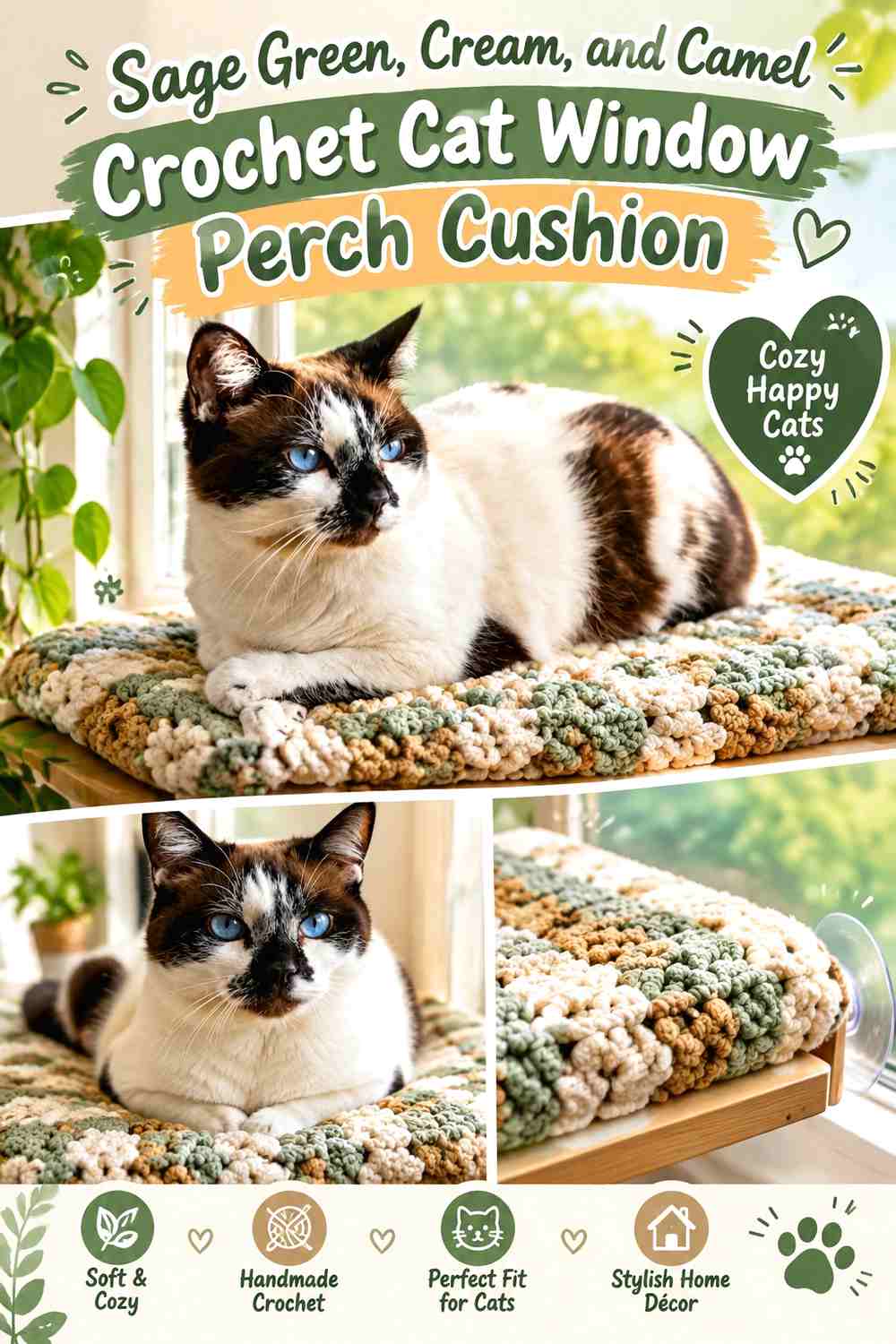
Sage green creates a quiet main surface that works well in a small window area because it has enough color to be noticeable without demanding several additional accents. Let sage cover most of the cushion, use cream where you want the crochet texture to read more clearly, and reserve camel for a warm outer edge.
Sage Green Should Run Across Most of the Crochet Window Perch
Keeping sage continuous along the long sleeping surface prevents the cushion from looking chopped into short sections. This is especially useful on a narrow sill where the rectangular proportion is already visually strong.
If the stitch pattern has pronounced ridges or raised texture, a solid sage field also gives that texture room to show.
Cream and Camel Can Frame Sage Green Without Crowding the Cat Perch
Use cream on a narrow inner edge or selected textured detail, then let camel form a slightly deeper outer border. The three levels of lightness make the edge easier to read without turning the surface into wide stripes.
If cream and camel are too close in value, keep only the stronger contrast rather than forcing all three shades into equal areas.
Creator Credit: First The Coffee Crochet
2. Terracotta, Oatmeal, and Cocoa Crochet Cat Window Perch Cushion
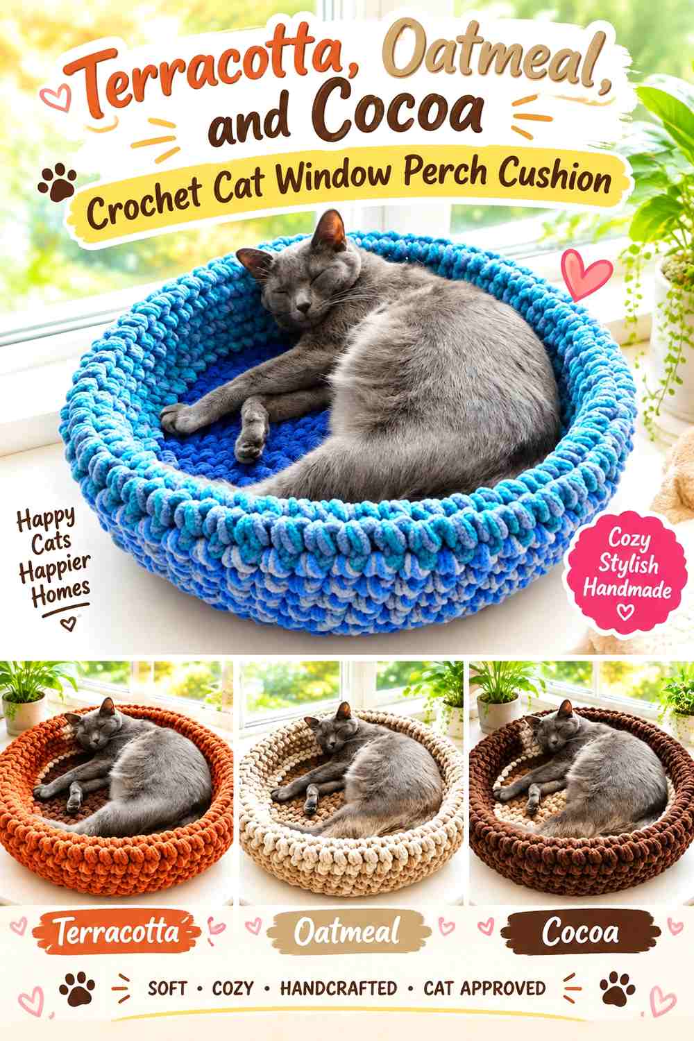
Terracotta gives a sunny window perch a warm earthy direction, while oatmeal prevents the surface from becoming too dark. Cocoa is best used at the outer edge or underside where its deeper value can visually anchor the cushion against a pale sill.
Terracotta Can Carry the Long Crochet Cat Cushion Surface
Use terracotta across most of the top rather than switching repeatedly between orange and brown. A continuous warm field can make a compact perch feel more unified.
If sunlight makes the terracotta look especially bright, keep the supporting colors neutral rather than adding another saturated accent.
Cocoa Gives Terracotta and Oatmeal a Defined Crochet Edge
A cocoa border can separate the lighter cushion from a white or cream windowsill. Oatmeal can sit between cocoa and terracotta where you want a softer transition.
Keep the brown narrow if you want terracotta to remain the first color noticed from across the room.
Creator Credit: Katia Creates
3. Dusty Blue, Ivory, and Charcoal Crochet Cat Window Perch Cushion

Dusty blue gives the perch a cooler appearance without the visual weight of navy. Ivory can highlight raised crochet details, while charcoal is useful for the perimeter when the cushion needs a stronger outline against a light window frame.
Dusty Blue Keeps the Crochet Window Cushion Soft but Visible
Let dusty blue occupy most of the top surface. Because it is a middle-value color, it can remain noticeable against both pale and darker surrounding decor.
Avoid scattering charcoal motifs across the middle if you want the perch to retain a calm, uninterrupted resting surface.
Charcoal Can Define Ivory Details on a Dusty Blue Cat Perch
Ivory can brighten one textured band or inner border, while charcoal finishes the outside edge. This gives each supporting shade a different purpose.
If direct daylight makes dusty blue and ivory look too similar, increase their value difference rather than making the ivory section wider.
Creator Credit: Crocheted by Julia
4. Blush Pink, Mushroom, and Cream Crochet Cat Window Perch Cushion

Blush creates a soft window-seat palette, but pairing it only with white can make the cushion look very pale in direct light. Mushroom adds a grounded neutral, while cream can remain a smaller highlight around texture or edging.
Blush Pink Works Best as the Main Crochet Cat Cushion Color
Use blush over the majority of the surface and let the neutral shades concentrate around the edges. This prevents a narrow cushion from becoming a series of pale color blocks.
A continuous blush field also gives bobbles, ridges, or other raised crochet texture more visual consistency.
Mushroom Gives Blush Pink More Definition Than Cream Alone
Use mushroom on the outer border or underside edge where a slightly darker neutral can frame the pink. Cream can then appear on a smaller inner edge.
If the room already contains many pale neutrals, increasing mushroom slightly can stop the cushion from disappearing into the window area.
Creator Credit: B.Hooked Crochet
5. Olive Green, Mustard, and Rust Crochet Cat Window Perch Cushion
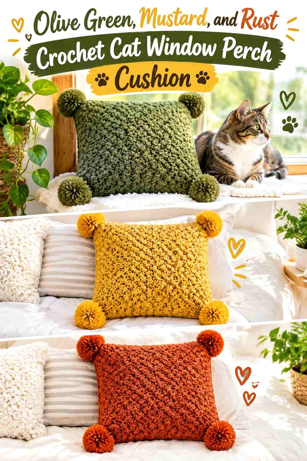
Olive, mustard, and rust create a richer retro palette that works best when one shade clearly dominates. Olive is the most practical lead color here because mustard and rust both attract attention quickly when repeated across a narrow surface.
Olive Green Should Control Most of the Crochet Perch Surface
Let olive extend from end to end, then introduce the warmer shades in smaller sections. This gives the cushion a stable base rather than an equal three-color stripe pattern.
Olive also allows a pronounced crochet texture to remain the visual detail between the stronger accents.
Mustard and Rust Should Stay Focused Against Olive Green
Use mustard for one narrow textured band or inner edge and rust for a deeper outer border. Separating their jobs prevents the warm colors from competing with each other.
If the sill is already warm-toned wood, reduce rust and allow olive to carry more of the visible edge.
Creator Credit: Jewels and Jones
6. Lavender, Soft Gray, and Cream Crochet Cat Window Perch Cushion

Lavender, gray, and cream suit a light-filled room, but their similar values require careful checking. Let lavender lead, use gray for structural definition, and keep cream around only the details that genuinely need extra brightness.
Lavender Needs Enough Depth on a Bright Crochet Window Perch
Choose a lavender that remains visibly different from the window frame and cream accent in daylight. If all three shades are extremely pale, the crochet pattern can lose definition.
A medium-soft lavender across the top usually gives the gray and cream more useful contrast.
Soft Gray Can Outline Lavender Better Than Adding More Cream
Use gray on the perimeter, seam area, or side panel so the cushion has a clear shape against a white sill. Cream can remain a small highlight.
This distribution is particularly helpful when the perch is long and narrow because the darker edge visually contains the lighter center.
Creator Credit: knots with love
7. Deep Teal, Camel, and Oatmeal Crochet Cat Window Perch Cushion
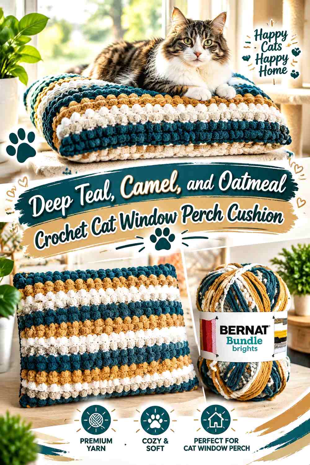
Deep teal provides a strong color foundation for a perch that needs to stand out against pale walls or white trim. Camel adds warmth, while oatmeal lightens selected details without creating the sharper contrast of bright white.
Deep Teal Should Anchor the Crochet Cat Perch From End to End
Use teal across most of the top so the narrow cushion reads as one continuous resting area. A dark main shade can also make lighter textured borders easier to see.
Check the stitch surface near the window, though, because very deep yarn can conceal subtle texture in shadowed areas.
Camel Can Warm Deep Teal While Oatmeal Keeps the Edge Visible
Place camel on a narrow interior stripe or one end detail and use oatmeal on the outer border. The lighter neutral keeps the edge from disappearing into teal.
If camel becomes too prominent, reduce its width rather than adding more oatmeal to compensate.
Creator Credit: Bag-O-Day Crochet
8. Cocoa Brown, Sage, and Ivory Crochet Cat Window Perch Cushion
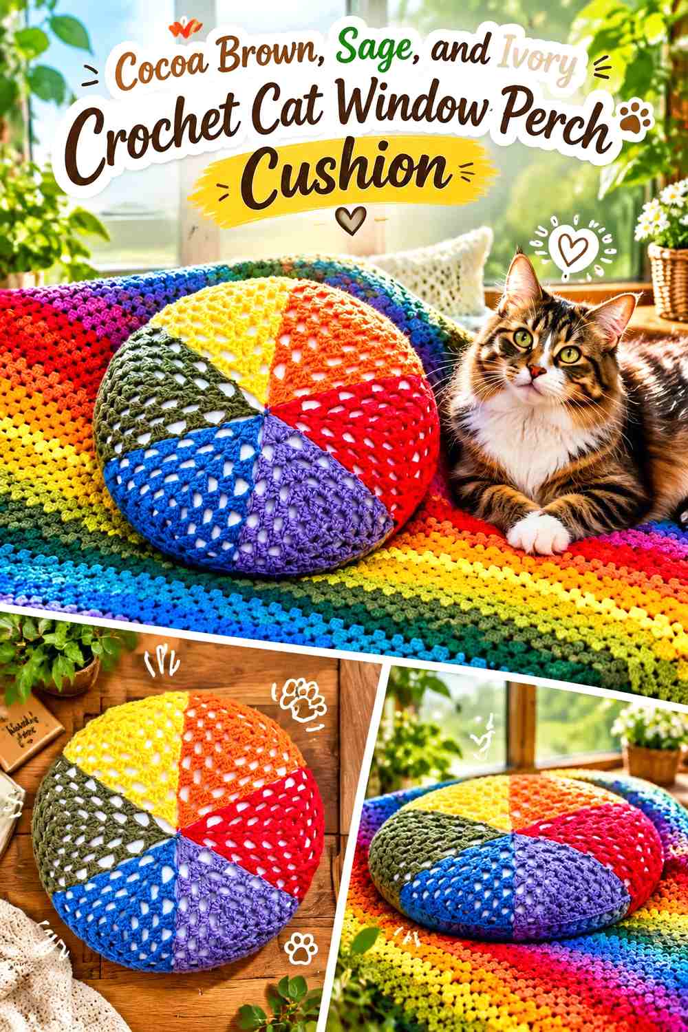
Cocoa gives the perch a grounded base, sage adds a muted botanical accent, and ivory keeps the combination from looking heavy. This palette works especially well when the window area already includes wood, baskets, or other warm neutrals.
Cocoa Brown Can Frame a Sage Crochet Sleeping Surface
Rather than covering the entire top in dark brown, let sage carry most of the surface and move cocoa toward the perimeter. This makes the actual lounging area look lighter while maintaining a defined edge.
The contrast also helps separate the cushion visually from a wooden sill.
Ivory Should Highlight Sage Before It Competes With Cocoa Brown
Use ivory sparingly around a raised band, center panel, or narrow finishing edge. Its purpose is to add light separation between sage and cocoa.
If the ivory section becomes too wide, the cushion may start reading as a cream design with green and brown accents instead.
Creator Credit: Ophelia Talks Crochet
9. Dusty Rose, Burgundy, and Taupe Crochet Cat Window Perch Cushion

Dusty rose and burgundy create a tonal red palette, while taupe prevents the cushion from looking overly saturated. Burgundy works especially well on the edge because the deepest shade can frame the softer rose top.
Dusty Rose Should Cover the Main Crochet Window Cushion
Use dusty rose across most of the sleeping surface and let burgundy appear in narrower sections. This keeps a dark red accent from visually shrinking the cushion.
The softer top also gives textured stitches more room to show than an all-burgundy surface might.
Burgundy and Taupe Can Give Dusty Rose a Clear Perimeter
A burgundy outer edge creates the darkest boundary, while taupe can sit just inside it as a quieter transition.
If the room already contains burgundy textiles, repeat less of it on the cushion so the perch does not become another large dark block near the window.
Creator Credit: Erica Arndt
10. Navy Blue, Tan, and Cream Crochet Cat Window Perch Cushion
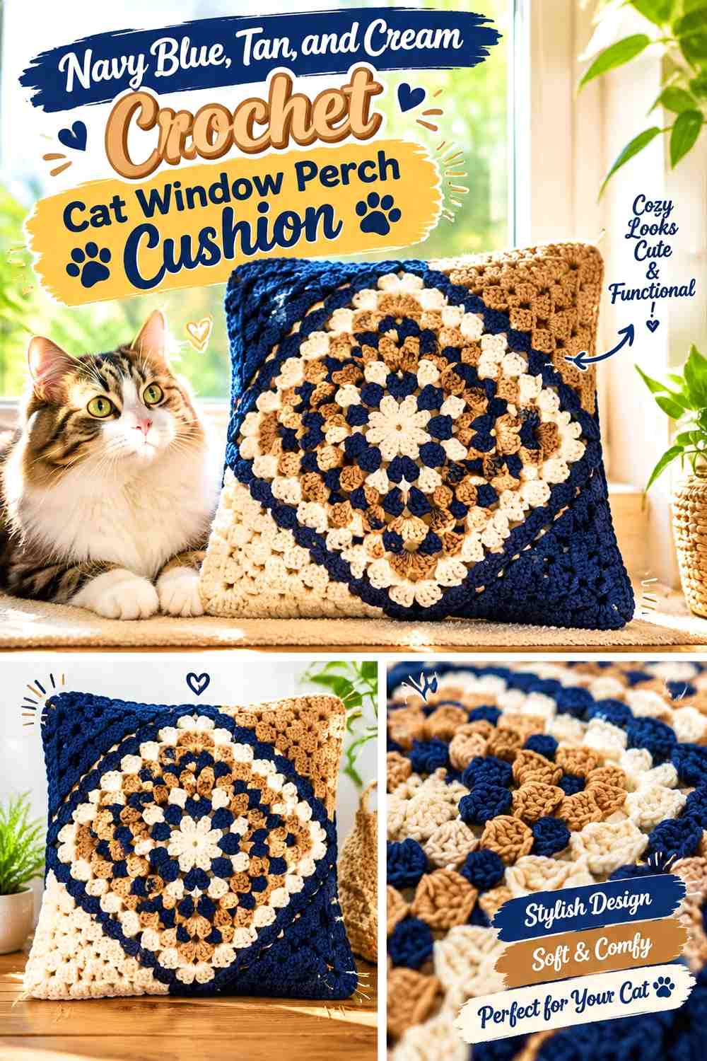
Navy is one of the strongest dark bases in this collection, so tan and cream need controlled placement. Let navy dominate the surface, use tan to warm the border, and reserve cream for small areas where the stitch pattern needs more visibility.
Navy Blue Can Make a Long Crochet Cat Perch Look Unified
A continuous navy top avoids breaking the narrow cushion into several high-contrast blocks. This works particularly well if the perch sits against a white window frame.
If navy conceals fine texture, move the most detailed stitchwork into the tan section instead.
Tan Should Carry More Edge Area Than Cream Against Navy Blue
Tan creates a moderate contrast that can cover a larger border without looking too sharp. Cream can then appear only as a narrow line or selected textured accent.
That hierarchy keeps the cushion dark and grounded while still making the edge readable.
Creator Credit: Crochet MC
11. Moss Green, Terracotta, and Oatmeal Crochet Cat Window Perch Cushion
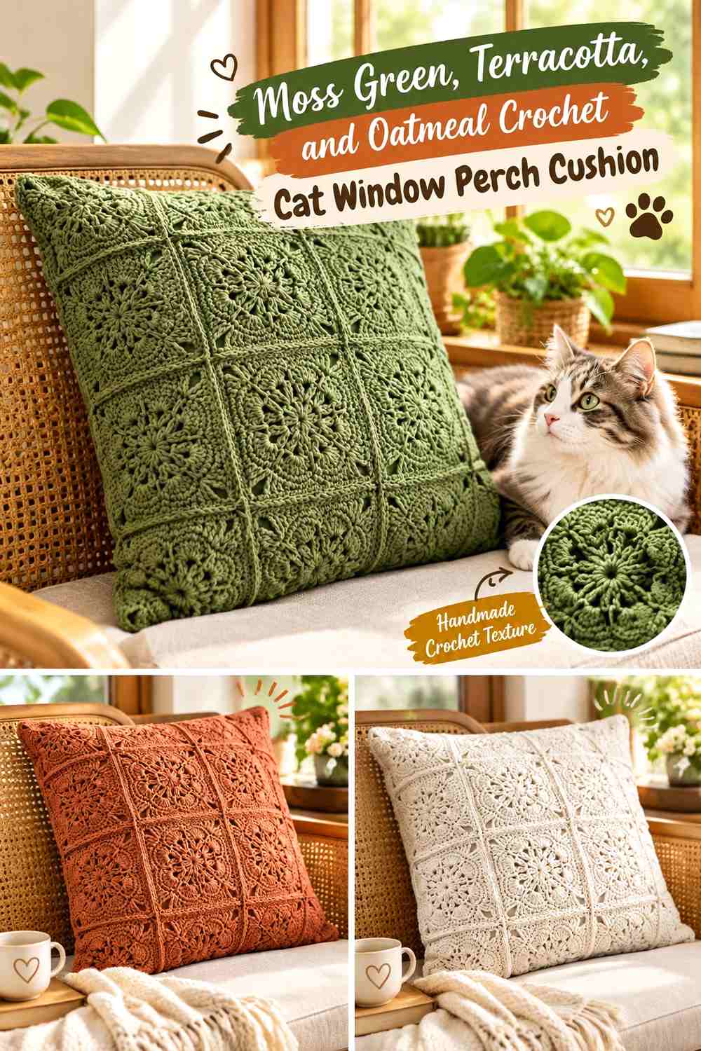
Moss and terracotta create an earthy warm-cool relationship, while oatmeal gives the perch a light neutral break. Use moss as the main surface if you want the cushion to stay visually calm beside houseplants or natural decor.
Moss Green Can Keep Terracotta From Overpowering the Crochet Perch
Cover most of the top with moss and restrict terracotta to a defined stripe, side panel, or border section. This prevents the orange tone from taking over a small window area.
Moss also works well as a repeated color on both the top and underside edge.
Oatmeal Separates Moss Green and Terracotta on Small Crochet Details
Where the two earthy shades meet, oatmeal can provide a narrow visual pause. That is useful if moss and terracotta have surprisingly similar lightness.
Avoid turning oatmeal into another large panel unless a much lighter cushion is your actual goal.
Creator Credit: Tres Agujas Artesanas
12. Charcoal Gray, Rust, and Cream Crochet Cat Window Perch Cushion
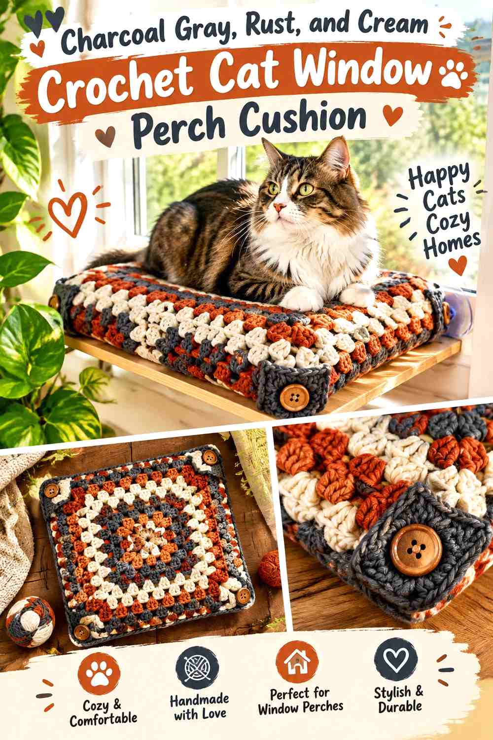
Charcoal gives this cushion a strong neutral base that can hide less easily against a bright window than pale gray. Rust introduces warmth, while cream can highlight a specific border or raised feature.
Charcoal Gray Should Control the Large Crochet Cushion Areas
Use charcoal over most of the long surface and keep rust concentrated around one structural feature. A dark continuous background gives the narrow perch a clean outline.
If the window receives limited daylight, check that the charcoal still allows the crochet texture to remain visible.
Rust Can Warm Charcoal Gray While Cream Protects the Contrast
A rust border or end panel brings warmth without requiring a large amount of color. Cream can sit next to rust where you need a lighter separator.
Keep the cream narrow if you want the final cushion to remain dark rather than becoming a three-color block design.
Creator Credit: House Hermit Hobbies
13. Faded Denim, Mustard, and Brown Crochet Cat Window Perch Cushion
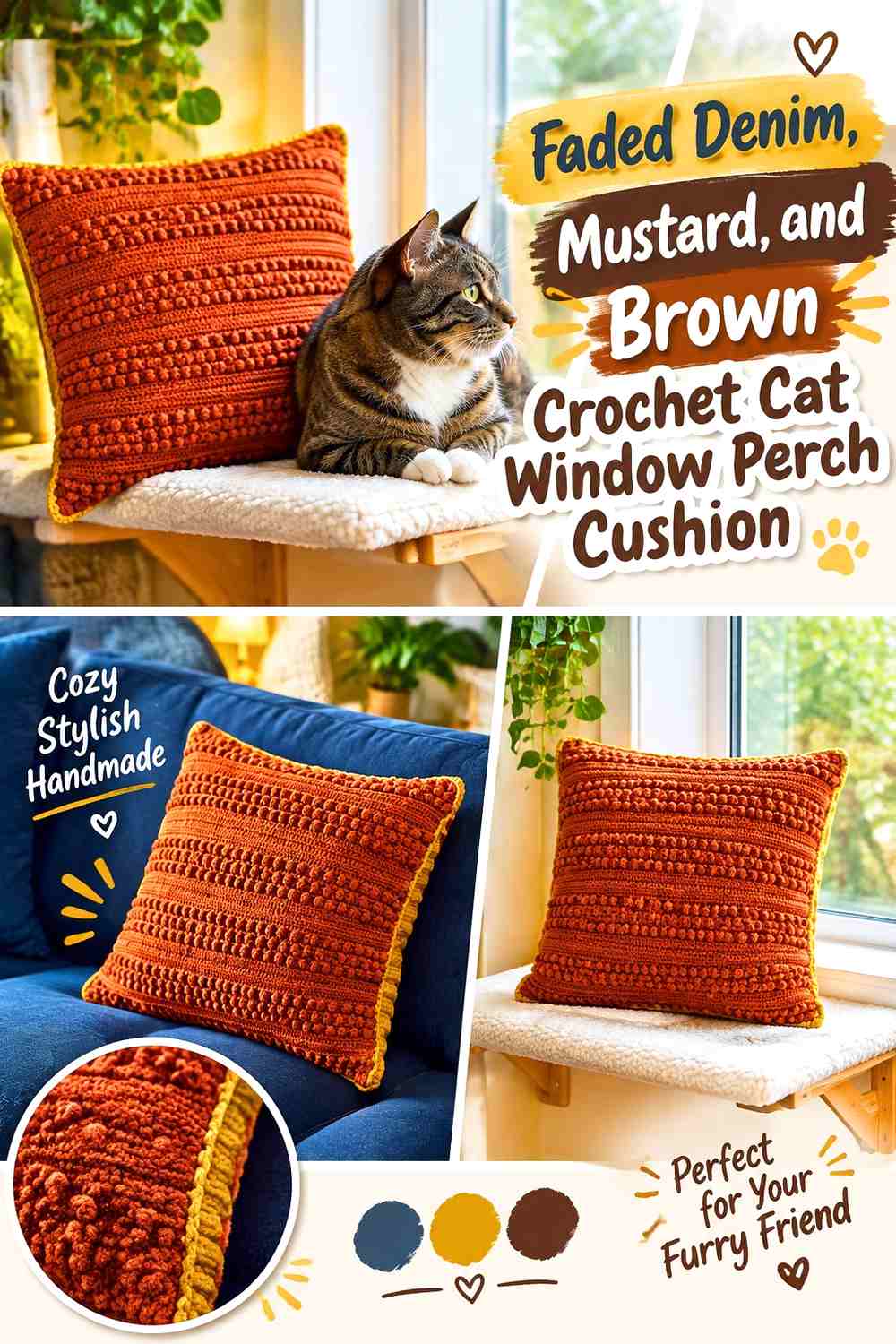
Faded denim gives the cushion a relaxed blue base, mustard introduces a vintage accent, and brown adds a deeper edge. The combination works best when the yellow is repeated sparingly rather than stretched across long horizontal stripes.
Faded Denim Should Stay Dominant on the Crochet Window Seat
Let the blue cover most of the rectangular top. This keeps the cushion easy to coordinate with a range of neutral window treatments.
Because faded denim is softer than navy, brown can provide the deeper definition at the perimeter.
Mustard Needs Small Repetition Against Faded Denim and Brown
Use mustard in one textured line and repeat it once near the opposite edge or end. Small repetition looks intentional without dividing the entire perch into yellow sections.
If the mustard is very saturated, make those sections narrower so faded denim remains the main color.
Creator Credit: The crochet Lab
14. Plum, Dusty Pink, and Mushroom Crochet Cat Window Perch Cushion
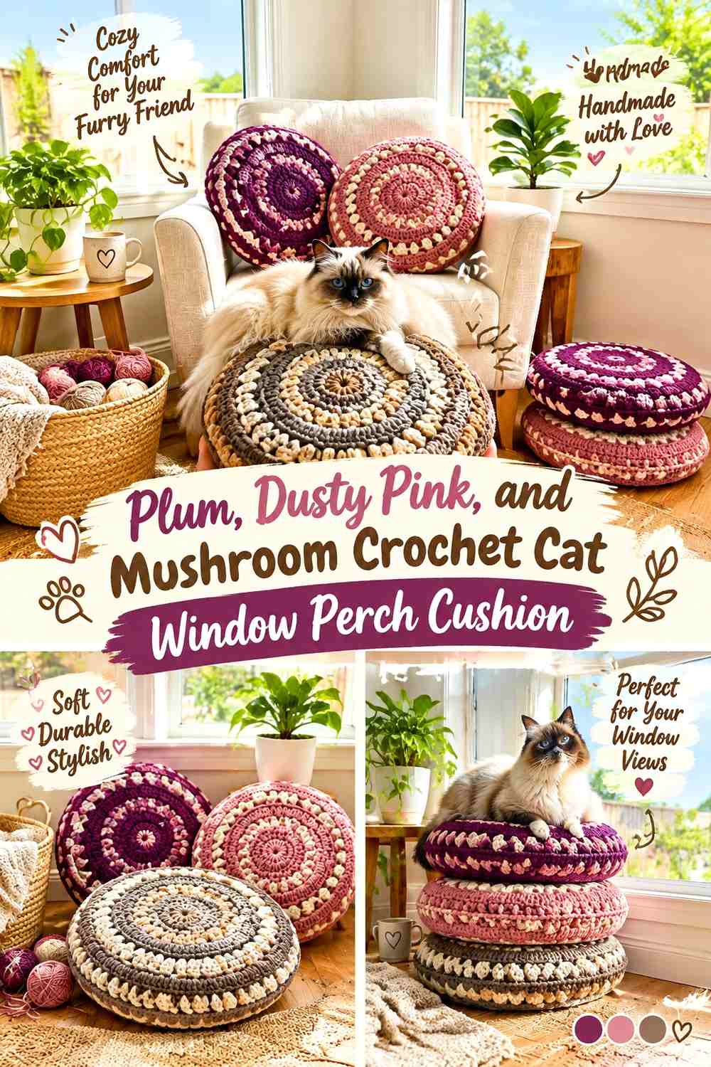
Plum provides a deep berry base, dusty pink softens it, and mushroom introduces a neutral that can connect the cushion to beige, taupe, or wood-toned surroundings.
Plum Can Frame a Dusty Pink Crochet Cat Perch
Use dusty pink across most of the top and move plum toward the border. This produces a lighter lounging surface while the darker color defines the cushion shape.
The contrast is also useful if the perch sits on a pale sill and needs a clear visual edge.
Mushroom Can Prevent Plum and Dusty Pink From Looking Too Tonal
Place mushroom between the two berry shades or use it on an underside panel. The neutral creates a break without requiring cream or white.
If mushroom and dusty pink are too close in value, deepen the plum edge rather than adding another color.
Creator Credit: Knit and Crochet Design
15. Oatmeal, Forest Green, and Caramel Crochet Cat Window Perch Cushion
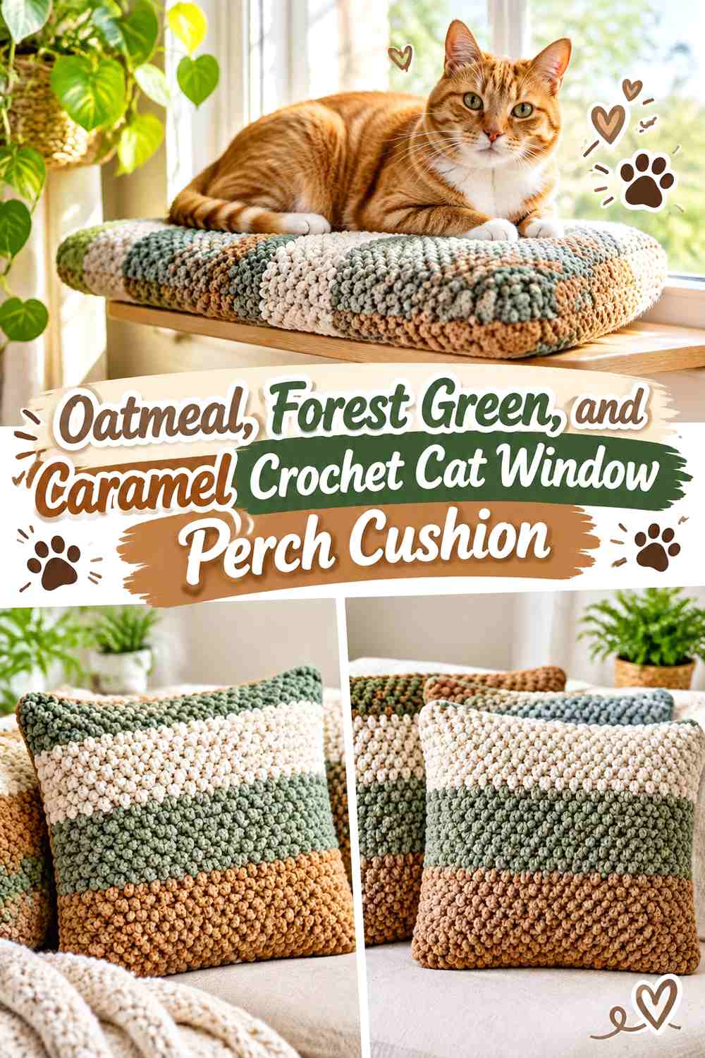
Oatmeal creates the lightest main surface in this collection. Forest green gives the cushion a strong frame, while caramel warms the transition and keeps the palette from becoming simply cream and dark green.
Oatmeal Needs Forest Green Definition on a Bright Crochet Window Perch
Use oatmeal across the center but give the outer edge enough forest green to remain visible in strong daylight. A very pale cushion without a darker boundary can disappear against a white sill.
The green also helps emphasize the long rectangular shape without adding repeated stripes.
Caramel Can Soften the Jump Between Oatmeal and Forest Green
Use caramel as an inner border, narrow textured band, or end-panel accent. It bridges the light and dark colors without competing with either.
If the room already contains warm wood, a restrained caramel repeat can connect the perch to those surroundings while forest green still provides the strongest outline.
Creator Credit: Lucky Platypus Crochet
Which Crochet Cat Window Perch Palette Fits a Cozy Space?
For a light, quiet room, sage and cream, lavender and gray, blush and mushroom, or oatmeal and forest green keep the window area soft while still providing enough edge definition.
For a warmer space, terracotta and cocoa, olive and mustard, moss and terracotta, or faded denim and mustard introduce more noticeable vintage or earthy color. These palettes work especially well when the window area includes wood tones, baskets, plants, or warm upholstery.
If you prefer a darker cushion, deep teal, navy, charcoal, burgundy, cocoa, or plum can anchor the perch. Give those shades a lighter edge or accent so the crochet texture and cushion outline remain visible.
Conclusion
A crochet cat window perch cushion benefits from a simpler color hierarchy than many larger home-decor projects. The narrow shape already creates a strong visual line, so one continuous dominant color often works better than many equal stripes or blocks.
Sage, dusty blue, blush, lavender, and oatmeal create lighter cozy-space palettes. Terracotta, olive, moss, camel, and rust add warmth. Navy, teal, charcoal, cocoa, burgundy, and plum provide stronger framing when the window area needs more contrast.
Choose the palette after looking at the actual window in daylight, then decide where the border and texture need contrast. Use the credited tutorial for the construction it demonstrates, and resize cushion-cover concepts to the real perch dimensions rather than assuming household-pillow sizing will fit a cat window space.
Frequently Asked Questions
What shape works best for a crochet cat window perch cushion?
A rectangle usually fits a conventional windowsill or shelf-style perch most efficiently because it follows the available length without wasting much depth. Measure the actual supported surface first, especially if the window trim narrows part of the usable area.
Which color should dominate a crochet window perch cushion?
The color covering the largest part of the sleeping surface should usually be the dominant shade. Use the second color around edging, end panels, or a textured band, and keep a third shade for smaller contrast details when needed.
How can I tell if two crochet cushion colors have enough contrast in daylight?
Place the yarns directly on or beside the window perch during daylight hours. Look at them from across the room as well as close up. If the border disappears into the center color, choose a noticeably lighter or darker shade. A grayscale photo can also help reveal value differences.
Should a crochet cat perch cushion have a contrasting border?
It can be useful when the cushion and windowsill are similar in color. A darker border around a cream or oatmeal cushion, or a lighter border around navy or charcoal, makes the finished shape easier to see. If the surface already has strong texture and contrast, a matching border may look calmer.
Are bobbles and raised crochet textures suitable for a cat window cushion?
Raised texture can work, but consider the individual cat and inspect the finished surface carefully. Avoid loose loops, unsecured embellishments, or openings that could catch claws. A flatter central sleeping area with texture concentrated nearer the edges can be a practical alternative.
Can I adapt a regular crochet pillow cover into a cat window perch cushion?
Yes, when the construction can be resized to the actual perch, but a home pillow tutorial is only a construction reference. Recalculate the length and depth for the window surface, consider whether the insert can be removed for cleaning, and make sure the finished cushion remains fully supported by the perch.
How should I coordinate a crochet cat window cushion with the room?
Start with the window frame and the largest nearby colors rather than trying to match every small decor item. A neutral or muted main surface can connect with the room, while one stronger border color can echo curtains, upholstery, plants, wood tones, or another nearby element without making the perch overly coordinated.