Moon and star crochet can give a bedroom a clear celestial direction without covering every surface in the same motif. A crescent pillow can add one sculptural shape to the bed, a star garland can create a lighter line above the headboard, and moon-phase wall art can bring a more graphic night-sky element to an otherwise simple room.

Color determines whether those pieces feel dark and atmospheric, soft and restful, warm and vintage, or playful. Instead of automatically pairing every moon with bright yellow and every star with white, it helps to give each project a dominant shade, a supporting neutral, and—where useful—a smaller accent color.
The tutorials supporting these ideas range from complete pillows, garlands, blankets, and hangings to smaller celestial motifs that can be adapted into framed or suspended bedroom decor. The proposed palettes are independent color directions rather than claims about the colors used by the credited creators.
Quick List
- Midnight Navy, Moon Cream, and Muted Gold Crochet Moon-Phase Wall Hanging
- Charcoal, Silver Gray, and Dusty Lavender Crochet Moon-Phase Garland
- Deep Teal, Warm White, and Brass Crochet Moon-and-Star Wall Hanging
- Mustard Gold and Cream Crochet Crescent Moon Pillow
- Indigo and Oatmeal Crochet Five-Point Star Pillow
- Plum, Moonstone Gray, and Cream Crochet Framed Moonlight Square
- Black, Ivory, and Camel Crochet Framed Crescent Moon Square
- Dusty Blue, Pearl Gray, and Cream Crochet Star Garland
- Navy, Antique Gold, and Ecru Crochet Star-Shaped Bed Throw
- Terracotta and Sand Crochet Hanging Star Set
- Sage and Warm White Crochet Crescent Moon Wall Accents
- Cocoa and Oatmeal Crochet Crescent Bedside Mat
- Burgundy, Blush, and Cream Crochet Shooting-Star Hanging
- Soft Lilac, Buttercream, and White Crochet Moon-and-Star Pillow Set
- Forest Green and Cream Crochet Star Pillow
- Rust and Camel Crochet Star Cushion
- Mauve, Cream, and Deep Plum Crochet Star Garland
- Pearl Gray and Warm White Crochet Crescent Moon Pillow
- Faded Blue, Cream, and Mustard Crochet Moon-and-Star Curtain
Build a Crochet Celestial Bedroom Around One Main Night-Sky Color
A celestial bedroom does not need every project to use exactly the same palette. It usually looks more connected when one color family repeats in different amounts.
Deep navy, charcoal, teal, plum, dusty blue, or another darker shade can become the night-sky anchor. Cream, ecru, pearl gray, oatmeal, or warm white can then lighten moons and stars, while mustard, muted gold, camel, or brass-toned yarn can provide smaller warm accents.
Keep the hierarchy clear. If navy dominates a blanket, it does not also have to dominate every wall hanging, pillow, and garland. Repeating navy only in small details elsewhere can be enough to connect the room.
Use Bedroom Backgrounds to Separate Crochet Moons and Stars
Wall paint and bedding act like extra colors in the palette. A cream crescent may look clear on a navy wall but nearly disappear against warm-white paint. A charcoal moon-phase panel can become dramatic over pale bedding but much quieter against a deep gray headboard.
Check the complete motif from several feet away. This matters especially for crescent moons because their recognizable shape depends on the inner and outer curves remaining distinct.
Star points have a similar issue. If a star pillow is close in color to the duvet behind it, the five-point outline can become less obvious. Moving the pillow to contrasting bedding may solve the problem without changing the crochet itself.
Mix Large and Small Crochet Celestial Shapes Instead of Repeating Everything
A bedroom usually needs only one or two large celestial anchors. A star-shaped throw and a large moon pillow already create substantial visual impact; surrounding them with several equally large star cushions can make the theme repetitive.
Use smaller decor to create transitions. A narrow star garland above the bed, a framed moon square beside a nightstand, or a few hanging celestial motifs can connect larger pieces without filling every available area.
Color can reinforce that hierarchy. Save the strongest contrast for the piece you want noticed first and use quieter tonal combinations on supporting decor.
1. Midnight Navy, Moon Cream, and Muted Gold Crochet Moon-Phase Wall Hanging
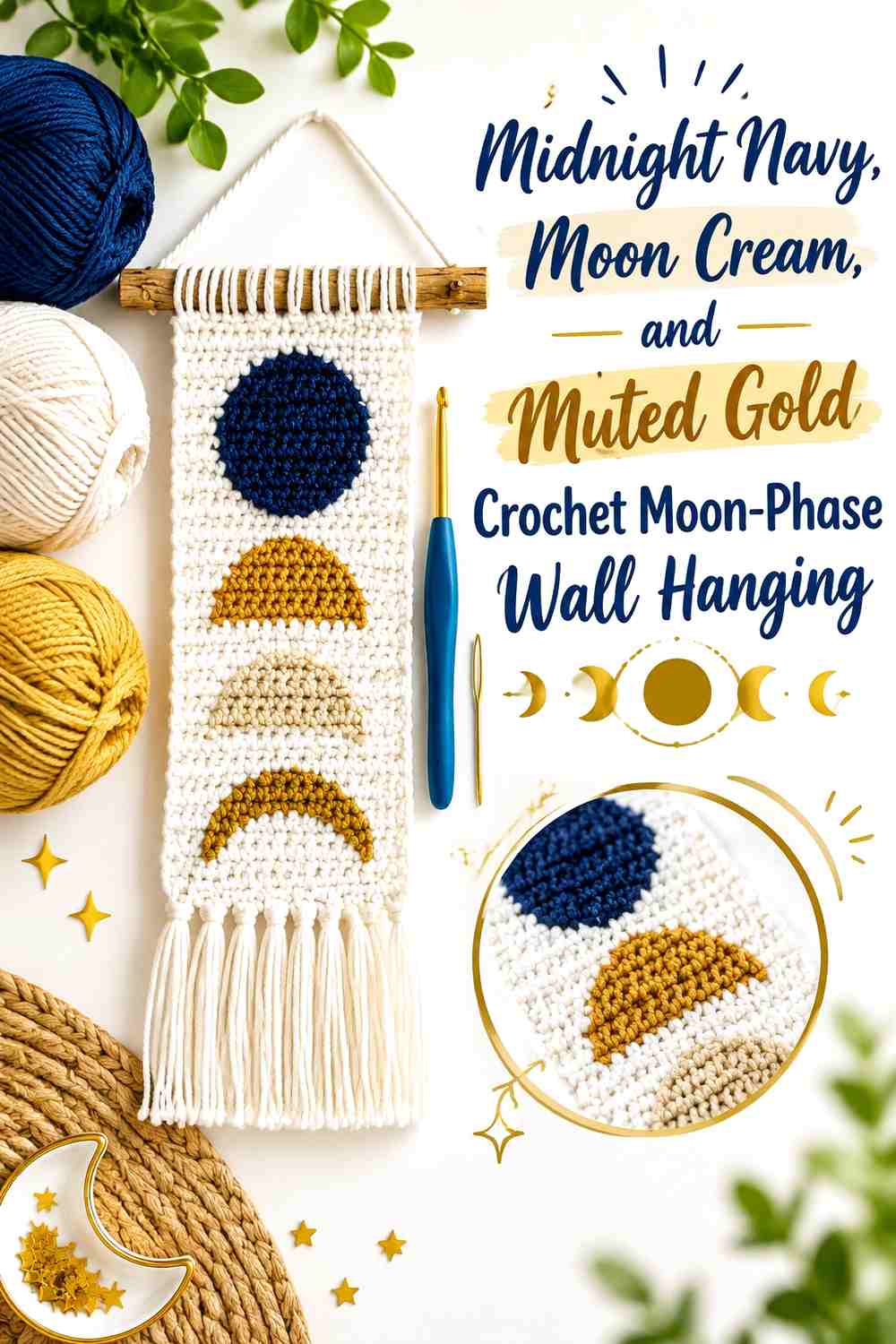
Midnight navy creates a strong night-sky field for a moon-phase panel, while moon cream keeps the lunar shapes clear from across the bedroom. Muted gold works best as a much smaller accent—perhaps in the fringe, a narrow border, or another repeated detail—rather than sharing equal space with the moons.
This palette suits a focal wall above a desk, dresser, or side of the bed where the whole lunar progression can remain visible.
Let Midnight Navy Surround the Moon Cream Crochet Phases
The moon sequence needs enough uninterrupted dark background between shapes. Keeping navy consistent allows each cream phase to read individually instead of turning the wall hanging into alternating color blocks.
If the bedroom wall is already navy, give the outer border or fringe more cream so the panel itself does not disappear.
Keep Muted Gold Smaller Than Moon Cream on the Crochet Wall Hanging
Muted gold can warm the navy-and-cream combination without competing with the lunar progression. Use it where a small repeated accent makes sense rather than inserting gold into every phase.
If the panel starts feeling busy, remove gold from the moon shapes first and let cream remain the only lunar color.
Creator Credit: Love & Stitch
2. Charcoal, Silver Gray, and Dusty Lavender Crochet Moon-Phase Garland
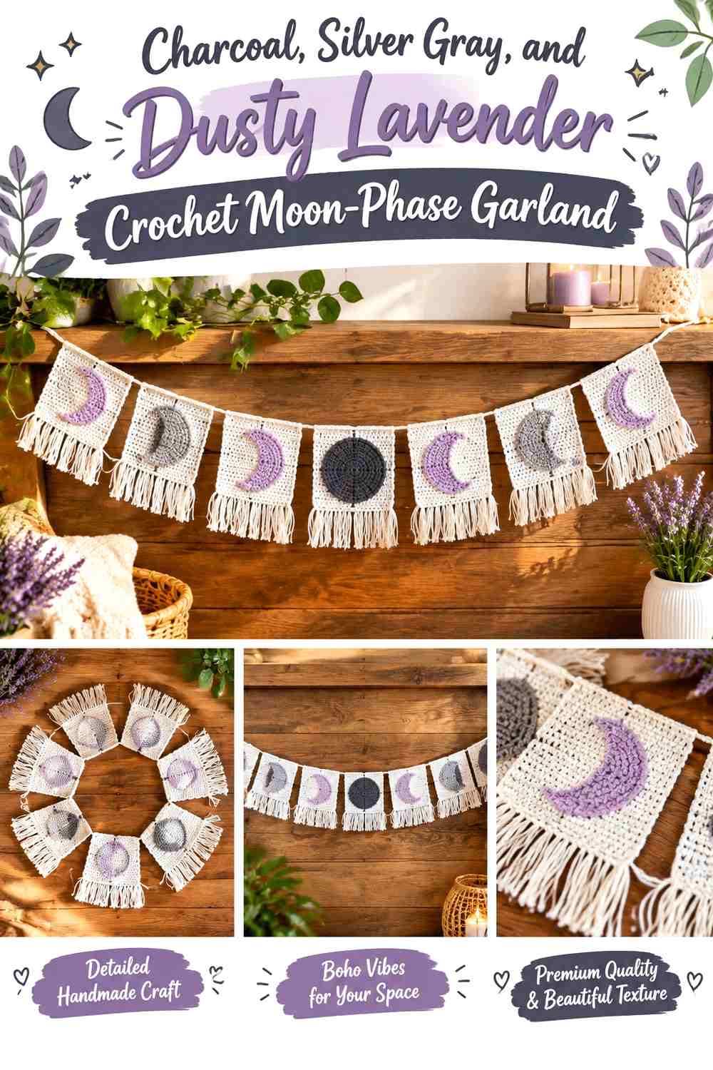
Charcoal provides the darkest background, silver gray can define most of the moons, and dusty lavender introduces a softer supporting color. Because a moon-phase garland already contains repeated panels, the palette benefits from controlled repetition rather than giving every phase a completely different shade.
Use silver gray consistently enough for the lunar sequence to remain connected.
Use Silver Gray to Keep Charcoal Crochet Moon Phases Readable
Silver gray gives the moon shapes enough value contrast against charcoal without creating the brightness of pure white. This is useful above a bed where a softer nighttime palette may fit better than a sharp black-and-white scheme.
View the finished color pairing in both daylight and evening bedroom lighting before making all the panels.
Repeat Dusty Lavender Sparingly Across the Charcoal Crochet Garland
Dusty lavender can appear in selected fringe sections or a limited number of phase details. Repeating it at intervals connects the garland without changing the identity of every moon.
If lavender and gray are very close in value, treat their difference as subtle and rely on charcoal for the main contrast.
Creator Credit: Happy Heartsy
3. Deep Teal, Warm White, and Brass Crochet Moon-and-Star Wall Hanging

A moon-and-star hanging already contains two distinct silhouettes, so it does not need complicated color blocking. Deep teal can lead the crescent, warm white can define the star, and a muted brass-like yarn color can appear in tassels or another restrained detail.
The color difference makes it easier to distinguish the curved moon from the pointed star at bedroom viewing distance.
Let Deep Teal Make the Crochet Crescent the Main Shape
Giving teal to the larger crescent establishes a clear focal form. Warm white then becomes a smaller light interruption instead of competing for the same visual area.
On a deep teal wall, reverse the emphasis and make the crescent lighter.
Use Warm White to Separate the Crochet Star From Deep Teal
Warm white is useful for the star because its pointed outline benefits from clear separation. A dark star placed directly beside a dark moon can make the two shapes merge.
Keep brass secondary so the eye still reads moon first, star second, accent third.
Creator Credit: Habijabi Ideas
4. Mustard Gold and Cream Crochet Crescent Moon Pillow

A crescent pillow can carry stronger color than a wall appliqué because the entire curved silhouette is visible on bedding. Mustard gold gives the moon warmth, while cream can appear in a small edging, embroidered detail, or nearby companion textile.
The main decision is how strongly the moon should separate from the duvet or chair behind it.
Let Mustard Gold Define the Crochet Crescent Moon Silhouette
Keeping the crescent largely one color allows its shape to do the decorative work. Avoid breaking the curved body into many small bands unless a striped moon is specifically the goal.
On tan or mustard bedding, shift toward a deeper ochre or lighter cream moon so the outer curve stays visible.
Use Cream Around Mustard Gold Crochet Moon Details
Cream works well where you need a small amount of separation without dividing the whole crescent. It can keep facial or decorative details visible if you choose to add them independently.
Against cream bedding, let mustard reach the entire outer edge.
Creator Credit: Beautiful Dawn Designs
5. Indigo and Oatmeal Crochet Five-Point Star Pillow

Indigo turns a shaped star pillow into a deeper bedroom accent, while oatmeal provides a soft neutral counterpart. Because five points already create plenty of visual movement, the star does not need frequent color changes.
Use indigo for the main shape and oatmeal only where additional definition helps.
Keep Indigo Continuous Across the Crochet Star Points
A continuous indigo surface makes all five points easier to read as one object. Splitting every point into a different color can weaken that clean star silhouette.
On navy or dark blue bedding, bring oatmeal toward the outer edge or reverse the palette.
Use Oatmeal to Soften the Indigo Crochet Star Center
An oatmeal center or restrained seam-area accent can break up the dark field without turning the cushion into a high-contrast graphic piece.
Choose an oatmeal shade noticeably lighter than indigo so the distinction remains visible under softer bedside lighting.
Creator Credit: Sweet Creek Patterns
6. Plum, Moonstone Gray, and Cream Crochet Framed Moonlight Square
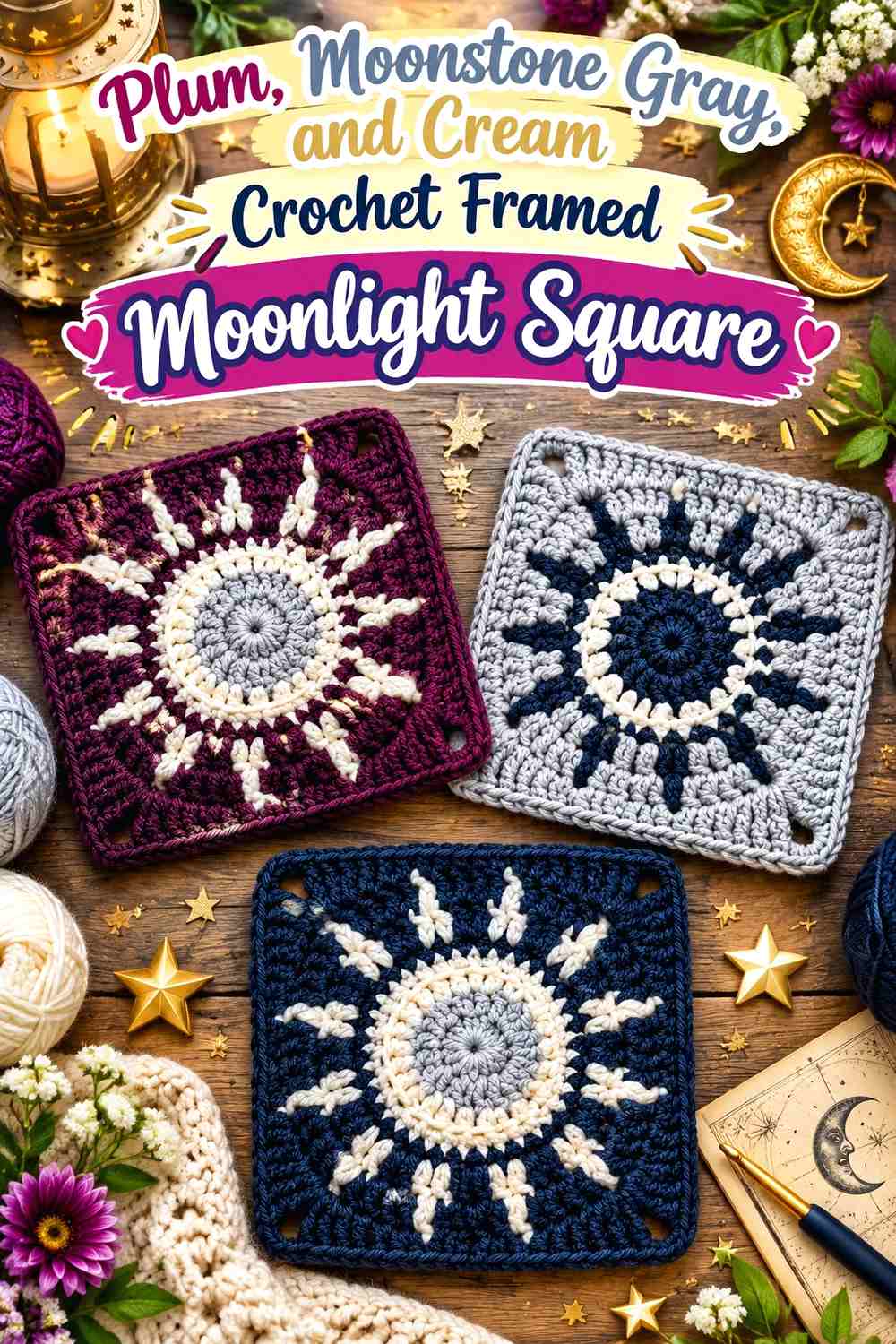
A celestial granny square can become bedroom decor when it is treated as a textile motif rather than automatically expanded into a blanket. Plum can form the surrounding field, moonstone gray can define the crescent or radiating details, and cream can create the lightest accent.
Framing a finished square is an adaptation beyond the motif tutorial, so plan the display only after you know the actual finished dimensions.
Let Plum Create Negative Space Around the Moonstone Gray Crochet Moon
A darker plum field helps a lighter moon motif separate from the square. Avoid adding too many cream details around the crescent or its outline may become harder to follow.
If the bedroom wall is deep purple, use cream or gray at the square’s outer edge.
Keep Cream Secondary to Moonstone Gray in the Crochet Celestial Square
Moonstone gray should remain the main celestial color, with cream reserved for smaller radiating or border details. That prevents the square from developing two competing light motifs.
A warmer off-white can replace cream if the room contains more beige than cool gray.
Creator Credit: Creggy’s Crochet
7. Black, Ivory, and Camel Crochet Framed Crescent Moon Square
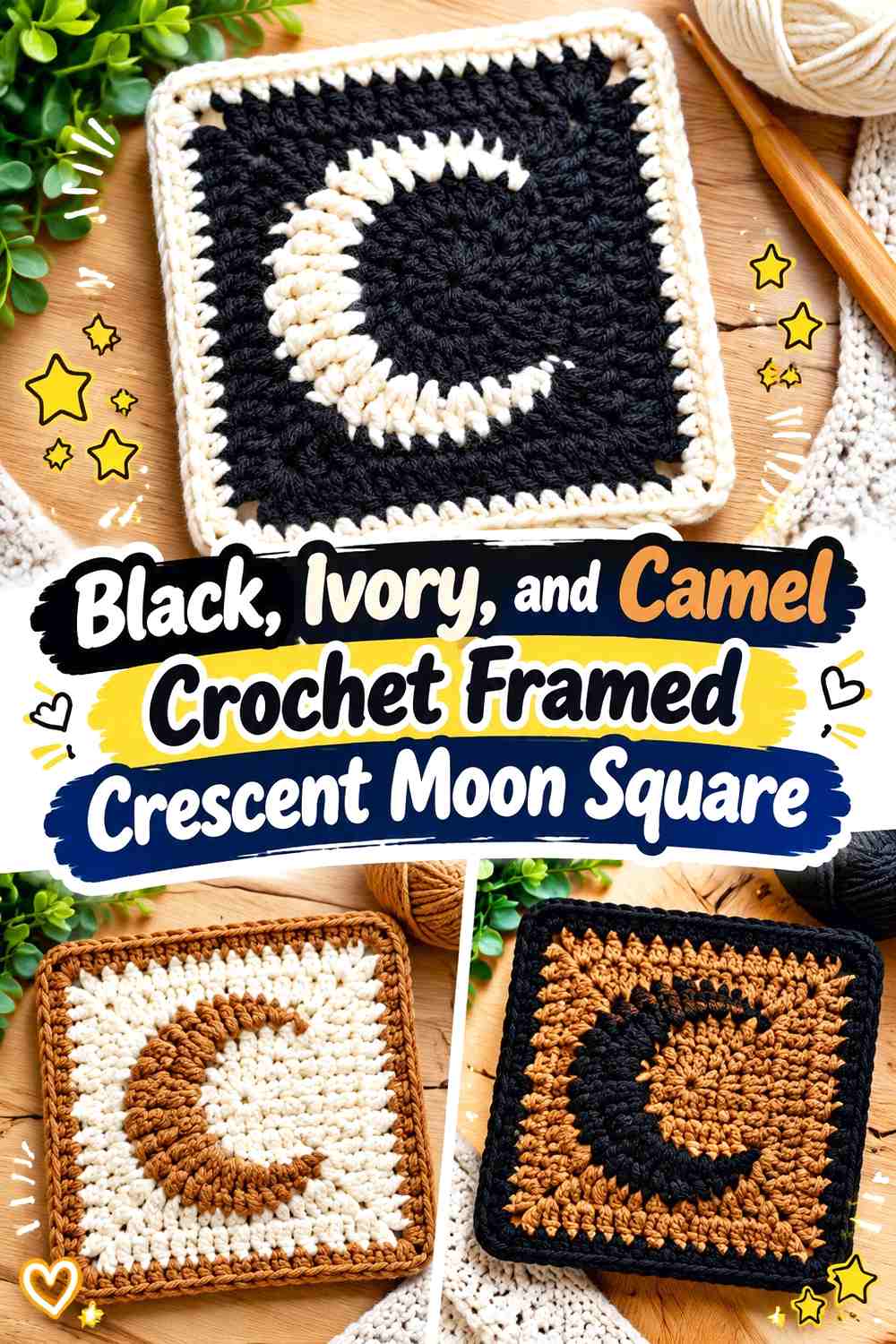
Black gives this crescent-square idea its strongest graphic background, ivory makes the moon highly visible, and camel provides a warmer frame or secondary field.
The combination works well for a bedroom that mixes black metal, natural wood, beige textiles, and other modern neutrals.
Let Ivory Make the Black Crochet Crescent Immediately Visible
Use ivory on the primary lunar shape rather than scattering it equally across the square. The strong light-dark contrast makes the moon readable even when the framed piece is small.
If black feels too severe, charcoal can preserve most of the same relationship.
Use Camel to Warm the Black and Ivory Crochet Square
Camel can occupy an outer round or supporting field, preventing the piece from feeling entirely monochrome. Keep it outside the most detailed moon area so the crescent remains the first shape the eye finds.
The frame color should be considered separately; a black frame against a black outer round may visually compress the piece.
Creator Credit: The Caffeinated Snail
8. Dusty Blue, Pearl Gray, and Cream Crochet Star Garland
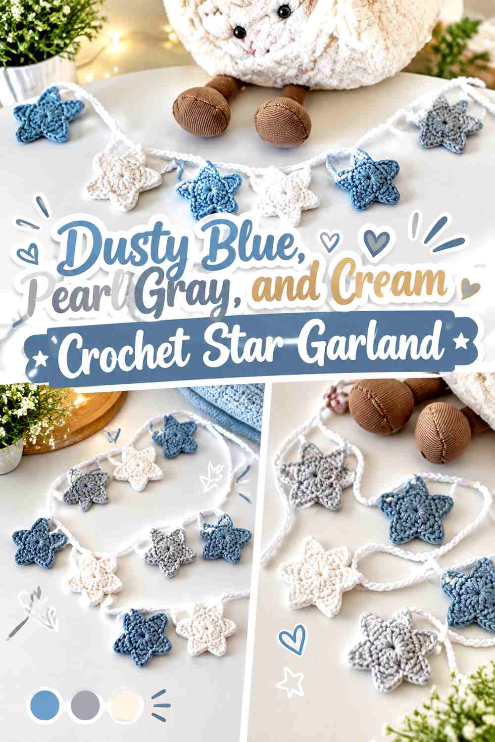
Dusty blue gives a row of stars a softer sky color than navy, while pearl gray and cream allow gentle variation without turning the strand into a rainbow.
A garland is particularly useful above a headboard or shelf because the empty spaces between stars prevent the celestial theme from becoming a solid block.
Make Dusty Blue the Repeating Crochet Star Color
Repeat dusty blue often enough to create a clear rhythm across the strand. Cream or pearl gray stars can interrupt it at controlled intervals.
If every star receives a different color, the bedroom decor may look more festive than celestial.
Use Cream to Separate Dusty Blue and Pearl Gray Crochet Stars
Cream can act as the lightest pause between two muted cool shades. This is useful when dusty blue and pearl gray appear too similar from across the room.
Against white walls, allow more blue toward the ends of the garland so the full strand remains visible.
Creator Credit: cosy kates 🪴
9. Navy, Antique Gold, and Ecru Crochet Star-Shaped Bed Throw
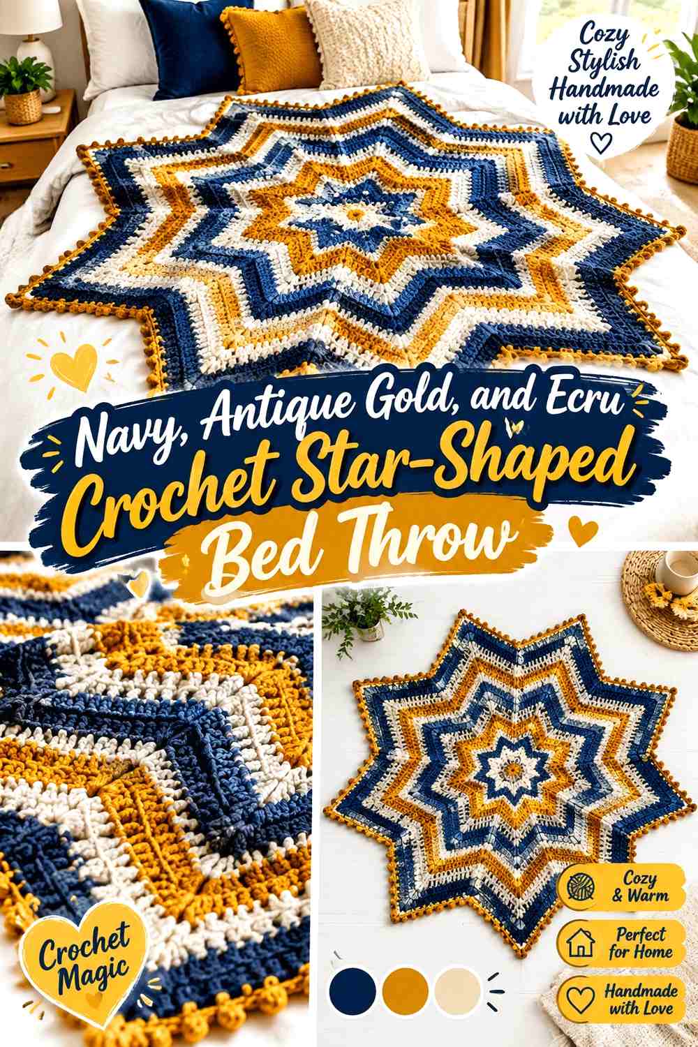
A star-shaped blanket can become the largest celestial element in the bedroom, so its palette should coordinate with smaller decor rather than competing with all of it. Navy can dominate, antique gold can highlight selected radiating sections, and ecru can create breathing room.
Because the blanket may often be folded or draped, consider which colors will remain visible when the full star shape is not spread flat.
Let Navy Anchor the Crochet Star-Shaped Bed Throw
Navy provides enough visual weight for a large textile and connects naturally with many celestial palettes. Use it across substantial sections so the blanket does not become a sequence of equally strong stripes.
A pale bedspread underneath will make the pointed outer shape easier to recognize.
Keep Antique Gold Smaller Than Ecru on the Navy Crochet Star
Antique gold can emphasize selected radiating sections without turning the blanket predominantly yellow. Ecru provides a quieter light contrast and is easier to repeat over a larger area.
If other bedroom decor already contains several gold accents, reduce the gold share in the blanket rather than repeating it everywhere.
Creator Credit: Sirin’s Crochet
10. Terracotta and Sand Crochet Hanging Star Set

Small crochet stars can move from holiday ornament territory into year-round bedroom decor when the palette changes and they are displayed on wall hooks, a peg rail, or a simple hanging strand.
Terracotta gives the stars warmth, while sand creates quieter companions.
Repeat Terracotta Across the Crochet Hanging Stars
Use terracotta on more than one star so it appears intentional rather than as a single isolated warm accent. Sand can fill the spaces between them visually.
Against terracotta walls, reverse the balance and let sand become more common.
Keep Sand Crochet Stars Lighter Than Terracotta
The two colors should remain distinguishable from normal bedroom viewing distance. If sand becomes too similar to a beige wall, position terracotta stars toward the outer ends of the display to preserve its overall shape.
A simple two-color arrangement usually gives small stars enough variety without making the strand busy.
Creator Credit: naztazia
11. Sage and Warm White Crochet Crescent Moon Wall Accents
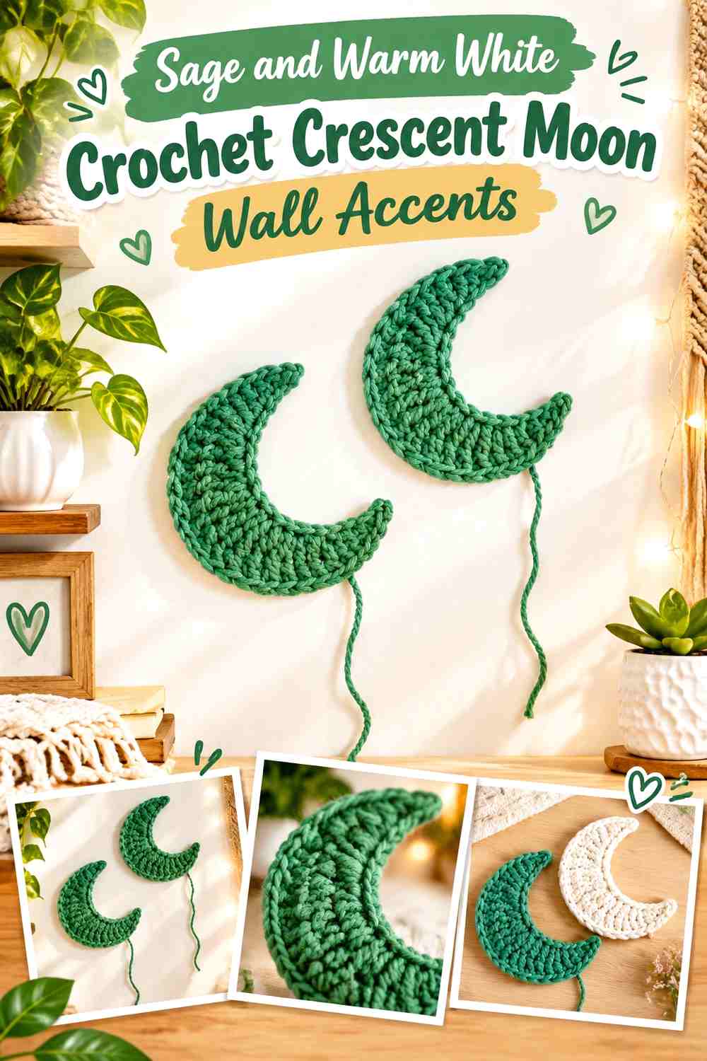
Small crescent motifs can become a flexible wall grouping when they are arranged independently after the crochet is complete. Sage creates a muted botanical-celestial crossover, while warm white keeps selected moons visible.
The tutorial supplies the moon motifs; arranging them as bedroom wall decor is a separate adaptation.
Let Sage Dominate the Crochet Crescent Moon Grouping
Use sage for most of the crescents and warm white for fewer pieces. This creates a clear primary color while still producing enough variation to keep several moons from looking identical.
Place the lighter crescents where the wall is darkest or visually busiest.
Use Warm White to Break Up Repeated Sage Crochet Moons
A few warm-white crescents can interrupt a long sage sequence and make the arrangement feel less mechanical.
If your wall is cream or white, substitute the light accent with oatmeal or a deeper natural beige so those moons do not disappear.
Creator Credit: Crochet With Samra
12. Cocoa and Oatmeal Crochet Crescent Bedside Mat
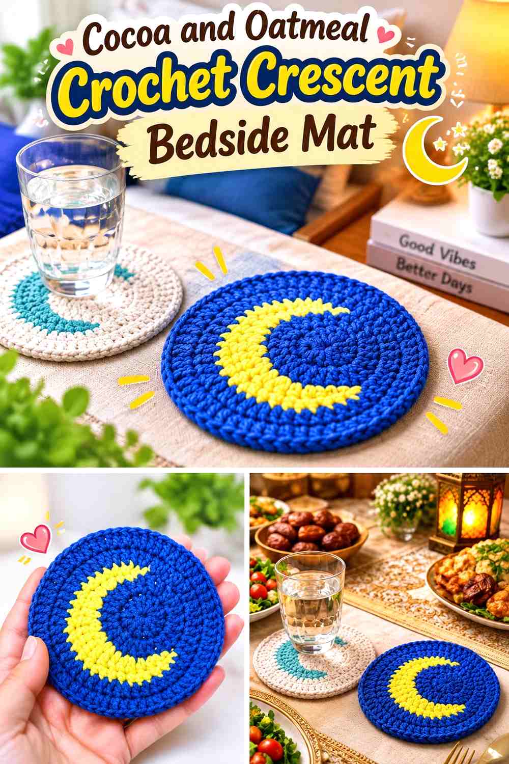
A crescent-shaped crochet coaster can become a small bedside-table accent beneath a narrow cup, candle holder, or decorative object, provided you check the actual fit first. Cocoa creates the deeper lunar shape, while oatmeal can be used as a smaller edge or companion color.
This is a useful celestial detail when the bedroom already contains larger moon and star pieces.
Let Cocoa Give the Crochet Crescent a Clear Bedside Silhouette
A dark cocoa moon can stand out well on pale wood, stone, or painted nightstands. The empty inner curve becomes part of the visual design because the table surface shows through.
On a dark wood table, switch to oatmeal as the main crescent color.
Use Oatmeal to Lighten the Cocoa Crochet Bedside Accent
A narrow oatmeal detail can connect the crescent with cream bedding or other pale room textiles without reducing the moon’s darker identity.
Avoid adding several extra colors to such a small object; the unusual crescent outline already provides enough interest.
Creator Credit: crochet with marmara
13. Burgundy, Blush, and Cream Crochet Shooting-Star Hanging
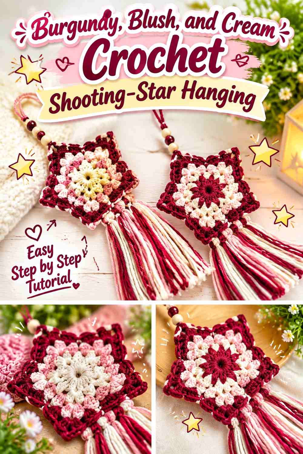
A shooting star introduces direction and movement into a celestial bedroom collection. Burgundy can lead the star body, blush can soften the transition into the trailing section, and cream can provide the lightest accent.
This palette offers a warmer alternative to the usual navy-and-gold night sky.
Keep Burgundy on the Main Crochet Shooting Star
Use burgundy for the five-point star or another principal upper section so the eye understands the shape before following the tail downward.
Against burgundy bedding or wall paint, reverse the star to cream and keep burgundy in the trailing accents.
Repeat Blush and Cream Through the Burgundy Crochet Star Tail
Blush can bridge the deep star and pale cream rather than letting the tail jump directly from dark to light. Keep the sequence controlled so the trailing element looks connected to the star.
Allow enough empty wall beneath the piece for the tail to remain visible.
Creator Credit: Sara Sach Crochet Designs
14. Soft Lilac, Buttercream, and White Crochet Moon-and-Star Pillow Set

A moon paired with stars gives the bed a coordinated celestial group without requiring matching shapes. Soft lilac can define the moon, buttercream can lead the larger star, and white can appear on the smallest supporting piece.
Keep the colors softened so the different novelty shapes do not all demand equal attention.
Let Soft Lilac Make the Crochet Moon the Largest Color Statement
Use lilac continuously on the crescent so its curve remains clean. Because the moon is already a distinctive silhouette, it does not need additional stripes.
Place it against cream, beige, or deeper purple bedding where the outline remains visible.
Use Buttercream and White to Separate the Soft Lilac Crochet Stars
Buttercream provides a warmer star color than pure yellow, while white works as the smallest light accent. If the bedspread is white, give the outermost star more buttercream so its points remain visible.
Keeping each shaped pillow largely one color also makes the set calmer.
Creator Credit: My Rainbow Crochet
15. Forest Green and Cream Crochet Star Pillow

Forest green brings the celestial theme into an earthy bedroom without depending on conventional blue. Cream can provide a center accent or a nearby coordinating textile.
Because the star shape has five prominent points, the darker color should remain visible around the entire perimeter.
Let Forest Green Fill the Crochet Star Points
Keep the star predominantly forest green so every point belongs to the same silhouette. Frequent cream striping can make the points feel visually shorter.
On deep green bedding, use a cream outer edge or reverse the full star color.
Use Cream to Open the Forest Green Crochet Star Center
A small cream center can lighten the darker pillow while leaving the star tips uninterrupted. That gives the eye a focal point without weakening the outline.
A warmer oatmeal can replace cream if the bedroom palette is dominated by tan and wood.
Creator Credit: chantelle
16. Rust and Camel Crochet Star Cushion

Rust creates a warm celestial accent that works especially well with beige, olive, walnut, or cream bedroom palettes. Camel softens the center or edge without creating extreme contrast.
The palette makes the star feel more earthy and retro than explicitly nighttime.
Use Rust Across the Main Crochet Star Cushion
A broad rust surface lets the five-point silhouette remain the main design feature. Keep camel in a smaller role so the cushion does not split into two equal color zones.
Against terracotta or rust bedding, move camel toward the outer points for better separation.
Let Camel Lighten the Rust Crochet Star Without Breaking Its Shape
Camel can occupy the center or another compact area while leaving rust continuous around the star’s perimeter. This protects the recognizable pointed outline.
Choose a camel that is clearly lighter than rust if you want the two colors to remain visible under warm lamps.
Creator Credit: Tejereta DIY
17. Mauve, Cream, and Deep Plum Crochet Star Garland

Mauve creates a softer repeated star color, cream keeps the strand light, and deep plum adds occasional depth. This works well for a bedroom where navy or black would feel too strong.
Let mauve establish the rhythm rather than alternating all three colors equally.
Repeat Mauve More Often Than Deep Plum in the Crochet Star Garland
Mauve should appear frequently enough that the garland reads as one coordinated bedroom accessory. Deep plum can be inserted at wider intervals where a darker visual stop is helpful.
Against mauve walls, increase the number of cream stars.
Use Cream Between Mauve and Deep Plum Crochet Stars
Cream prevents several purple tones from forming one dark horizontal band above the bed. It also gives individual star points more separation.
If the wall is white, choose a slightly warmer cream or oatmeal so the light stars remain visible.
Creator Credit: Bella Coco
18. Pearl Gray and Warm White Crochet Crescent Moon Pillow

Pearl gray creates one of the quietest moon-pillow directions in this collection. Warm white can remain a small supporting detail or appear in nearby bedding rather than dividing the crescent itself.
This palette allows the plush shape and crochet texture to carry more of the decoration.
Let Pearl Gray Cover the Crochet Crescent Moon Body
A nearly single-color crescent keeps the curved silhouette uninterrupted and works particularly well among patterned bedding where another multicolor pillow would add too much activity.
Against gray sheets or upholstery, shift to a noticeably lighter or darker pearl gray.
Use Warm White to Separate the Pearl Gray Crochet Moon From the Bed
Warm-white surrounding pillows or a small moon detail can create the contrast the shape needs without adding another saturated hue.
If both gray and white are pale, check the crescent under evening lighting; shadows may become more important than color for defining the inner curve.
Creator Credit: Jayda InStitches
19. Faded Blue, Cream, and Mustard Crochet Moon-and-Star Curtain

A hanging curtain of moons and stars can create a larger celestial field without adding another solid wall textile. Faded blue can repeat through the main motifs, cream can lighten selected stars, and mustard can provide a smaller warm moon or star accent.
Because the pieces hang separately, color repetition is important for keeping multiple strands visually connected.
Repeat Faded Blue Through the Crochet Moon-and-Star Curtain
Use faded blue on several moons and stars rather than assigning it to only one strand. Repetition guides the eye across the whole hanging and stops individual columns from feeling unrelated.
Against blue walls or curtains behind the piece, increase cream around the outer strands.
Keep Mustard Smaller Than Cream in the Faded Blue Crochet Curtain
Mustard is visually warmer and often attracts attention quickly, so a few repeated motifs can be enough. Cream provides a quieter contrast and can appear more frequently.
Lay the finished motifs out before assembly so mustard does not accidentally cluster on one side of the hanging.
Creator Credit: Crochet Anne
Which Crochet Celestial Bedroom Palette Should You Choose?
For a dark night-sky bedroom, midnight navy and moon cream, charcoal and silver gray, deep teal and warm white, or black and ivory creates the clearest moon-and-star contrast.
For a softer bedroom, dusty blue and pearl gray, soft lilac and buttercream, mauve and cream, or pearl gray and warm white keeps the celestial theme visible without making every piece highly graphic.
Warm bedrooms can move away from blue entirely. Mustard and cream, terracotta and sand, rust and camel, or burgundy and blush can still read as celestial because the moon and star silhouettes provide the theme.
If you plan to make several projects, choose one large anchor first. A star-shaped throw, moon-phase wall hanging, or large crescent pillow can establish the room’s main color direction. Smaller stars, framed squares, and hanging motifs can then repeat only one or two of those colors rather than introducing a new palette each time.
Conclusion
Crochet celestial bedroom decor works best when moons and stars are treated as different shapes with different jobs instead of repeating the same motif everywhere. A large crescent pillow can add curves to the bed, a star garland can create a lighter horizontal line, and moon phases can introduce a more structured wall pattern.
Color should make those shapes easier to read. Use dark-light contrast where small moons or star points need definition, softer tonal combinations on large pieces where shape is already obvious, and warm accents in limited amounts when you want to break up a cool night-sky palette.
The credited tutorials provide the construction starting points. From there, use the wall, bedding, furniture, and neighboring crochet pieces to decide which color should dominate and where supporting shades will actually improve the finished bedroom.
Frequently Asked Questions
What colors work best for crochet moon and star bedroom decor?
Navy, charcoal, cream, gray, dusty blue, plum, muted gold, teal, and warm white all work well, but there is no required celestial palette. Earthier rust, sage, camel, terracotta, and forest green can also work because the moon and star shapes—not blue yarn alone—create the celestial theme.
Should crochet moons be lighter than the bedroom background?
Not necessarily. A cream moon on a dark wall creates strong separation, but a deep navy or plum moon can work well against pale paint. What matters most is enough value difference for the crescent or full-moon outline to remain recognizable.
How can I combine crochet moon and star decor without making a bedroom busy?
Use different scales. Choose one large anchor, such as a blanket or pillow, one medium wall piece, and smaller accents such as a garland or framed motif. Leaving plain wall and bedding areas between them gives each crochet shape more room to register.
Should all crochet celestial decor use the same colors?
No. Repeating one or two anchor colors is usually enough. For example, navy might dominate a blanket, reappear in a wall hanging background, and show up only once or twice in a star garland while the supporting colors change.
How can I make crochet stars stand out on a bed?
Compare the star points with the bedding beneath them. If both are similar in value, the shaped perimeter may disappear. Moving to a lighter or darker star color—or placing the pillow against contrasting bedding—can restore the outline.
Can crochet granny squares be used as celestial bedroom wall decor?
Yes as an independent adaptation. A moon or celestial granny-square tutorial teaches the motif itself; framing it or combining several squares into a wall display requires separate planning. Finish one square first so its actual scale and color contrast can guide the display.
How do I replace a celestial palette color without changing the whole design?
Preserve the color’s role. Replace a deep night-sky shade with another dark value, a moonlight neutral with another clearly lighter shade, or a warm accent with another restrained medium-value color. Maintaining dominant, supporting, and accent relationships is more important than matching an exact shade name.