A crochet bolster is especially well suited to circus-inspired stripes because the long cylindrical surface gives color plenty of room to repeat. Long stripes can suggest a striped tent canopy, while bands wrapped around the cylinder create a more graphic, stacked effect. The circular ends add another useful color decision: they can calm a busy body, repeat an accent, or create their own concentric retro detail.

The strongest palettes do more than combine three nostalgic colors. They establish a hierarchy. One shade should usually carry most of the visual weight, another can separate or soften the stronger colors, and a smaller accent can provide definition. That matters on a bolster because the pattern is visible from several angles at once.
The palettes below are editorial adaptations. Some linked tutorials teach a bolster, neck roll, tube, or cylindrical cushion directly, while a few teach related cushion shapes that are useful only as construction, texture, or color-placement references. The proposed retro colors are not attributed to the tutorial creators.
Quick List
- Tomato Red, Buttercream, and Navy Circus Stripe Crochet Bolster Cushion
- Mustard, Rust, and Cream Retro Ring-Stripe Crochet Bolster Cushion
- Teal, Burnt Orange, and Oatmeal Carnival Stripe Crochet Bolster Cushion
- Avocado Green, Mustard, and Chocolate Brown Scrap-Stripe Crochet Bolster Cushion
- Turquoise, Coral, and Cream Mosaic Stripe Crochet Bolster Cushion
- Cherry Red, Blush Pink, and Ivory Candy Stripe Crochet Bolster Cushion
- Plum, Ochre, and Dusty Pink Wave-Stripe Crochet Bolster Cushion
- Cobalt Blue, Tomato Red, and Warm White Awning-Stripe Crochet Bolster Cushion
- Tangerine, Camel, and Espresso Pencil-Stripe Crochet Bolster Cushion
- Olive, Brick Red, and Beige Heritage Stripe Crochet Bolster Cushion
- Powder Blue, Mustard, and Rust Soft Retro Crochet Bolster Cushion
- Burgundy, Peach, and Cream Vintage Roll Crochet Bolster Cushion
- Golden Yellow, Scarlet, and Cream Sunburst-End Crochet Bolster Cushion
- Dusty Aqua, Terracotta, and Ivory Concentric-End Crochet Bolster Cushion
- Pistachio, Tomato Red, and Butter Yellow Granny-Stripe Crochet Bolster Cushion
- Maroon, Mustard, and Teal Harlequin-Stripe Crochet Bolster Cushion
- Black, Cream, and Tangerine Interlocking Circus Stripe Crochet Bolster Cushion
Plan the Stripe Direction Before Choosing Your Retro Colors
On a cylindrical cushion, stripe direction changes how the whole palette reads. Stripes running along the length emphasize the bolster’s long shape and give the strongest circus-awning effect. Bands that circle the body divide the cylinder into shorter visual sections and can make a three-color palette feel more rhythmic.
Decide on that direction before assigning the dominant color. A color that looks balanced as a narrow lengthwise stripe may become overpowering when it forms a wide ring around the entire cushion. Also check how the chosen tutorial constructs and joins its body so your planned stripe direction works with the construction rather than fighting it.
Give Retro Circus Colors a Clear Visual Hierarchy
Using three saturated retro colors in equal amounts can make a small bolster feel crowded. A more controlled approach is to let one color lead, use a quieter second color to create breathing room, and reserve the strongest contrast for selected stripes, seams, or end details.
This does not require identical stripe widths. In fact, alternating broader dominant bands with thinner accents can make the palette easier to read. Before committing, place the yarns together and check their light/dark values. Two very different hues can still merge if they are similarly light or dark.
Use the Crochet Bolster Ends to Finish the Color Scheme
Circular end caps are part of the design, not just a place to finish construction. On a busy striped body, a solid end in the dominant or darkest color can contain the pattern visually. With simpler body stripes, the ends can repeat two or three colors as concentric sections.
Try to bring at least one body color onto the ends. Introducing a completely unrelated end-cap shade can make the circular sections feel detached from the rest of the bolster.
1. Tomato Red, Buttercream, and Navy Circus Stripe Crochet Bolster Cushion

Tomato red gives this bolster an unmistakably lively retro direction, while buttercream prevents the cylindrical surface from becoming one uninterrupted block of strong color. Use tomato red for the broadest body stripes, buttercream for regular separating bands, and navy only where extra definition is useful. The navy can be especially effective near the ends because its darker value creates a clear stopping point before the circular caps.
Let Tomato Red Lead the Crochet Bolster Stripes
Give tomato red more visual area than navy so the cushion stays warm and energetic rather than becoming dark and heavy. Broad red stripes separated by slimmer buttercream sections also make it easier to recognize the stripe rhythm as the cushion turns.
If the crochet texture is pronounced, avoid breaking every small section into a new color. Longer tomato red sections give the stitch surface enough uninterrupted space to remain visible.
Use Buttercream and Navy to Separate Tomato Red at the Bolster Ends
Buttercream is useful between tomato red and navy because it creates a lighter transition instead of forcing the two strong colors directly against each other everywhere. Near each circular end, a navy border followed by a buttercream center can connect the caps to the body without reproducing every body stripe.
Creator Credit: The Crochet Crowd
2. Mustard, Rust, and Cream Retro Ring-Stripe Crochet Bolster Cushion

Mustard and rust sit close enough in warmth to create a cohesive retro surface, so cream has an important job here: it keeps their bands distinguishable. Use mustard as the main field, rust as a recurring secondary stripe, and cream as a narrow separator or end-cap color. Ring-like stripes around the cylinder suit this palette because the repeated warm bands can look intentional without requiring a large number of different shades.
Keep Mustard Wider Than Rust on the Crochet Bolster
When mustard and rust receive identical stripe widths, neither color clearly leads. Giving mustard the broader bands and rust shorter interruptions creates a more readable hierarchy around the cylinder.
This is particularly useful when the two yarns have similar light/dark values. The difference in stripe width provides separation even when the colors themselves do not create strong value contrast.
Let Cream Break Up Mustard and Rust Ring Stripes
Place cream where mustard and rust start to visually merge, rather than scattering it randomly. A slim cream band between selected warm sections can define the stripe repeat while preserving the predominantly earthy look.
Cream can also cover most of the circular ends if you want the body to remain the busiest part of the cushion.
Creator Credit: Ophelia Talks Crochet
3. Teal, Burnt Orange, and Oatmeal Carnival Stripe Crochet Bolster Cushion

Teal and burnt orange make this scheme more strongly contrasted than the first two ideas, so oatmeal works as a visual buffer. Let teal establish the darker base, bring burnt orange through as the warm statement color, and use oatmeal strategically rather than dividing all three equally. On a bolster, alternating teal and oatmeal with occasional burnt-orange stripes prevents every turn of the cylinder from presenting two equally strong colors.
Use Teal as the Dark Anchor on the Crochet Bolster
Teal can cover broad body sections or define the area beside each end cap. Its darker visual weight gives the cylindrical form a stronger outline and makes smaller oatmeal sections easier to see.
If teal begins to dominate too heavily, increase oatmeal rather than adding more burnt orange. That lightens the overall cushion without creating additional color competition.
Repeat Burnt Orange in Controlled Carnival Stripes
Burnt orange works well as a repeated accent instead of an isolated stripe in the center. Using it more than once helps the color look integrated as the bolster is viewed from different sides.
Keep an oatmeal stripe beside at least some burnt-orange areas when stronger separation from teal is wanted.
Creator Credit: Love & Stitch
4. Avocado Green, Mustard, and Chocolate Brown Scrap-Stripe Crochet Bolster Cushion

Avocado green, mustard, and chocolate brown create a deeper 1970s-style direction without relying on bright primary colors. Avocado can handle most of the body, mustard brings lighter interruptions, and chocolate brown works best in smaller amounts because it carries the greatest visual weight. This is also a useful palette for irregular scrap-style stripes: the colors can vary in width while their roles remain consistent.
Make Avocado Green the Connecting Color Between Scrap Stripes
With irregular stripe widths, repeat avocado green frequently enough that it acts as the common thread across the bolster. This keeps mustard and chocolate brown from looking like unrelated leftover bands.
Avocado is also a useful choice beside seams or joins because repeating the dominant shade there avoids creating an accidental new focal line.
Keep Chocolate Brown Narrow Beside Mustard and Avocado Green
Chocolate brown can define a stripe edge effectively, but too much of it may make the cylindrical cushion look visually bottom-heavy when viewed from one side. Use it as a narrow divider, occasional wider band, or end-cap outline.
Mustard can then provide the lighter contrast needed to keep avocado green from blending into the brown.
Creator Credit: Sara Sach Crochet Designs
5. Turquoise, Coral, and Cream Mosaic Stripe Crochet Bolster Cushion
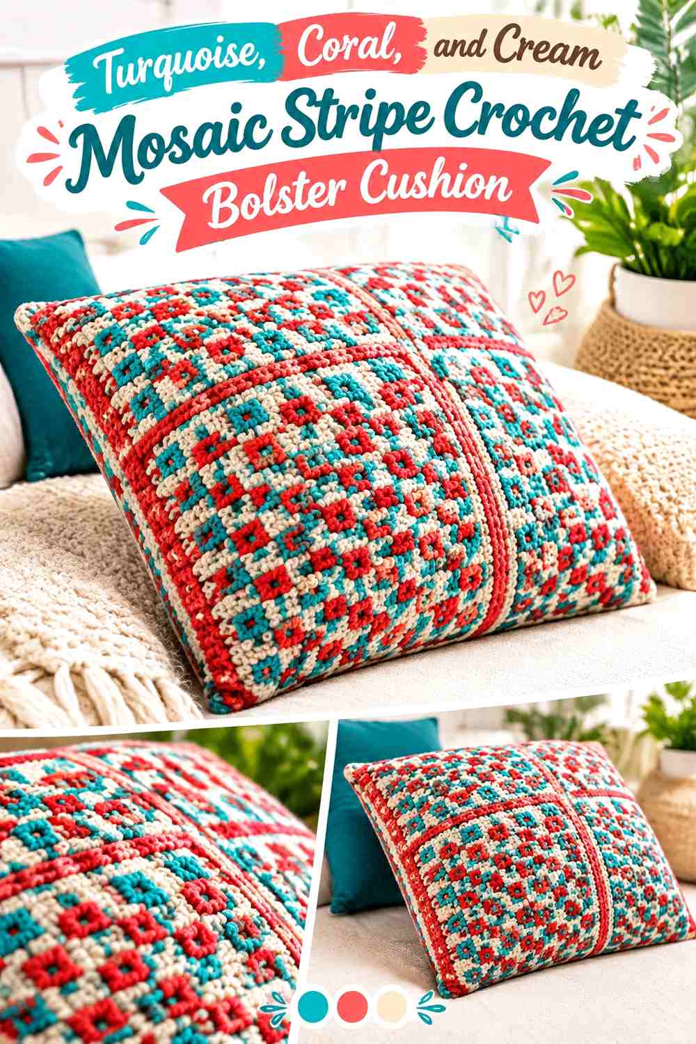
Turquoise and coral give this bolster a brighter retro character, while cream keeps a mosaic or textured surface from becoming visually crowded. Turquoise can serve as the main ground, coral can highlight selected stripe sections, and cream can frame transitions or circular ends. If the body includes strong stitch texture, avoid changing all three colors too rapidly; texture and frequent color changes can compete for attention.
Let Turquoise Carry the Largest Crochet Bolster Sections
Broader turquoise areas create continuity around the cylinder and give any textured crochet surface room to register. Coral is then easier to notice when it appears in shorter, more deliberate stripes.
If substituting turquoise, preserve its medium-to-dark contrast against the cream rather than choosing a very pale aqua that causes the two to merge.
Place Cream Beside Coral Where Mosaic Texture Needs Clarity
Coral against turquoise already creates a strong hue change, but cream introduces clearer light/dark separation. Use cream around narrower coral details, near highly textured areas, or at the body-to-end transition when those sections need sharper definition.
Creator Credit: MOSAIC LOOP
6. Cherry Red, Blush Pink, and Ivory Candy Stripe Crochet Bolster Cushion
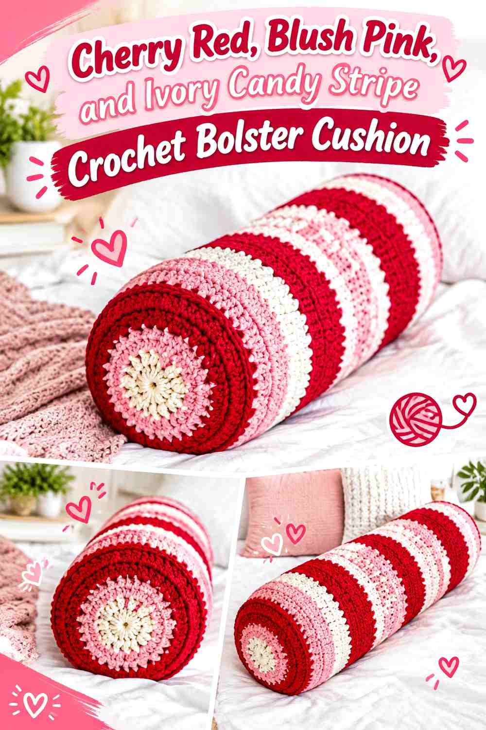
Cherry red can make a striped bolster feel very bold very quickly, so blush pink and ivory should soften rather than compete with it. A useful layout is broad blush or ivory sections interrupted by narrower cherry-red stripes. That reverses the common expectation of making the darkest color dominant and gives this cushion a lighter candy-shop direction.
Control Cherry Red With Wider Blush Pink Stripes
Keeping blush pink wider than cherry red prevents the strongest color from wrapping around too much of the cylinder at once. Cherry red can then define the rhythm without becoming the entire visual story.
For lengthwise stripes, alternate red beside blush more often than red beside ivory if you want a smoother transition between the strongest and lightest values.
Use Ivory to Keep Cherry Red Details Crisp
Ivory is most useful where the red needs clean separation: beside small stripes, around the circular ends, or as a narrow break before a seam. If ivory and blush pink are very close in value, avoid putting them in tiny alternating bands because their distinction may disappear from across the room.
Creator Credit: Ninja Bunny Crochet
7. Plum, Ochre, and Dusty Pink Wave-Stripe Crochet Bolster Cushion
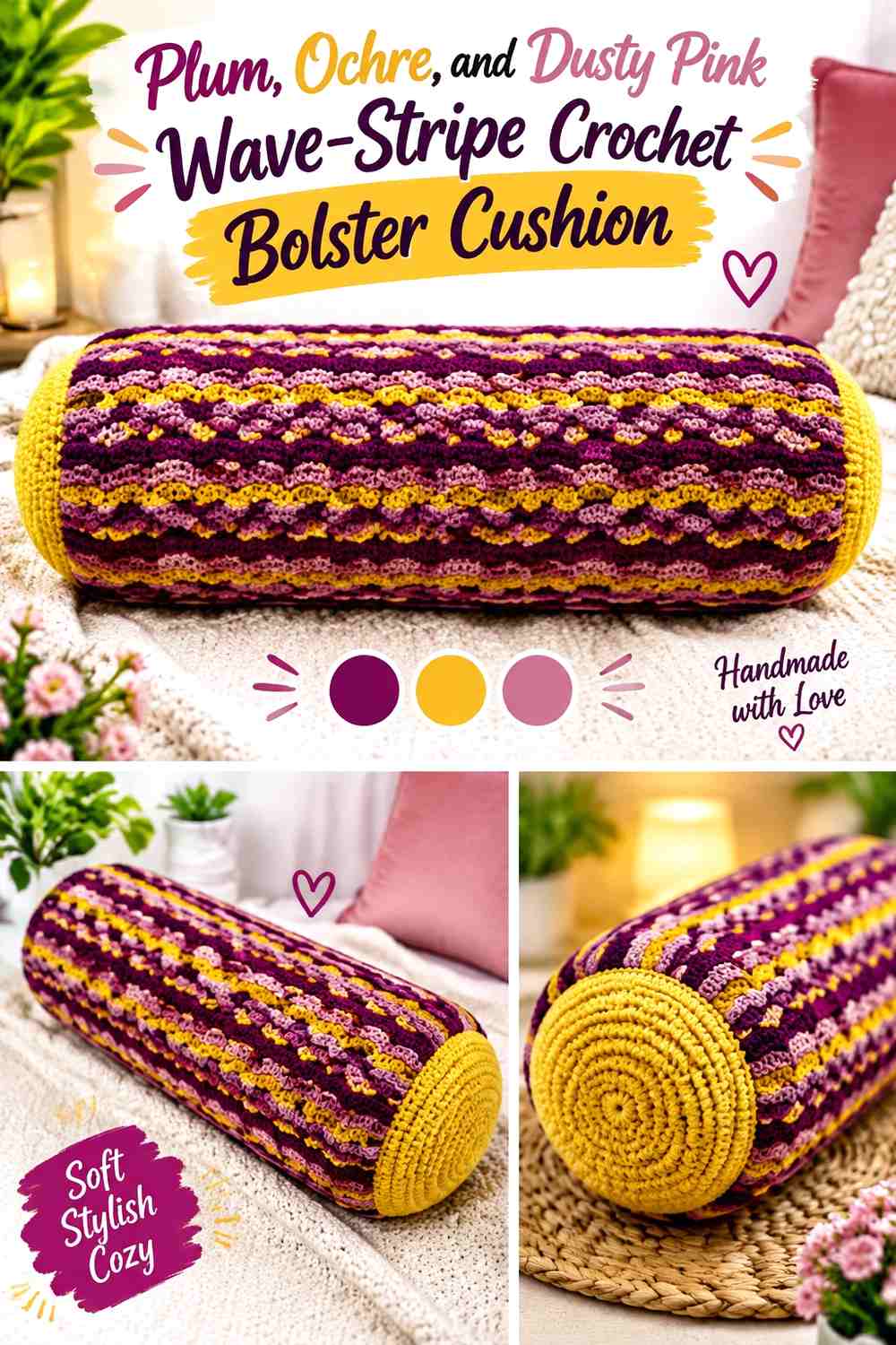
Plum supplies a dark foundation, ochre adds warm contrast, and dusty pink makes the jump between them less abrupt. This combination is particularly useful when the bolster has noticeable surface texture or a wave-like stitch effect: rather than changing colors at every textural shift, let several repeats remain in one color so the stitch pattern and palette can both be read.
Give Plum Enough Space to Show the Crochet Wave Texture
Use plum in a few substantial areas rather than many thin lines. Dark yarn can make fine texture less obvious from a distance, so uninterrupted plum sections allow the larger ridges or waves to remain part of the design.
Dusty pink can sit beside plum where more value separation is needed.
Use Ochre as a Repeated Accent Between Plum and Dusty Pink
Ochre has enough warmth to become a focal color, so repeat it deliberately instead of placing one isolated ochre stripe in the middle. Smaller ochre intervals along the body can connect the two ends and help the bolster look balanced from either direction.
Creator Credit: Lu’s Handicrafts
8. Cobalt Blue, Tomato Red, and Warm White Awning-Stripe Crochet Bolster Cushion

Cobalt blue, tomato red, and warm white create one of the clearest circus-awning palettes in the collection. For a bolster adaptation, use warm white to separate the two strong primaries and consider running the stripes lengthwise to emphasize the long cylindrical silhouette. The linked tutorial demonstrates an elongated lumbar pillow rather than a classic cylindrical bolster, so treat it as a related pillow-construction reference rather than an exact shape match. YouTube
Alternate Cobalt Blue and Tomato Red With Warm White
Avoid placing every cobalt stripe directly against tomato red if you want a cleaner awning effect. Warm white gives the two saturated colors visual space and makes the repeat easier to follow along the length of the cushion.
If you want one shade to lead, make cobalt blue slightly more frequent rather than simply making all three colors equally wide.
Carry Cobalt Blue Onto the Crochet Bolster End Caps
A solid cobalt end or cobalt outer ring gives the bright body a defined edge. Warm white can fill the center if the striped body already has plenty of red.
Repeating tomato red on the ends is another option, but keep the end-cap pattern simpler than the body if the lengthwise stripes are narrow and numerous.
Creator Credit: The Stitch Sessions – Crochet & Conversation
9. Tangerine, Camel, and Espresso Pencil-Stripe Crochet Bolster Cushion

Tangerine gives this idea its retro brightness, camel expands the warm middle range, and espresso provides a dark outline. Long, narrow stripes suit the elongated form, but espresso should remain controlled so it does not divide the body into too many heavy lines. The linked tutorial is for a giant crochet pencil pillow, so use it as an elongated-pillow shape reference rather than as an exact traditional bolster tutorial. YouTube
Let Tangerine Interrupt Broad Camel Crochet Stripes
Camel makes a useful dominant because it allows the brighter tangerine to stand out without covering the entire cushion. Try broad camel sections with repeated tangerine lines rather than alternating equal areas.
This also makes shade substitution easier: preserve the warm medium-value relationship of camel instead of trying to match an exact beige.
Reserve Espresso for Thin Bolster Definition
Espresso can outline lengthwise stripes, mark the body-to-end transition, or form the outermost end-cap ring. Because it is considerably darker than camel and tangerine, even a small amount can provide enough definition.
If the cushion begins to look too segmented, remove an espresso divider before reducing the tangerine.
Creator Credit: A Crafty Concept
10. Olive, Brick Red, and Beige Heritage Stripe Crochet Bolster Cushion
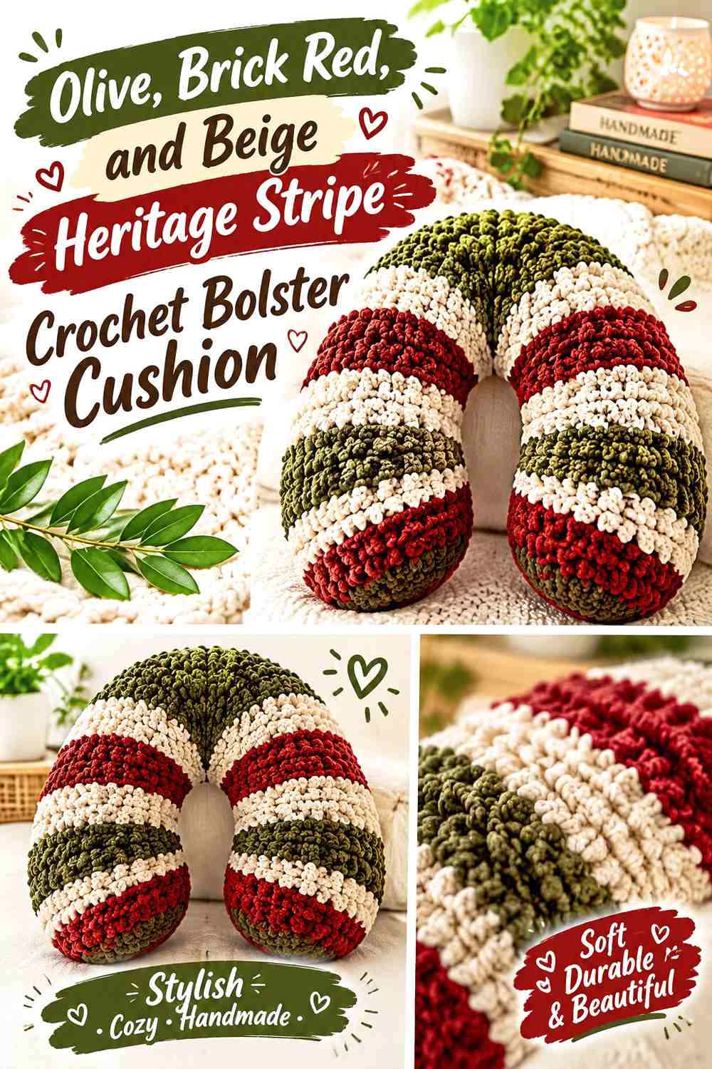
Olive and brick red create a muted, earthy contrast, while beige provides the light value needed to stop the two darker colors from collapsing together. Let olive dominate the body, introduce brick red at measured intervals, and use beige around smaller stripe changes or the circular ends. This is a quieter circus palette for rooms where bright primary stripes would feel too sharp.
Let Olive Form the Main Crochet Bolster Field
Olive works well in broad bands because it visually connects both the warm brick red and neutral beige. Keeping it dominant also helps the cushion read as a coordinated object rather than three equal blocks of color.
If replacing olive, look for another muted green that remains clearly darker than the beige.
Place Beige Between Olive and Brick Red Where Contrast Is Weak
Olive and brick red can be different in hue yet similar in value. If they blur when viewed from a distance, insert beige between selected sections instead of increasing the number of colors.
Beige is especially useful on the end caps, where small circular color changes need more separation than broad body stripes.
Creator Credit: Hectanooga1
11. Powder Blue, Mustard, and Rust Soft Retro Crochet Bolster Cushion
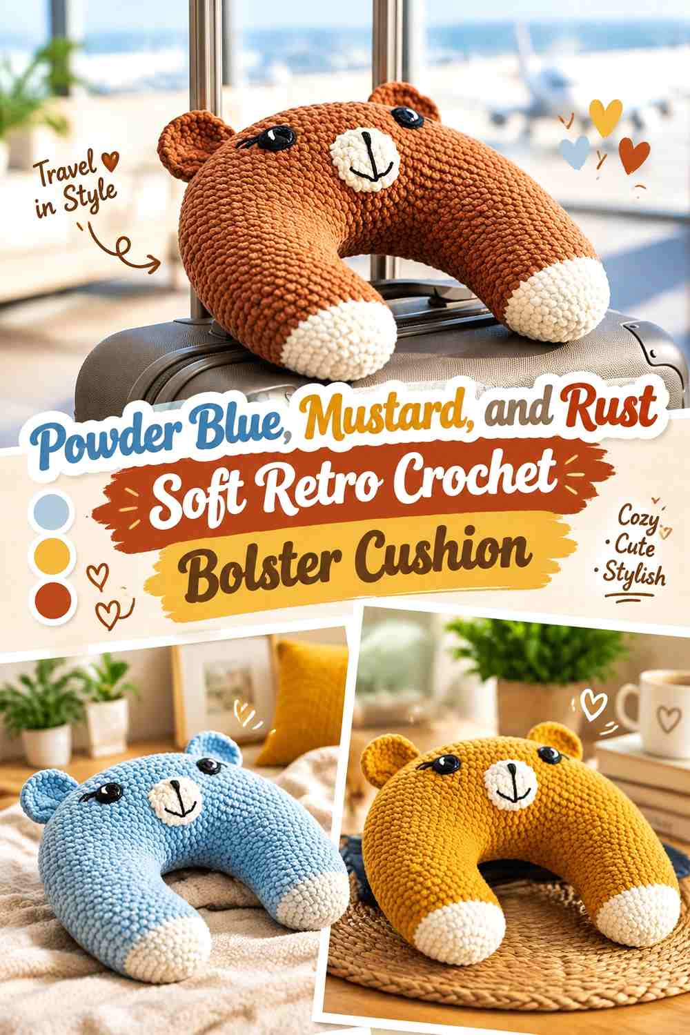
Powder blue changes the direction of the retro palette by introducing a cooler, lighter dominant shade. Mustard supplies the strongest contrast, while rust can act as the smaller connecting accent. This scheme works particularly well when you want circus striping without making the entire cushion intensely saturated.
Keep Powder Blue Broad Across the Crochet Bolster Body
Powder blue can occupy the largest areas so the cylindrical surface remains visually open. Use mustard as a medium-width stripe rather than matching the powder blue band-for-band.
The result gives the warmer colors stronger impact because they appear against a quieter field.
Use Rust Sparingly Beside Powder Blue and Mustard
Rust should have a clear purpose: a narrow repeating stripe, a body-to-end border, or a small end-cap detail. If rust and mustard take up equal space, the cooler powder blue may lose its dominant role.
When substituting rust, preserve a deeper warm tone that remains visibly distinct from mustard.
Creator Credit: meingarn
12. Burgundy, Peach, and Cream Vintage Roll Crochet Bolster Cushion
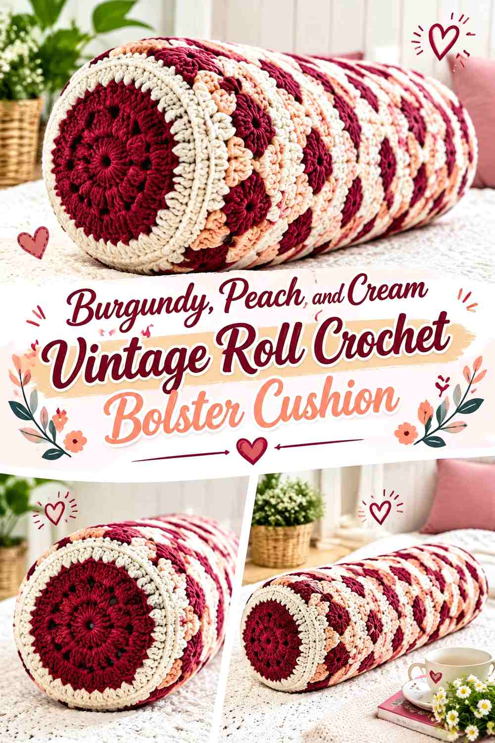
Burgundy creates a deep visual frame, peach introduces a softer warm middle, and cream keeps both from feeling too dense. Because burgundy carries considerable visual weight, this palette benefits from fewer, wider dark stripes instead of many narrow ones. Peach can then repeat more often without overwhelming the cylindrical shape.
Use Burgundy to Frame the Crochet Bolster Rather Than Cover It
Try burgundy near the outer portions of the body or beside both circular ends. That creates symmetry and gives the bolster a defined boundary without requiring burgundy to dominate the center.
If you prefer longitudinal striping, use burgundy as narrow dark lines between broader peach sections.
Let Cream Give Peach and Burgundy More Separation
Cream is especially valuable where smaller color changes meet. It can prevent peach from disappearing beside a lighter neighboring shade and can soften the strong value jump created by burgundy.
For simpler end caps, use cream in the center with burgundy around the outside edge.
Creator Credit: Duka Art’s em Crochê
13. Golden Yellow, Scarlet, and Cream Sunburst-End Crochet Bolster Cushion
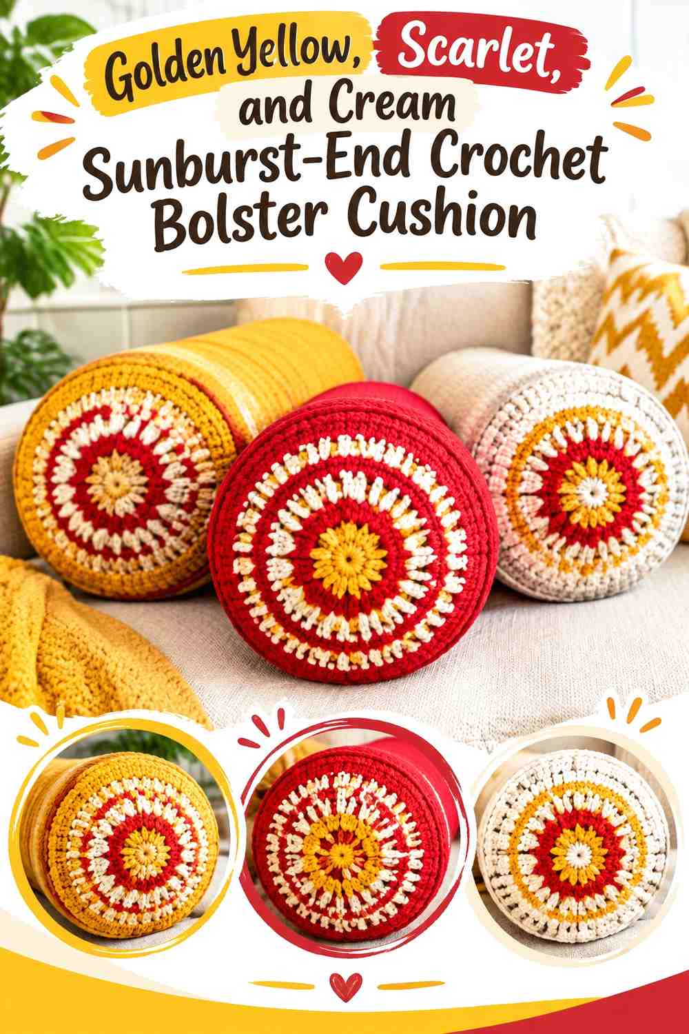
Golden yellow can lead the body while scarlet supplies a narrower circus-red accent. Cream keeps the combination from becoming solidly warm and is especially useful for the circular end treatment. A sunburst-like end can echo the body colors without duplicating every stripe. The linked tutorial teaches a round pillow rather than a cylindrical bolster, so its circular construction is most relevant as an end-shape reference for this adaptation. YouTube
Keep Golden Yellow Dominant Across the Crochet Bolster Body
Golden yellow can appear in the broadest stripes, with cream used as a lighter break and scarlet inserted more selectively. This prevents scarlet from taking over simply because it is the strongest hue.
If golden yellow is replaced, choose another warm yellow that still separates clearly from cream.
Repeat Scarlet Around Golden Yellow End Details
On the ends, a scarlet outer ring can connect directly to scarlet body accents. Golden yellow can fill more of the circular center, while cream acts as a separator if the two warm colors feel too compressed in the smaller end area.
Creator Credit: Yarnspirations
14. Dusty Aqua, Terracotta, and Ivory Concentric-End Crochet Bolster Cushion
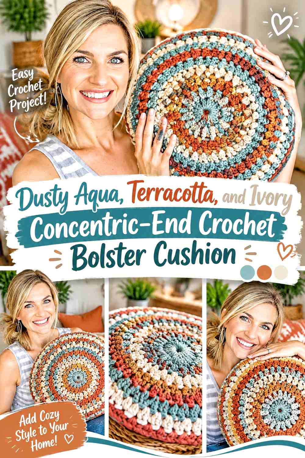
Dusty aqua provides a muted cool base, terracotta supplies the warm contrast, and ivory creates the lightest point in the palette. Rather than using identical stripes everywhere, let the body stay relatively simple and move more of the color variation onto concentric circular ends. The linked source teaches a round crochet pillow, not a bolster, so use its round-pillow concept only as an end-cap adaptation reference. YouTube
Let Dusty Aqua Quiet the Terracotta Crochet Stripes
Use dusty aqua for broader body sections and terracotta for shorter accents. Because both colors are muted, the result can remain retro without the visual intensity of bright turquoise and orange.
Ivory should appear where stronger value contrast is needed rather than being divided equally across every stripe.
Build Dusty Aqua and Ivory Into Concentric Bolster Ends
A dusty-aqua outer section can connect the cap to the main body, followed by ivory and a smaller terracotta center. If the end begins to look busier than the body, remove one color repeat instead of adding thinner rings.
Creator Credit: Melanie Ham
15. Pistachio, Tomato Red, and Butter Yellow Granny-Stripe Crochet Bolster Cushion
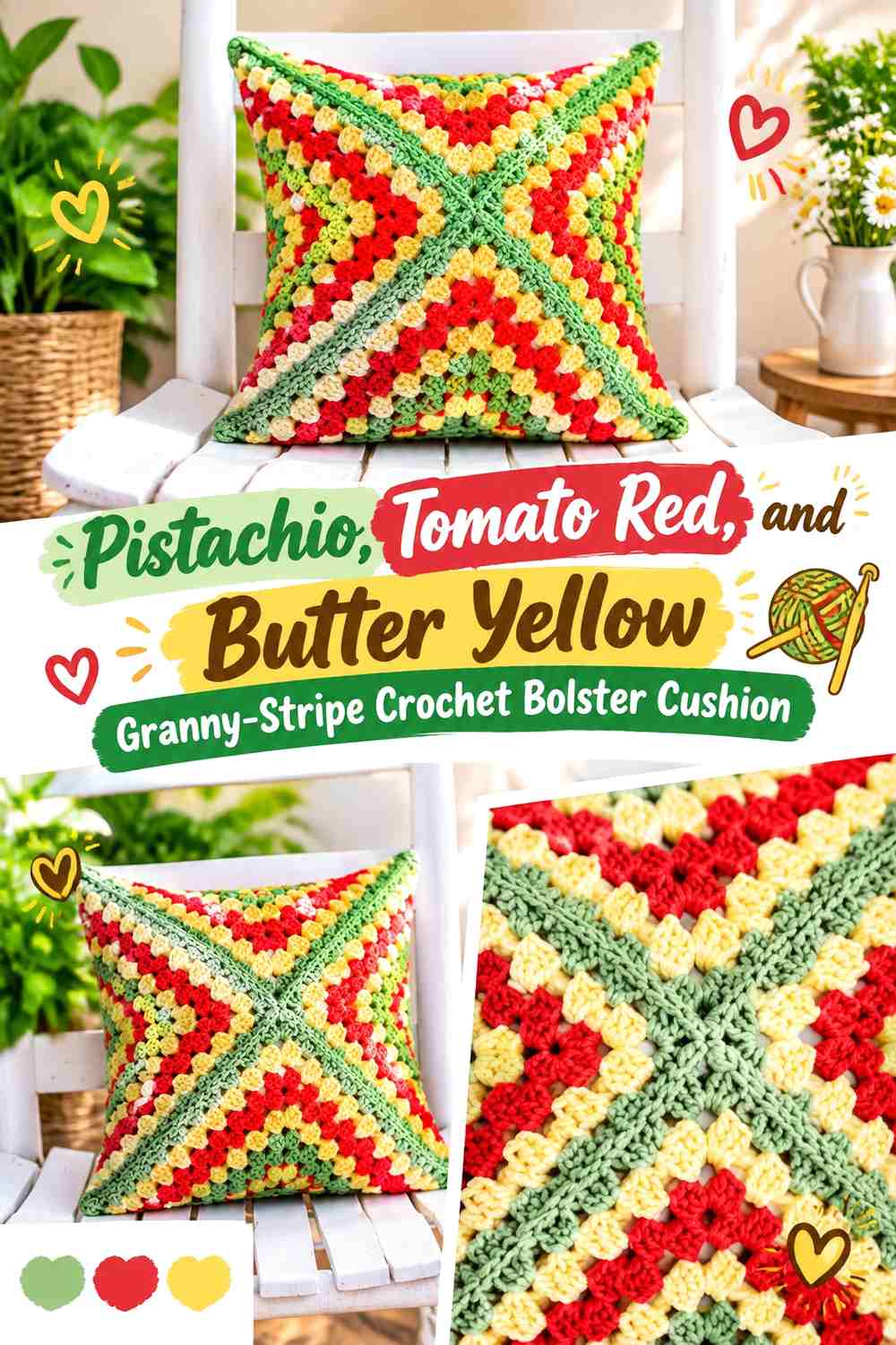
Pistachio, tomato red, and butter yellow create a playful mid-century-inspired palette without depending on stark white. For the bolster, translate the idea into blocky stripes or repeated rectangular color sections rather than forcing square motifs around the cylinder. The linked tutorial creates a retro granny-square pillow rather than a bolster, so use it as a color-blocking and cushion-cover reference, not as an exact cylindrical construction guide. YouTube
Use Pistachio to Connect Tomato Red and Butter Yellow Blocks
Pistachio can serve as the repeated background or joining color between warmer sections. This prevents tomato red and butter yellow from creating an uninterrupted hot-color band around the entire cushion.
Keep the pistachio sections substantial enough to remain visible when the bolster is viewed from across a room.
Give Tomato Red Less Space Than Butter Yellow on the Crochet Bolster
Tomato red has more visual force than the other two colors, so it does not need equal coverage. Narrower red blocks or stripes can provide the circus accent while butter yellow and pistachio carry more of the surface.
Creator Credit: B.Hooked Crochet
16. Maroon, Mustard, and Teal Harlequin-Stripe Crochet Bolster Cushion

Maroon, mustard, and teal create the darkest, richest three-color palette in this collection. Because maroon and teal can both carry substantial visual weight, mustard should do more than act as a tiny accent; it needs enough space to separate the deeper colors. The linked tutorial is a vintage harlequin throw pillow rather than a bolster, so use its contrasting-color concept only as an adaptation reference for the striped cylindrical version. YouTube
Separate Maroon and Teal With Mustard Crochet Stripes
If maroon and teal sit directly beside one another throughout the body, the cushion may read as one dark mass from a distance. Mustard bands between selected sections add the lighter value needed to reveal the repeat.
For a subtler version, widen teal rather than increasing maroon, keeping the warm dark shade as the smaller anchor.
Repeat Maroon at Both Crochet Bolster Ends
Maroon at both ends gives the cylinder a deliberate frame and prevents an asymmetrical accent from making one side appear visually heavier. Mustard can sit just inside the maroon edge, with teal connecting the cap back to the body.
Creator Credit: Bag-O-Day Crochet
17. Black, Cream, and Tangerine Interlocking Circus Stripe Crochet Bolster Cushion

Black, cream, and tangerine create the highest-contrast palette here. Cream should carry enough surface area to stop black from dominating, while tangerine adds the unmistakable retro accent. Long interlocking or alternating stripe sections can work well, but keeping the repeat legible matters more than adding more color changes. The linked tutorial makes an interlocking cushion cover from a square rather than a cylindrical bolster, so its value here is color-interlocking and cover-construction inspiration rather than an exact bolster shape. YouTube
Keep Black Narrow Beside Cream Crochet Stripes
Black can define every neighboring shade with very little surface area. Use it as narrow dividers, selected body stripes, or an outer end border instead of allowing broad black sections to swallow the lighter retro palette.
Cream provides the clearest background for tangerine, so protect some uninterrupted cream areas.
Repeat Tangerine Across the Cream Crochet Bolster Surface
Do not limit tangerine to a single central stripe. Repeat it at measured intervals so the accent remains visible from multiple viewing angles around the cylinder.
If you want a softer version, substitute a muted orange while preserving the clear light/dark contrast between cream and black.
Creator Credit: Blue Star Crochet | Veronika Cromwell
Choosing the Right Retro Circus Stripe Palette
For the clearest classic circus effect, the tomato red, buttercream, and navy scheme or the cobalt blue, tomato red, and warm white scheme gives strong light/dark separation and recognizable awning-style color repetition.
For a softer retro cushion, powder blue with mustard and rust, dusty aqua with terracotta and ivory, or burgundy with peach and cream reduces the intensity while keeping distinct stripe roles. If you want an earthier 1970s direction, avocado with mustard and chocolate brown or olive with brick red and beige keeps the palette muted.
The darkest options—maroon, mustard, and teal or black, cream, and tangerine—need the most attention to color proportion. In both cases, give the lighter shade enough surface area to keep the cylindrical form and stripe repeat visible.
Conclusion
A successful crochet circus stripe bolster needs more than three nostalgic colors. The cylinder should have a clear dominant shade, a repeat that remains readable as the cushion turns, and end caps that feel connected to the body rather than added afterward.
Choose tomato red, cobalt, or tangerine when you want the circus reference to feel bold. Look toward olive, avocado, rust, dusty aqua, or powder blue for a quieter retro direction. Whatever palette you choose, compare the yarns for light/dark contrast before committing to the full cover and decide whether the body stripes or the circular ends should carry the most visual detail.
Use the linked creator tutorial for its intended construction, then adapt the color placement only where that construction comfortably allows it.
Frequently Asked Questions
How many retro colors work well on a crochet circus stripe bolster?
Three colors are enough to create strong variety because they can take different dominant, supporting, and accent roles. More colors can work, but the cylindrical surface becomes busier quickly. Before adding another shade, check whether changing stripe width or repetition would create the variation you actually need.
Should circus stripes run lengthwise or around a crochet bolster?
Either direction can work. Lengthwise stripes emphasize the long cylinder and give a stronger awning-like appearance. Stripes circling the bolster create distinct bands and can make a three-color repeat easier to organize. Let the tutorial’s construction method influence the final choice so the color plan fits the way the cover is made.
How can I keep retro crochet stripes from looking muddy?
Check light/dark value as well as hue. Olive and brick red, for example, can look different in color but still sit close together in value. Add a lighter beige or cream between selected stripes when more separation is needed. Viewing the yarns in grayscale is also a useful visual check before starting the full cushion.
Should the crochet bolster end caps use all the body colors?
Not necessarily. When the striped body is already busy, one solid end color or a simple two-color cap can give the design a cleaner finish. If the body has broad, restrained stripes, concentric end-cap colors can add more detail without overwhelming the cushion.
How do I substitute one of these retro yarn colors?
Preserve the color’s role rather than searching for an exact named shade. If replacing dusty aqua, for example, choose another muted cool color that still contrasts with the accompanying ivory and terracotta. For a dark accent such as navy, maroon, or espresso, keep enough value difference to preserve the original definition.
Do all the stripes on a crochet circus bolster need to be the same width?
No. Changing stripe width can actually make the color hierarchy clearer. Broader dominant sections, medium supporting bands, and occasional narrow accent stripes prevent three strong colors from competing equally. The important checkpoint is repetition: irregular widths should still look deliberate as they continue around or along the cylindrical body.
Does the YouTube tutorial need to use the same retro colors?
No. The tutorial is there to support the crochet construction or a clearly identified adaptation concept. The color schemes in this article are separate palette plans, so the creator’s original yarn colors do not need to match tomato red, mustard, teal, avocado, or any of the other proposed combinations.