An oversized crochet flower cushion can change an ordinary chair because its outline stays visible instead of disappearing into the usual square-pillow shape. Color determines whether that flower looks soft and blended, retro and graphic, botanical, or dramatically sculptural.

For chair styling, think about three areas separately: the flower center, the petal ring, and the chair upholstery behind them. A dark center can anchor pale petals, a lighter center can break up deep petals, and a contrasting chair can make the entire flower silhouette easier to see. The tutorials below support flower-pillow and closely related floral cushion constructions; the proposed palettes are independent color adaptations rather than claims about the colors used by each creator.
Quick List
- Butter Yellow, Cream, and Cocoa Crochet Daisy Chair Cushion
- Dusty Rose, Oatmeal, and Burgundy Crochet Flower Chair Cushion
- Terracotta, Sand, and Olive Crochet Flower Chair Cushion
- Sage, Warm White, and Mustard Crochet Sunflower Chair Cushion
- Rust, Camel, and Espresso Crochet Flower Chair Cushion
- Dusty Blue, Cream, and Denim Crochet Sunflower Chair Cushion
- Lavender, Mushroom, and Plum Crochet Flower Chair Cushion
- Peach, Clay, and Chocolate Crochet Flower Chair Cushion
- Olive, Oatmeal, and Charcoal Crochet Flower Chair Cushion
- Deep Teal, Camel, and Ecru Crochet Retro Flower Chair Cushion
- Coral, Blush, and Cinnamon Crochet Flower Chair Cushion
- Mustard, Burnt Orange, and Brown Crochet Retro Flower Chair Cushion
- Mint, Cream, and Forest Green Crochet Tulip Chair Cushion
- Plum, Mauve, and Pearl Gray Crochet Rose Chair Cushion
- Warm Beige, Caramel, and Cocoa Crochet Flower-Front Chair Cushion
Make the Crochet Flower Center Strong Enough to Anchor Oversized Petals
The center occupies less area than the petals, but it often becomes the first place the eye lands. If the petals are pale, a darker cocoa, burgundy, espresso, charcoal, or deep green center can keep the oversized flower from looking washed out.
With dark petals, reversing the relationship usually works better. Cream, camel, oatmeal, or another lighter center gives the middle enough separation to remain visible when the cushion is resting against a chair back.
Avoid choosing center and petal colors only by hue. Two different colors can still blend if they are similar in value, especially in plush or heavily textured crochet.
Let the Chair Upholstery Become Part of the Crochet Flower Palette
A flower cushion that looks strongly defined on a worktable can almost disappear once placed on a chair. Compare the petal color with the actual upholstery before committing to the full project.
Cream petals stand out strongly against charcoal or navy chairs, while plum, rust, teal, olive, and burgundy can create clearer silhouettes on pale beige or off-white seating. If the chair and petals are close in color, use a contrasting outer petal edge or a clearly different center to recover definition.
For an oversized cushion, also check how the petals sit against the chair edges. Color contrast is most useful when the petal tips remain visible instead of visually merging with the seat or back.
Keep Oversized Crochet Petals Visually Connected
Each petal is a large color area. If every petal receives a different equally strong shade, the cushion can start looking like a color wheel rather than one flower.
A more controlled plan is to repeat one dominant petal color, use a supporting shade on selected petals or inner sections, and reserve the strongest contrast for the center. Tonal petal changes can also work when you want variety without breaking the overall flower silhouette.
1. Butter Yellow, Cream, and Cocoa Crochet Daisy Chair Cushion

Butter yellow gives this oversized daisy a warm retro direction without the intensity of a brighter yellow. Use cream for most of the petals and cocoa at the center so the flower remains clearly readable against a chair.
This arrangement puts the lightest color across the widest area while using the deeper shades where definition matters most.
Let Cream Dominate the Butter Yellow Crochet Daisy Petals
Cream works well across broad petals because their curves and shadows remain visible instead of being hidden by several competing colors. Butter yellow can enter near the petal bases or on a smaller repeated detail.
Against a cream chair, reverse that emphasis and allow more yellow to reach the petal tips.
Use Cocoa to Anchor the Cream and Butter Yellow Crochet Flower Center
A cocoa center creates the strongest contrast in the palette. Keeping that darkness concentrated in the middle also prevents the entire cushion from becoming visually heavy.
If cocoa feels too dark for the room, use a medium warm brown while keeping it clearly deeper than butter yellow.
Creator Credit: Cute Crochet
2. Dusty Rose, Oatmeal, and Burgundy Crochet Flower Chair Cushion

Dusty rose can lead the petals, oatmeal can soften selected areas, and burgundy can create a defined center. The palette remains tonal enough for a quiet reading chair but still has a clear dark anchor.
Because the cushion is oversized, dusty rose should occupy uninterrupted petal surfaces rather than being broken into many small bands.
Keep Dusty Rose Broad Across the Crochet Flower Petals
Use dusty rose on most or all of the petal faces so the overall silhouette reads as one flower. Oatmeal is more useful as a secondary petal detail than as an equal competing color.
If the chair itself is pink or mauve, increase the oatmeal near the outside of the flower.
Let Burgundy Give Dusty Rose Crochet Petals a Defined Center
Burgundy provides enough depth to distinguish the middle even when the cushion is viewed from across the room. It can also make dusty rose look lighter without introducing stark black.
Choose another deep muted red if substituting, preserving the value difference from the petals.
Creator Credit: VivCrochets
3. Terracotta, Sand, and Olive Crochet Flower Chair Cushion
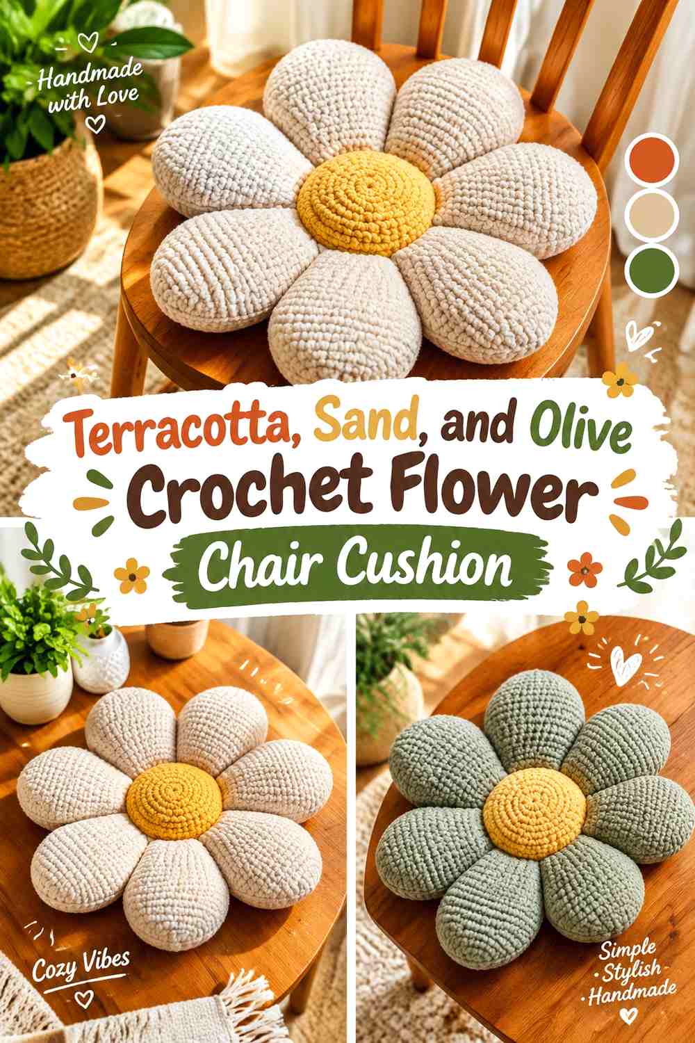
Terracotta creates a warm petal field, sand keeps the inner flower from becoming too dense, and olive introduces a botanical accent. This is more complex than a simple two-color daisy, so keep the three shades in clearly different roles.
Let terracotta dominate, sand support, and olive remain the smallest color.
Use Terracotta Across the Largest Crochet Flower Petal Areas
Large terracotta petals give the cushion a consistent warm silhouette against oatmeal, cream, gray, or deep green chairs. Avoid switching colors halfway through every petal because the oversized shape already provides enough visual movement.
Sand can appear closer to the center where you want a softer transition.
Keep Olive Smaller Than Terracotta and Sand on the Crochet Flower
Olive works best as a controlled botanical detail around the center or in a limited secondary area. Repeating too much green through the petals can weaken terracotta’s role as the main color.
If the chair is olive, use the green even more sparingly so the cushion does not blend into the upholstery.
Creator Credit: Sahar Elkady
4. Sage, Warm White, and Mustard Crochet Sunflower Chair Cushion

A conventional sunflower palette can be softened for interior use by moving from vivid green and yellow toward sage, warm white, and muted mustard. Let warm white carry the larger petal areas, mustard define the floral center, and sage appear as a restrained supporting shade.
This combination keeps the flower recognizable without making the chair feel strongly seasonal.
Let Warm White Open Up the Sage Crochet Sunflower Shape
Warm white petals can make a large cushion feel lighter, particularly on a darker wooden or upholstered chair. Sage can be placed nearer the petal bases or used selectively around the flower.
On a white chair, increase the sage share so the petal outline remains visible.
Keep Mustard Concentrated in the Warm White Crochet Sunflower Center
Mustard creates a warmer focal point without needing to extend into every petal. Its controlled placement makes the flower center obvious while allowing the oversized petal ring to remain calm.
If you want stronger contrast, deepen mustard toward ochre rather than introducing an unrelated fourth color.
Creator Credit: Wonder Crochet
5. Rust, Camel, and Espresso Crochet Flower Chair Cushion
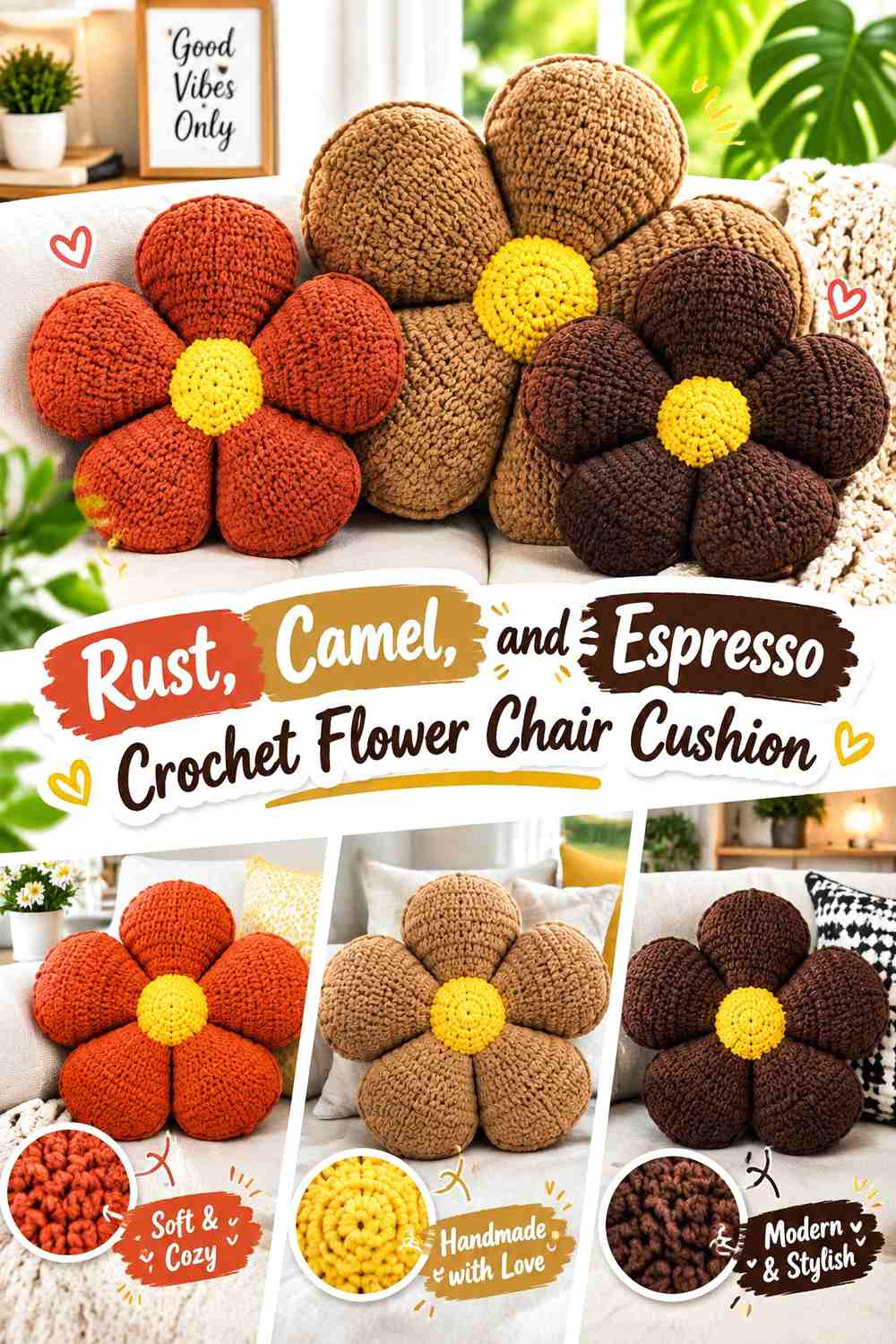
Rust and camel stay within the same warm family, while espresso gives the center enough visual depth to separate the two. This palette suits a chair surrounded by wood, tan, brown, or other natural neutrals.
Use rust as the primary petal shade and camel as the light break rather than dividing them equally.
Let Rust Control the Crochet Flower Petal Ring
Rust has enough depth to hold the oversized shape together. Long uninterrupted sections also make the individual petal curves easier to follow than frequent rust-and-camel stripes would.
On a dark brown chair, move camel farther toward the petal tips to recover the silhouette.
Espresso Gives Rust and Camel Crochet Petals a Strong Center
A deep espresso middle creates a compact focal area surrounded by the larger warm petals. It also keeps the two midtone colors from making the complete cushion feel flat.
If espresso nearly matches the chair, that is less important than petal contrast because most of the center remains surrounded by crochet rather than upholstery.
Creator Credit: Maria’s Blue Crayon
6. Dusty Blue, Cream, and Denim Crochet Sunflower Chair Cushion
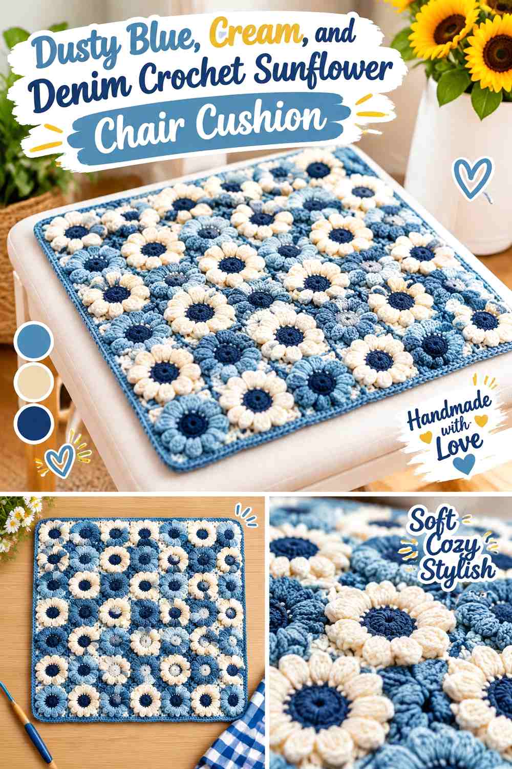
Dusty blue turns a sunflower-style cushion away from literal botanical coloring and toward a softer decorative interpretation. Cream can highlight the petal structure, while denim supplies the darkest center.
The palette is useful when yellow or orange would clash with the room but a large flower silhouette still fits the chair.
Use Dusty Blue as the Main Crochet Sunflower Petal Color
Give dusty blue the largest area and use cream only where separation helps the petals remain distinct. The softened blue can coordinate with neutral chairs without needing an exact upholstery match.
On blue seating, let cream reach more of the outer petal edge.
Denim Can Ground the Dusty Blue and Cream Crochet Sunflower
A denim center gives the flower a deeper visual core without the severity of black. Keep that dark value concentrated so the cushion stays primarily soft blue and cream.
If dusty blue and denim look too similar from several feet away, deepen only the center shade.
Creator Credit: Crochet Studio
7. Lavender, Mushroom, and Plum Crochet Flower Chair Cushion
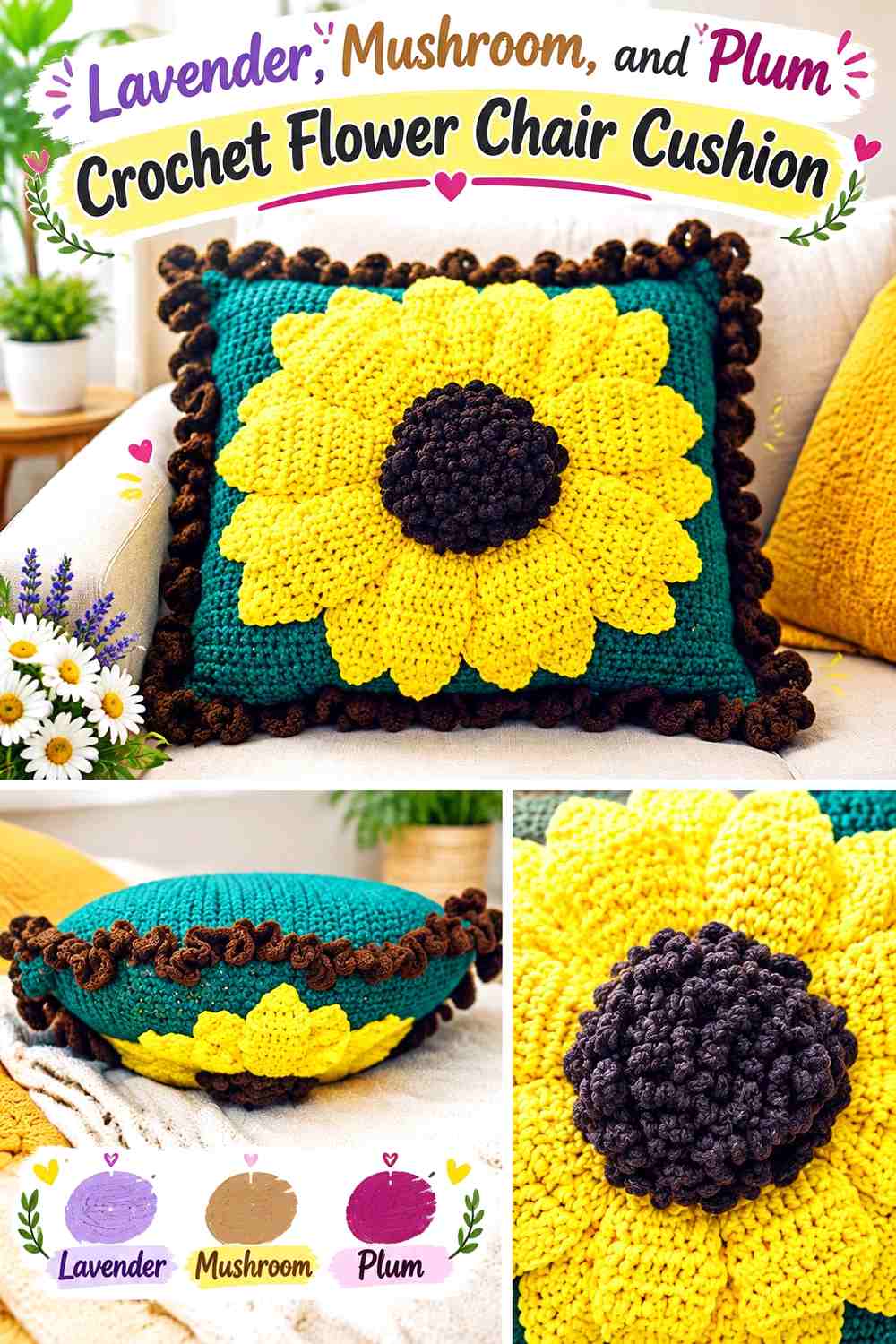
Lavender makes the petals the obvious color feature, mushroom introduces a restrained neutral, and plum gives the middle a deeper anchor. The palette can work particularly well on oatmeal, taupe, gray, or cream chairs.
The useful contrast is between the light-muted petals and the concentrated plum center.
Keep Lavender Continuous Across the Crochet Flower Petals
Large lavender petal surfaces will show the flower outline more clearly than small alternating lavender and mushroom segments. Use mushroom closer to the center or on selected secondary petals if the construction supports it.
On lavender upholstery, increase mushroom at the outer edges.
Let Plum Separate Lavender and Mushroom in the Crochet Flower Center
Plum provides a clear dark stop between two softer colors. A compact plum center also makes the lighter petal ring look broader.
When substituting, choose another muted purple that remains visibly darker than lavender rather than simply choosing a different hue.
Creator Credit: Meladora’s Creations for Crochet
8. Peach, Clay, and Chocolate Crochet Flower Chair Cushion

Peach creates a light warm petal surface, clay adds a second earthy tone, and chocolate gives the center its strongest definition. This palette can make an oversized flower noticeable without relying on saturated pink.
Keep peach dominant so the cushion does not become visually too dark for a chair.
Let Peach Keep the Clay Crochet Flower Petals Light
Use peach across most petal faces and clay near selected inner areas or alternating details. This gives the flower some tonal change while preserving one clear overall color family.
If the chair is pale peach or beige, shift more clay toward the petal tips.
Chocolate Should Stay Central in the Peach and Clay Crochet Flower
Chocolate works best in a smaller central disk because its visual weight is much stronger than either petal shade. Extending it too far outward can make the middle appear disproportionately large.
A dark warm brown can replace chocolate as long as the center remains distinctly deeper than clay.
Creator Credit: Sweet Creek Patterns
9. Olive, Oatmeal, and Charcoal Crochet Flower Chair Cushion
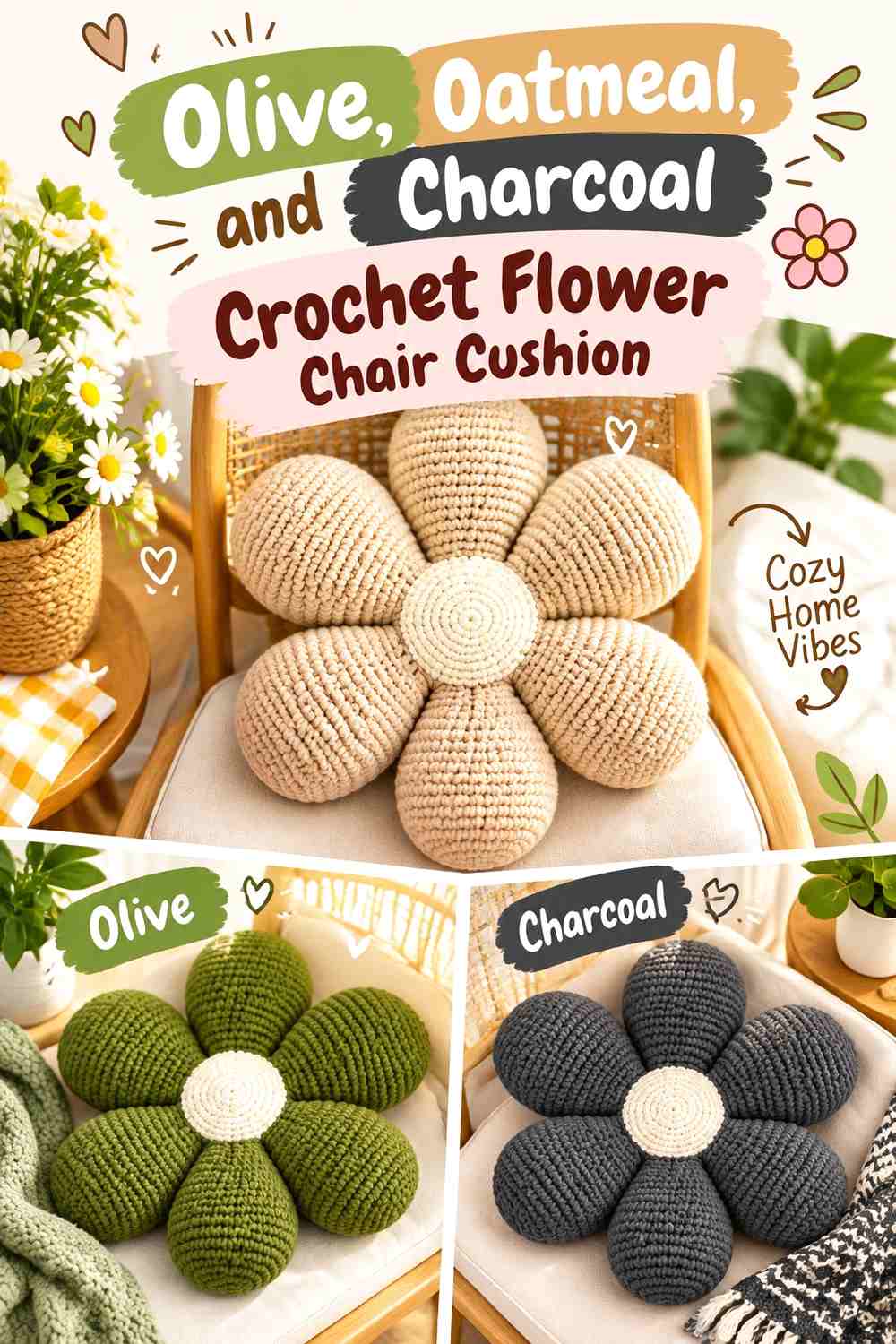
Olive gives the flower a grounded botanical direction, oatmeal provides a lighter secondary value, and charcoal creates the darkest central point. The result works well when you want something less literal than a colorful daisy.
Because olive and charcoal are both deep, oatmeal has an important separating role.
Keep Oatmeal Between Olive and Charcoal Crochet Flower Areas
Use oatmeal near the inner petals or directly around the center when the darker colors would otherwise touch too broadly. This creates a visual break and preserves the flower’s layered construction.
The lighter shade is also useful on chairs upholstered in deep green, brown, or charcoal.
Let Olive Carry More Crochet Petal Area Than Charcoal
Olive should remain the main flower color. If charcoal spreads across large petal sections, the cushion can lose its botanical character and begin reading as mostly dark neutral.
Reserve charcoal for the center or another small structural area.
Creator Credit: Alexsandra Medeiros – Ami decor
10. Deep Teal, Camel, and Ecru Crochet Retro Flower Chair Cushion

Deep teal gives the oversized flower a strong retro base, while camel warms the palette and ecru provides the lightest separation. This combination can sit comfortably on cream, tan, rust, or muted green chairs.
Use teal on the largest petal areas rather than giving all three colors equal coverage.
Let Deep Teal Define the Crochet Retro Flower Silhouette
Deep teal works well on the outer petal shape because it creates a clear boundary against lighter upholstery. Keep broad teal surfaces intact so the cushion reads as one bold flower.
On navy or dark teal chairs, reverse the balance and bring ecru farther outward.
Use Camel and Ecru to Break Up Deep Teal Crochet Petals
Camel can sit nearer the flower center, while ecru provides a smaller light accent between darker areas. The two supporting colors should not both compete for the same visual role.
If the palette feels crowded, remove one supporting shade rather than adding more divisions within each petal.
Creator Credit: Let’s crochet
11. Coral, Blush, and Cinnamon Crochet Flower Chair Cushion
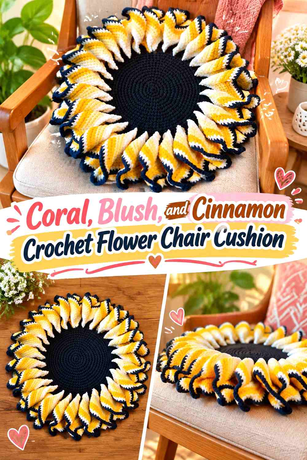
Coral and blush create a warmer pink flower than dusty rose, while cinnamon supplies an earthy center. The palette works best when coral remains the main petal color and blush softens selected areas rather than alternating equally.
Cinnamon prevents the whole cushion from becoming one continuous pink field.
Let Coral Carry the Largest Crochet Flower Petals
Use coral consistently across most of the flower circumference. An oversized cushion needs enough repeated color for the complete silhouette to remain recognizable behind the chair arms or back.
Blush can lighten the inner petal area without creating a separate competing flower.
Cinnamon Gives Coral and Blush Crochet Petals an Earthy Center
A cinnamon center provides warmer contrast than chocolate or charcoal. Its brown-orange character keeps the palette connected to coral while still providing enough depth.
If coral and cinnamon become too similar, move cinnamon slightly darker rather than making blush brighter.
Creator Credit: Nicoles-kleine-Haekelschule
12. Mustard, Burnt Orange, and Brown Crochet Retro Flower Chair Cushion

Mustard and burnt orange produce the strongest 1970s-inspired palette in the collection, while brown keeps the center grounded. Because all three shades are warm and fairly substantial, their visual areas need clear hierarchy.
Let mustard dominate the petals, use burnt orange as the secondary color, and keep brown mostly central.
Keep Mustard Broader Than Burnt Orange Across the Crochet Flower
Large mustard petals create the primary read from across the room. Burnt orange can appear nearer the petal bases or on alternating secondary sections without dividing the flower into equal color blocks.
On mustard upholstery, reverse those roles so the outer silhouette stays distinct.
Brown Should Anchor the Mustard and Burnt Orange Crochet Center
A brown center creates enough depth to separate two warm saturated petal colors. Keep it compact so the retro flower remains colorful rather than predominantly brown.
If the room already contains very dark wood, a medium brown can provide better separation from the furniture.
Creator Credit: #связаны
13. Mint, Cream, and Forest Green Crochet Tulip Chair Cushion
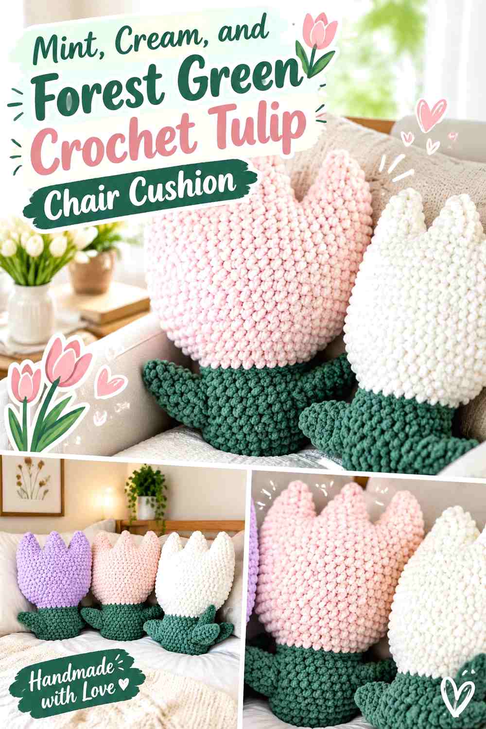
A tulip-inspired cushion changes the color-placement problem because the flower has a stronger top-to-bottom direction than a round daisy. Mint can lead the flower body, cream can lighten selected sections, and forest green can define the lower or supporting areas.
This palette is especially effective on a warm beige, tan, or muted pink chair.
Use Mint Across the Main Crochet Tulip Flower
Keeping mint continuous through the principal tulip shape makes the flower identifiable before the smaller color details are noticed. Cream can be used where the folded or divided sections need more visual separation.
Avoid equal mint-and-cream striping if you want the tulip silhouette to remain the focus.
Forest Green Can Ground the Mint Crochet Tulip Cushion
Use forest green in the lower supporting area or another limited structural section. Its darkness visually anchors the cushion without competing with the mint flower above it.
If the chair is already dark green, replace forest green with a lighter muted olive while preserving its supporting role.
Creator Credit: Stitchberry
14. Plum, Mauve, and Pearl Gray Crochet Rose Chair Cushion
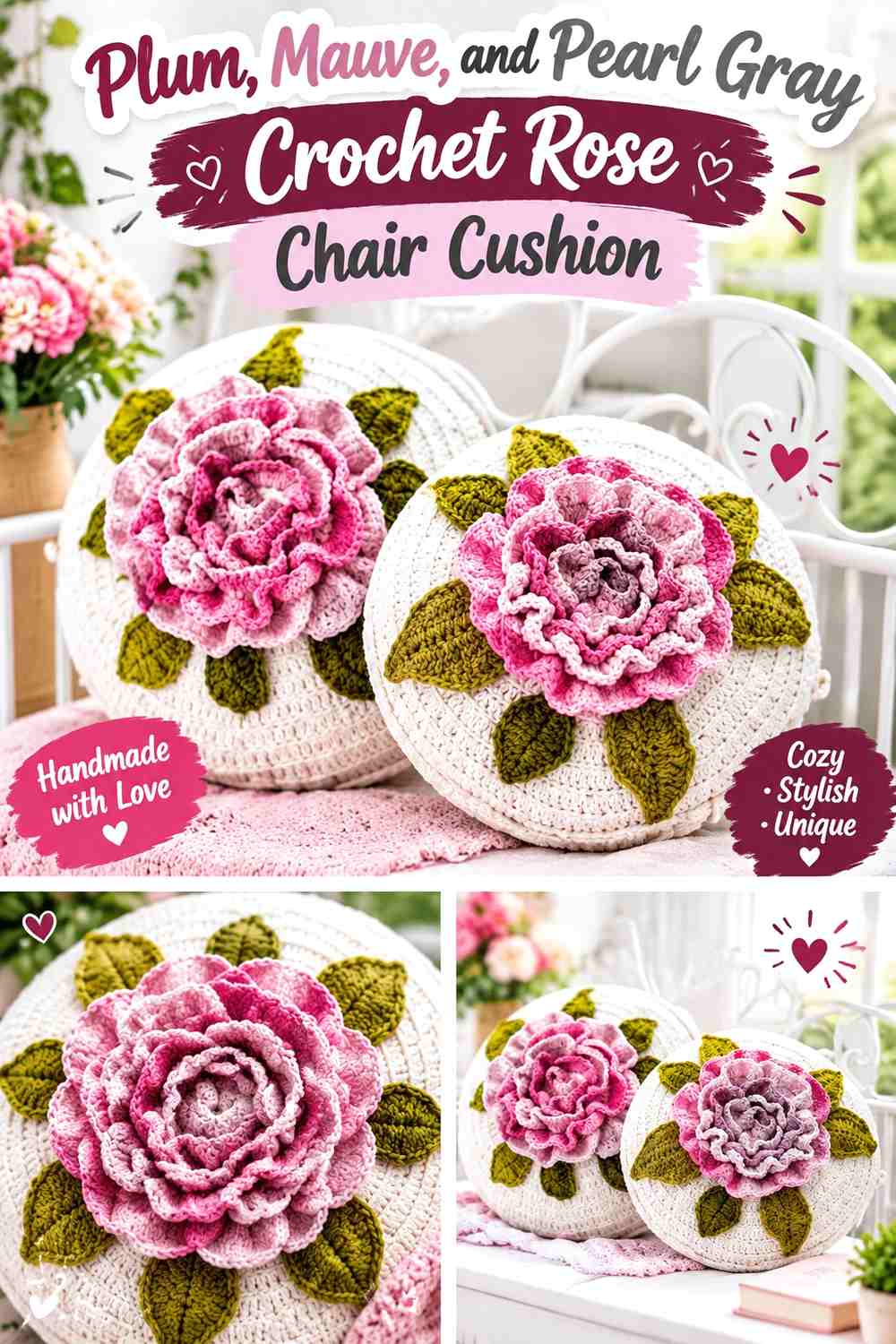
A rose-inspired cushion benefits from tonal layering because the flower already contains several overlapping visual sections. Plum provides the deepest folds, mauve carries the broader floral areas, and pearl gray gives the design a neutral break.
This is a useful option when a simple two-color daisy feels too graphic for the chair.
Let Mauve Carry the Largest Crochet Rose Areas
Use mauve across the broad flower surface so plum can remain a shadow-like accent rather than taking over the complete cushion. This preserves enough tonal variation for overlapping rose sections to remain distinguishable.
On mauve upholstery, use pearl gray nearer the outside.
Use Plum to Deepen Mauve Crochet Rose Layers
Plum works well wherever the rose needs stronger visual depth. Keeping it in repeated interior sections can emphasize layering without outlining every shape.
Pearl gray should remain lighter and smaller, providing a pause between neighboring purple tones.
Creator Credit: Лиля | Вязание, Вдохновение и Жизнь в Канаде
15. Warm Beige, Caramel, and Cocoa Crochet Flower-Front Chair Cushion

A flower-front cushion offers a different way to use the oversized floral idea when a completely flower-shaped cushion is not practical for the chair. Warm beige can form the surrounding field, caramel can build the large floral area, and cocoa can emphasize the center and selected edges.
This approach keeps the palette neutral while giving the chair a clear floral focal point.
Give Caramel the Largest Crochet Flower Area on Warm Beige
Caramel should occupy enough of the flower to remain visible against the pale background. If the motif is too close in value to warm beige, the petals can disappear even though the yarn colors look different in the skein.
Deepening caramel slightly is often more effective than adding another accent color.
Use Cocoa to Separate Caramel Crochet Petals From Warm Beige
Cocoa can define the center or selected small boundaries where caramel needs more distinction from the cushion field. Keep the dark color concentrated so it sharpens the flower instead of outlining every element.
On a cocoa-brown chair, leave more warm beige visible at the outer cushion edge.
Creator Credit: Daisy Girl Crochet
Which Crochet Oversized Flower Chair Cushion Palette Should You Choose?
For a light, airy chair accent, butter yellow with cream, sage with warm white, dusty blue with cream, or peach with clay keeps most of the petal area relatively bright.
For a deeper statement, deep teal and camel, olive and charcoal, plum and mauve, or rust and espresso gives the flower more visual weight and works particularly well against pale upholstery.
If you want an unmistakable retro direction, mustard with burnt orange and brown or coral with blush and cinnamon brings stronger warm color into the oversized petals. For a quieter chair, warm beige, caramel, and cocoa keeps the flower idea visible without making the palette the loudest element in the room.
Conclusion
An oversized crochet flower chair cushion has two jobs visually: it needs to read as a flower, and it needs to remain distinct from the chair supporting it. Color placement can solve both.
Give the petals one clear dominant shade, make the center noticeably lighter or darker when extra definition is needed, and consider the chair upholstery before finalizing the palette. When the cushion is very large, fewer, better-controlled color areas usually let the petal silhouette do more of the work.
Use the credited tutorials for their exact construction methods, then adapt the palette according to the chair, the amount of contrast you want, and which part of the flower should attract attention first.
Frequently Asked Questions
Which color should dominate an oversized crochet flower chair cushion?
The petal color usually occupies the largest visible area, so it makes sense for it to establish the main palette direction. The center can then act as a darker or lighter anchor rather than competing equally with the petals.
How can I keep crochet flower petals visible on a chair?
Compare the outer petal color directly with the chair upholstery. If they are close in value, use a lighter or darker petal edge, increase contrast in the main petal color, or position a contrasting supporting shade toward the tips.
Should every crochet flower petal be the same color?
No, but repetition helps the cushion remain visually connected. You can alternate two related colors or introduce a second shade near the petal bases, provided one color still has a clear dominant role.
What should I do if the crochet flower center looks too large?
Reduce its visual weight through color. A center close in value to the petals will appear less dominant, while a strongly contrasting center will attract more attention even if its physical dimensions stay unchanged.
Can an oversized crochet flower cushion work on a patterned chair?
Yes, but simplifying the crochet palette can help. One dominant petal shade and one center color generally compete less with patterned upholstery than several equally strong petal colors.
How do I substitute colors without losing the original crochet flower palette?
Preserve the relationships rather than exact shade names. Replace a dark center with another clearly dark shade, a pale petal with another light value, or a muted accent with another similarly softened color. Maintaining those roles keeps the original balance even when the hues change.