Chunky crochet storage baskets already have a strong visual presence, so color needs to support the structure instead of competing with it. Thick stitches, braided cord, doubled yarn, rope-like edging, and substantial rims all create shadows that can make colors appear heavier than they do in the skein.
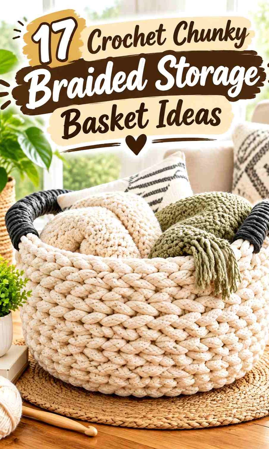
A useful basket palette therefore starts with function. The main color usually needs enough uninterrupted surface area to show the chunky texture, while a supporting shade can define the base, rim, handles, or a controlled section of the walls. A third accent works best when it has a specific job rather than appearing randomly around the basket.
The color schemes below are editorial adaptations. The linked tutorials support basket construction concepts, while the proposed palettes, braided appearance, color placement, and storage styling can be adapted separately. Where a tutorial does not specifically use braided cord, treat the braided look as an optional material or finishing direction rather than a feature of the creator’s original project.
Quick List
- Oatmeal and Charcoal Chunky Braided Crochet Storage Basket
- Cream and Camel Chunky Braided Crochet Storage Basket
- Terracotta and Natural Chunky Braided Crochet Storage Basket
- Olive Green and Oatmeal Chunky Braided Crochet Storage Basket
- Black and Warm White Chunky Braided Crochet Storage Basket
- Rust, Mustard, and Cream Chunky Braided Crochet Storage Basket
- Dusty Blue and Stone Chunky Braided Crochet Storage Basket
- Sage Green and Cream Chunky Braided Crochet Storage Basket
- Burgundy, Blush, and Oatmeal Chunky Braided Crochet Storage Basket
- Mocha and Ivory Chunky Braided Crochet Storage Basket
- Deep Teal and Camel Chunky Braided Crochet Storage Basket
- Mustard and Chocolate Brown Chunky Braided Crochet Storage Basket
- Dusty Rose and Taupe Chunky Braided Crochet Storage Basket
- Navy and Natural Chunky Braided Crochet Storage Basket
- Forest Green and Oatmeal Chunky Braided Crochet Storage Basket
- Soft Gray and Burnt Orange Chunky Braided Crochet Storage Basket
Choose Colors That Keep Chunky Braided Texture Visible
Thick basket fabric already creates noticeable ridges and shadows. If two colors are close in lightness, a narrow stripe between them can disappear into that texture. Use stronger value contrast when you specifically want a rim, handle, braided detail, or lower basket section to stand out.
For a quieter basket, tonal colors can still work. Instead of relying on sharp contrast, give each shade a larger uninterrupted area—for example, a camel body with a cream rim—so the color division remains visible despite the bulky surface.
Decide Whether the Basket Body or Braided Rim Should Lead
A contrasting rim attracts attention because it traces the entire opening. If the basket body already contains several colors, a bold additional rim can make the design feel top-heavy.
One controlled strategy is to keep the body mostly one color and move the second shade to the rim and handles. Another is to use two body colors and repeat one of them at the rim instead of introducing a new accent. Repetition makes the basket look planned from the base through the opening.
Keep Basket Handles Connected to the Main Palette
Handles occupy little surface area, but their position makes them visually prominent. A very dark handle on a pale basket can become the first feature you notice.
That can be useful when you want definition. For a calmer storage basket, repeat the body or rim color in the handles. If you are adding a braided or wrapped handle treatment, compare it against both the basket wall and whatever will usually be stored inside the basket before settling on the final shade.
1. Oatmeal and Charcoal Chunky Braided Crochet Storage Basket

Oatmeal gives a chunky basket enough light surface area for ridges and rope-like texture to remain visible, while charcoal provides a controlled dark anchor. Let oatmeal cover most of the walls and reserve charcoal for the base transition, upper rim, or handles. That keeps the basket visually light while still defining its structure.
This is particularly useful for a braided look because dark charcoal lines can emphasize selected edges without hiding all the texture beneath a dark overall color.
Let Oatmeal Cover Most of the Chunky Crochet Basket Walls
Broad oatmeal sections give thick stitches room to show. If the yarn or cord has an obvious braided surface, keeping the body mostly oatmeal also prevents frequent color changes from interrupting the texture.
For a tall basket, you can bring charcoal into the lower portion rather than splitting the walls exactly in half. The lighter upper section then keeps the opening from appearing visually heavy.
Use Charcoal to Define the Oatmeal Basket Rim and Handles
A slim charcoal rim can outline the opening clearly against the oatmeal body. Repeating charcoal on the handles connects those features instead of making the dark edge look isolated.
If the contrast feels too severe, substitute a softer deep gray while preserving enough light/dark separation from oatmeal.
Creator Credit: Studio Cozy Goose
2. Cream and Camel Chunky Braided Crochet Storage Basket
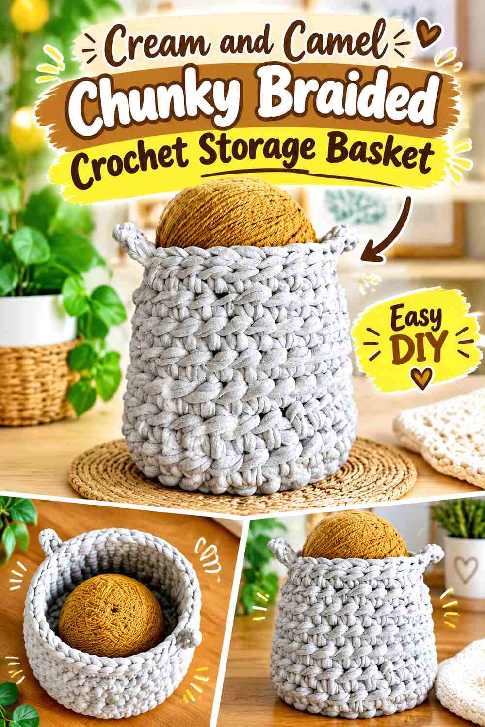
Cream and camel create a low-contrast basket that relies more on texture than dramatic color blocking. Camel can lead across the main walls, while cream lightens the rim, handles, or a broad upper band. Because both colors are relatively quiet, larger sections work better than numerous narrow stripes.
This palette is useful when you want the braided or chunky surface to be the main decorative feature.
Give Camel the Largest Area on the Crochet Storage Basket
Camel provides enough warmth to keep the basket from looking flat while remaining neutral enough for a large body section. Use it continuously across the sides so the chunky stitch pattern remains easy to read.
If your cream and camel are very close in value, avoid tiny alternating bands because the color division may disappear into the thick texture.
Place Cream at the Camel Basket Opening for a Lighter Finish
A cream upper section draws attention to the basket opening without introducing a high-contrast color. It can also separate the camel walls from whatever darker items are stored inside.
Repeating cream on a braided rim or handle treatment gives the lighter shade a clear purpose instead of making it an isolated stripe.
Creator Credit: Bags by Bento | Taylor
3. Terracotta and Natural Chunky Braided Crochet Storage Basket
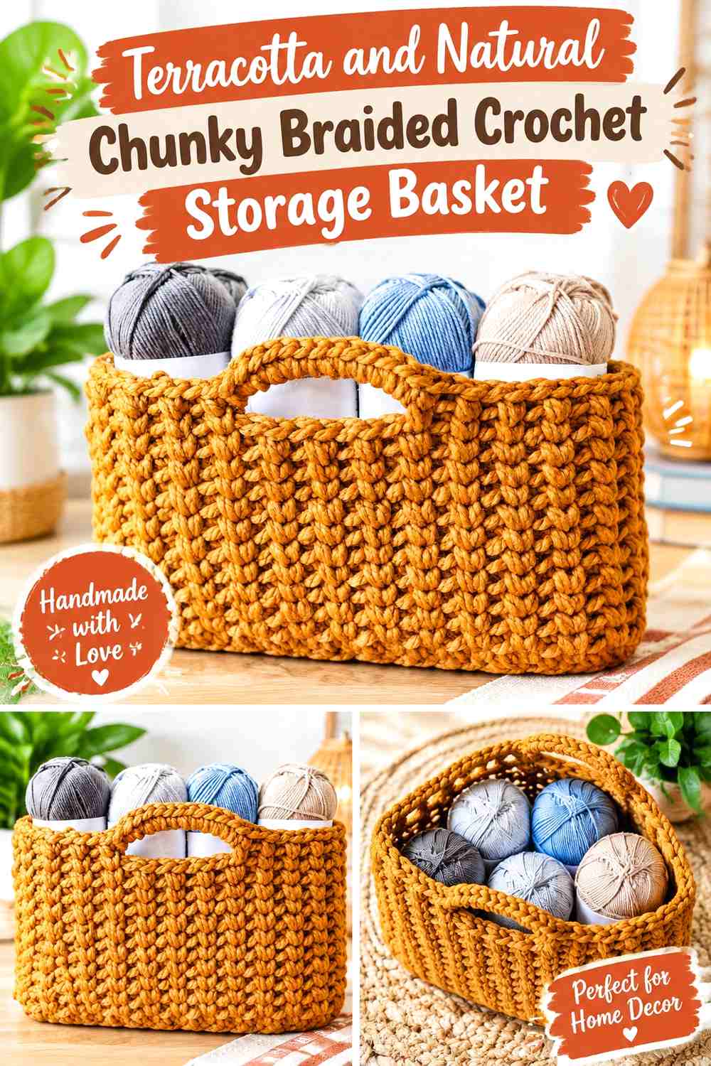
Terracotta gives this basket a warm earthy body, while an undyed-looking natural shade can prevent the color from becoming too dense. Use terracotta across most of the walls and natural around the top or handles. A natural-colored base is another option when you want the basket to look lighter from below.
The substantial form of a chunky basket lets terracotta occupy more area than it might on a small accessory without needing extra accent colors.
Keep Terracotta Broad Across the Chunky Crochet Basket
Terracotta is strongest when it appears as a continuous field instead of being chopped into narrow stripes. Broad coverage lets the basket retain a clean storage-oriented appearance while still bringing noticeable color into the room.
For visible braided texture, choose placement that leaves enough uninterrupted terracotta to show the surface clearly.
Use Natural Color to Break Up Terracotta at the Basket Rim
Natural can form the upper band, rim, or handles so the warm body has a clear visual stopping point. This is especially useful on taller baskets, where full terracotta coverage may otherwise feel visually dense.
If you add a braided rim, repeating natural there can emphasize the braid through value contrast without needing a third shade.
Creator Credit: TL Yarn Crafts
4. Olive Green and Oatmeal Chunky Braided Crochet Storage Basket

Olive creates an earthy storage basket with more color than a beige neutral but less intensity than a brighter green. Oatmeal provides the lighter contrast needed to reveal an upper rim, handles, or a selected wall section.
Let olive dominate if you want the basket to anchor a shelf or corner visually. Increase oatmeal if you prefer a lighter overall piece.
Let Olive Green Anchor the Crochet Basket Base and Walls
Using olive continuously from the base into most of the walls gives the basket a grounded appearance. It also avoids creating a hard color break exactly where the base becomes the side.
If the chunky surface includes prominent diagonal or chevron-like texture, a large olive section gives that texture enough visual room.
Add Oatmeal Above Olive Green to Lighten the Basket Opening
Oatmeal works particularly well in the upper portion because it draws a lighter boundary around the opening. A narrow olive finishing edge can then repeat the dominant shade and keep the oatmeal band tied to the rest of the basket.
Creator Credit: Ned & Mimi
5. Black and Warm White Chunky Braided Crochet Storage Basket
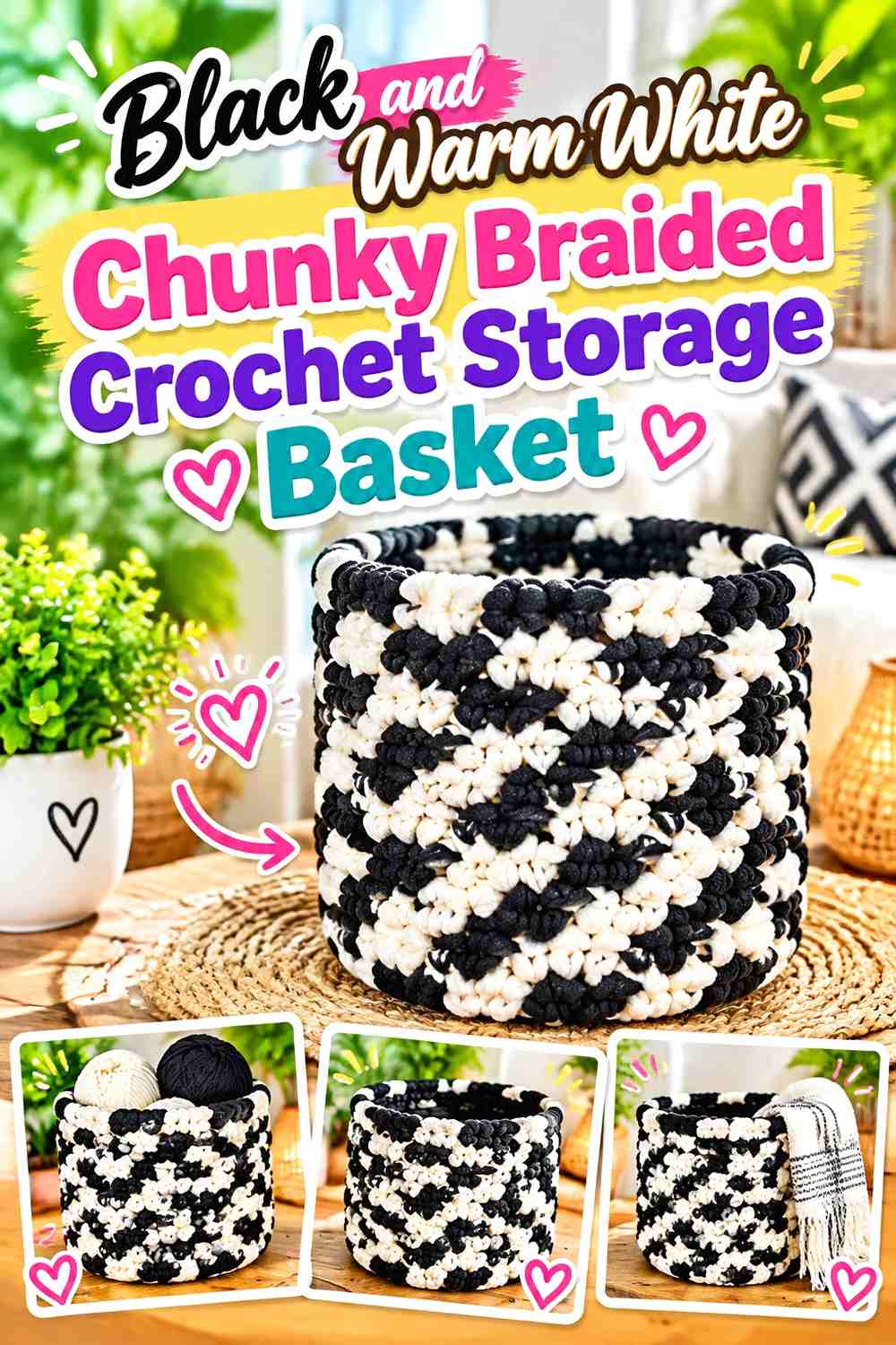
Black and warm white produce the highest-contrast scheme in this collection, so color proportion matters. Warm white should usually have more visual area if you want the chunky stitch definition to remain obvious. Black can define the lower section, handles, or an outer braided rim.
Avoid dividing the basket into many equally sized black-and-white stripes unless a highly graphic effect is intentional.
Keep Warm White Dominant on the Chunky Crochet Basket
Warm white allows shadows between bulky stitches to provide natural definition. This makes it useful for most of the side walls, particularly when the basket texture itself is part of the design.
A black lower band can create contrast without cutting through the entire body.
Restrict Black to Warm White Basket Edges and Handles
Black has enough visual force to work in relatively small amounts. A dark rim, handle, or base boundary can define the basket without turning it into a mostly black container.
If the black rim feels disconnected, repeat a small black section near the base.
Creator Credit: The Crochet Crowd
6. Rust, Mustard, and Cream Chunky Braided Crochet Storage Basket

Rust and mustard create a warm vintage combination, but cream is important because the two warm shades can sit closer together in value than expected. Let rust lead, use cream to create clear breaks, and keep mustard as the smaller accent.
A chunky basket can carry this three-color scheme effectively when the colors are organized into broad areas instead of many thin bands.
Make Rust the Main Color of the Crochet Storage Basket
Rust can cover the majority of the sides and still leave enough room for mustard to register as an accent. Give the dominant shade several continuous rows or a broad wall section rather than alternating it constantly.
Put Cream Between Rust and Mustard Basket Sections
Cream can stop rust and mustard from visually blending where the thick stitches cast deeper shadows. Use it between major color blocks, along the rim, or in the handles.
Mustard can then appear as a controlled stripe or finishing detail instead of competing with rust over equal surface area.
Creator Credit: MJ’s Off The Hook Designs
7. Dusty Blue and Stone Chunky Braided Crochet Storage Basket
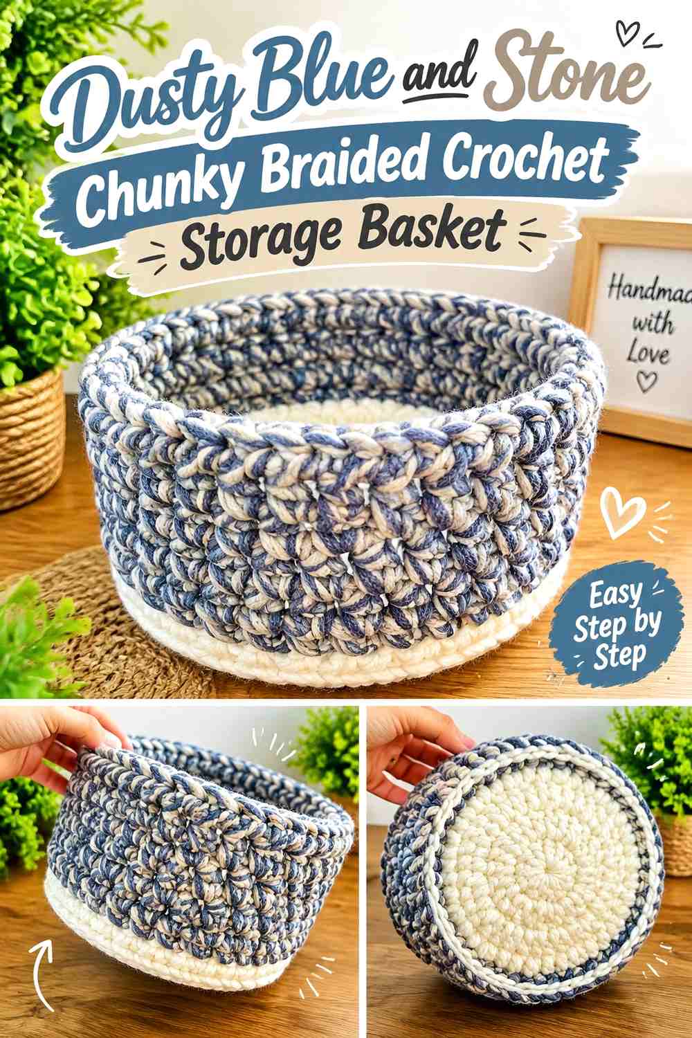
Dusty blue gives a storage basket noticeable color while still staying muted, and stone keeps the combination calm. Let dusty blue cover the walls, with stone at the base, rim, or handles. Because neither shade is extremely dark, check that they have enough light/dark separation before committing to small details.
The palette is strongest when its simplicity lets the chunky texture supply the visual interest.
Use Dusty Blue Across the Main Crochet Basket Surface
A wide dusty-blue field emphasizes the substantial basket shape without creating excessive color movement. It is particularly effective when the basket will sit beside warmer wooden or neutral-colored furnishings because the cooler body color remains noticeable.
Give Stone Enough Width Beside Dusty Blue to Stay Visible
If stone is used in a band, make it broad enough to read as intentional. A very narrow low-contrast stripe may disappear among chunky stitches.
For a subtler basket, use stone only at the rim and handles while allowing dusty blue to run continuously from base to top.
Creator Credit: KnitcroAddict
8. Sage Green and Cream Chunky Braided Crochet Storage Basket

Sage and cream create a light botanical palette that works particularly well when the basket itself has a simple silhouette. Sage can lead across the body, while cream defines the opening or selected bands.
Because both shades can be fairly light, avoid overcomplicating the color pattern. The braided or rope-like texture can provide enough variation on its own.
Let Sage Green Carry the Chunky Crochet Basket Walls
Sage is easier to read as the main basket color when it remains uninterrupted through most of the sides. This also keeps the basket from looking stripe-heavy when its stitches are already substantial.
Use Cream to Highlight the Sage Green Basket Rim
A cream rim creates a gentle transition from the green walls to the open top. If handles are part of the basket, repeating cream there gives the lighter shade a second visual anchor.
For a more defined version, choose cream that is clearly lighter than the sage instead of two shades with nearly identical value.
Creator Credit: naztazia
9. Burgundy, Blush, and Oatmeal Chunky Braided Crochet Storage Basket

Burgundy gives this basket a deep visual anchor, blush softens it, and oatmeal prevents the two warm colors from filling every part of the surface. Because burgundy can look especially heavy in thick fabric, keep it concentrated rather than giving all three colors equal coverage.
One effective hierarchy is a blush-led body, oatmeal upper section, and burgundy base or handles.
Keep Burgundy Low on the Blush Crochet Storage Basket
Placing burgundy near the lower portion gives the basket visual weight without surrounding the opening with a dark ring. Blush can take over through the middle walls so the storage basket remains lighter overall.
Let Oatmeal Separate Burgundy and Blush Braided Details
Use oatmeal wherever smaller burgundy and blush details meet, particularly if the colors appear close in value under indoor light. An oatmeal rim can also keep the top of the basket from repeating the darkest shade.
Creator Credit: Jayda InStitches
10. Mocha and Ivory Chunky Braided Crochet Storage Basket
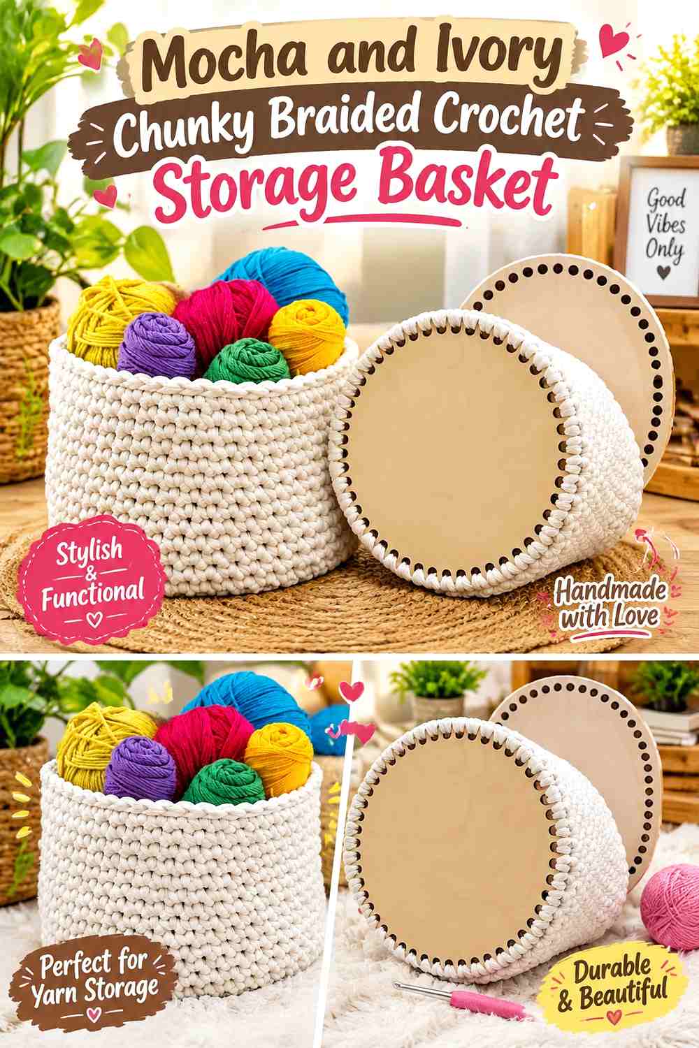
Mocha gives the basket a rich neutral body while ivory provides enough light contrast to highlight construction details. Use mocha broadly across the walls and let ivory define the upper edge, handles, or a narrow lower transition.
This palette is especially suitable when you want a braided surface to stand out through shadow rather than through several colors.
Give Mocha Plenty of Continuous Crochet Basket Texture
Avoid interrupting mocha too frequently. A broad section allows the thick stitch pattern to become the main design element and keeps the basket suitable for visible everyday storage.
Place Ivory Where the Mocha Basket Needs Clear Definition
Ivory can outline the opening, separate a handle from the body, or form a contrasting braid-like finish. Because the two shades are both neutral, the basket stays restrained even with a clear value change.
Creator Credit: Crochet with Tuula Maaria
11. Deep Teal and Camel Chunky Braided Crochet Storage Basket
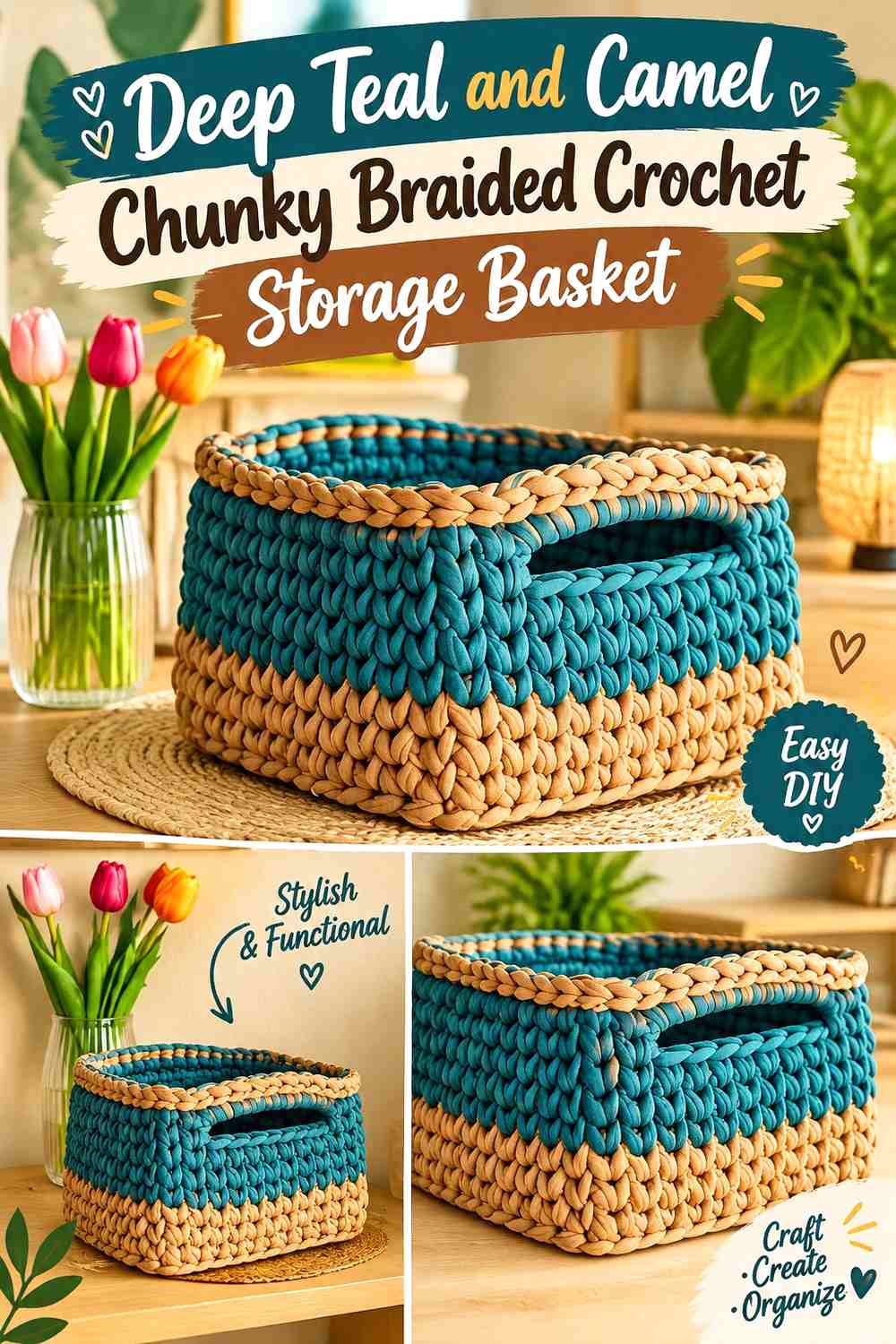
Deep teal creates a strong, cooler body color, while camel introduces warmth without the sharpness of white. This works well for a basket where you want color to be obvious but still grounded.
Let teal occupy the main walls and use camel near the rim, handles, or as a substantial upper band rather than as tiny scattered accents.
Use Deep Teal as the Main Chunky Crochet Basket Color
Deep teal can visually reduce fine stitch definition if the fabric is very textured, so give it broad uninterrupted areas where larger ridges can still be appreciated.
A camel upper section can keep the basket from feeling uniformly dark.
Repeat Camel on the Deep Teal Basket Handles
Using camel in both the upper band and handles keeps the warm color connected around the basket. If camel appears only once, it may look like an unrelated stripe.
For a more restrained version, keep the rim teal and reserve camel solely for substantial handles.
Creator Credit: Lallaulab
12. Mustard and Chocolate Brown Chunky Braided Crochet Storage Basket

Mustard and chocolate brown give a strongly retro, earthy direction. Mustard should usually cover more area because chocolate has greater visual weight and can quickly dominate thick basket walls.
Try a mustard body with chocolate at the base and rim, or reverse only the lower portion if you want a darker foundation.
Let Mustard Lead the Crochet Storage Basket Walls
Broad mustard sections make the color feel intentional rather than decorative. The chunky texture then adds natural shadow that keeps the single large color area from looking flat.
Use Chocolate Brown to Frame the Mustard Basket Opening
A chocolate rim can give mustard a crisp stopping point, especially when the basket sits against a pale wall or shelf.
Repeating a small amount of chocolate lower on the basket keeps the dark upper edge visually connected to the rest of the design.
Creator Credit: L’angolo di Criss
14. Dusty Rose and Taupe Chunky Braided Crochet Storage Basket
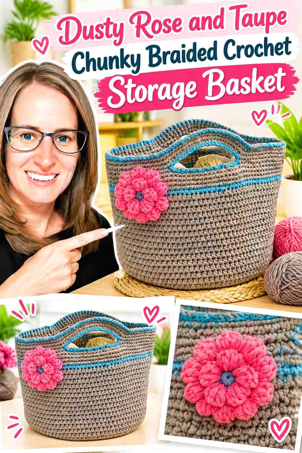
Dusty rose gives a storage basket color without pushing it into an overly bright direction, while taupe reduces the sweetness and keeps the piece grounded. Let dusty rose dominate if the basket is meant to serve as a decorative bedroom organizer; increase taupe when you want a more neutral result.
Let Dusty Rose Cover the Main Crochet Basket Body
Dusty rose works well over a large area because its muted character allows chunky stitch shadows to remain part of the design. Avoid adding several additional pinks unless a tonal basket is specifically intended.
Put Taupe on the Dusty Rose Basket Base or Handles
Taupe can visually anchor the basket when placed lower down, or it can define the handles without creating the stark contrast that black would.
Repeating taupe at the rim gives the supporting shade enough presence to look intentional.
Creator Credit: Crochet with Clare
15. Navy and Natural Chunky Braided Crochet Storage Basket
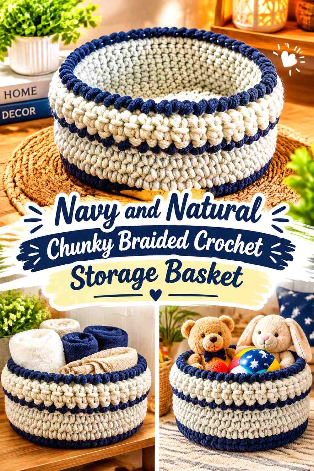
Navy gives this basket one of the darkest main surfaces in the collection, so a natural-colored supporting shade is important for showing the opening and larger structural details. Use navy across the lower and middle walls, then introduce natural near the top.
This palette can also emphasize a knit-look or tightly textured surface because the light rim provides a clear boundary around a dark body.
Keep Navy Away From Every Crochet Basket Detail
When the body, handles, and rim are all navy, the basket silhouette remains strong but smaller structural details can disappear. Keeping one major feature natural gives the eye a clearer reference point.
Use Natural Color to Define the Navy Basket Opening
A broad natural rim or upper section can visually lighten the basket. Repeating natural on the handles is useful when you want those handles to remain noticeable against the navy walls.
Creator Credit: Life and Yarn
16. Forest Green and Oatmeal Chunky Braided Crochet Storage Basket
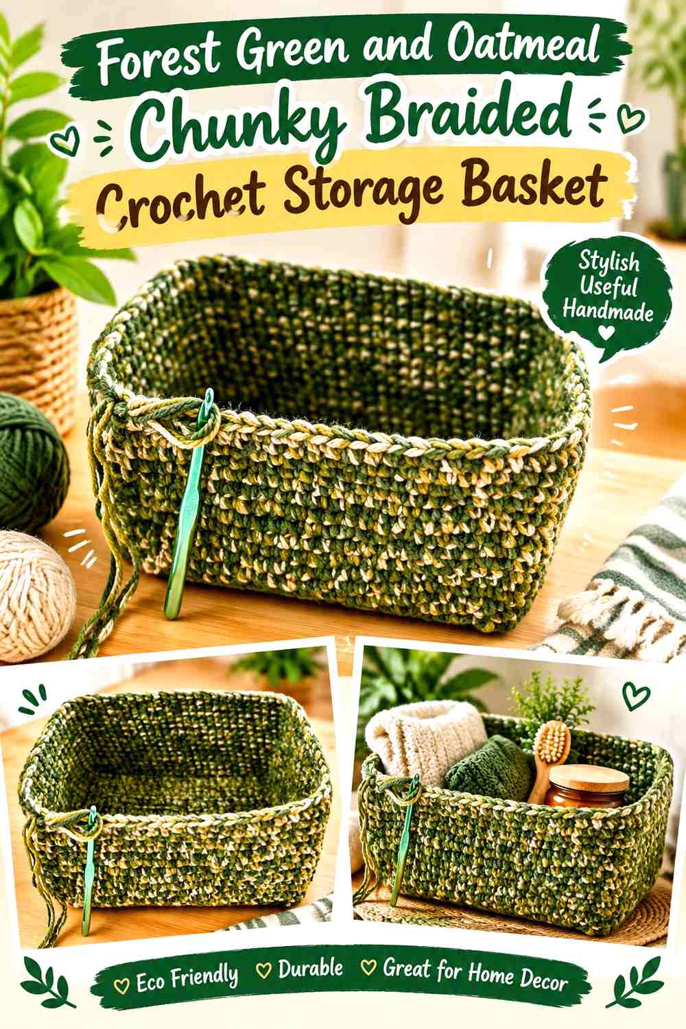
Forest green creates a deeper botanical basket than sage or olive, making oatmeal important for contrast. Rather than dividing the two colors equally, let forest green cover the main storage walls and use oatmeal where you want structural features to be easier to see.
For a rectangular basket, oatmeal can also emphasize the upper outline without turning every corner into a separate accent.
Let Forest Green Define the Main Crochet Storage Basket Shape
A large forest-green section gives the basket a clear color identity. Keep the middle walls relatively uninterrupted so the chunky fabric remains readable rather than disappearing beneath numerous stripes.
Use Oatmeal to Highlight Forest Green Basket Corners and Rim
Oatmeal at the upper edge creates a lighter frame around the opening. On a rectangular basket, continuing it around the complete rim can make the shape easier to read than placing isolated light patches at individual corners.
Creator Credit: Ophelia Talks Crochet
17. Soft Gray and Burnt Orange Chunky Braided Crochet Storage Basket

Soft gray creates a neutral background that lets burnt orange become a deliberate accent rather than another competing body color. This is one of the easiest palettes here to control because the roles can remain very clear: gray for the majority of the basket and orange for selected high-visibility details.
A burnt-orange braided rim is especially useful when you want the top edge to become the main decorative feature.
Keep Soft Gray Dominant Across the Crochet Basket Walls
Gray allows the heavy stitch texture to provide most of the surface variation. Use it from the base through most of the sides so the storage basket remains visually calm.
Repeat Burnt Orange From the Soft Gray Rim to the Handles
If burnt orange appears only at the rim, the accent may feel detached. Repeating it on handles or one controlled lower detail distributes the warm color without covering too much of the basket.
If the orange feels too strong, choose a more muted burnt orange rather than reducing it to tiny details that disappear into the chunky texture.
Creator Credit: Hopeful Turns
Which Chunky Braided Crochet Storage Basket Palette Should You Choose?
For a light, quiet basket, cream and camel, sage and cream, mocha and ivory, or oatmeal and charcoal are easy to coordinate because one neutral can carry most of the surface while the second defines the structure.
For more noticeable color, terracotta and natural, deep teal and camel, forest green and oatmeal, or dusty blue and stone provide a clear dominant shade without requiring a complicated multicolor repeat.
If you want a stronger vintage direction, mustard with chocolate brown, rust with mustard and cream, or soft gray with burnt orange brings warmer accents into the basket. Burgundy with blush and oatmeal gives the richest tonal variation, while black and warm white creates the sharpest graphic contrast.
Conclusion
Chunky braided storage baskets usually look more deliberate when the color plan follows the basket’s construction. Give one shade enough uninterrupted wall space to show the thick crochet texture, then decide whether the supporting color belongs at the base, rim, handles, or one substantial body section.
Choose oatmeal, cream, stone, ivory, or natural when you want the braid and chunky stitches to do most of the decorative work. Terracotta, olive, dusty blue, forest green, deep teal, and dusty rose give the basket a stronger color identity. Dark accents such as charcoal, chocolate, navy, and burgundy are most effective when they define selected parts rather than taking over every structural detail.
Use each creator’s tutorial for its intended basket construction, and treat the proposed colors and braided styling as separate adaptation choices.
Frequently Asked Questions
Which colors show chunky braided crochet basket texture most clearly?
Light and medium-value shades such as oatmeal, cream, camel, stone, dusty blue, sage, and natural tones generally make stitch shadows easier to notice. Very dark colors can still work, but larger texture tends to remain easier to see than fine surface detail.
Should a chunky crochet storage basket use one color or two?
Both approaches can work. One color puts more emphasis on the basket’s texture and shape. Two colors make it easier to define the base, upper rim, handles, or another structural area. If you use two shades, give each one enough area to remain recognizable in the thick fabric.
Where should the darkest color go on a braided storage basket?
A dark shade can work at the base when you want visual grounding, or at the rim and handles when you want stronger definition. Avoid assuming the darkest color always belongs at the top; on an already tall basket, a very dark continuous rim can make the opening look visually heavy.
How can I make a two-color chunky basket look less striped?
Use larger blocks of color. Keep most of the basket in the dominant shade and move the second color to the upper section, base, handles, or rim instead of alternating it frequently across the walls.
Should the braided rim match the crochet basket body?
It can, especially when you want texture rather than contrast to define the rim. A contrasting braided rim is useful when the opening needs more visual definition. If you choose contrast, consider repeating that shade in the handles or another small detail so the rim does not look isolated.
How do I substitute colors without changing the whole basket palette?
Preserve each color’s role. Replace a light neutral with another shade that remains noticeably lighter than the dominant body color, or replace a deep accent with another shade of similar visual weight. Maintaining the contrast relationship matters more than matching an exact color name.
How can I tell whether two yarn or cord colors have enough contrast?
Place them side by side in the lighting where the basket will normally be used and compare their light/dark values, not just their hues. A grayscale photo can help reveal whether apparently different colors are actually very similar in value. If they merge, use them in larger sections or introduce more value separation.