A miniature crochet coffee shop feels more convincing when the colors help separate drinks, pastries, counters, cups, and winter decorations. Cocoa brown can connect the whole café, but it should not cover every object. Cream cups, cranberry accents, forest-green trim, faded blue packaging, and caramel pastries give individual pieces enough contrast to remain recognizable at miniature scale.

Winter color does not have to mean bright red and green everywhere. Oatmeal, burgundy, pine, dusty blue, plum, sage, charcoal, and warm ivory can create a quieter cold-weather café. Strong seasonal colors work especially well on small details such as cup sleeves, pastry boxes, menu accents, awnings, or tiny decorations.
The tutorials below teach coffee cups, coffee pots, pastries, desserts, bread, cookies, and other café-sized crochet pieces that can support a miniature winter coffee-shop scene. The shop arrangements and proposed palettes are independent adaptations rather than claims that each creator made the exact finished café display described here.
Quick List
- Cranberry, Cream, and Cocoa Crochet Miniature Winter Coffee Mug Counter
- Caramel, Oatmeal, and Burgundy Crochet Miniature Croissant Bakery Tray
- Cocoa, Blush, and Cream Crochet Miniature Winter Donut Display
- Chocolate, Raspberry, and Ivory Crochet Miniature Cake-Slice Display Case
- Cranberry, Vanilla, and Forest Green Crochet Miniature Winter Cupcake Stand
- Espresso Brown, Camel, and Cream Crochet Miniature Coffee Bean Mascot
- Faded Blue, White, and Cocoa Crochet Miniature Milk-Carton Creamer Station
- Pine Green, Cream, and Coffee Brown Crochet Miniature Espresso Cup Shelf
- Dusty Rose, Ivory, and Cocoa Crochet Miniature Takeaway-Cup Counter
- Plum, Pistachio, and Cream Crochet Miniature Macaron Display
- Charcoal, Copper Brown, and Cream Crochet Miniature Coffee-Pot Station
- Cinnamon Brown, Ivory, and Sage Crochet Miniature Cinnamon-Roll Counter
- Burgundy, Chocolate, and Oatmeal Crochet Miniature Glazed Donut Tray
- Icy Blue, Cocoa, and Cream Crochet Miniature Winter Donut Box
- Vanilla, Chocolate, and Cranberry Crochet Miniature Dessert-Counter Sundae
- Mint, Cocoa, and Cream Crochet Miniature Snowy Café Ice-Cream Display
- Mustard, Cocoa, and Oatmeal Crochet Miniature Muffin Basket
- Golden Brown, Cream, and Forest Green Crochet Miniature Bread Shelf
- Gingerbread Brown, White, and Cranberry Crochet Miniature Cookie Counter
Use Cocoa Brown as a Connecting Color, Not the Whole Coffee Shop
Coffee brown naturally belongs in mugs, coffee pots, beans, chocolate desserts, and wooden-looking café details, but repeating it across every object can make a miniature scene difficult to read. Give brown a few consistent jobs and let lighter or cooler shades distinguish the individual displays.
Cream and oatmeal are particularly useful around brown. They can define cup rims, frosting, pastry liners, packaging, and shelf edges without introducing another strong color.
Add Winter Color to Small Café Details
Cranberry, forest green, pine, faded blue, dusty rose, and plum can create a winter atmosphere when they stay concentrated. A cranberry cup, green bakery liner, blue milk carton, or plum macaron tray can be enough to move a neutral coffee-shop scene into cold-weather styling.
This restrained approach also keeps the food recognizable. A croissant still benefits from caramel and golden brown even when the surrounding tray or napkin uses burgundy.
Keep Pastries Lighter Than Dark Coffee-Shop Shelving
Miniature pastries can disappear on dark brown, charcoal, or black counters. Cream plates, oatmeal trays, pale pastry papers, or faded-blue packaging create useful separation between the food and the display surface.
Before arranging a full café counter, place the darkest pastry beside the darkest shelf color. If the outline disappears, adjust the tray or background rather than adding unnecessary colors directly to the food.
1. Cranberry, Cream, and Cocoa Crochet Miniature Winter Coffee Mug Counter
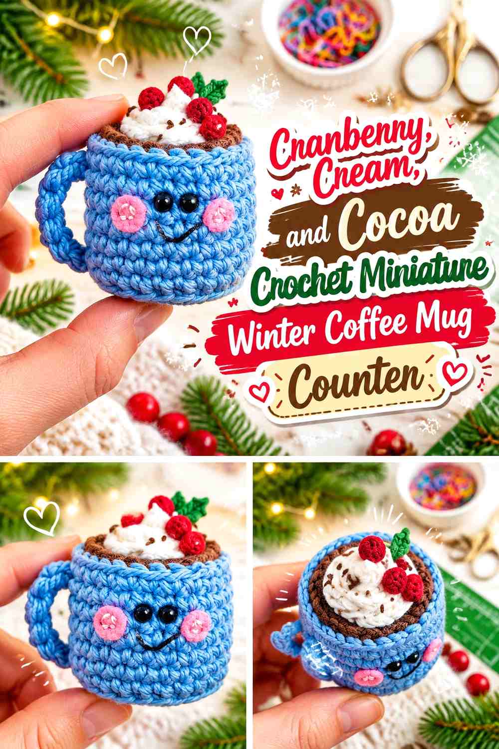
A tiny mug makes a natural centerpiece for a miniature winter café. Cranberry can cover the mug body, cocoa can define the coffee surface, and cream can appear around the rim or in nearby café details. The strong red accent gives the counter a seasonal focal point without requiring every object in the shop to be red.
Surround the mug with quieter oatmeal or brown counter colors so its silhouette remains easy to see.
Cranberry Should Lead the Crochet Winter Coffee Mug
Keep cranberry across most of the cup rather than dividing the mug into several narrow winter stripes. A solid color gives the handle and cup shape more visual clarity.
Cream can be repeated nearby on a napkin-like detail or counter edge if the red needs additional separation.
Cocoa Needs Cream Contrast Around the Cranberry Coffee Mug
Dark coffee against a dark-red cup can become visually dense from above. A cream rim or pale surrounding detail helps distinguish the drink from the mug body.
Keep cocoa confined mainly to the coffee surface so the cup remains cranberry-led.
Creator Credit: The Pudgy Rabbit
2. Caramel, Oatmeal, and Burgundy Crochet Miniature Croissant Bakery Tray
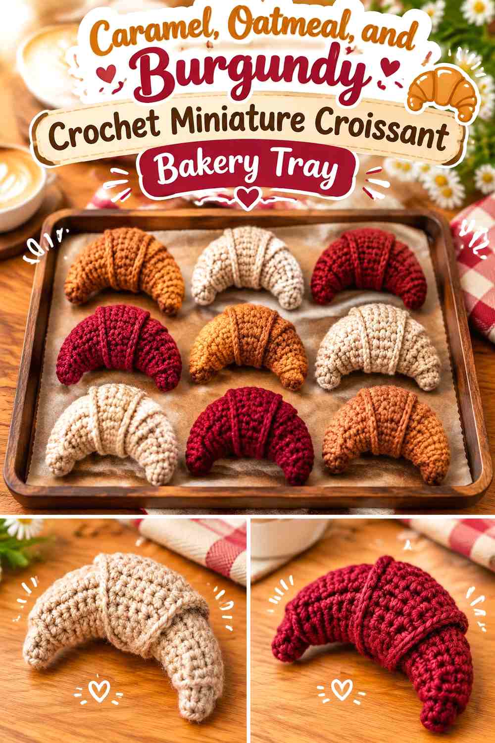
Caramel should carry the croissant itself, while oatmeal can form the tray or cloth beneath it and burgundy can provide one winter café accent. This keeps the pastry looking warm and baked while still connecting it to a richer seasonal palette.
Several croissants can be displayed together, but leave oatmeal visible between them so their curved shapes do not merge.
Caramel Should Remain the Main Crochet Croissant Color
Use caramel continuously across the pastry so the crescent silhouette remains easy to follow.
A darker brown detail can be used sparingly if the form needs definition, but burgundy belongs more naturally around the display than on the pastry.
Burgundy Should Frame Caramel and Oatmeal at the Bakery Counter
Use burgundy on a tray edge, tiny café cloth, or nearby decorative detail.
Keeping the wine-red shade off most of the croissant preserves the pastry’s warm neutral appearance.
Creator Credit: World Of Amigurumi
3. Cocoa, Blush, and Cream Crochet Miniature Winter Donut Display

A cocoa donut with blush frosting creates a softer winter bakery color scheme than bright holiday red. Cream can appear as tiny decorative accents or on the display tray.
Because frosting already adds a second strong surface to the donut, keep the supporting counter palette simple.
Blush Should Stay Clearly Visible Above the Cocoa Crochet Donut
Let blush cover the top frosting area while enough cocoa remains visible around the sides to preserve the pastry shape.
If the pink is very pale, a cream display underneath may reduce contrast; choose oatmeal or darker cocoa nearby instead.
Cream Should Accent Blush Without Covering the Cocoa Donut
Use cream only in small decorative areas or the surrounding café setup.
Too much cream on the donut itself can weaken the contrast between pastry and frosting.
Creator Credit: Club Crochet
4. Chocolate, Raspberry, and Ivory Crochet Miniature Cake-Slice Display Case

Chocolate can form the cake body, raspberry can identify the frosting or filling, and ivory can provide lighter icing or display contrast. The three colors make the layers visible without requiring an unrealistic number of tiny stripes.
Place the cake slice against a pale interior if the display case itself is dark.
Chocolate Should Give the Crochet Cake Slice a Stable Base
Use chocolate across the broadest cake sections so the triangular slice remains visually connected.
Raspberry works better as a defined filling or frosting area than as scattered spots throughout the cake.
Ivory Should Separate Raspberry From Chocolate in the Cake Display
A small ivory section can keep two saturated dark colors from visually merging.
Repeat ivory on the plate or display liner if the slice needs a clearer outer silhouette.
Creator Credit: Citybrightknits
5. Cranberry, Vanilla, and Forest Green Crochet Miniature Winter Cupcake Stand

A cranberry cupcake topping paired with a vanilla cake or liner creates the main focal point, while forest green can stay on the stand, tray edge, or surrounding winter décor. This creates classic seasonal color without turning the cupcake itself into a red-and-green object.
Let vanilla provide enough lightness between the red topping and darker café background.
Cranberry Should Dominate the Crochet Cupcake Topping
Use cranberry in one broad decorative area so the miniature topping reads clearly.
Forest green should remain off most of the cupcake surface unless the goal is intentionally striped holiday food.
Forest Green Should Support Cranberry and Vanilla Around the Cupcake Stand
Move green to the display structure or a small nearby accent.
This separation lets the dessert stay appetizing in color while the café environment supplies the winter mood.
Creator Credit: Magic Uncinetto
6. Espresso Brown, Camel, and Cream Crochet Miniature Coffee Bean Mascot

A tiny coffee-bean figure can become a playful shop mascot on a counter or shelf. Espresso brown should lead the bean body, camel can provide a lighter coffee-toned accent, and cream can appear on a scarf, sign detail, or small winter accessory.
Because the mascot is already dark, place it against a light shelf or wall.
Espresso Brown Should Keep the Crochet Coffee Bean Recognizable
Use the deepest brown over most of the bean body rather than dividing it into several coffee shades.
The characteristic center detail can use camel if more definition is needed.
Cream Should Separate Camel Details From the Espresso Brown Mascot
Use cream on one small accessory or surrounding display element.
A pale accent provides enough contrast to keep a miniature dark-brown figure from disappearing into a cocoa-colored counter.
Creator Credit: Tekson Crochet
7. Faded Blue, White, and Cocoa Crochet Miniature Milk-Carton Creamer Station
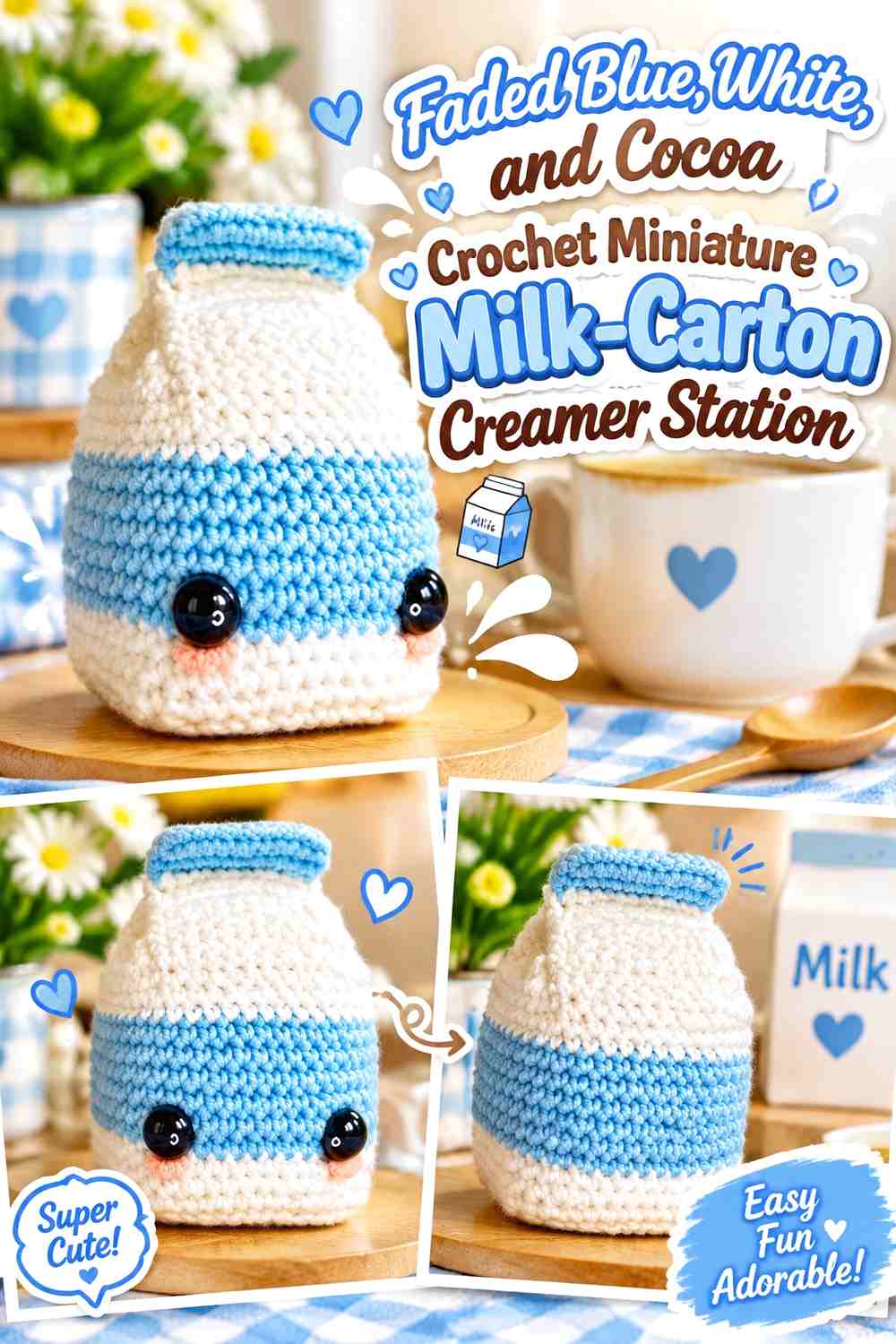
A faded-blue milk carton adds cool winter color to a counter dominated by brown drinks and pastries. White should cover the lightest packaging sections, while cocoa can appear nearby in the coffee-service area rather than taking over the carton itself.
Place the carton beside darker mugs where its pale blue shape can act as a visual break.
Faded Blue Should Lead the Crochet Milk Carton
Keep blue across most of the packaging so the object has one recognizable main color.
White can highlight the upper fold or selected front area without dividing the carton into many small blocks.
Cocoa Should Stay Outside the Faded Blue Creamer Carton
Use cocoa in the surrounding coffee counter or drink rather than throughout the milk packaging.
That keeps the cool carton visually distinct from the warmer café palette around it.
Creator Credit: Kress Krochet
8. Pine Green, Cream, and Coffee Brown Crochet Miniature Espresso Cup Shelf

Pine green gives a tiny coffee cup a stronger winter identity than ordinary neutral ceramic colors. Cream can define the rim or shelf backing, while coffee brown naturally belongs at the top surface.
Arrange several cups on an oatmeal or cream shelf if you want pine green to repeat through the café without dominating the larger scene.
Pine Green Should Carry the Crochet Espresso Cup Body
Keep green continuous around the cup so the tiny handle remains recognizable.
Cream is more effective as a narrow supporting detail than as several stripes across such a small object.
Cream Should Frame Pine Green and Coffee Brown on the Cup Shelf
A pale shelf backing helps both the dark-green cup and brown drink stand apart.
If the shop wall is already cream, use a camel or faded-red shelf edge instead.
Creator Credit: Crochnitting
9. Dusty Rose, Ivory, and Cocoa Crochet Miniature Takeaway-Cup Counter

Dusty rose creates a softer takeaway cup for a whimsical winter café, while ivory can form a sleeve or lid-like accent and cocoa can represent the drink. This palette works well near darker pastry displays because the pink cup introduces a lighter focal object.
Keep the cup mostly rose so it does not resemble a striped container.
Dusty Rose Should Remain the Main Crochet Takeaway Cup Color
Give the cup one broad dusty-rose field and use ivory in a smaller structural area.
The muted pink works especially well when nearby pastries are caramel or chocolate.
Ivory Should Separate Dusty Rose From Cocoa at the Coffee Counter
A light rim or nearby detail can keep the dark drink distinct from the pink body.
Avoid adding another bright winter shade directly to the cup; the surrounding shop can supply that color.
Creator Credit: DidyToys
10. Plum, Pistachio, and Cream Crochet Miniature Macaron Display

A miniature macaron display can use plum for one shell color, pistachio for another macaron or supporting accent, and cream for the fillings. The palette feels festive and bakery-like without relying on standard red and green.
Arrange the darker plum macarons beside cream or pale trays rather than directly against charcoal shelving.
Plum Should Stay Rich Against the Cream Crochet Macaron Filling
Keep the cream layer clearly visible between the darker shells.
That light horizontal separation is important at miniature scale, where the top and bottom pieces can otherwise merge.
Pistachio Should Balance Plum Without Overcrowding the Macaron Shelf
Use pistachio on alternate macarons or one defined display section rather than mixing green and purple into every individual piece.
This creates variety while keeping each pastry color easy to identify.
Creator Credit: Angie’s Corner
11. Charcoal, Copper Brown, and Cream Crochet Miniature Coffee-Pot Station
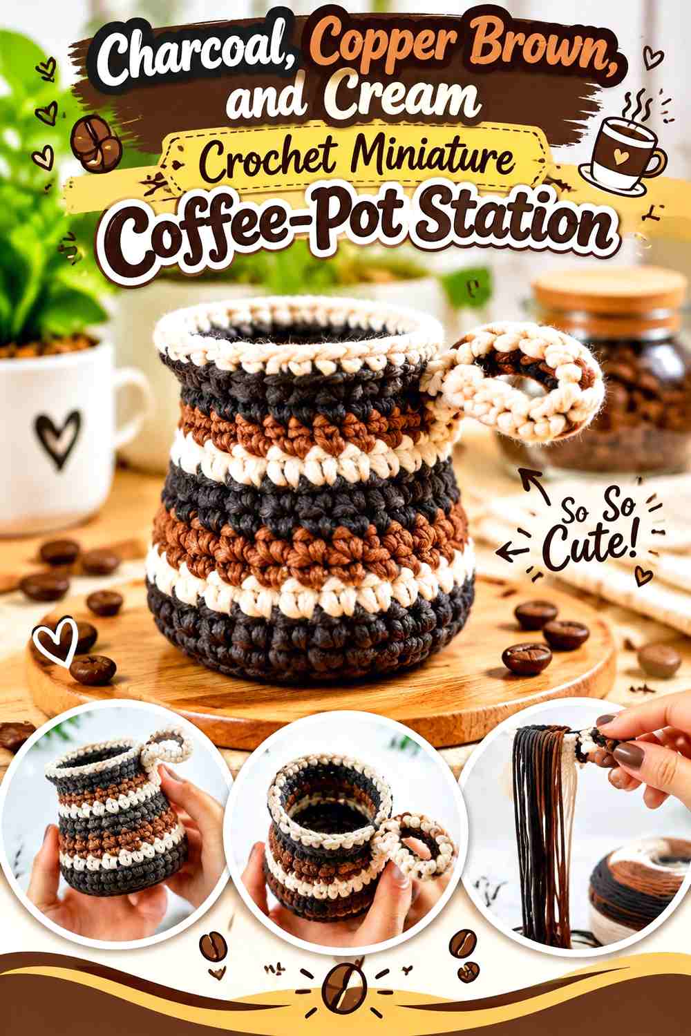
A crochet coffee pot can anchor the service area of the miniature café. Charcoal gives the vessel a deep neutral body, copper brown warms the surrounding coffee palette, and cream can define a cloth, cup, or countertop detail.
Because charcoal is visually heavy, keep the counter beneath it lighter than the pot.
Charcoal Should Define the Crochet Coffee Pot Silhouette
Use charcoal across most of the pot so the handle and spout belong to one clear object.
Scattering copper through every section can make the small vessel harder to read.
Cream Should Lift Charcoal and Copper Brown at the Coffee Station
Place cream underneath or beside the pot where it can expose the dark outer edge.
Copper brown can then connect the station visually to pastries and coffee elsewhere in the shop.
Creator Credit: Özges Art
12. Cinnamon Brown, Ivory, and Sage Crochet Miniature Cinnamon-Roll Counter
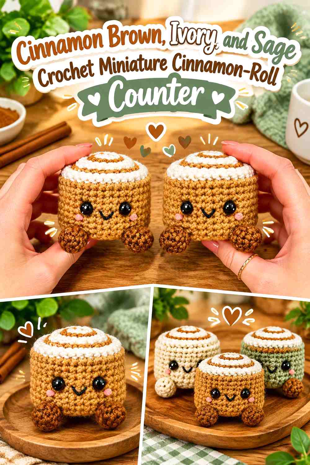
Cinnamon brown naturally leads this pastry, while ivory can represent a light topping and sage can appear on the tray, café cloth, or winter packaging. The green should support the display rather than become part of the roll’s spiral.
Use a lighter counter if the pastry itself contains several brown values.
Cinnamon Brown Should Keep the Crochet Roll Spiral Visible
Let brown form the broad pastry surface and use the lighter topping only where it adds definition.
Too much ivory can hide the characteristic spiral and make the pastry look like a generic frosted shape.
Sage Should Stay Around the Cinnamon Brown and Ivory Display
Use sage on the tray liner or neighboring decorative detail.
This gives the coffee shop a winter botanical accent without changing the warm pastry palette.
Creator Credit: Korê Studio | Crochet
13. Burgundy, Chocolate, and Oatmeal Crochet Miniature Glazed Donut Tray

This darker donut display uses chocolate for the pastry, burgundy for the glaze, and oatmeal for the serving surface. The deeper colors suit a moody winter coffee shop where bright pastel frosting would feel out of place.
Oatmeal is essential because burgundy and chocolate can be close in value.
Burgundy Needs Oatmeal Contrast Around the Chocolate Crochet Donut
Keep the serving tray or liner pale enough to reveal the full round pastry edge.
If burgundy sits directly against dark shelving, its glaze detail may disappear.
Chocolate Should Stay Visible Beneath the Burgundy Donut Glaze
Allow enough brown around the sides to distinguish pastry from topping.
Avoid covering the entire donut in burgundy if you want the two-color construction to remain clear.
Creator Credit: OlenCrochet
14. Icy Blue, Cocoa, and Cream Crochet Miniature Winter Donut Box

Icy blue frosting creates a deliberately wintry donut without needing snowflake motifs. Cocoa can form the pastry and cream can define small topping details or the box interior.
A pale box with one or two blue-topped donuts can become a strong counter accent among warmer brown pastries.
Icy Blue Should Stay Clearly Separate From the Cocoa Crochet Donut
Keep the frosting visibly cool and pale enough to contrast with the brown base.
If blue and cocoa are both dark, the donut loses the snowy winter effect.
Cream Should Support Icy Blue Inside the Donut Box
Use cream for the liner, small topping details, or surrounding packaging.
Do not cover most of the frosting in cream; icy blue should remain the defining winter color.
Creator Credit: puffy hook
15. Vanilla, Chocolate, and Cranberry Crochet Miniature Dessert-Counter Sundae

A small ice-cream or dessert piece can become a winter café special when vanilla leads the scoop, chocolate supplies sauce-like contrast, and cranberry appears as one tiny topping or counter accent.
The palette works because the warm dark and light dessert colors stay familiar while the small red detail introduces seasonal color.
Vanilla Should Remain the Largest Crochet Dessert Color
Keep vanilla through most of the scoop so chocolate remains a topping rather than the dominant field.
This lighter area is especially useful on a dark café counter.
Cranberry Should Stay Smaller Than Chocolate on the Vanilla Dessert
Use cranberry as one small accent rather than repeating it throughout the entire dessert.
Its limited size keeps the café styling wintery without making the miniature look primarily red.
Creator Credit: The Turtle Trunk
16. Mint, Cocoa, and Cream Crochet Miniature Snowy Café Ice-Cream Display
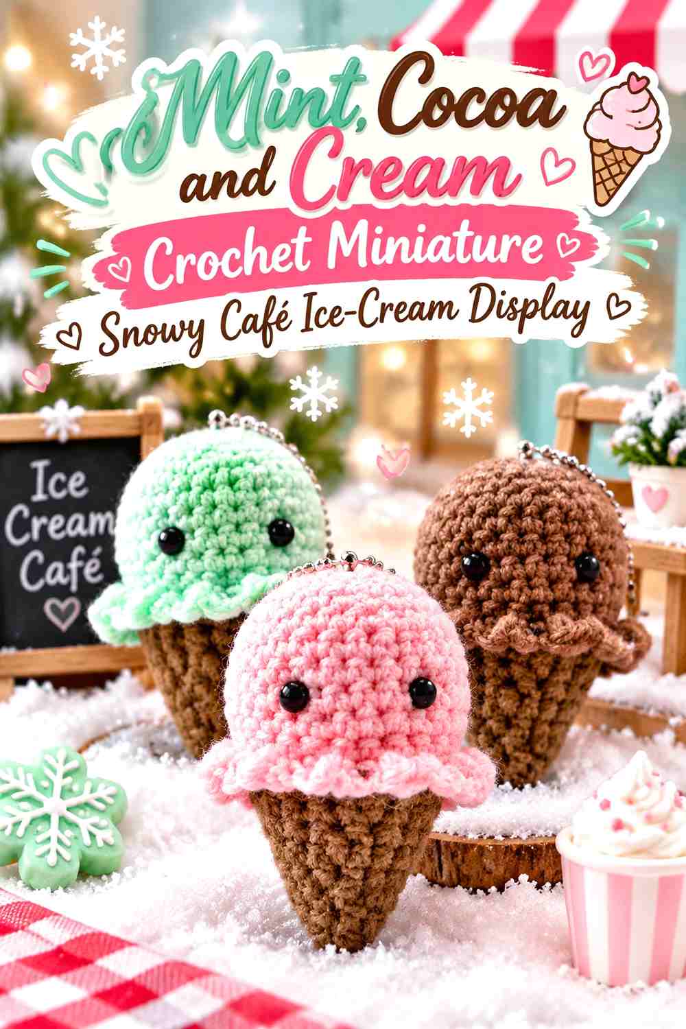
Mint can create a whimsical cool-toned dessert, cocoa can anchor the cone or chocolate detail, and cream can provide a snowy winter supporting shade. This display works well in a playful café where the color story is intentionally less realistic.
Keep the mint area broad and simple so it remains readable beside other miniature pastries.
Mint Should Lead the Crochet Winter Ice-Cream Display
Use mint through the main scoop and avoid breaking it with several additional pastel colors.
Cream can appear in a small topping or nearby display detail instead.
Cocoa Should Ground Mint and Cream at the Café Counter
A brown cone or base gives the pale winter colors enough contrast.
Repeat cocoa somewhere else on the café shelf to connect this playful dessert with the broader coffee-shop palette.
Creator Credit: Jae Jasmine
17. Mustard, Cocoa, and Oatmeal Crochet Miniature Muffin Basket

Mustard can create a warm cake color, cocoa can provide the wrapper or small darker detail, and oatmeal can form the basket or cloth beneath the muffins. The earthy palette gives the bakery section a retro winter warmth.
Keep the muffins grouped but leave pale space between them so each top remains visible.
Mustard Should Stay Warmer and Lighter Than the Cocoa Crochet Muffin Base
This value difference helps the top and wrapper read as separate sections.
If mustard and brown are very similar, use oatmeal immediately beneath the display for additional contrast.
Oatmeal Should Keep Mustard and Cocoa Muffins Separate in the Basket
A pale basket or liner prevents several warm-colored pastries from merging into one cluster.
Avoid introducing another strong red or green here; other café sections can carry the seasonal accents.
Creator Credit: Amigu World
18. Golden Brown, Cream, and Forest Green Crochet Miniature Bread Shelf
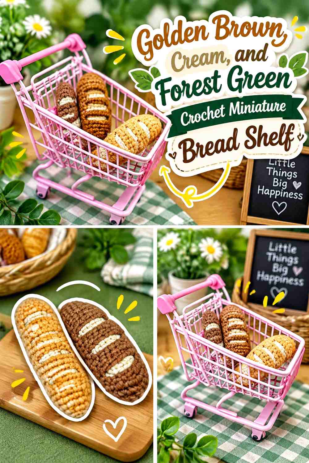
A tiny loaf adds a useful bakery staple beside sweeter pastries. Golden brown should carry the bread, cream can lighten the shelf liner or bag-like display detail, and forest green can appear on the shelf trim or winter café decoration.
Keeping the bread neutral helps balance nearby macarons, donuts, and cupcakes.
Golden Brown Should Define the Crochet Mini Bread Loaf
Use one warm brown across most of the loaf so its simple shape remains easy to see.
A slightly lighter cream detail can highlight the display without turning the bread itself multicolored.
Forest Green Should Stay Around the Golden Brown Bread Shelf
Use forest green on surrounding shop trim rather than across the loaf.
That separation introduces winter color while preserving the bakery-neutral appearance of the bread.
Creator Credit: HappyYarny
19. Gingerbread Brown, White, and Cranberry Crochet Miniature Cookie Counter
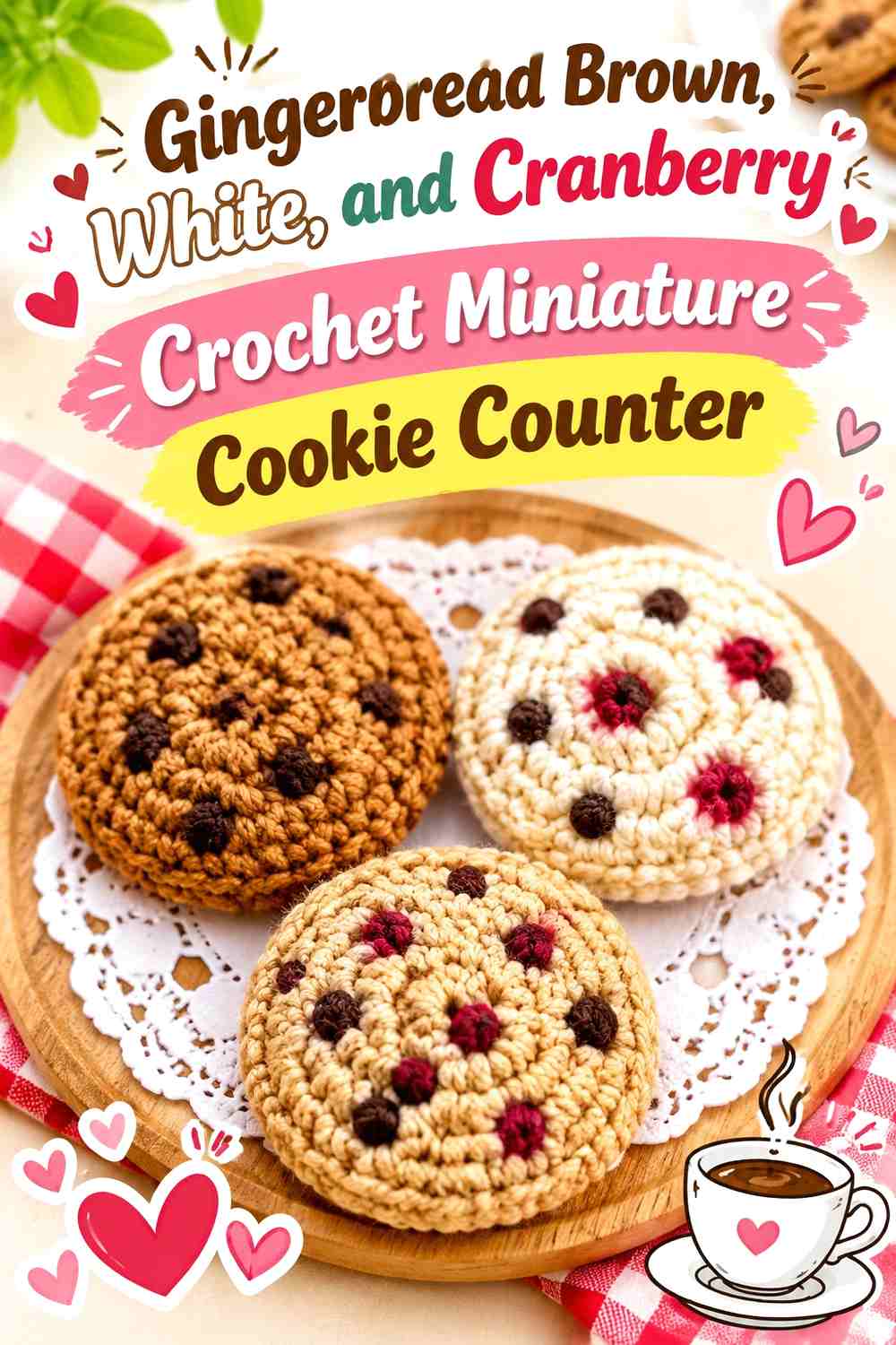
Gingerbread brown makes a strong final bakery color, while white can form cream or icing-like details and cranberry can add one small winter accent. Arrange several cookies on an oatmeal or pale counter so their brown edges remain distinct.
The cookies can visually connect the pastry case with the coffee service because they repeat both warm brown and light cream from elsewhere in the shop.
Gingerbread Brown Should Remain Visible Around the White Crochet Cookie Detail
Keep a clear brown perimeter so the miniature still reads as a cookie rather than a white disk.
The lighter center or filling should remain contained and structurally distinct.
Cranberry Should Stay Small Beside Gingerbread Brown and White
Use cranberry on the tray, nearby packaging, or one tiny decorative detail rather than coloring half of every cookie red.
That restrained accent gives the final counter a winter connection without overwhelming the bakery colors.
Creator Credit: Kanittha’s Crafts
Which Miniature Winter Coffee Shop Palette Should You Choose?
For a traditional cozy café, build around cocoa, caramel, cream, oatmeal, forest green, and cranberry. These colors work naturally across coffee, baked goods, counters, and winter accents without making every object look identical.
For a softer shop, dusty rose, faded blue, blush, mint, pistachio, and ivory can lighten the display. Keep cocoa or charcoal present somewhere in the scene so the pale pieces have enough visual grounding.
A moodier miniature café can use burgundy, plum, chocolate, pine, charcoal, and antique cream. In that palette, pale trays and cup details become especially important because several dark pastries and fixtures can otherwise merge on the same shelf.
Conclusion
A crochet miniature winter coffee shop works best when the colors connect the individual pieces without forcing them all into one palette. Coffee brown can repeat through mugs, beans, pots, and chocolate pastries, while cream ties together cup edges, bakery liners, and dessert details. Cranberry, pine, faded blue, plum, or dusty rose can then give separate café stations their own identity.
Arrange the finished pieces before deciding on the counter and shelf colors. A chocolate cake, cocoa donut, coffee pot, and dark mug may all look clear separately but blend together when placed on one brown surface. Pale trays or strategically placed cool colors can restore separation without changing the projects themselves.
Use the credited tutorials for the coffee, drink, pastry, and food constructions they actually demonstrate, then combine those elements independently into your own tiny winter coffee-shop scene.
Frequently Asked Questions
What colors work well for a crochet miniature winter coffee shop?
Cocoa, caramel, cream, oatmeal, cranberry, burgundy, forest green, pine, faded blue, dusty rose, plum, charcoal, and muted gold-brown all work well. Use warm neutrals for coffee and pastries, then introduce winter colors through cups, trays, packaging, and shop details.
How can I keep a miniature crochet coffee shop from looking too brown?
Repeat brown only where it makes sense, such as coffee, chocolate, bread, and selected fixtures. Use cream shelves, faded-blue packaging, green cups, cranberry accents, or pale bakery liners to break up neighboring brown objects.
Which crochet pieces should go on a miniature bakery counter?
Croissants, donuts, cake slices, cupcakes, cinnamon rolls, muffins, macarons, cookies, and bread can all create a varied display. Separate similar-colored foods with pale trays or contrasting packaging.
How can I make a crochet coffee shop look wintry without covering it in Christmas colors?
Use muted cranberry, pine, dusty blue, oatmeal, cream, plum, sage, and charcoal. One seasonal shade per display area is often enough to create a winter mood without turning the café into holiday-only décor.
Should all the miniature coffee cups match?
No. Repeating one shared shade can create coordination while allowing individual cups to differ. For example, cream rims could connect cranberry, pine-green, and dusty-rose cups.
How can I coordinate a crochet pastry case with the coffee counter?
Repeat one or two neutral colors across both areas. Cocoa or cream can appear in the drink station and bakery case, while stronger colors such as plum, green, or cranberry stay concentrated in individual displays.
Do all the linked tutorials make complete miniature winter coffee shops?
No. The tutorials teach individual café-related pieces such as mugs, coffee pots, beans, pastries, desserts, milk cartons, bread, and cookies. The miniature shop arrangements and winter palettes in this article are independent ways to combine those crochet constructions into a larger café display.