A crochet journal cover can take on a distinctly vintage character when the border is treated as part of the design rather than an afterthought. Antique ivory picots can soften a burgundy cover, cream scallops can give sage a lighter frame, and a dark plum edge can make lavender feel richer without covering the entire journal in strong color.
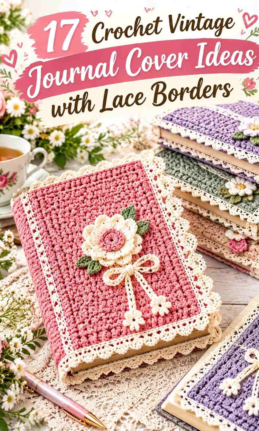
The cover body and lace border need different visual jobs. The body usually benefits from a quieter continuous color because it surrounds the whole journal, while the lace can carry lighter contrast, darker definition, or a small accent color. The spine, flap pockets, button closure, ties, and bookmark can then repeat one of those colors so the cover feels connected from front to back.
Some linked tutorials teach complete book or journal covers, while others teach lace borders, picot edging, scallops, or doily-style crochet that can support the decorative border concept. Use each creator’s tutorial for its original construction, then adapt the palette and edging placement to your own journal.
Quick List
- Antique Ivory and Dusty Rose Crochet Vintage Journal Cover With Scalloped Lace
- Burgundy and Cream Crochet Vintage Journal Cover With Picot Lace
- Sage Green and Oatmeal Crochet Vintage Granny Journal Cover With Lace Edging
- Faded Blue and Ivory Crochet Vintage Buttoned Journal Cover With Lace Edge
- Plum and Antique Silver Crochet Vintage Journal Cover With Braided Border
- Terracotta and Ecru Crochet Vintage Journal Cover With Lace Border
- Charcoal and Antique Gold Crochet Gothic Vintage Journal Cover With Lace Edge
- Dusty Rose and Sage Crochet Vintage Journal Cover With Scalloped Border
- Navy and Cream Crochet Vintage Journal Cover With Picot Border
- Mustard, Olive, and Oatmeal Crochet Retro Vintage Journal Cover With Decorative Edge
- Cocoa Brown and Cream Crochet Vintage Journal Cover With Framed Border
- Lavender and Plum Crochet Vintage Journal Cover With Picot Lace
- Deep Teal and Cream Crochet Vintage Journal Cover With Doily-Lace Border
- Sepia Brown and Antique White Crochet Vintage Journal Cover With Lace Trim
- Forest Green, Camel, and Cream Crochet Vintage Heirloom Journal Cover
- Cranberry and Warm Ivory Crochet Vintage Journal Cover With Ribbon-Tie Lace Border
- Black, Burgundy, and Cream Crochet Mourning-Inspired Vintage Journal Cover With Lace Border
Choose the Journal Body Color Before the Lace Border
The journal body takes up far more visual area than the trim, so decide which shade should dominate before choosing the decorative edge. Sage, burgundy, faded blue, cocoa, teal, or another medium-to-dark color can support a much lighter cream or ivory border without needing extra outlining.
A pale body needs different treatment. Antique ivory beside cream may not produce enough separation for fine lace to remain visible. In that case, move dusty rose, plum, cranberry, navy, or another deeper shade into the final lace round.
Use Lace Where It Will Not Interfere With the Journal
The outer front and back edges are natural places for scallops and picots because they can frame the journal without crowding the spine. If the cover uses tuck-in flaps, keep bulky lace away from the inner sections that need to slide around the journal covers.
Closures also deserve clear space. A button loop or ribbon tie should remain easy to use without catching on a highly textured floral border. Decorative lace can become more elaborate along the top, bottom, or opening edge while the fastening area stays comparatively simple.
1. Antique Ivory and Dusty Rose Crochet Vintage Journal Cover With Scalloped Lace

Antique ivory creates a light journal body that feels traditional without using stark white. Dusty rose can define the scalloped border, closure, or narrow spine detail so the pale cover does not visually disappear against cream pages or a light-colored journal.
Keep dusty rose concentrated near the outer edge. That placement gives the journal a visible frame while leaving the larger ivory surface calm enough for the lace itself to remain noticeable.
Antique Ivory Should Carry Most of the Crochet Journal Cover
Use antique ivory across the front, back, and major flap sections so the vintage neutral remains the dominant color.
If the journal underneath is also pale, let dusty rose reach the extreme outer edge rather than adding another neutral just for contrast.
Dusty Rose Can Define the Antique Ivory Scalloped Border
A dusty-rose scallop creates a clear finishing line without the sharpness of black or dark brown.
Repeat the rose once in a button loop, narrow bookmark, or small closure detail so the border does not feel disconnected from the rest of the cover.
Creator Credit: ElyseCrochets 💌
2. Burgundy and Cream Crochet Vintage Journal Cover With Picot Lace
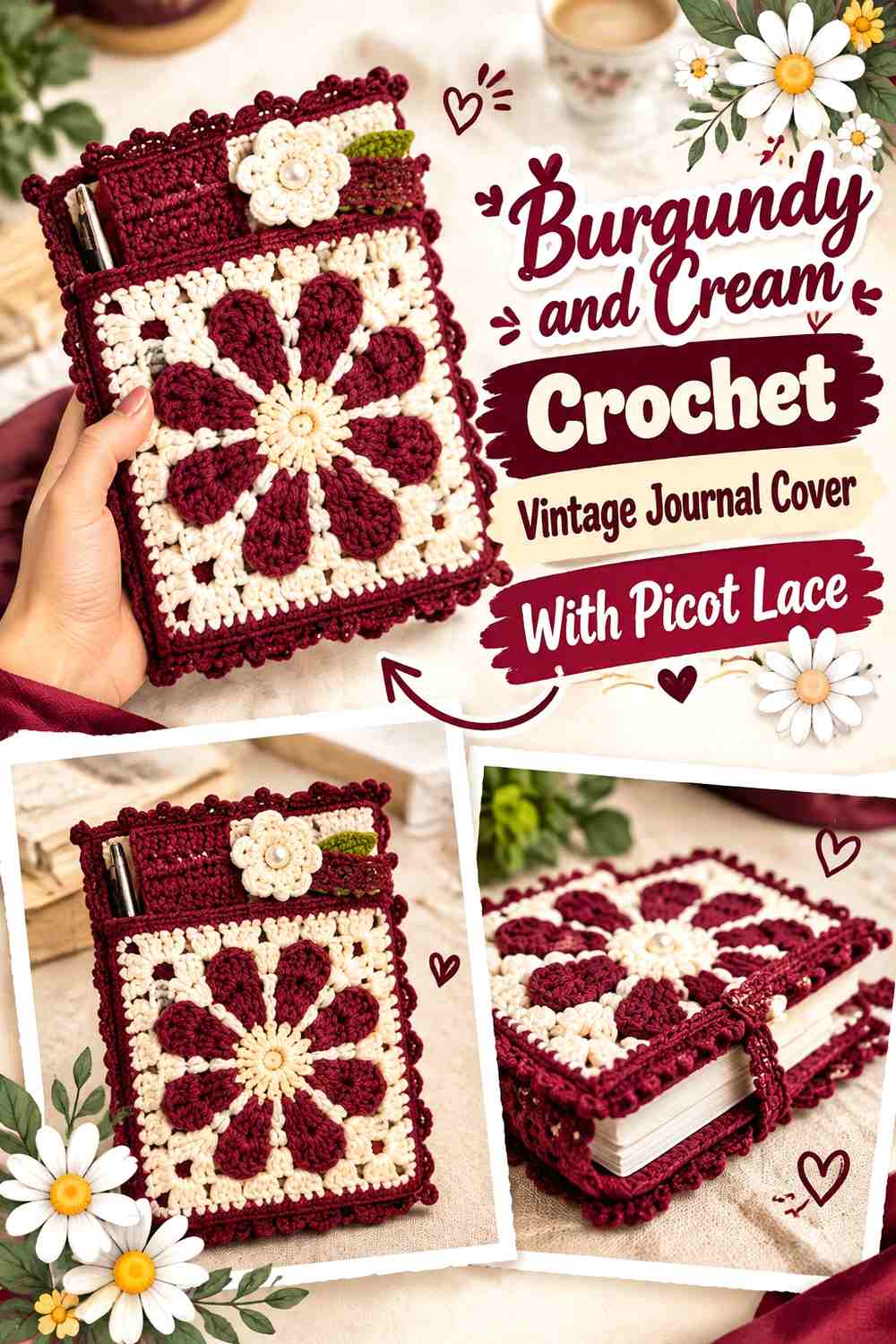
Burgundy gives the journal a rich body color while cream creates a delicate picot edge around the opening or front perimeter. The strong value contrast means the cream border can remain narrow and still be easy to see.
Keep the cream away from large uninterrupted body sections if you want burgundy to remain visually dominant. A cream spine, broad stripe, and cream border together may shift the entire cover toward a two-tone rather than burgundy-led design.
Burgundy Should Remain the Main Crochet Journal Cover Color
Use burgundy through the front and back so the cover has one continuous dark field.
A solid body also gives tiny cream picots enough surrounding space to remain distinct instead of competing with several other light details.
Cream Picots Should Stay Small Against the Burgundy Journal Cover
Let cream appear primarily at the decorative edge, where each point can create a lighter outline around the dark body.
If a closure needs another cream detail, keep it narrow so the lace border retains its visual importance.
Creator Credit: Brianna Nicole
3. Sage Green and Oatmeal Crochet Vintage Granny Journal Cover With Lace Edging
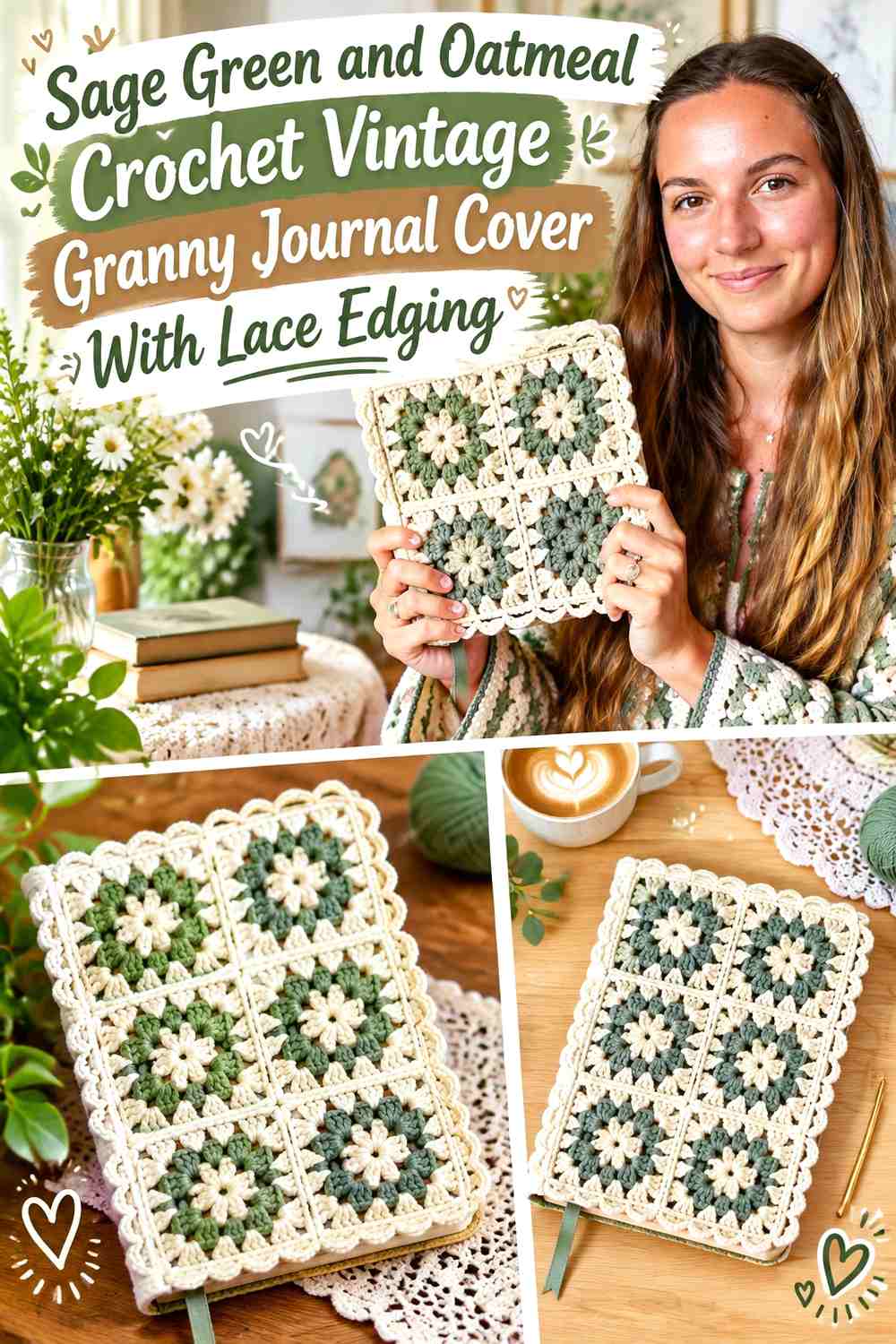
Sage green can create a muted granny-square journal body, while oatmeal provides a consistent border around motifs and the finished cover. If the squares use additional scraps, repeating sage and oatmeal in every motif will keep the cover from becoming visually random.
Oatmeal is especially useful around the journal opening because it separates the square grid from the decorative lace edge.
Sage Green Should Repeat Across the Crochet Journal Squares
Use sage in the same structural position on several squares—centers, outer rounds, or connecting sections—so the front and back look related.
Avoid placing every stronger accent on the front only. A little repeated sage across the spine or back keeps the wraparound cover visually continuous.
Oatmeal Should Unite Sage Green With the Journal Lace Border
Use oatmeal around the square edges and again in the final lace treatment. This makes the decorative border feel like part of the original motif plan rather than an extra trim added later.
If the journal itself is oatmeal or beige, finish the extreme edge in sage for clearer definition.
Creator Credit: Bailey Elise
4. Faded Blue and Ivory Crochet Vintage Buttoned Journal Cover With Lace Edge

Faded blue gives a journal cover a softer vintage appearance than navy, while ivory can highlight the button loop, edge, and lace treatment. Because the main blue is muted, the light border does not need to be especially wide.
A decorative button can sit on the blue field where it remains easy to find rather than being surrounded by busy lace.
Faded Blue Should Stay Continuous Around the Crochet Journal Body
Use faded blue through most of the sleeve or wrap so the cover has a clear dominant field.
If the blue changes repeatedly around the button area, the closure can become harder to distinguish from the surrounding stitch texture.
Ivory Should Frame the Faded Blue Journal Opening
Place ivory along the edge where the cover opens and closes. The contrast makes both the lace and the journal opening easier to identify.
A small ivory button loop can repeat the same color without widening the entire border.
Creator Credit: Ryann Woods
5. Plum and Antique Silver Crochet Vintage Journal Cover With Braided Border

Plum creates a dark romantic journal body, while antique-silver gray can soften the edge and make a braided or cord-like border visible. The two colors work best when plum remains uninterrupted across the cover and silver-gray is restricted to structural finishing areas.
This is useful for a journal with a simple surface because the border itself provides most of the decoration.
Plum Should Give the Crochet Journal Cover Its Darkest Field
Use plum across the broad front and back rather than mixing gray through every row.
The uninterrupted color allows the border texture to become easier to read around the perimeter.
Antique Silver Should Outline Plum Without Taking Over the Journal
Keep silver-gray at the edge, fastening loop, or bookmark rather than turning half of the cover gray.
If plum and gray have similar values, choose a slightly lighter antique silver so the border does not disappear.
Creator Credit: Strong Earth Creations
6. Terracotta and Ecru Crochet Vintage Journal Cover With Lace Border

Terracotta creates a warm journal body that works especially well with softer ecru rather than bright white. Let ecru form the open lace border and use terracotta again at the final edge when the trim needs stronger definition.
This warm palette suits a journal where you want the crochet to feel aged and earthy rather than delicate or pastel.
Terracotta Should Stay Visible Beside the Ecru Crochet Lace
Leave a clear terracotta margin behind or immediately inside the border so the light lace has a darker field to work against.
If the ecru extends too far into the main cover, the warm body color can lose its dominant role.
Ecru Should Keep the Terracotta Journal Border Soft
Use ecru for open scallops, loops, or other lace details rather than a dense solid band.
That lighter openwork gives the perimeter detail without visually making the journal larger and heavier.
Creator Credit: Sirin’s Crochet
7. Charcoal and Antique Gold Crochet Gothic Vintage Journal Cover With Lace Edge
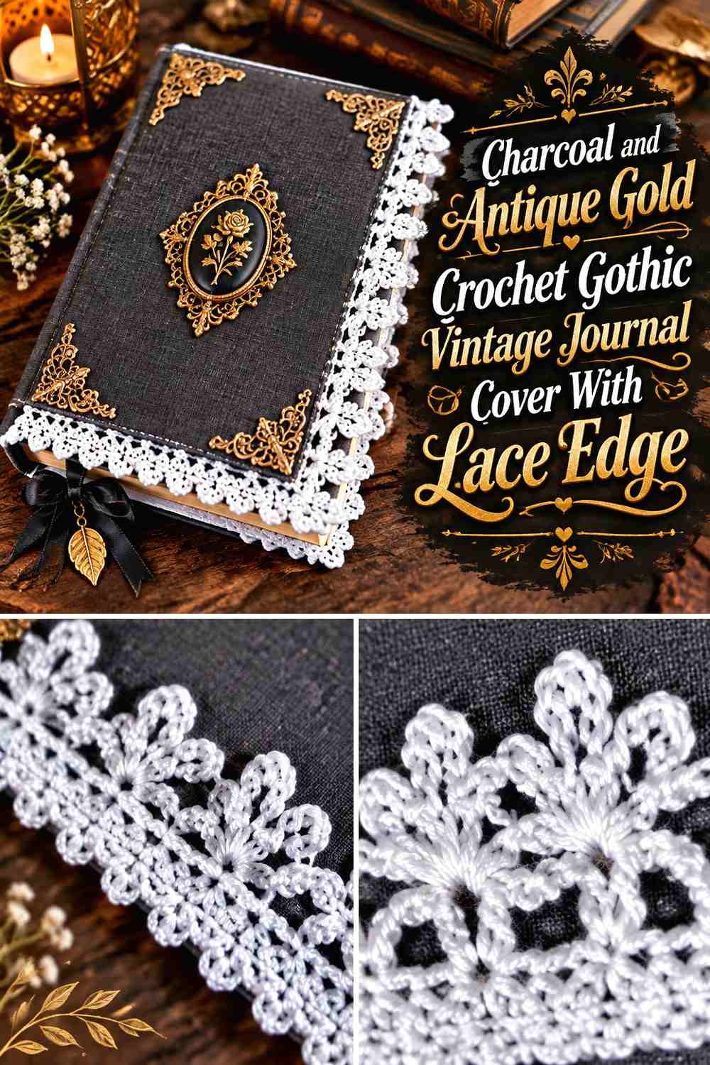
Charcoal creates the darkest journal in the collection, while antique gold can provide a restrained border that suggests an aged decorative frame. Keep the gold narrow so the journal remains Gothic and textile-focused rather than becoming visually dominated by the accent.
A dark body also gives you room for one cream or gray closure detail if the fastening would otherwise disappear.
Charcoal Should Carry the Main Crochet Journal Surface
Use charcoal through the broad panels and spine so the journal reads as one continuous dark object.
Open lace at the edge will show more clearly when the background beneath it is simpler.
Antique Gold Should Stay Narrow Around the Charcoal Journal Border
Use muted gold in the final lace row, tiny picots, or one decorative fastening detail.
If the yarn is particularly bright, reduce the amount of gold rather than adding it to the spine and flaps as well.
Creator Credit: Tiara Lace Crochet
8. Dusty Rose and Sage Crochet Vintage Journal Cover With Scalloped Border
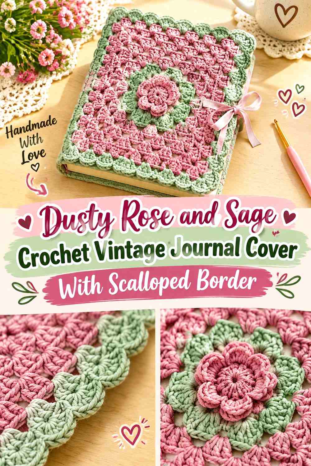
Dusty rose can lead the body while sage forms a contrasting scalloped border. Because both colors are muted, the cover stays soft even though the hue contrast is noticeable.
If the two shades are close in lightness, place a very small cream transition row beneath the sage rather than changing the entire two-color plan.
Dusty Rose Should Remain Broader Than Sage on the Crochet Journal
Use rose across the journal panels and keep sage at the outer edge. This preserves the romantic pink direction while allowing green to act as a framing color.
A broad sage spine may divide the cover too strongly if the border already carries plenty of green.
Sage Scallops Should Clearly Frame the Dusty Rose Journal
Use sage where the decorative curves can be seen from the front rather than hiding the color inside the flap.
On a sage-green desk or fabric background, a cream final tip can keep the scallops visible without changing their main color.
Creator Credit: Bella Coco
9. Navy and Cream Crochet Vintage Journal Cover With Picot Border

Navy provides a strong traditional-looking body, while cream picots add a delicate edge without weakening the darker palette. This works particularly well when the journal cover itself is plain and the lace is meant to supply the vintage detail.
Keep the cream border consistent around the visible perimeter rather than changing width from one edge to another.
Navy Should Give the Crochet Journal Cover a Clean Background
Use navy across the body and spine so the tiny lace points have a stable dark field behind them.
If the journal has a closure flap, keeping that flap navy can prevent the front from becoming overly cream-heavy.
Cream Picots Should Stay Crisp Against the Navy Journal
A small cream picot can provide enough contrast without a broad light border beneath it.
Repeat cream in a bookmark or button loop only if the top and bottom border otherwise feel isolated from the journal’s functional details.
Creator Credit: Yarndrasil
10. Mustard, Olive, and Oatmeal Crochet Retro Vintage Journal Cover With Decorative Edge
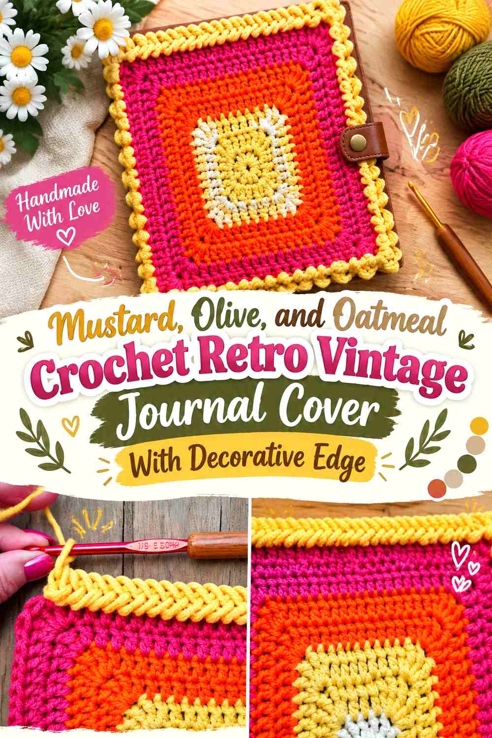
Mustard and olive create a retro vintage direction, while oatmeal prevents the journal from becoming one dense block of earthy color. Let olive form most of the cover, mustard provide selected bands or motifs, and oatmeal define the border.
The lace should remain simpler than the color blocking. Too much openwork combined with several strong body stripes can make the relatively small journal surface busy.
Olive Should Lead the Mustard Crochet Journal Cover
Give olive the broadest uninterrupted areas so mustard remains an accent rather than an equal competitor.
One mustard front panel detail or narrow stripe can provide enough warmth without repeating it on every edge.
Oatmeal Should Separate Mustard From Olive at the Journal Border
Use oatmeal immediately before or within the decorative edge. The lighter neutral keeps mustard and olive distinct when they are similar in value.
A small oatmeal bookmark can repeat the neutral inside the journal without changing the outer palette.
Creator Credit: naztazia
11. Cocoa Brown and Cream Crochet Vintage Journal Cover With Framed Border
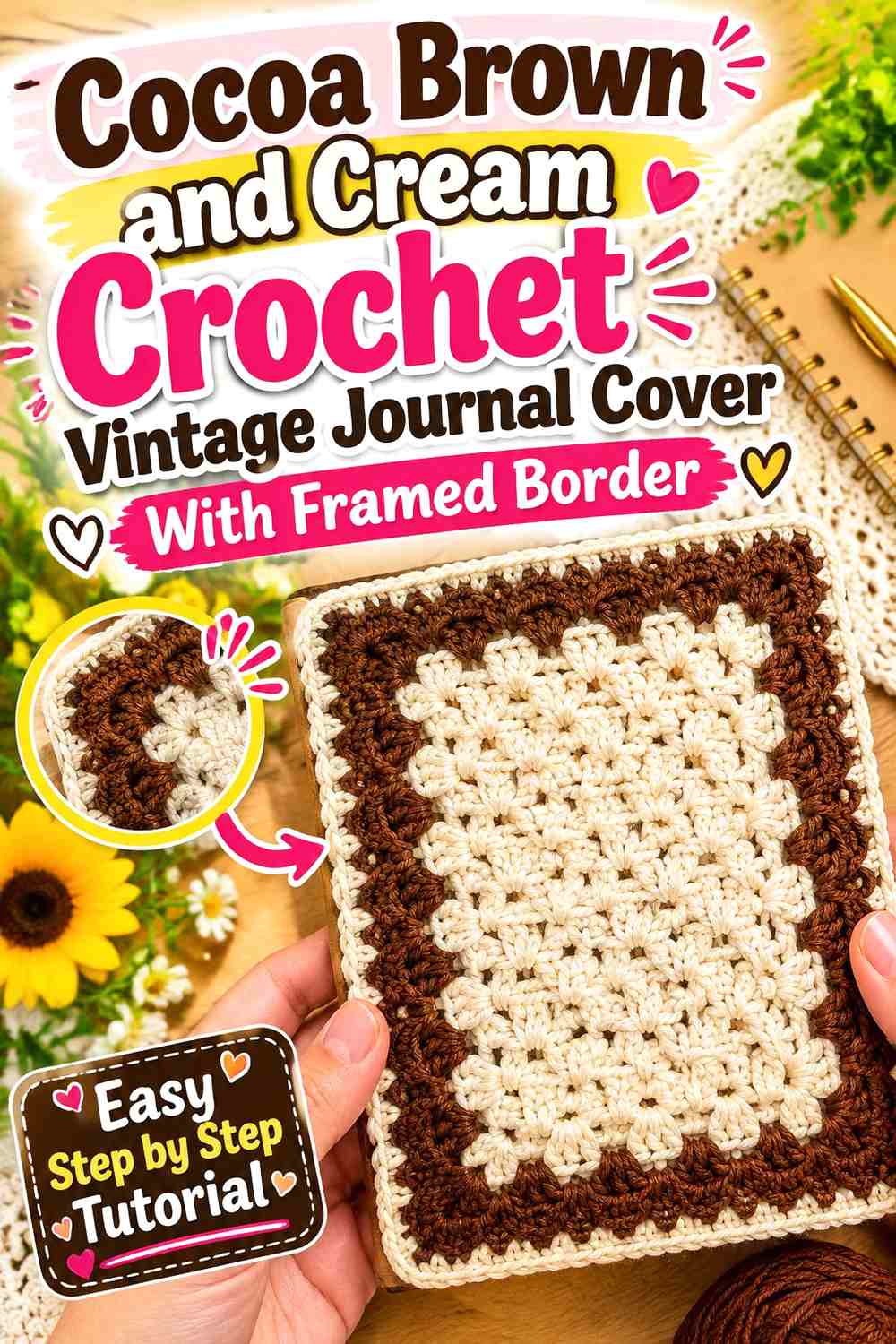
Cocoa brown gives a journal cover a leather-inspired color direction while remaining clearly crocheted. Cream can create a picture-frame-like border around the front and back without requiring floral embellishment.
This palette benefits from keeping the cream border relatively straight before adding any decorative corner or edge treatment.
Cocoa Brown Should Remain Visible Inside the Cream Crochet Frame
Leave a broad brown center so the border reads as a frame rather than becoming most of the cover.
If you add a front pocket or label panel, keep it cocoa or a closely related brown so it does not compete with the outer cream line.
Cream Should Create a Consistent Border Around Cocoa Brown
Keep the light edge similar in visual width around the visible front. Irregular cream areas can make the journal look unintentionally off-center.
At the spine, reduce the decorative treatment if necessary so the cover can still bend naturally around the book.
Creator Credit: The Crochet Crowd
12. Lavender and Plum Crochet Vintage Journal Cover With Picot Lace

Lavender creates a lighter journal body, while plum gives the lace border enough depth to remain visible. This reverses the common dark-body/light-border formula and works particularly well when you want a romantic vintage palette without cream dominating the edge.
A small ivory detail can be introduced at the closure only if lavender and plum need more value separation.
Lavender Should Stay Broad Behind the Plum Crochet Lace
Use lavender throughout most of the cover so the dark edge reads clearly around it.
Avoid placing wide plum bands through the body unless you want the journal to become strongly striped rather than lace-focused.
Plum Picots Should Define the Lavender Journal Opening
Concentrate plum along the opening edge where the tiny points can remain visible against the lighter body.
Repeating plum on a narrow button loop can connect the closure without spreading the dark shade across the spine.
Creator Credit: Hectanooga1
13. Deep Teal and Cream Crochet Vintage Journal Cover With Doily-Lace Border

Deep teal gives delicate doily-inspired lace a strong visual foundation. Cream can form a small medallion or decorative edge while the journal body remains teal.
Instead of placing complex lace around every side, concentrate the most ornate treatment along the front opening or one corner. That keeps the journal easier to handle and gives the detailed crochet somewhere to stand out.
Deep Teal Should Ground the Cream Crochet Journal Lace
Use teal across the cover panels so cream openwork remains clearly visible.
If a lace motif sits over the front rather than at the perimeter, leave enough teal exposed around it for the shape to remain distinct.
Cream Should Stay Airy Against the Deep Teal Journal
Choose open lace placement rather than a large solid cream panel. The visible teal showing through the lace becomes part of the decoration.
A cream-heavy spine can reduce that effect, so keep the more intricate work toward the front.
Creator Credit: NotikaLand crochet and knitting
14. Sepia Brown and Antique White Crochet Vintage Journal Cover With Lace Trim

Sepia brown and antique white create one of the most aged-looking palettes in the collection. Use sepia across the main journal body and antique white for the lace border, corner detail, or small medallion.
The contrast is softer than black and white but still strong enough for small openwork details to remain readable.
Sepia Brown Should Carry the Crochet Journal’s Vintage Base
Keep sepia continuous across the largest panels so the cover retains its warm neutral identity.
If you add a label-like front motif, use antique white sparingly around it rather than building several pale panels.
Antique White Should Lighten the Sepia Journal Border
Use antique white through the most delicate edge so each loop or scallop has enough contrast to be visible.
On a pale wooden desk, let a narrow sepia final edge remain outside the white lace so the cover perimeter does not disappear.
Creator Credit: Olga Poltava
15. Forest Green, Camel, and Cream Crochet Vintage Heirloom Journal Cover
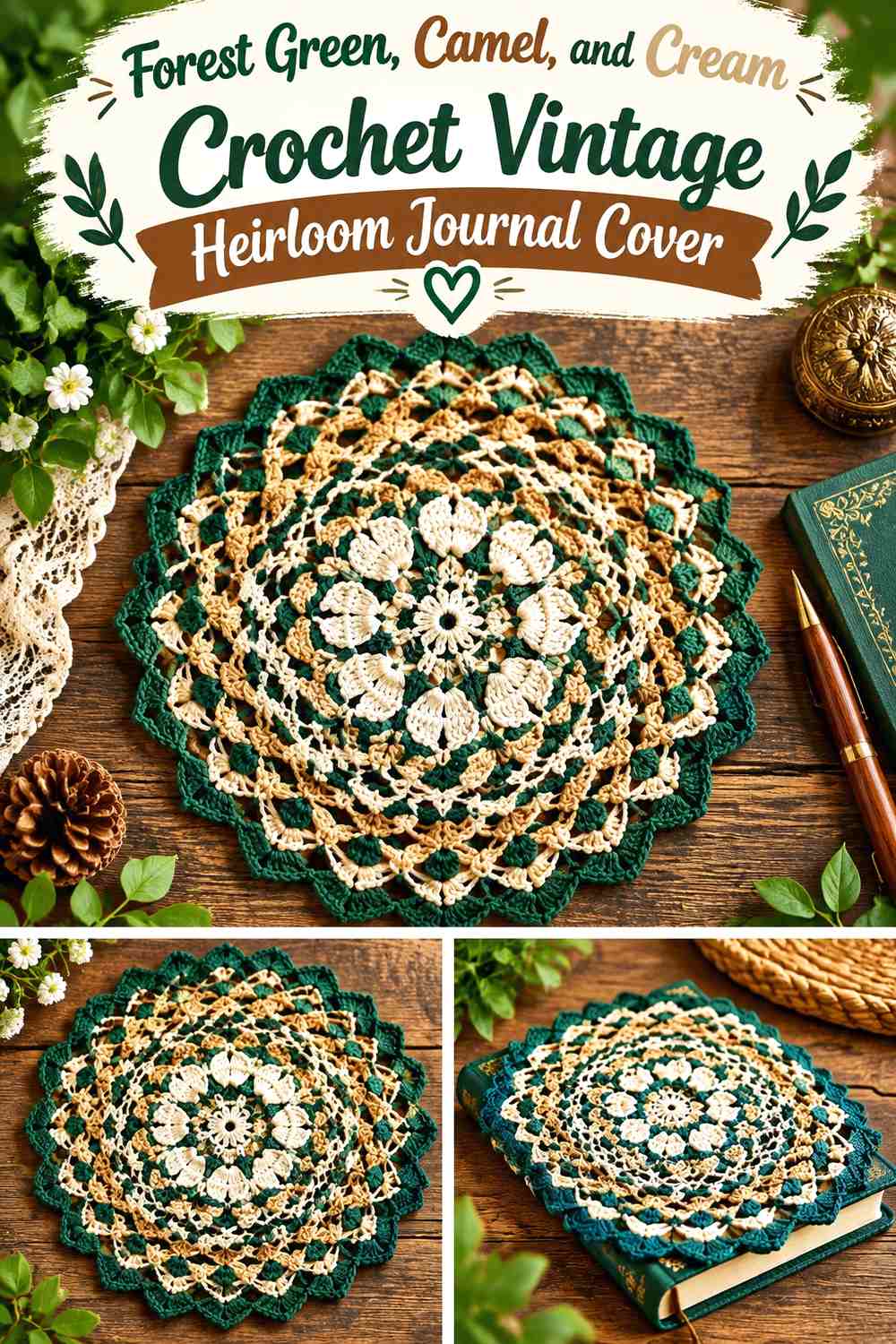
Forest green creates the main cover, camel can provide a warmer secondary section, and cream can finish the journal with a delicate lace border. The three colors work best when forest green clearly leads and camel remains a controlled supporting accent.
A camel spine or closure tab can connect the cream edge with the green body without forcing all three colors into every row.
Forest Green Should Dominate the Camel Crochet Journal Details
Use green across the front and back, then bring camel into one functional area such as the spine, closure, or narrow band.
This keeps the journal from becoming a three-color patchwork when the lace itself already adds detail.
Cream Should Separate Forest Green From Camel at the Journal Edge
A cream border provides the lightest point in the palette and keeps the two warm earthy shades from blending.
If the journal underneath has cream pages visible near the edge, finish the outermost tips in forest green for a stronger silhouette.
Creator Credit: Kristines Crochets
16. Cranberry and Warm Ivory Crochet Vintage Journal Cover With Ribbon-Tie Lace Border
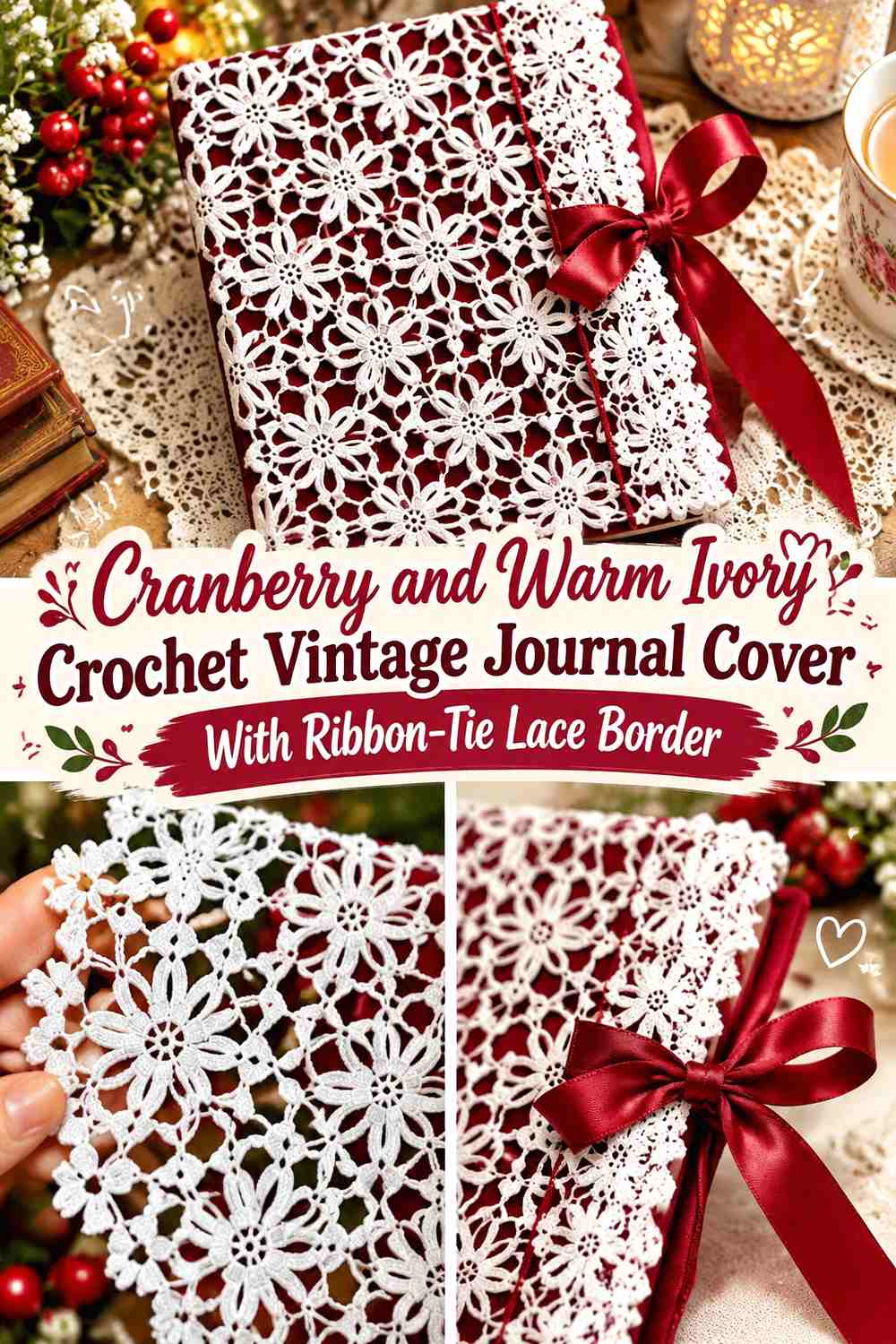
Cranberry can create a deep vintage journal body while warm ivory forms both the lace border and ribbon-like ties. Keeping the tie and trim in the same light color prevents the closure from introducing another unrelated shade.
Position the most decorative lace away from the point where the ties are pulled. A simpler edge near the fastening area is less likely to visually compete with the bow.
Cranberry Should Give the Warm Ivory Crochet Ties a Dark Background
Use cranberry across the journal surface so the pale tie remains immediately visible when the cover is closed.
A cranberry tie on the same body can disappear, especially when it crosses the front at an angle.
Warm Ivory Should Connect the Ribbon Tie to the Cranberry Lace Border
Repeat ivory at the border and closure so the functional tie feels intentionally integrated with the decorative edge.
Keep the central cover cranberry rather than adding a large ivory motif behind the bow, which can make the front visually crowded.
Creator Credit: Crochet Swan
17. Black, Burgundy, and Cream Crochet Mourning-Inspired Vintage Journal Cover With Lace Border

Black creates the darkest body in the collection, burgundy introduces a restrained romantic accent, and cream ensures the lace remains visible. Let black cover most of the journal, burgundy appear in a narrow front detail or selected lace section, and cream define the finest border.
This palette works particularly well when the journal itself is meant to look ornate and dramatic rather than light or cottage-inspired.
Black Should Remain the Main Crochet Journal Cover Color
Keep black through the broad panels and spine so the cover has a clear Gothic-vintage foundation.
Burgundy is more effective as one concentrated accent than as frequent stripes through the entire journal body.
Cream Should Separate Burgundy Lace From the Black Journal
Put cream between or beside the two dark colors where fine lace needs definition. Even a narrow cream row can stop burgundy from disappearing against black.
If the finished journal will sit against a black bag or shelf, allow cream or burgundy to reach the extreme outer edge so the cover silhouette remains visible.
Creator Credit: Crochet Jewel
Which Vintage Journal Cover Palette Should You Choose?
For a traditional heirloom look, antique ivory with dusty rose, sepia with antique white, or forest green with camel and cream gives the journal a softened, aged palette without relying on stark contrast.
Burgundy, plum, cranberry, charcoal, and black work when you want the cover to feel richer or more Gothic. These darker bodies generally benefit from cream, ivory, silver-gray, or muted gold at the lace edge so small decorative details remain visible.
Sage, faded blue, lavender, dusty rose, and teal offer a softer vintage direction. When using pale colors together, compare their lightness carefully—the lace border needs enough contrast to remain distinct from the journal body.
Conclusion
A vintage crochet journal cover becomes more convincing when the lace border has a clear relationship to the main cover color. Dark journal bodies can support pale picots and scallops, while light covers often benefit from dusty rose, plum, sage, navy, or another deeper edge.
Choose burgundy and cream for strong traditional contrast, sage and oatmeal for a quieter botanical look, faded blue and ivory for a soft heirloom direction, or black, burgundy, and cream for a darker mourning-inspired journal.
Before finishing the lace, place the crochet around the actual journal and check the opening, spine, inner flaps, button loop, or ties. The most decorative edge should enhance the cover without making the journal awkward to open. Use each credited tutorial for its original book-cover, border, edging, or lace construction, then adapt the palette and placement independently.
Frequently Asked Questions
What colors make a crochet journal cover look vintage?
Antique ivory, cream, oatmeal, ecru, dusty rose, faded blue, sage, burgundy, plum, cranberry, sepia, forest green, muted gold, and warm gray can all create a vintage direction. Pair one dominant cover color with a clearly supporting lace color rather than making every shade equally prominent.
Should a crochet journal lace border be lighter than the cover?
Not always. Cream or ivory looks clear against burgundy, navy, teal, brown, or black, but a pale journal can benefit from plum, sage, dusty rose, or another darker lace edge. The important factor is enough contrast for the lace shape to remain visible.
Where should I place lace on a crochet journal cover?
The opening edge, top and bottom edges, or front perimeter are useful locations. Keep highly textured lace away from inner flaps, the spine fold, or closures if it would interfere with fitting and opening the journal.
How can I make a cream lace border visible on a pale journal?
Add a slightly darker transition row underneath it or move a deeper palette color to the outermost edge. Dusty rose, sage, sepia, burgundy, faded blue, or plum can create separation without making the whole cover dark.
Can I add a button or ribbon tie to a vintage crochet journal cover?
Yes. Treat the closure as part of the color scheme. A cream tie can repeat a cream lace border on a cranberry cover, while a burgundy loop can connect to a burgundy edge on an ivory journal.
How can I keep a lace journal cover from looking too busy?
Give the body one dominant color and concentrate the most intricate lace in one or two structural areas. A decorative opening edge usually needs fewer additional flowers, stripes, or motifs across the main front panel.
Do all the linked tutorials make the exact vintage journal covers described here?
No. Some teach complete book or Bible covers, while others demonstrate picot borders, scalloped edging, braided finishes, doily lace, or related decorative crochet that can support the journal-border concept. Follow each creator’s original construction, then adapt the lace placement and vintage palette to your journal.