Icy mint and pearl white make a winter palette that can look crisp without relying on harsh contrast. The challenge is that both shades can be relatively light, so their placement matters. If they occupy similar amounts of the same textured surface, the color change may be much quieter than expected.

The strongest mitt sets give the two colors different jobs. Icy mint can carry the main hand section while pearl white defines a ribbed cuff, or pearl white can become the dominant field with icy mint reserved for edging, stripes, thumb details, or decorative accents. Fingerless mitts and longer arm warmers create even more places to repeat the secondary shade without making the pair look busy.
The ideas below use mitten, fingerless-mitt, wrist-warmer, and arm-warmer tutorials as construction references. The icy mint and pearl white arrangements are color adaptations, so use the original tutorials for their exact construction details.
Quick List
- Icy Mint Crochet Mittens With Pearl White Ribbed Cuffs
- Pearl White Crochet Mittens With Icy Mint Framing
- Icy Mint And Pearl White Crochet Split Color Mittens
- Icy Mint Textured Crochet Mittens With Pearl White Cuffs
- Pearl White Crochet Mittens With Icy Mint Detail Accents
- Icy Mint Cuff And Pearl White Crochet Fingerless Mitts
- Pearl White Crochet Fingerless Mitts With Icy Mint Thumb Edging
- Icy Mint Puff Stitch Crochet Mitts With Pearl White Bands
- Pearl White Crochet Fingerless Mitts With Icy Mint Top Edging
- Icy Mint Crochet Fingerless Mitts With A Pearl White Statement Cuff
- Pearl White Crochet Arm Warmers With Icy Mint Bow Accents
- Icy Mint Long Crochet Arm Warmers With Pearl White Borders
- Icy Mint And Pearl White Striped Crochet Fingerless Mitts
- Pearl White Crochet Wrist Warmers With An Icy Mint Center Band
- Icy Mint And Pearl White Mirrored Crochet Wrist Warmers
Keep Icy Mint and Pearl White Distinct on Crochet Mitts
Because icy mint and pearl white are both light colors, hue difference alone may not give every crochet texture strong definition. Place the yarns side by side before committing to a large color section. If they still appear distinct when viewed from farther away, the transition should remain easier to see across cuffs, stripes, and borders.
A quick grayscale photo can also help when you are deciding whether the two yarns differ enough in lightness. If they nearly merge in grayscale, use placement rather than contrast to define them: a complete pearl white cuff against an icy mint body will usually read more clearly than tiny alternating color changes scattered across the same surface.
Decide Whether Icy Mint or Pearl White Should Lead the Mitt Set
Giving one shade more visual area keeps this two-color palette intentional. Icy mint works naturally as the dominant color when you want the winter green to be immediately noticeable. Pearl white can then mark structural areas such as cuffs, upper edges, thumb borders, or narrow stripes.
Reversing that hierarchy creates a lighter-looking mitt. A pearl white hand section with controlled icy mint details makes the mint behave more like a frame or accent. For a balanced version, divide the colors into clear blocks rather than trying to make every small detail exactly half mint and half white.
Use Icy Mint and Pearl White to Clarify Cuffs, Thumbs, and Texture
Mitts give you several natural color-change points. The cuff is particularly useful because it already reads as a separate visual area. Changing from pearl white ribbing to an icy mint hand section therefore feels deliberate even when the shades have fairly soft value contrast.
Thumb openings and upper edges can carry smaller accents. On heavily textured mitts, consider keeping larger textured areas mostly one color and using the second shade around them. That lets the crochet texture remain readable rather than breaking every raised detail into competing color changes.
1. Icy Mint Crochet Mittens With Pearl White Ribbed Cuffs

Let icy mint cover most of the mitten while pearl white takes over the cuff. This gives the soft green enough surface area to define the pair, while the pale cuff creates a clean break at the wrist. The arrangement is especially useful when both yarns are close in lightness because the larger blocks make the color change easier to recognize than scattered one-row accents.
Pearl White Gives Icy Mint Mittens a Defined Wrist Break
Keep pearl white concentrated in the cuff instead of repeating it randomly throughout the mitten. The cuff naturally separates from the hand area, so this placement creates a clear visual hierarchy without requiring a dark contrast color.
If your pearl white and icy mint yarns look almost identical from a distance, extending the white across the full cuff area will usually make more impact than using it only as a very narrow line.
Icy Mint Should Remain Continuous Across the Main Mitten Surface
A mostly uninterrupted icy mint hand section lets the mitten shape and crochet texture remain visually calm. Small pearl white interruptions across that same area could make a low-contrast palette look fragmented without adding much definition.
For a coordinated pair, repeat the same approximate mint-to-white balance on both mittens rather than allowing one cuff to visually outweigh the other.
Creator Credit: Crochet con Sole
2. Pearl White Crochet Mittens With Icy Mint Framing
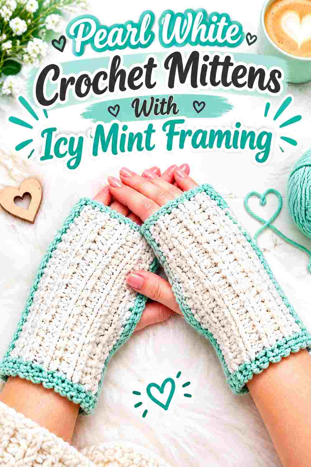
Reverse the first palette by allowing pearl white to dominate the hand while icy mint defines selected outer areas. This makes the mitts appear lighter overall and turns mint into a deliberate framing color. The strongest version keeps the mint concentrated around one or two structural zones rather than spreading tiny accents everywhere.
Icy Mint Can Frame Pearl White Without Covering the Whole Mitten
Use icy mint where the construction already creates a boundary, such as the cuff or finishing edge. Against a broad pearl white hand section, even a relatively soft mint becomes more noticeable because it occupies a separate visual block.
Avoid dividing every small section equally between the colors. Pearl white needs enough uninterrupted area to remain the obvious lead color in this version.
Pearl White Makes Crochet Mitten Texture the Main Visual Feature
With pearl white covering most of the surface, texture and silhouette become more important than strong color contrast. Before committing to the palette, work a small sample in the white yarn and check whether the stitch definition is visible enough for the look you want.
If the surface feels visually flat, use icy mint at a boundary rather than inserting it randomly through the textured area.
Creator Credit: Patronarte
3. Icy Mint And Pearl White Crochet Split Color Mittens

A larger two-block arrangement gives icy mint and pearl white nearly equal importance without requiring frequent striping. Think of the mitt as two deliberate color zones, such as a mint lower section moving into a pearl white upper section. The larger transition keeps this pale palette graphic enough to read from a distance.
Icy Mint and Pearl White Need a Clear Split Point
Place the main color change at a visually understandable part of the mitten rather than changing shades at an arbitrary point simply to reach equal coverage. A clearly defined block looks intentional and gives the eye one strong transition to follow.
Before making the second mitt, note the location of the color division so the pair feels coordinated.
Pearl White Should Not Reduce Icy Mint to a Thin Leftover Section
For a true split-color look, both shades need meaningful visual area. If pearl white covers nearly the entire hand and icy mint appears only at the cuff, the result becomes a white-dominant palette rather than a balanced block design.
Compare the two mittens side by side before finishing to make sure one color has not unintentionally taken over.
Creator Credit: Bag-O-Day Crochet
4. Icy Mint Textured Crochet Mittens With Pearl White Cuffs
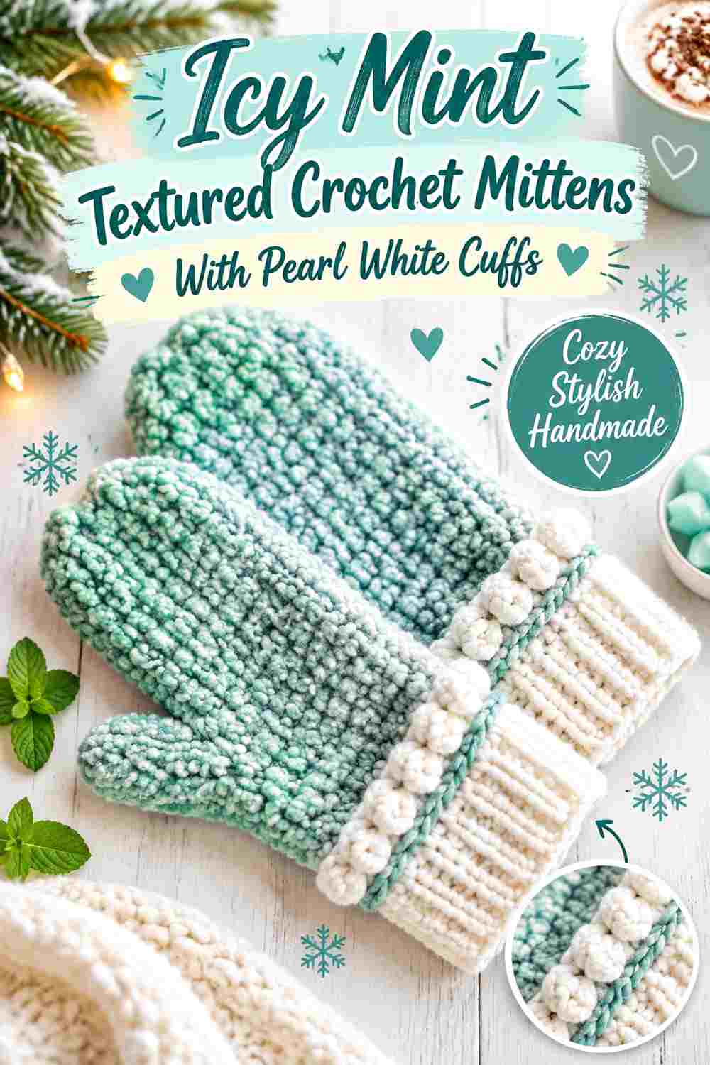
Texture already adds visual activity, so keep the color strategy restrained. Icy mint can cover the main textured portion while pearl white forms a quieter cuff. That division allows the raised or dimensional surface to remain the focus instead of asking color changes and texture to compete for attention.
Icy Mint Lets the Main Crochet Texture Stay Continuous
Work the main textured field primarily in icy mint when you want both the shade and the stitch surface to read clearly. Repeated white changes inside every raised section could break up the pattern and make the surface harder to read.
Look at a swatch under ordinary indoor light before deciding whether your mint yarn gives enough shadow and definition to the texture.
Pearl White Can Calm an Icy Mint Textured Mitten at the Wrist
A pearl white cuff gives the eye a flatter, quieter area beside the more active icy mint surface. This is particularly useful for heavily textured mitts because the color boundary emphasizes the change between cuff and hand without adding another decorative element.
Keep the transition crisp rather than introducing several intermediate stripe changes.
Creator Credit: Rich Textures Crochet
5. Pearl White Crochet Mittens With Icy Mint Detail Accents

This approach keeps the mitten primarily pearl white and uses icy mint in small, repeated details. Because the accent is limited, the placement needs to be intentional. A small mint element that appears once can look disconnected, while repeating mint in a second visible area helps it feel like part of the whole pair.
Icy Mint Details Need Repetition Against Pearl White Mittens
If you add a small icy mint accent, echo the mint elsewhere through a simple edging, cuff detail, or another limited area. Repetition connects the accent to the mitten instead of making it look like an unrelated addition.
Keep both accents small enough that pearl white remains the obvious dominant shade.
Pearl White Needs Open Space Around Icy Mint Accents
Do not crowd a small mint detail with several additional color changes. Pearl white works as visual breathing room and makes the limited mint sections easier to notice.
This is particularly useful if the two yarns are close in value: separation can provide clearer distinction than increasing the number of color changes.
Creator Credit: Jayda InStitches
6. Icy Mint Cuff And Pearl White Crochet Fingerless Mitts

Fingerless mitts create a strong wrist-to-hand division, making them a good candidate for a mint cuff beneath a pearl white hand section. The lighter hand keeps the overall set bright, while the icy mint cuff adds enough color to anchor the wrist without taking over the entire design.
Icy Mint Works Well as the Visual Base of Pearl White Fingerless Mitts
Keeping icy mint low on the wrist gives the set a clear foundation. Because the cuff occupies a contained area, it can carry a noticeable color change without making the open finger area look busy.
Use the same mint depth on both cuffs so the pair maintains a consistent visual weight.
Pearl White Should Carry the Open Hand Area Cleanly
Allow pearl white to remain uninterrupted around most of the hand. On a fingerless design, the thumb opening and upper edge already produce several visual breaks, so too many extra mint stripes can make the small surface look divided.
If you want another mint repeat, a restrained finishing edge is enough.
Creator Credit: В’язання і майстер класи Candy-Yarn
7. Pearl White Crochet Fingerless Mitts With Icy Mint Thumb Edging

A mostly pearl white fingerless mitt gives icy mint a chance to highlight the thumb opening rather than simply decorating the cuff. Because the thumb opening is small, this is a quieter interpretation of the two-color palette and works particularly well when you want white to dominate.
Icy Mint Can Make the Pearl White Thumb Opening Easier to Read
A controlled mint edge around the thumb area can clarify that opening against an otherwise white surface. This is more useful than scattering mint stitches randomly because the accent is attached to a functional visual boundary.
Check the pair together so the mint detail sits consistently on both mitts.
Pearl White Should Stay Dominant Around the Icy Mint Thumb Accent
Resist adding mint to every available edge after introducing it around the thumb. Leaving most of the upper and lower surface white preserves the deliberate contrast between a broad neutral field and a small winter-green detail.
If you want one additional mint repeat, keep it narrower than the main hand area.
Creator Credit: naztazia
8. Icy Mint Puff Stitch Crochet Mitts With Pearl White Bands

Puff-style texture creates its own shadows and raised areas, so icy mint can remain the main texture color while pearl white is used in flatter bands or borders. This separates the jobs of color and texture instead of asking both colors to alternate through every dimensional stitch.
Icy Mint Keeps Puff-Stitch Texture Visually Unified
Using one main shade across repeated puff texture prevents each raised section from becoming visually disconnected from the next. Icy mint also remains clearly identifiable as the primary color when the same shade repeats throughout the hand.
Before adding white, view the mint texture from a normal wearing distance rather than judging only close up.
Pearl White Bands Can Organize an Icy Mint Textured Surface
Pearl white is most useful here when it marks a complete boundary, such as a cuff or narrow finishing band. A defined band creates contrast through placement even when the two yarns are similar in value.
Avoid inserting white into every puff unless you specifically want a much busier patterned effect.
Creator Credit: Hooked by Robin
9. Pearl White Crochet Fingerless Mitts With Icy Mint Top Edging

This variation places the secondary shade at the opposite end of the mitt. Pearl white covers the hand and wrist while icy mint finishes the upper edge near the fingers. The placement draws attention upward and gives a simple fingerless shape a clean color endpoint.
Icy Mint Gives Pearl White Fingerless Mitts a Visible Upper Finish
A complete icy mint upper edge can look more intentional than several scattered mint details. Because the color change follows the opening, it reinforces the shape of the fingerless design rather than interrupting the middle of the hand.
Keep that upper accent similar in width on both mitts.
Pearl White Needs Enough Surface Below the Icy Mint Edge
The upper mint finish has more impact when there is a generous white field underneath it. If mint begins appearing repeatedly throughout the hand, the top edge loses its role as the main accent.
For a lighter overall winter palette, let pearl white cover the largest visual area.
Creator Credit: The Crochet Crowd
10. Icy Mint Crochet Fingerless Mitts With A Pearl White Statement Cuff
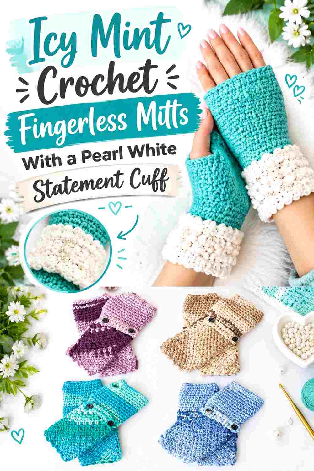
Rather than treating the cuff as a minor finishing area, make pearl white an obvious design block beneath an icy mint hand. This works particularly well when the cuff has a visibly different stitch treatment because the color shift can reinforce that structural change.
Pearl White Can Make the Icy Mint Cuff Transition More Deliberate
Use pearl white across the full cuff section instead of adding only a token white stripe. The larger block clearly separates wrist and hand, which is useful when the two colors have soft light/dark contrast.
The white cuff should look like an intentional component of the design rather than leftover color placement.
Icy Mint Should Take Over Cleanly Above the Pearl White Cuff
Once the main hand begins, allow icy mint enough continuous area to establish itself. Repeated switches back to white immediately above the cuff can weaken the two-block effect.
If you want another pearl white repeat, reserve it for a very small finishing point rather than a second large section.
Creator Credit: Yarnspirations
11. Pearl White Crochet Arm Warmers With Icy Mint Bow Accents

Longer hand warmers give pearl white a much larger surface, so a concentrated icy mint decorative detail can provide enough color without requiring stripes from wrist to forearm. A mint bow or similarly limited accent becomes a focal point against the clean white base.
Icy Mint Bows Need Clear Space on Pearl White Arm Warmers
Keep the area immediately around a mint bow or decorative accent mostly pearl white. The open space makes the accent readable and prevents it from competing with multiple nearby color changes.
Place decorative color consistently on the pair so the two warmers look related when worn together.
Pearl White Keeps Icy Mint Decoration From Overwhelming a Longer Mitt
Because arm warmers cover more visual area than short wrist mitts, a small amount of mint can still be noticeable. You do not need to repeat the mint continuously along the whole length.
If the accent feels isolated, echo icy mint once in a narrow edge rather than adding several additional motifs.
Creator Credit: mahum 🎀
12. Icy Mint Long Crochet Arm Warmers With Pearl White Borders
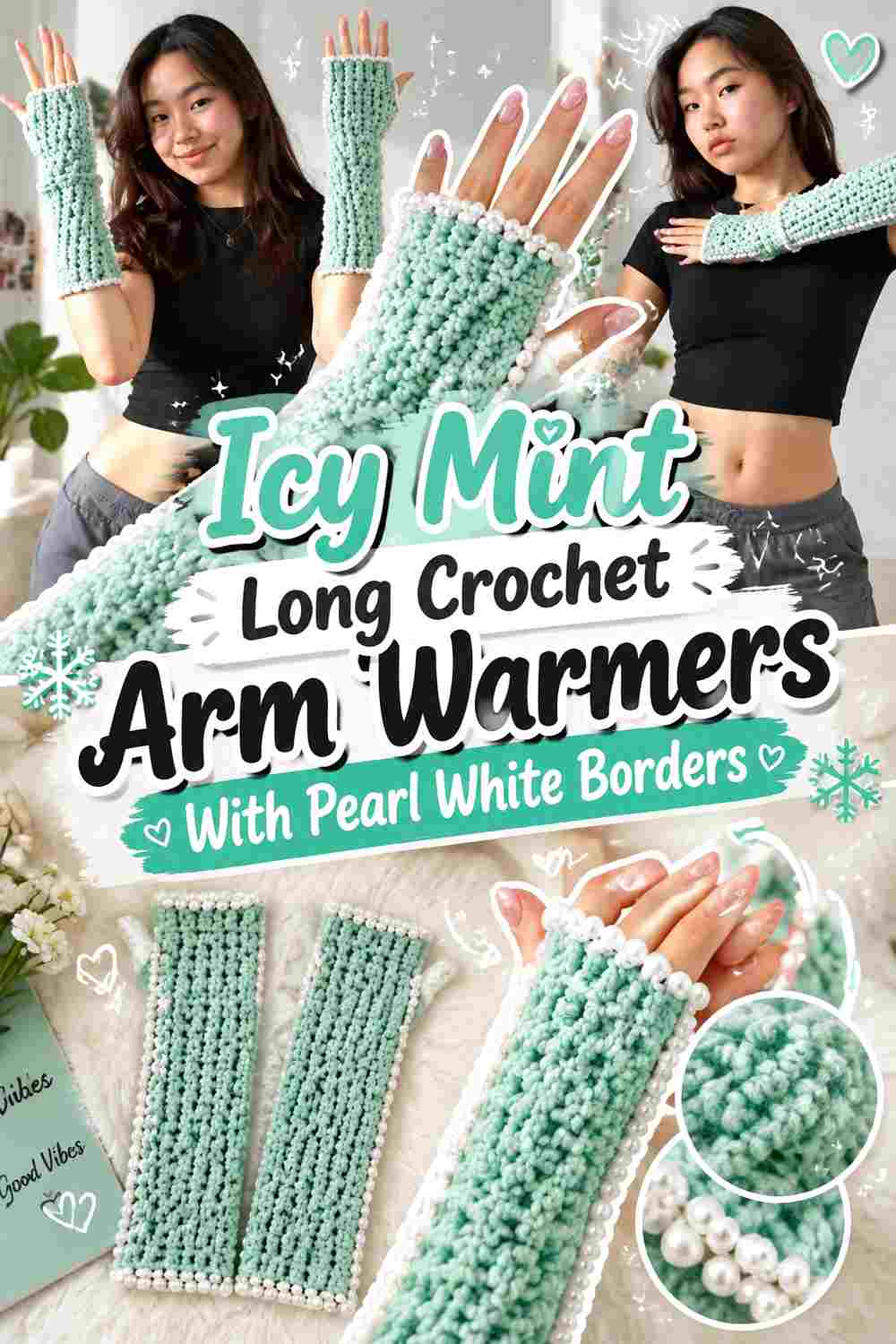
For a more mint-forward version, cover most of the longer warmer in icy mint and use pearl white to define the beginning and end. Repeating white at both boundaries visually contains the large mint field and makes the length feel intentionally framed.
Pearl White Borders Can Frame a Long Icy Mint Crochet Mitt
Using pearl white at both ends creates repetition without breaking up the center. That gives the warmer a connected color story from wrist to upper edge while keeping icy mint dominant.
Compare the width of the two white borders before finishing; very different border depths can make one end appear visually heavier.
Icy Mint Needs an Uninterrupted Center Between Pearl White Borders
The large middle area is what makes this palette direction different from a striped design. Keep most of the center icy mint so the eye reads one long color field rather than a succession of short bands.
This also gives any ribbing or texture through the center enough uninterrupted space to remain visible.
Creator Credit: Ariel Tong
13. Icy Mint And Pearl White Striped Crochet Fingerless Mitts

Striping is the most direct way to give icy mint and pearl white similar visual importance. Because both colors are light, stripe width becomes especially important. Wider, repeated bands will generally remain easier to recognize than many very narrow color changes when the yarns have little value contrast.
Icy Mint and Pearl White Stripes Need a Predictable Repetition
Choose a stripe rhythm and carry it through both mitts rather than changing band widths at random. Consistent repetition makes the pale two-color combination feel deliberate even when the contrast itself is subtle.
Lay the mitts together while working so the placement does not drift noticeably from one hand to the other.
Pearl White Stripes Should Not Erase the Icy Mint Lead Unless You Want Equal Balance
If icy mint is meant to remain the primary shade, give mint either wider bands or more total surface. For a true balanced look, keep the two stripe colors closer in visual area.
This is a placement decision rather than a strict formula; the useful checkpoint is simply whether the finished striping reads the way you intended from a normal distance.
Creator Credit: Chenda DIY
14. Pearl White Crochet Wrist Warmers With An Icy Mint Center Band

A single mint band through a white wrist warmer creates a different rhythm from cuff-only color placement. Instead of anchoring one edge, icy mint crosses the middle of the piece and becomes a focal stripe surrounded by pearl white on both sides.
Icy Mint Works Best as a Clear Center Band Against Pearl White
Give the mint band enough width to register as intentional. A very thin line may disappear against pearl white if the colors are similar in value.
Centering does not have to be mathematically exact, but the mint should look deliberately positioned rather than like an accidental yarn change.
Pearl White on Both Sides Keeps the Icy Mint Band Isolated
The white sections above and below the mint band are what make this idea work. They create separation and stop the accent from turning into an ordinary repeated stripe pattern.
Use similar overall placement on the second wrist warmer so the mint bands align visually as a set.
Creator Credit: The Crochet Channel
15. Icy Mint And Pearl White Mirrored Crochet Wrist Warmers

For the most playful two-color option, make one wrist warmer predominantly icy mint with pearl white accents and reverse the hierarchy on the second. The set still uses exactly the same palette, but the dominant color changes from hand to hand.
Icy Mint and Pearl White Need Matching Placement in a Mirrored Set
Mirroring works best when the color roles reverse while the overall placement remains related. For example, an area that is mint on one mitt becomes white on the other instead of creating two completely unrelated layouts.
That shared structure keeps the intentionally mismatched pair looking coordinated.
Pearl White and Icy Mint Should Carry Comparable Visual Weight Across the Pair
Stand the finished wrist warmers side by side and look at the set as a whole. One may be mint-dominant and the other white-dominant, but the combined pair should still feel reasonably balanced.
If one color is disappearing, repeat it in a slightly larger structural area rather than introducing an entirely new third shade.
Creator Credit: B.Hooked Crochet
Comparing the 15 Icy Mint and Pearl White Mitt Color Directions
If you want icy mint to dominate, Ideas 1, 4, 8, 10, and 12 keep the winter green across most of the visible crochet surface while pearl white handles cuffs, borders, or framing.
For a pearl white-dominant set, Ideas 2, 5, 7, 9, 11, and 14 leave more open white area and use icy mint selectively. These versions make the mint easier to treat as an accent rather than an equal partner.
Ideas 3, 13, and 15 give the colors more balanced visual importance. The split-block design provides the cleanest large-scale division, stripes create repeated alternation, and the mirrored pair balances the palette across two separate mitts.
If stitch texture is one of your priorities, Ideas 4 and 8 keep most of the dimensional surface in one shade so the texture is not interrupted by excessive color changes.
Conclusion
Icy mint and pearl white can produce far more than one pale winter look. The main decision is not simply which two yarn colors to buy, but how much visual area each color receives and where the transition occurs.
Choose an icy mint-dominant design when you want the green to define the set immediately. A pearl white-dominant layout creates a lighter field and gives mint more impact as an edge, band, thumb detail, or decorative accent. For more obvious two-color patterning, broad blocks, deliberate striping, or a mirrored pair give both shades stronger roles.
Because the colors can be relatively close in lightness, check your actual yarns together before starting the full pair. Then use cuffs, borders, thumb openings, stripes, and structural transitions to create separation instead of relying on hue difference alone. Follow the credited tutorials for their exact construction and adapt the color placement to the version you want.
Frequently Asked Questions
Do Icy Mint and Pearl White Have Enough Contrast for Crochet Mitts?
They can, but the result depends on the actual yarns you select. Two different hues can still be close in lightness. Place your mint and white yarns side by side and look at them from a distance. A grayscale photo can also help you see whether their light/dark values are distinct.
If the contrast is very soft, use large color blocks such as a complete white cuff against a mint hand instead of relying on tiny alternating details.
Should Icy Mint or Pearl White Be the Main Color in a Winter Mitt Set?
Either can lead. Icy mint dominance makes the green immediately visible and works well with pearl white cuffs or borders. Pearl white dominance creates a lighter overall set and allows mint to become a more controlled accent.
Decide which shade you want to notice first, then give that color the larger uninterrupted area.
Where Should Pearl White Go on Icy Mint Crochet Mittens?
Cuffs, upper borders, thumb edging, and complete bands are useful options because they already correspond to clear areas of a mitt. These placements make pearl white look intentional rather than scattered.
If the mitten contains strong texture, keeping the textured hand mainly icy mint and moving pearl white to a simpler border can also preserve stitch visibility.
How Can I Make Icy Mint and Pearl White Stripes Look Less Busy?
Use a predictable stripe rhythm and limit unnecessary changes in band width. Wider stripes also give pale colors more room to register individually when the two yarns have similar values.
If the pair still feels too active, increase the amount of one dominant shade and let the other appear in fewer repeated bands.
Can I Reverse Icy Mint and Pearl White Between the Two Mitts?
Yes. A mirrored set can use icy mint as the dominant shade on one mitt and pearl white on the other. Keep the color-placement structure related so the reversal appears intentional rather than accidental.
Repeating the same cuff, band, or border positions in opposite colors is one way to maintain that connection.
What Should I Preserve If I Substitute a Different Icy Mint or Pearl White Yarn?
Focus on the color relationship rather than finding an exact commercial shade. For icy mint, choose another cool, light green that remains visibly distinct from your white. For pearl white, choose a soft light neutral that still provides the level of separation you want.
Compare the replacement colors together before crocheting the full mitt set, especially when the original plan depends on subtle light-on-light contrast.