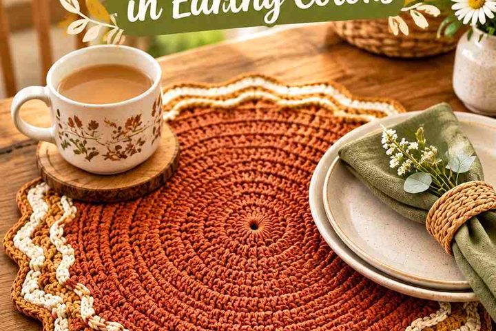
Vintage gingham has a simple visual logic that works especially well for kitchen curtains: a pale base, a medium check color, and a deeper shade that suggests the darker intersections found in woven gingham. In crochet, you can recreate that character through color-blocked squares, joined motifs, tapestry-style sections, filet-inspired grids, or a simpler checked color plan adapted to a curtain construction.
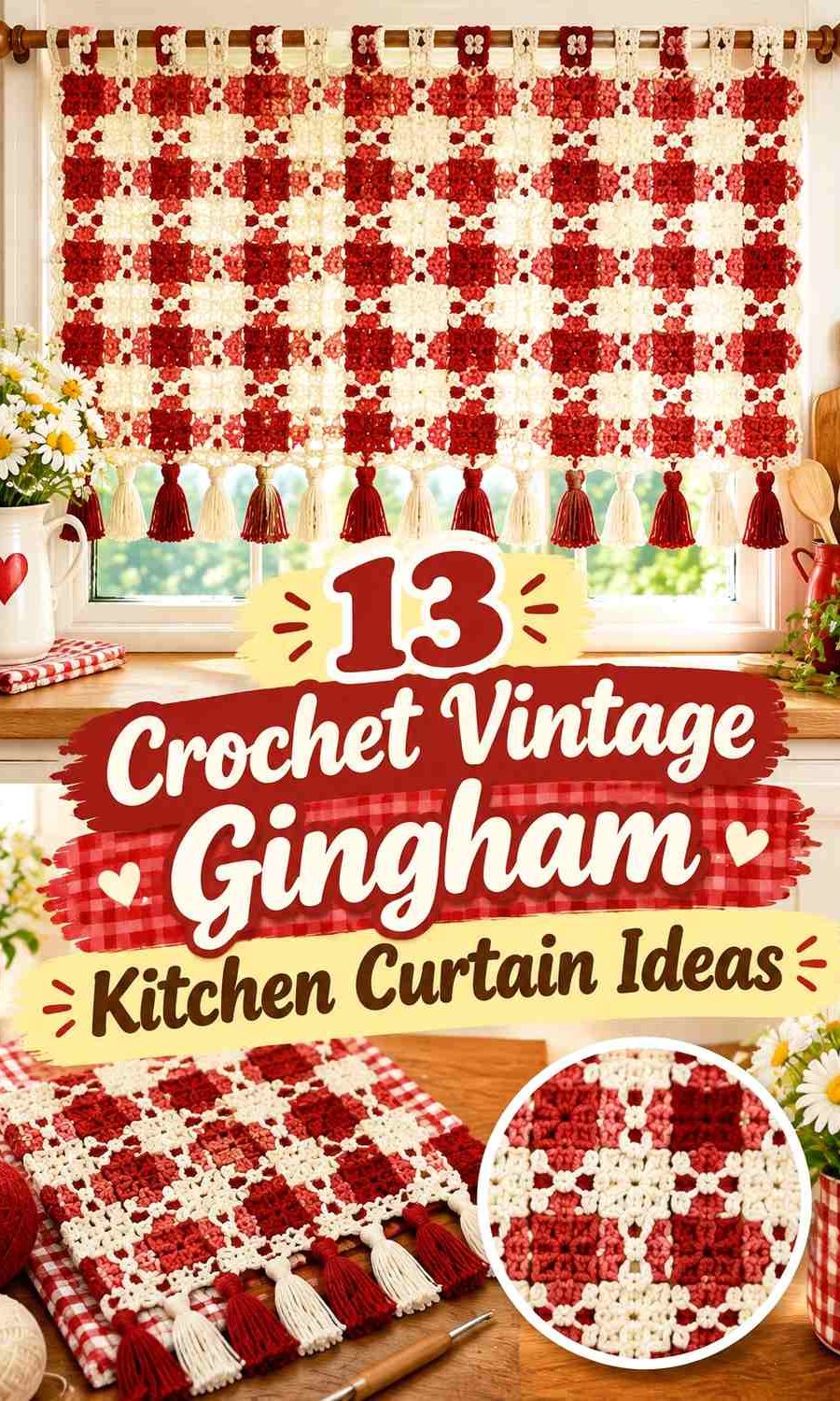
For a kitchen window, color distribution matters as much as the palette itself. The upper hanging area needs to look orderly against the rod, the checks need enough contrast to remain visible with daylight behind them, and the lower edge should feel finished without becoming visually heavier than the rest of the curtain.
The linked tutorials support curtain, valance, lace-panel, or related window-treatment constructions that can serve as foundations for these gingham color adaptations.
Quick List
- Sage, Cream, and Deep Sage Crochet Gingham Café Curtain
- Buttercream, Muted Mustard, and Ochre Crochet Gingham Valance
- Warm White, Dusty Blue, and Denim Crochet Gingham Kitchen Curtain
- Ivory, Brick Red, and Burgundy Crochet Gingham Café Curtain
- Oatmeal, Olive, and Moss Crochet Gingham Lace Curtain
- Cream, Dusty Rose, and Mulberry Crochet Gingham Valance
- Ecru, Terracotta, and Chestnut Crochet Gingham Kitchen Curtain
- Soft White, Taupe, and Cocoa Crochet Gingham Café Panel
- Pale Peach, Clay, and Rust Crochet Gingham Curtain
- Linen, Muted Teal, and Petrol Crochet Gingham Kitchen Curtain
- Cream, Lavender Gray, and Plum Crochet Gingham Valance
- Vanilla, Faded Aqua, and Deep Teal Crochet Gingham Café Curtain
- Warm Beige, Soft Black, and Caramel Crochet Gingham Kitchen Curtain
Build Crochet Gingham With Three Clear Color Roles
Traditional-looking gingham becomes easier to interpret when the palette contains three related values. Use the lightest color as the open base, a medium shade for the main checks, and a darker version of that same color family for selected intersections.
That third shade matters because crochet does not create the translucent overlap of woven gingham automatically. A deliberately darker square can visually suggest that overlap and make the grid feel more recognizably gingham.
Avoid choosing three shades that are nearly identical in value. When backlit by a kitchen window, subtle differences can become even harder to see.
Keep Crochet Gingham Checks Visible Against Window Light
Curtains are viewed in two very different conditions: daylight coming through from behind and interior light falling on the front. A palette that looks strongly contrasted on a table may become softer once installed.
Before committing to an entire panel, hold the yarn or a small color sample near the window. Pay particular attention to the medium and dark gingham shades. If they merge at normal viewing distance, deepen the darkest color rather than making every square more saturated.
The pale base should still occupy enough area to keep the curtain from feeling dense, especially in a smaller kitchen window.
Use Vintage Crochet Gingham Without Making the Curtain Too Busy
Gingham already contains repetition, so decorative borders, floral motifs, lace, and scallops should support the checks rather than compete with them. A restrained lower edging in the lightest or darkest palette color is often enough.
For café curtains, keep the check repeat particularly clear near the lower half because that area remains most visible when the curtain is installed. For valances, the pattern can be more concentrated because the overall panel is shorter.
1. Sage, Cream, and Deep Sage Crochet Gingham Café Curtain

Cream creates the open background in this vintage kitchen palette, sage forms the regular check, and deep sage marks selected intersections. The three-value green scheme feels softer than black-and-white gingham while still giving the crochet grid enough structure.
For a café-length curtain, let cream occupy the largest share so daylight continues to move through the panel. Sage can establish the repeated squares, while deep sage should appear only where stronger check definition is needed.
Let Cream Keep the Sage Crochet Gingham Café Curtain Light
Cream should surround enough sage squares that the grid does not become one large green field. That open spacing matters particularly across a kitchen window, where a dense medium-value palette can appear heavier once illuminated from behind.
Continue cream into the upper hanging area if you want the curtain rod line to look visually quiet.
Use Deep Sage at Selected Sage Crochet Gingham Intersections
Reserve deep sage for repeated intersection-style squares rather than alternating it everywhere. The darker value gives the impression that two sage bands have overlapped.
If your sage and deep sage are difficult to distinguish at the window, deepen the latter rather than changing the cream base.
Creator Credit: Kiri Kiri
2. Buttercream, Muted Mustard, and Ochre Crochet Gingham Valance
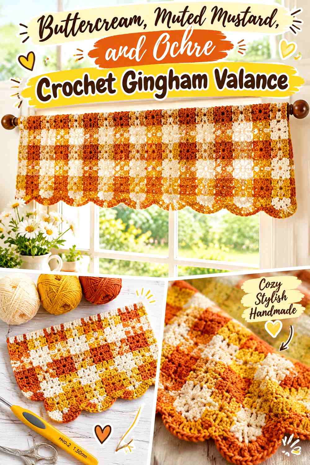
This warm vintage palette uses buttercream as the light ground, muted mustard for the main checked pattern, and ochre as the deeper intersection shade. Because the colors are close in temperature, the result can feel aged and mellow rather than sharply graphic.
A shorter valance gives the stronger yellows enough presence without covering a large portion of the window.
Keep Buttercream Broad Around the Muted Mustard Crochet Checks
Buttercream needs to remain visible between mustard blocks so the pattern can still be recognized as a grid. If mustard occupies too many neighboring squares, the design starts reading as color blocking instead of gingham.
The lighter shade is also useful near the rod loops or upper border where you may want less visual weight.
Let Ochre Deepen the Muted Mustard Crochet Gingham Grid
Place ochre where selected vertical and horizontal mustard paths visually meet. The darker shade should be related closely enough to mustard that it looks like a deeper version rather than a separate accent color.
Avoid adding brown to every check; ochre already provides the depth this palette needs.
Creator Credit: Ahuyama Crochet
3. Warm White, Dusty Blue, and Denim Crochet Gingham Kitchen Curtain

Dusty blue gives this curtain the familiar character of vintage blue-and-white kitchen textiles without the brightness of a clear primary blue. Denim serves as the darker check intersection, while warm white prevents the panel from feeling too cool.
This scheme is especially effective when the crochet curtain contains repeated square or rectangular sections that can visually organize the three values.
Use Warm White Between Dusty Blue Crochet Gingham Squares
Give warm white enough uninterrupted space to make the dusty-blue checks individually readable. This also keeps the window treatment visually lighter during the day.
If the kitchen already contains white cabinets or tile, a slightly warmer white can prevent the curtain from looking overly stark against them.
Keep Denim Smaller Than Dusty Blue in the Crochet Gingham Pattern
Denim should act as the deepest overlap color rather than a second dominant shade. Repeating it consistently at selected grid intersections gives the pattern depth without turning the panel into navy-and-white checks.
If dusty blue disappears when backlit, keep denim where it is and shift the medium blue slightly darker.
Creator Credit: Crochet CeliaBe (Tejido.manualidades .Craft)
4. Ivory, Brick Red, and Burgundy Crochet Gingham Café Curtain
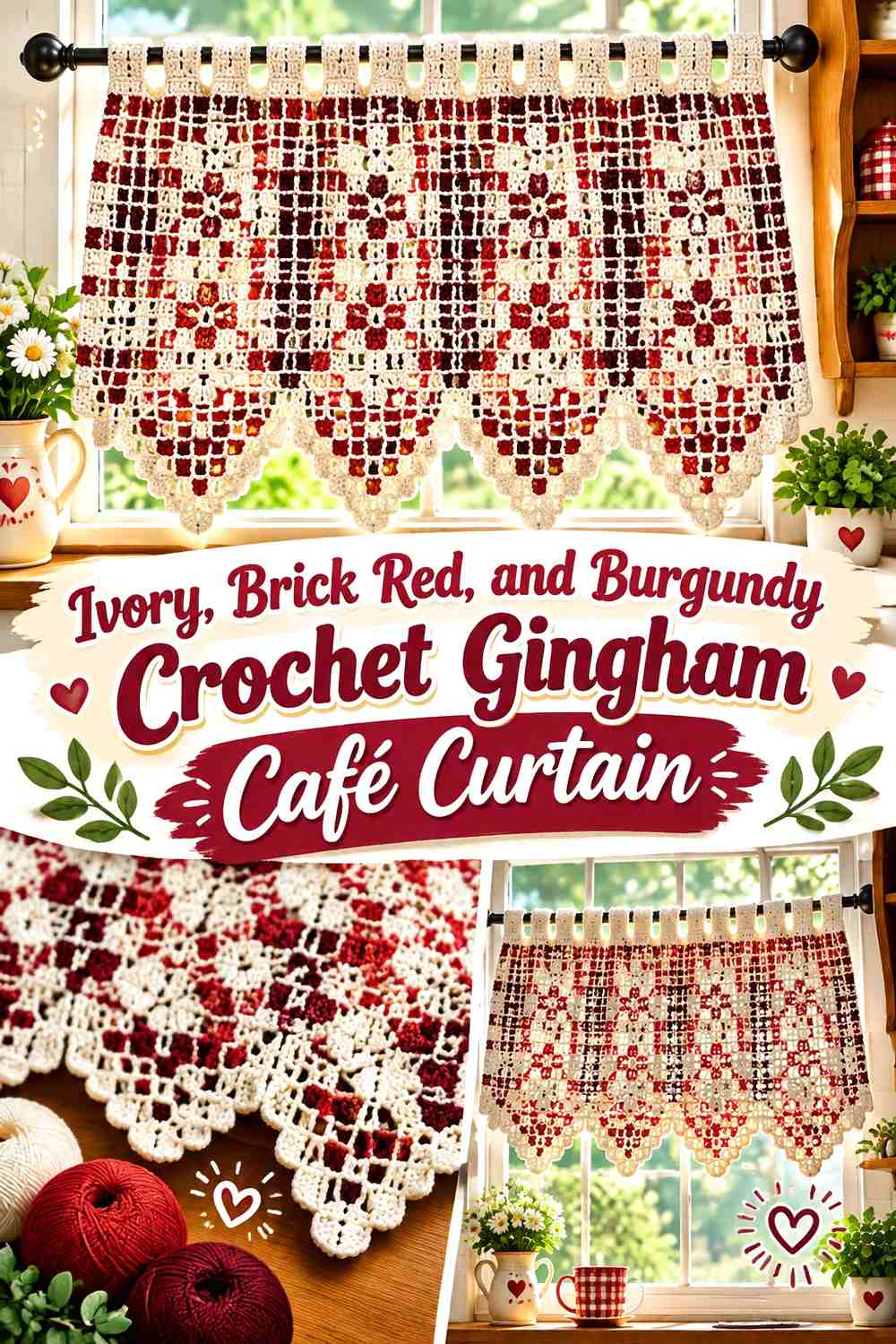
Brick red and burgundy create one of the more traditional country-kitchen directions in this collection. Ivory provides the pale base, brick red builds the repeated checks, and burgundy adds the deepest intersections.
Because both reds have considerable visual weight, the ivory share should remain generous.
Give Ivory More Space Than Brick Red in the Crochet Café Curtain
A broad ivory base stops the curtain from becoming visually dense across a smaller kitchen window. Let brick red repeat rhythmically but keep pale squares surrounding it.
This also creates more separation between neighboring burgundy intersections.
Use Burgundy to Define Brick Red Crochet Gingham Crossings
Burgundy works most effectively as a small repeated dark note. At gingham-style intersections, it reinforces the grid while maintaining a family relationship with brick red.
Avoid spreading burgundy into a heavy lower border if the checks already contain plenty of dark accents; the bottom of the curtain can otherwise look disproportionately heavy.
Creator Credit: El Talento de Tejer – Berenice Cruz Alejandro
5. Oatmeal, Olive, and Moss Crochet Gingham Lace Curtain

Oatmeal, olive, and moss create an earthy gingham direction suited to a kitchen where bright white would feel too crisp. Olive forms the medium checks, moss provides deeper overlap squares, and oatmeal keeps the open crochet sections visible.
If the curtain construction includes lace or open areas, the muted palette lets that negative space become part of the pattern.
Use Oatmeal Around Olive Crochet Gingham Lace Sections
Oatmeal can form both the light checks and larger open areas. This prevents the olive geometry from fighting with the lace structure.
When the panel is viewed against daylight, confirm that oatmeal remains distinguishable from the wall and window frame surrounding it.
Keep Moss Focused Inside the Olive Crochet Gingham Grid
Use moss where the grid needs its deepest value, not as an extra border around every olive square. That keeps the visual hierarchy clear: oatmeal first, olive second, moss third.
If olive and moss become too similar from across the kitchen, shift the moss darker rather than introducing a fourth color.
Creator Credit: Arte da Teca
6. Cream, Dusty Rose, and Mulberry Crochet Gingham Valance

Dusty rose creates a softer vintage kitchen palette, while mulberry gives the checks enough depth to avoid becoming washed out. Cream provides the brightest value and should occupy most of the background.
This scheme works particularly well on a shorter valance, where the richer dark intersections can remain decorative without making the whole window treatment feel heavy.
Let Cream Separate the Dusty Rose Crochet Gingham Checks
Use cream between the medium pink squares rather than letting dusty rose spread across large uninterrupted sections. Gingham depends on repeated spacing as much as on the individual colors.
Cream can also continue into a scalloped or simple lower trim if the check field already has enough variation.
Use Mulberry Sparingly With Dusty Rose Crochet Gingham
Mulberry should represent the darkest overlap areas. Because it has noticeably more visual weight than dusty rose, even a small repeated amount can define the check structure.
If you use mulberry again at the border, keep the edge narrow so it does not overpower the softer center pattern.
Creator Credit: Mundo de arañitas
7. Ecru, Terracotta, and Chestnut Crochet Gingham Kitchen Curtain
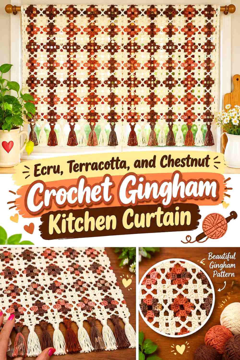
Terracotta supplies the medium gingham color, chestnut creates the darkest intersections, and ecru keeps the palette connected to natural kitchen neutrals. Compared with red-and-ivory gingham, this combination is warmer and more subdued.
It is particularly useful when the surrounding room contains wood, clay, beige, or other warm materials.
Keep Ecru Visible Around Terracotta Crochet Gingham Blocks
A generous ecru base prevents terracotta and chestnut from visually closing the window. It also makes the warm colors easier to distinguish from wooden cabinets or window trim.
If your kitchen has very pale walls, compare ecru against them before making it the outermost edge.
Use Chestnut to Deepen Terracotta Crochet Gingham Intersections
Chestnut should appear where you want the strongest grid definition. Keeping it concentrated at regular intersections gives the terracotta pattern more dimension.
A broad chestnut hem is unnecessary unless you specifically want the bottom edge to become the strongest part of the curtain.
Creator Credit: Esperanza y Ana Celia Rosas – Tejiendo Perú
8. Soft White, Taupe, and Cocoa Crochet Gingham Café Panel
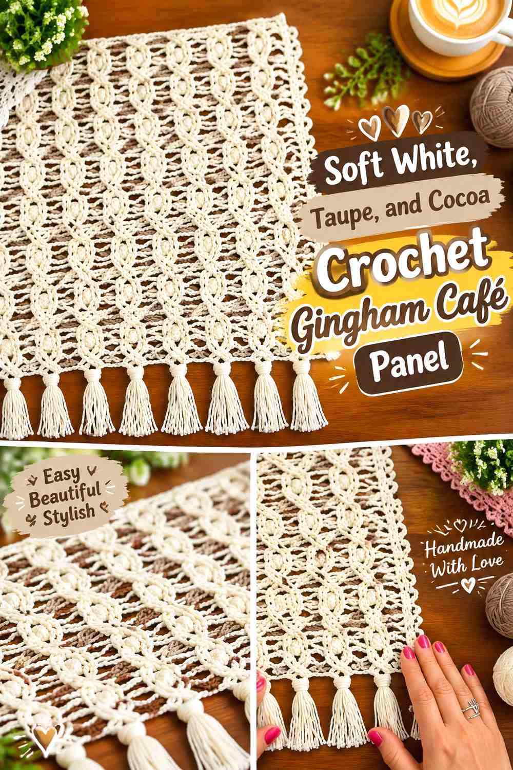
This neutral-only gingham palette relies on value rather than strong hue. Soft white is the background, taupe forms the medium checks, and cocoa supplies the darkest overlap squares.
Because all three colors are neutral, careful contrast matters more than it would in a green, red, or blue scheme.
Give Soft White Enough Area Around Taupe Crochet Gingham
Keep the pale squares broad enough that the curtain does not become one continuous beige field. This is especially important under warm kitchen lighting, which can make white and taupe appear closer.
The soft white can also form the side borders to give the checked center a cleaner frame.
Let Cocoa Sharpen Taupe Crochet Gingham Squares
Cocoa can define the intersection points and selected lower-edge details. Its darker value gives the otherwise quiet neutral palette enough structure to remain visible at window distance.
If cocoa feels too dark, choose a medium brown but preserve a clear step down from taupe.
Creator Credit: Ivy Teje
9. Pale Peach, Clay, and Rust Crochet Gingham Curtain
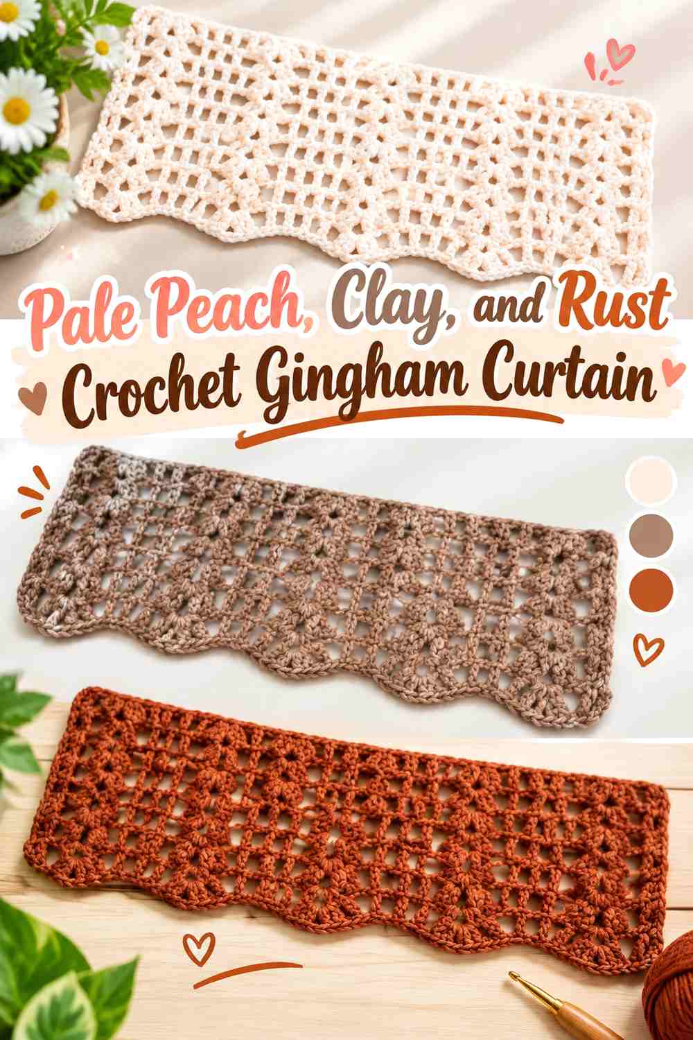
Pale peach takes the light role, clay creates the main check, and rust supplies the deepest squares. The three colors stay within one warm family, creating a more tonal interpretation of vintage gingham.
Because the hues are closely related, their differences in lightness need to remain obvious.
Use Pale Peach as the Open Field Around Clay Crochet Gingham
Pale peach should occupy the largest visual area so the clay checks retain their shape. If too much clay is used, the distinction between background and grid becomes less obvious.
Near the kitchen window, check the peach in daylight; very warm light can make peach and clay look closer than expected.
Keep Rust Darker Than Clay in the Crochet Gingham Grid
Rust must remain noticeably deeper than clay if it is meant to suggest the gingham overlap. Similar orange-brown shades can collapse into one color once viewed through bright window light.
Use rust consistently rather than randomly so the repeated grid remains easy to follow.
Creator Credit: normanualidades y mas
10. Linen, Muted Teal, and Petrol Crochet Gingham Kitchen Curtain

Muted teal gives this vintage palette a cooler direction, while petrol supplies the deeper intersections and linen keeps everything grounded. The combination offers more contrast than sage without becoming as crisp as navy and white.
Use linen generously if the curtain includes open crochet because the pale neutral will help the geometric checks stay separated.
Let Linen Balance the Muted Teal Crochet Gingham Panel
Linen can control the background, side edges, and some of the upper hanging area. This leaves muted teal as a clearly repeated design color rather than a full-panel field.
On a very pale window frame, make sure the outer linen edge still remains visible.
Put Petrol Only Where Muted Teal Crochet Gingham Needs Depth
Petrol is strongest when it appears at the darker intersection squares or a narrow framing detail. Too much of it can make the curtain substantially darker than the vintage gingham concept requires.
If the panel is short, a small amount of petrol is usually enough to establish the third value.
Creator Credit: Moni Okuyama
11. Cream, Lavender Gray, and Plum Crochet Gingham Valance
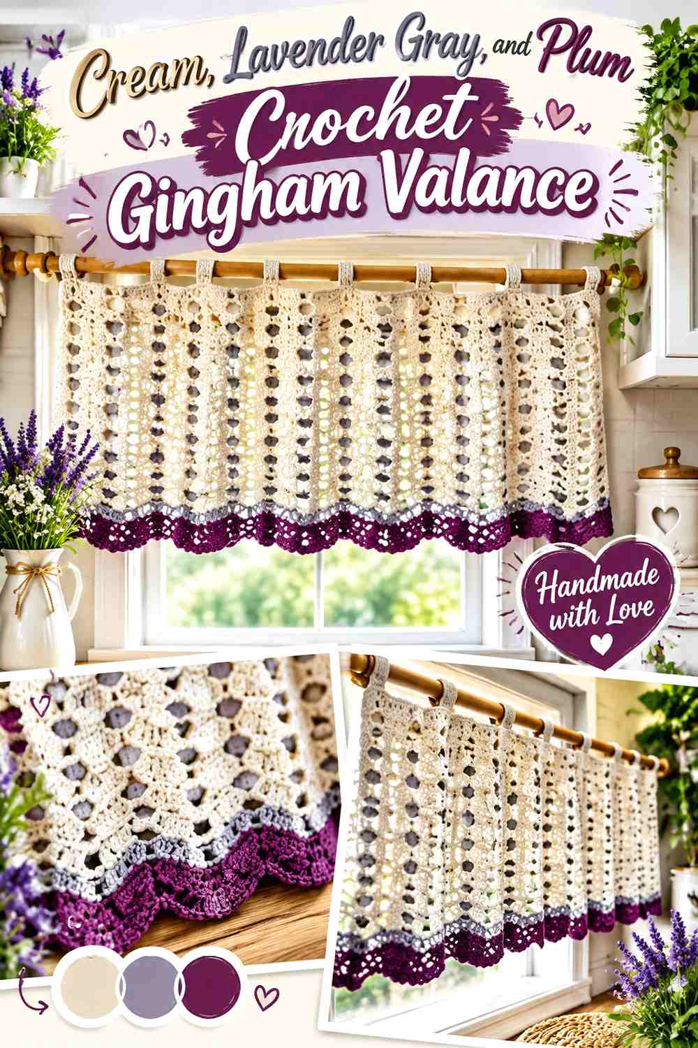
Lavender gray brings a faded vintage quality to the medium checks, while plum prevents the pattern from becoming too pale. Cream remains the main background and keeps the short valance visually open.
This combination is useful when you want something softer than red or blue gingham but more colorful than taupe.
Keep Cream Around Lavender Gray Crochet Gingham Squares
Lavender gray should appear as regular checked blocks surrounded by enough cream to reveal the pattern. Its muted nature means it can disappear if placed beside another equally light shade.
If the gingham looks too faint, deepen the lavender gray before increasing the amount of plum.
Use Plum as the Darkest Lavender Gray Crochet Gingham Detail
Plum works well at the overlap-style intersections because it remains related to the lavender family while providing stronger value contrast.
Keep the lower edging mostly cream or lavender gray if the valance already contains many plum intersections.
Creator Credit: Artes da Isa Crochê
12. Vanilla, Faded Aqua, and Deep Teal Crochet Gingham Café Curtain
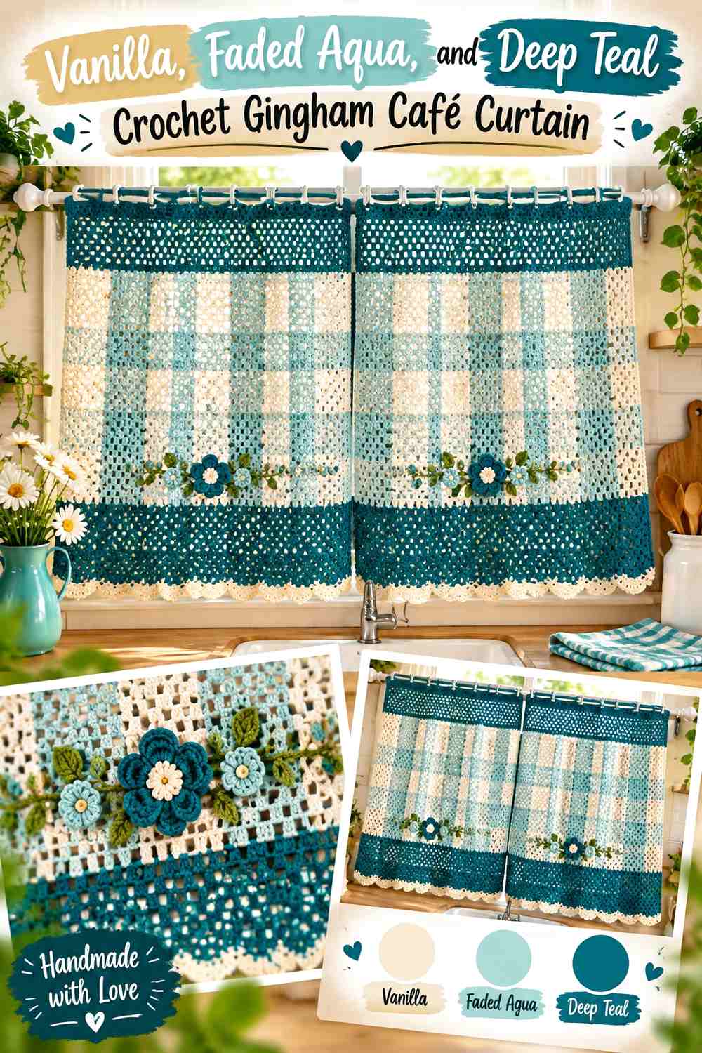
Vanilla softens the light base, faded aqua creates a washed vintage check, and deep teal marks the darkest intersections. This palette has a nostalgic kitchen feel without relying on classic red gingham.
The warmer vanilla also prevents the two blue-green shades from making the curtain feel uniformly cool.
Use Vanilla to Open Up the Faded Aqua Crochet Gingham
Keep vanilla across most background squares and use it near the outer edges. The warm pale base gives faded aqua enough contrast while maintaining a softer appearance than bright white.
If the curtain receives very strong light, check that faded aqua does not become visually washed out.
Let Deep Teal Strengthen Faded Aqua Crochet Gingham Crossings
Use deep teal only where the grid needs a strong intersection. Because teal is substantially darker, small amounts can define the pattern clearly.
Avoid turning every outer border into deep teal unless you specifically want a heavily framed café curtain.
Creator Credit: janine freitas
13. Warm Beige, Soft Black, and Caramel Crochet Gingham Kitchen Curtain
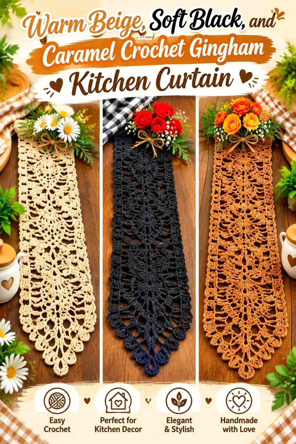
This final palette interprets vintage gingham with warmer neutrals and a stronger graphic element. Warm beige provides the background, caramel creates the medium checks, and soft black supplies selected deep intersections.
Soft black needs particular restraint because it carries much more visual weight than the other two colors.
Let Warm Beige Dominate the Caramel Crochet Gingham Curtain
Keep warm beige across most of the curtain so caramel remains clearly identifiable as the check color. This also reduces the risk of the darker accents making the window treatment look overly dense.
For a kitchen with dark cabinetry, the beige perimeter can help separate the curtain from its surroundings.
Use Soft Black Only at Key Caramel Crochet Gingham Intersections
A small repeated black square can give the grid a crisp vintage graphic effect. It does not need to appear at every border, hanging loop, and hem as well.
If soft black feels too strong, replace it with espresso or deep charcoal while preserving a clear value difference from caramel.
Creator Credit: Carmem Crochê
Which Vintage Gingham Crochet Curtain Palette Works Best?
For a classic country-kitchen direction, ivory with brick red and burgundy, warm white with dusty blue and denim, or buttercream with mustard and ochre makes the check pattern immediately recognizable.
For an earthier kitchen, sage and deep sage, olive and moss, terracotta and chestnut, or taupe and cocoa keeps the vintage structure while toning down the color saturation.
If you prefer a softer nostalgic palette, look at dusty rose and mulberry, lavender gray and plum, or faded aqua and deep teal. These combinations still use a clear light-medium-dark hierarchy, but the medium check has a faded quality rather than a bold farmhouse contrast.
Conclusion
A successful crochet gingham kitchen curtain needs more than alternating colored squares. The most convincing palettes establish three deliberate roles: a light base, a medium check, and a deeper intersection shade.
For a lighter kitchen window, increase the cream, ivory, linen, oatmeal, or vanilla share. For a stronger vintage statement, deepen the intersection shade while keeping it limited to repeated points in the grid. On shorter café curtains and valances, a dark intersection can appear more frequently because the panel covers less of the window.
Before making the full curtain, compare all three yarn colors against daylight and the actual kitchen surroundings. Then use the credited tutorial for the construction and adapt the color placement to the gingham layout you want.
Frequently Asked Questions
Do I need three colors for a crochet vintage gingham kitchen curtain?
Three colors make the classic gingham effect easier to suggest in crochet: one light background, one medium check color, and a darker shade for intersections. A two-color version can still work, but it will usually read as a simpler checkerboard rather than layered gingham.
How do I choose the darkest color for crochet gingham?
Start with a deeper version of the medium check color. Dusty blue can move into denim, sage into deep sage, brick red into burgundy, or terracotta into chestnut. The goal is visible value separation without making the darkest square feel unrelated.
Why does my crochet gingham look different when hung at the window?
Backlighting can reduce apparent contrast and make nearby values merge. Test a small sample at the actual window before committing to the entire panel, especially when using muted or pastel colors.
Should the crochet curtain border repeat the darkest gingham color?
It can, but it does not have to. A dark border creates a stronger frame, while repeating the lightest shade keeps the window treatment softer. If the gingham field already contains many dark intersection squares, a pale border may produce better balance.
Can gingham work with an open crochet curtain pattern?
Yes, provided the color blocks remain readable. Open stitches introduce additional visual space, so the check pattern usually benefits from clear color repetition and enough value contrast between the medium and dark shades.
Which vintage gingham colors suit a small kitchen window?
Lighter combinations such as cream with sage, vanilla with faded aqua, warm white with dusty blue, or buttercream with muted mustard can keep the window visually open. Use the darkest shade in smaller amounts so the panel does not become unnecessarily heavy.