A wavy crochet edge can completely change how an earthy placemat reads on the table. A quiet oatmeal center becomes more defined with an olive scallop, terracotta gains breathing room beside sand, and a dark espresso border can turn a pale neutral placemat into a more structured place setting.
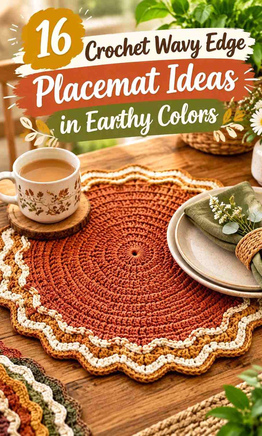
Earthy color schemes work especially well here because the curved border already creates movement. The center does not need complicated color changes. In many of these ideas, one grounded shade carries most of the placemat while a lighter or darker supporting color makes the waves, shells, petals, or soft ripples easier to see.
The tutorials below support the placemat or decorative-border construction concepts. Some demonstrate pronounced decorative edging, while others provide a useful placemat foundation that can inspire a wavy-edge adaptation. The proposed earthy palettes are independent editorial color directions rather than claims about colors used by the creators.
Quick List
- Terracotta and Oatmeal Crochet Wavy Edge Placemat
- Olive Green and Cream Crochet Scalloped Placemat
- Clay and Espresso Crochet Fan-Edge Placemat
- Sage and Stone Crochet Soft-Wave Placemat
- Rust and Camel Crochet Shell-Edge Placemat
- Walnut Brown and Linen Crochet Petal-Edge Placemat
- Moss Green and Warm Beige Crochet Wavy Placemat
- Ochre and Mushroom Taupe Crochet Scalloped Placemat
- Cinnamon and Ivory Crochet Ripple-Edge Placemat
- Forest Green and Tan Crochet Decorative-Edge Placemat
- Chestnut and Ecru Crochet Rounded-Wave Placemat
- Mushroom and Charcoal Crochet Shell-Border Placemat
- Muted Mustard and Umber Crochet Wavy Placemat
- Dusty Teal and Natural Flax Crochet Ripple Placemat
- Cocoa Brown and Blush Clay Crochet Scalloped Placemat
- Burnt Sienna and Sand Crochet Soft-Fan Placemat
Keep the Earthy Center Quieter Than the Crochet Wavy Edge
When the border is the main visual feature, giving the placemat center one dominant color often makes the curved outline easier to appreciate. A busy striped center combined with a multicolor scalloped edge can create competing focal points.
For a two-color placemat, let the dominant earthy shade occupy most of the center and reserve the supporting shade for the final border or last few rounds. This gives the edge enough contrast to register around plates without breaking the placemat into many small color sections.
Use Value Contrast to Make Crochet Scallops and Ripples Visible
Earthy colors can be different in hue but surprisingly close in lightness. Olive and medium brown, for example, may separate clearly as yarn balls yet blend once worked into a textured border.
Place the yarns side by side and view them from a distance. A grayscale photo can also reveal whether a scallop, shell, or ripple will have enough contrast against the placemat body. Softer value contrast is useful when you want a tonal table; stronger separation is better when the edge itself should be a noticeable design feature.
Coordinate the Crochet Edge With Plates and Table Surfaces
The plate covers much of a placemat center, while the edge stays visible. That makes border color especially important.
Against a dark wood table, oatmeal, linen, ecru, camel, and sand can keep the wavy outline visible. On pale wood or a cream tablecloth, olive, rust, espresso, forest green, cocoa, or charcoal can provide a stronger outer frame. Consider the table surface and dinnerware alongside the yarn rather than choosing the border color in isolation.
1. Terracotta and Oatmeal Crochet Wavy Edge Placemat
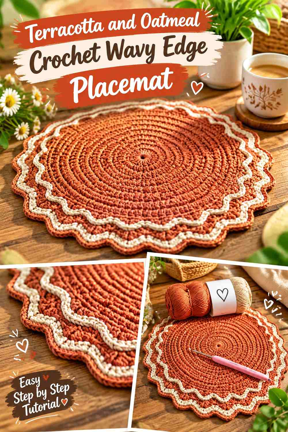
Terracotta gives this placemat a warm, grounded center, while oatmeal lightens the perimeter. Keeping terracotta across most of the body lets the plate sit over a consistent field, and the oatmeal waves remain visible around the outside where the border receives the most attention.
This is a useful direction when you want a warm table without making every part of the placemat equally saturated.
Let Terracotta Cover Most of the Crochet Placemat Center
Use terracotta across the broad central area rather than alternating it repeatedly with oatmeal. The uninterrupted color gives the plate a clear visual base and prevents the finished placemat from looking striped.
If you substitute the shade, preserve a warm medium-depth character so the lighter oatmeal edge still has enough contrast.
Use Oatmeal to Lighten the Terracotta Crochet Waves
Oatmeal works especially well on the outer scallops because the lighter value exposes each rise and dip. If the border contains several shell-like groups, the color change can also make those repeated shapes easier to distinguish.
On a very pale tablecloth, however, check that oatmeal does not disappear into the background.
Creator Credit: Ayşe Önem
2. Olive Green and Cream Crochet Scalloped Placemat

Olive green can carry the center while cream gives the scalloped edge a clear outline. The muted green keeps the palette earthy, and the lighter perimeter prevents the rounded border from disappearing when several scallops sit close together.
The combination is particularly useful when you want the edge to be noticeable without using a bright accent.
Keep Olive Green Continuous Beneath the Crochet Plate Area
A solid olive center gives the placemat a calm visual field and leaves the decorative work to the perimeter. That balance matters because a wavy edge already introduces repetition.
If your dinnerware contains green, compare the two shades together rather than trying to match them exactly.
Let Cream Separate the Olive Green Crochet Scallops
Cream can outline each scallop through contrast, especially when the edge casts small shadows on the table. Keep the cream primarily around the perimeter so it functions as a frame rather than a second competing center color.
A warmer cream can replace a bright white when you want the palette to stay softer.
Creator Credit: Nana & crochê
3. Clay and Espresso Crochet Fan-Edge Placemat
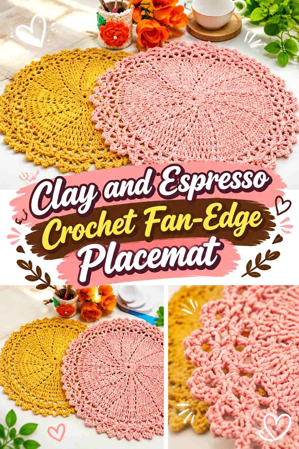
Clay supplies a softened warm center, while espresso gives the fan-shaped outer edge more weight. Unlike a pale border, espresso makes the perimeter visually stronger than the center.
That makes this palette useful when the waves need to remain noticeable beneath light dinnerware.
Give Clay Enough Space Inside the Crochet Placemat
Keep clay across most of the flat body so the dark edge does not overwhelm the whole piece. A medium warm center also creates a gentler transition between pale plates and the very dark outer border.
Avoid adding several other brown shades inside the center unless a deliberately tonal effect is wanted.
Keep Espresso Concentrated on the Clay Crochet Fan Edge
Use espresso where the edge rises into its strongest curves. A dark border makes repeated fans easier to identify and gives the placemat a clear stopping point.
If espresso feels too severe against the table, replace it with a dark chocolate brown while preserving its role as the deepest shade.
Creator Credit: Stefania Borges Rabelo
4. Sage and Stone Crochet Soft-Wave Placemat
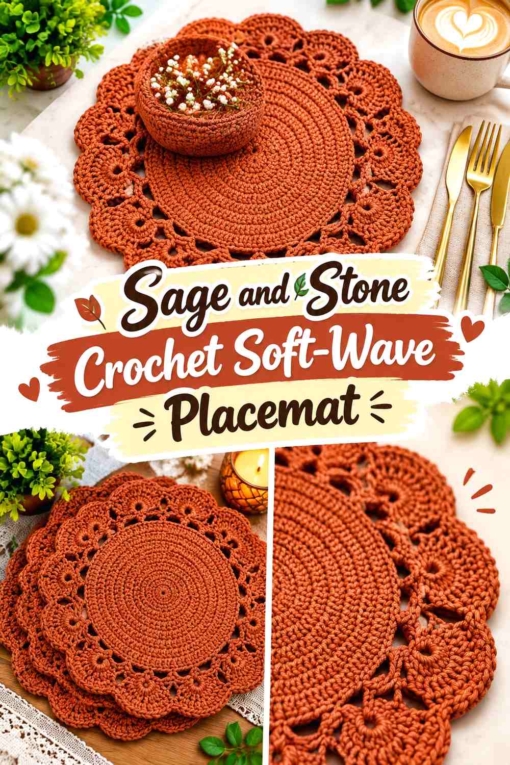
Sage and stone create lower contrast than cream and forest green, making the palette suitable for a softer wavy edge. Sage can dominate the body, while stone runs around the perimeter as a quiet neutral.
Because these colors may sit close in value, the physical curves of the edge become especially important.
Let Sage Lead the Crochet Placemat Surface
Keep sage across the center and most inner rounds so the mat has one obvious main color. This gives the soft waves enough visual breathing room even if the stone border is subtle.
For substitution, choose another muted green rather than a highly saturated one if you want to retain the restrained direction.
Check Stone Against Sage Before Crocheting the Wavy Edge
View the yarns from several feet away. If stone and sage merge almost completely, decide whether that tonal effect is intentional.
If you want clearer waves, move the stone either lighter or darker rather than introducing a third unrelated accent.
Creator Credit: Warmi Sulata
5. Rust and Camel Crochet Shell-Edge Placemat

Rust provides the strongest warm color in this scheme, while camel creates a softer outer border than cream would. The two colors remain related enough to feel cohesive but different enough for the shell edge to separate from the center.
Use rust as the visual base and camel as the supporting color.
Keep Rust Dominant Across the Crochet Placemat Body
A broad rust center makes the table setting feel warm without requiring multiple accent colors. It also gives the lighter camel border a consistent background.
If the table itself has reddish wood tones, compare the rust yarn against it to make sure the outer shape remains visible.
Let Camel Define the Rust Crochet Shell Edge
Camel can sit across the final shell or fan section where the border begins to undulate. Its lighter value exposes the individual curves without creating the stark jump that white might produce.
If camel and rust are too close in depth, choose a slightly lighter tan rather than increasing the number of colors.
Creator Credit: Vana Crochet
6. Walnut Brown and Linen Crochet Petal-Edge Placemat

Walnut brown creates a deep neutral center, while linen gives petal-like outer shapes a light, natural frame. The strong value difference is useful when the edge contains several small curves that could otherwise disappear.
This palette can also balance pale ceramic plates because the dark center remains visible around their base.
Use Walnut Brown to Anchor the Crochet Placemat Center
Keep walnut across the center and inner rounds rather than spreading it equally through the light edge. The darker body establishes visual weight and helps the placemat stand apart from light wood or neutral linens.
A softer medium brown can replace walnut if the contrast feels too heavy.
Let Linen Open Up the Walnut Brown Crochet Petal Edge
Linen can make individual petal points and valleys easier to read. Because it is lighter, it also prevents the perimeter from feeling dense despite the darker center.
When setting the table, check the linen border against the tablecloth so its shape does not vanish.
Creator Credit: Blog do crochê
7. Moss Green and Warm Beige Crochet Wavy Placemat
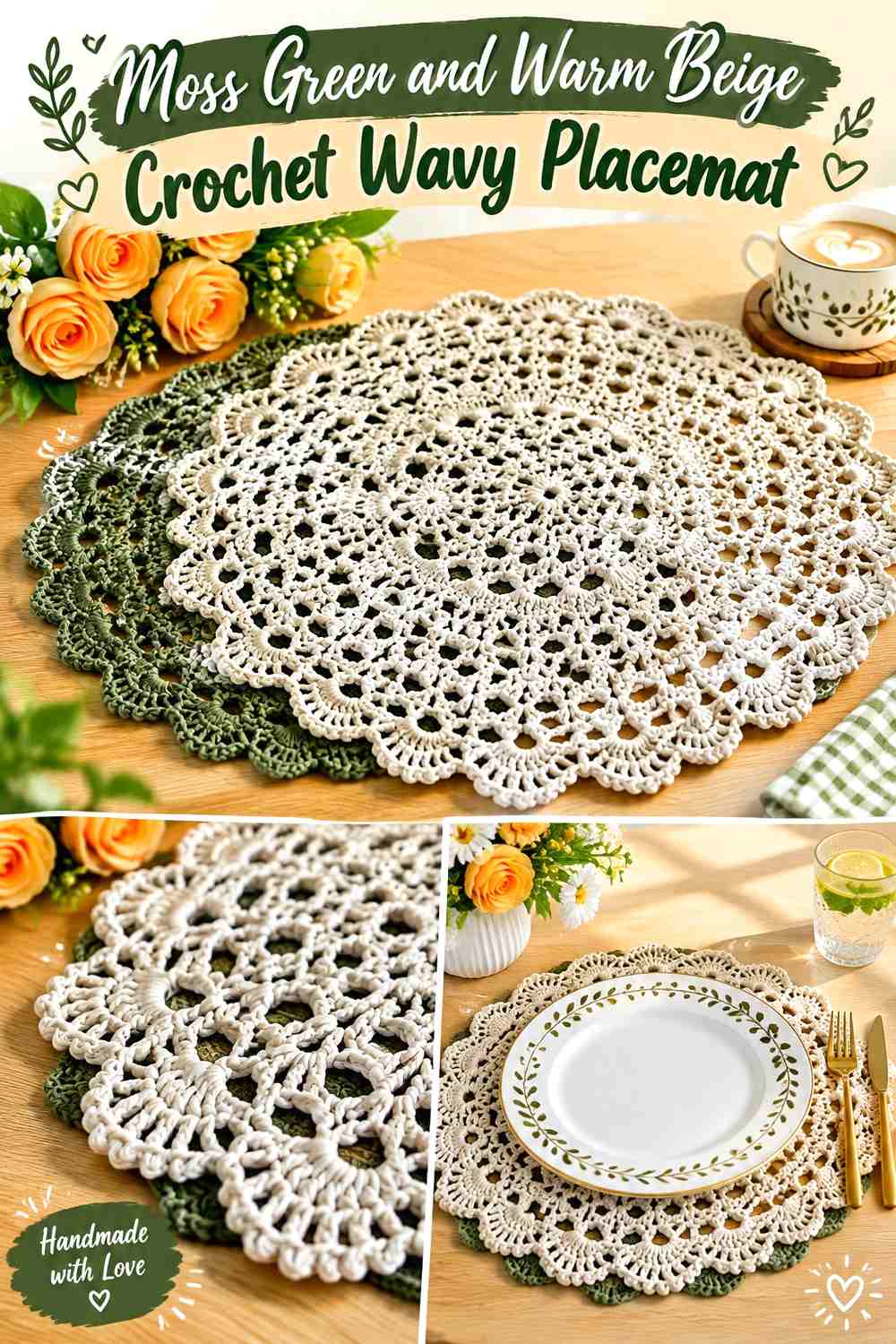
Moss green gives the placemat a darker botanical base, while warm beige keeps the waves understated. The difference is enough to mark the edge without turning it into a sharp black-and-white outline.
This palette works best when the beige is kept mainly around the border rather than repeatedly inserted into the center.
Let Moss Green Create the Main Crochet Placemat Field
A continuous moss center gives the eye one large calm area. That helps the border remain decorative instead of making the entire placemat busy.
On a dark green table runner, however, increasing the beige share near the outer edge can preserve separation.
Use Warm Beige to Trace the Moss Green Crochet Waves
Warm beige can cover the final wave section and make each curve visible against moss. If the border contains several rounds, keeping the transition near the edge gives the light shade a clear purpose.
Avoid switching back and forth repeatedly between beige and moss unless a striped border is specifically desired.
Creator Credit: Duducrochet Brasil
8. Ochre and Mushroom Taupe Crochet Scalloped Placemat

Ochre introduces an earthy golden tone, while mushroom taupe keeps the perimeter grounded. Instead of using the darker neutral for the center, let ochre carry most of the placemat and use taupe to sharpen the scallops.
The result has less contrast than ochre with black but more structure than an all-gold placemat.
Keep Ochre Broad Across the Crochet Placemat Center
The center gives ochre enough space to read as the main color rather than a small seasonal accent. Plates will cover part of it, so letting the shade continue toward the border helps it remain visible.
If you want a more subdued version, replace ochre with muted mustard while retaining taupe.
Use Mushroom Taupe to Ground the Ochre Crochet Scallops
Mushroom taupe works well around repeated rounded sections because it adds definition without creating a very dark frame.
If the two yarns are close in value, place them together in natural dining-room light before deciding whether the edge has enough separation.
Creator Credit: Crochet Swan
9. Cinnamon and Ivory Crochet Ripple-Edge Placemat
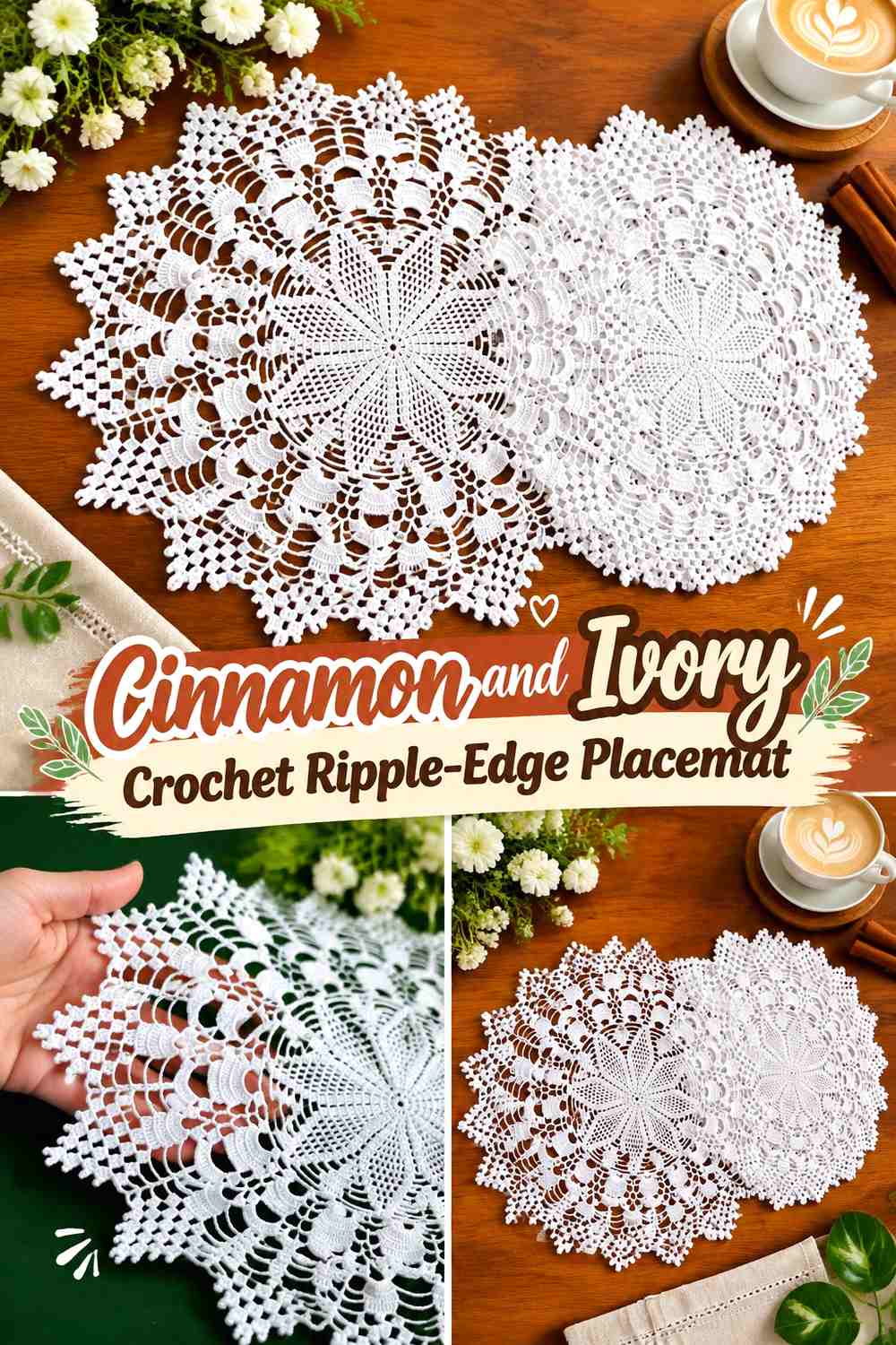
Cinnamon gives this placemat a warm brown-red center, while ivory makes the ripple edge visibly lighter. The contrast is stronger than cinnamon with camel, so the perimeter becomes a more obvious design feature.
Keep the ivory limited to the edge if you want the palette to remain earthy rather than pale overall.
Let Cinnamon Carry the Crochet Placemat Under the Plate
A consistent cinnamon center gives light dinnerware a grounded background and leaves enough visible warmth around the plate.
For darker dinnerware, check whether the cinnamon still provides enough separation before making the entire center deep.
Use Ivory to Expose Each Cinnamon Crochet Ripple
Ivory highlights the peaks and dips of the outer edge. This is especially helpful when the ripple is relatively shallow and could otherwise look almost straight from across the table.
A warmer off-white can take the same role if pure ivory feels too bright for the surrounding linens.
Creator Credit: Crochet by Glau
10. Forest Green and Tan Crochet Decorative-Edge Placemat
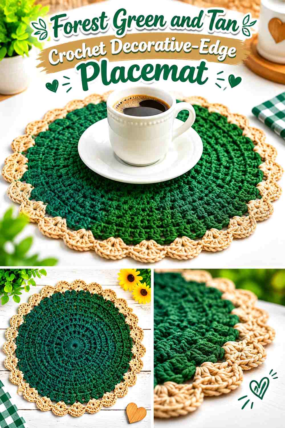
Forest green is one of the darkest palettes in this collection, so tan has an important job: keeping the decorative perimeter visible. Use the green across the center and let tan appear where the edge develops its curves.
This creates a strong natural contrast without relying on white.
Keep Forest Green Away From a Very Dark Table Edge
If the placemat will sit on walnut, black, or another dark surface, check that the forest green outer area does not disappear. Bringing tan slightly inward can preserve the placemat silhouette.
On a pale table, the green can safely occupy more of the visible perimeter.
Let Tan Outline the Forest Green Crochet Waves
Tan makes a useful edge color because it stays warm while remaining substantially lighter than forest green. Keep it consistent around the perimeter so the waves feel connected.
If a third color is added, restrict it to a very small accent rather than disrupting every scallop.
Creator Credit: Home Handwork Diy
11. Chestnut and Ecru Crochet Rounded-Wave Placemat
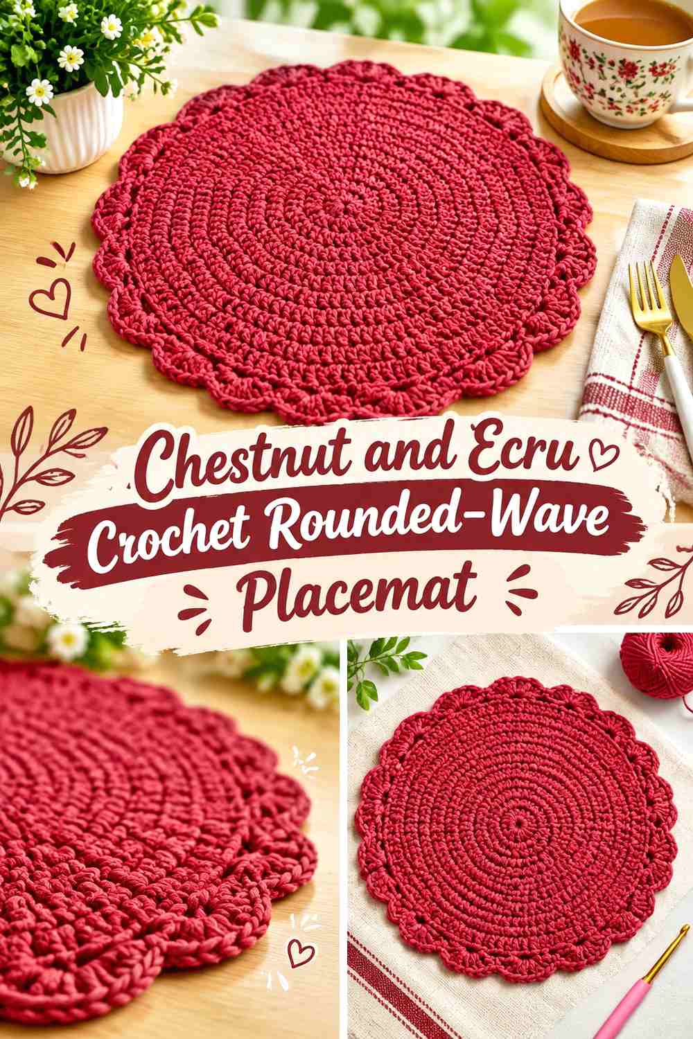
Chestnut and ecru offer a classic dark-light earthy pairing. Chestnut can control the main body while ecru makes the rounded waves look lighter and more open.
Because the value difference is strong, avoid making the border overly wide unless you want ecru to become almost equal to the center.
Use Chestnut as the Visual Base of the Crochet Placemat
Keep chestnut across the plate area and enough surrounding space that it remains clearly dominant after the place setting is assembled.
If you use dark plates, consider shifting chestnut toward a medium brown so the plate and placemat do not merge.
Keep Ecru Focused on the Chestnut Crochet Outer Waves
Ecru can define the final rounded sections without needing additional outlines. A narrower light border preserves the warm brown identity of the placemat while still making the edge noticeable.
Against an ecru tablecloth, add enough chestnut close to the perimeter to maintain a visible outer boundary.
Creator Credit: Ina Crochê Mania
12. Mushroom and Charcoal Crochet Shell-Border Placemat
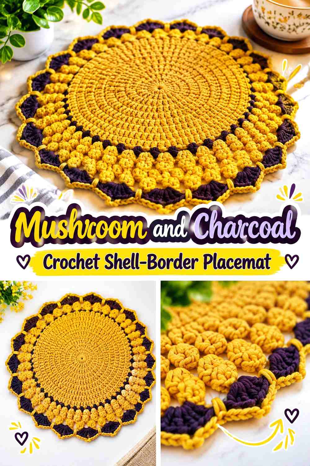
Mushroom taupe leads this neutral-heavy palette, while charcoal adds definition around the shell edge. This reverses the usual light-border approach: the center stays soft and the perimeter becomes the strongest visual line.
It works well when you want an earthy placemat without an obvious green, orange, or yellow hue.
Let Mushroom Taupe Keep the Crochet Placemat Center Quiet
Use mushroom across most of the broad surface so the center does not compete with the darker border. Its muted character allows plates, napkins, and serving pieces to take more attention.
Compare mushroom with the table surface because similar beige-brown values can blend unexpectedly.
Keep Charcoal Narrow Around the Mushroom Crochet Shell Edge
Charcoal can make each shell easier to identify, but it does not need to occupy several wide rounds. A controlled dark perimeter is usually enough.
If the edge begins looking too heavy, switch to a medium charcoal rather than reducing the clarity of the shell shapes completely.
Creator Credit: Tuba Crochet
13. Muted Mustard and Umber Crochet Wavy Placemat

Muted mustard creates a warm center without the brightness of clear yellow, and umber adds a deeper brown frame. The combination gives the wavy edge strong definition while staying within an autumnal earth palette.
Use mustard generously enough that the dark border does not turn the overall placemat predominantly brown.
Let Muted Mustard Lead the Crochet Placemat Surface
A broad mustard center gives the plate a warm backdrop and distinguishes this palette from rust- or terracotta-led options.
If the shade feels too saturated beside the dinnerware, choose a duller ochre rather than replacing it with beige.
Use Umber to Give Muted Mustard Crochet Waves More Weight
Umber works especially well on deeper scallops or a pronounced wave because the dark value visually reinforces the edge.
Keep it out of too many inner rounds if you want the mustard field to stay open and spacious.
Creator Credit: Yarnspirations
14. Dusty Teal and Natural Flax Crochet Ripple Placemat
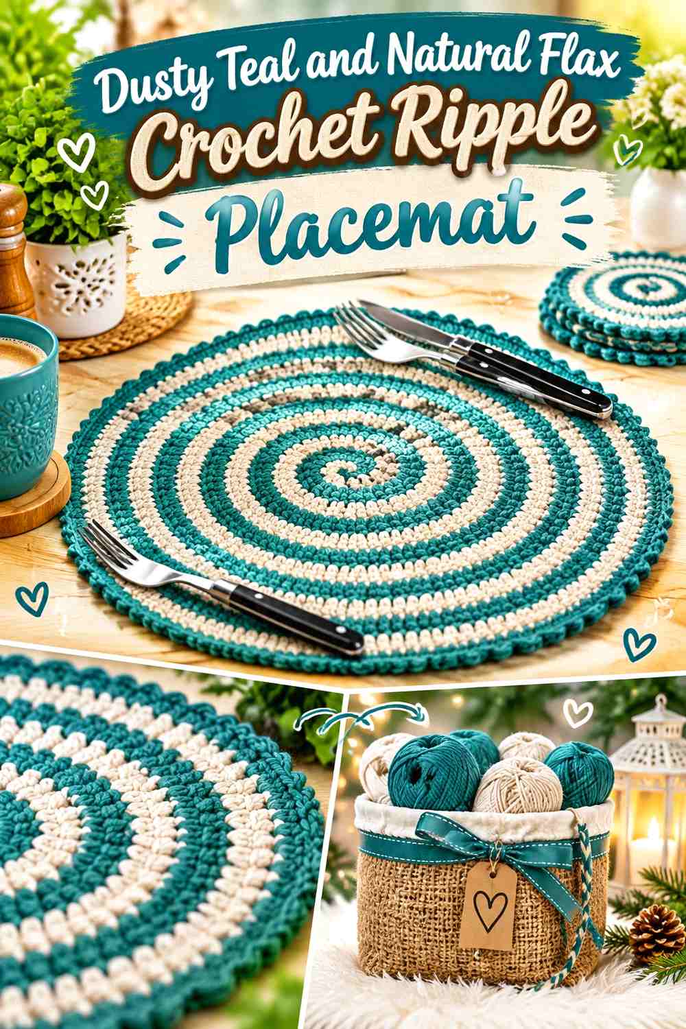
Dusty teal introduces a cooler earthy direction while natural flax keeps the palette grounded. The muted blue-green can dominate the placemat body, with flax tracing the outer ripple.
This combination is useful when the table already contains many warm browns and you want a cooler color without moving into a bright coastal palette.
Keep Dusty Teal Muted Across the Crochet Placemat Center
Choose a softened teal rather than a vivid blue-green so it remains compatible with wood, stone, beige, and brown table elements.
A broad teal field also gives the lighter border a clear background.
Let Natural Flax Soften the Dusty Teal Crochet Ripple
Natural flax creates lighter separation without the crispness of white. Place it across the wavy perimeter where the table surface shows through around each curve.
If flax and the tablecloth are nearly identical, retain a thin teal area near the very outside so the silhouette stays visible.
Creator Credit: The Crochet Crowd
15. Cocoa Brown and Blush Clay Crochet Scalloped Placemat

Cocoa brown provides a deep neutral base, while blush clay introduces a muted pink-earth accent. This creates a warmer and slightly softer alternative to brown paired with cream.
Blush clay works particularly well on the edge because the scallops give the smaller accent enough repetition to feel intentional.
Let Cocoa Brown Ground the Crochet Placemat Center
Keep cocoa across the broad center and inner sections. Its depth gives pale plates a defined setting and keeps the warmer blush clay from taking over the whole composition.
If the table is also dark brown, increase the blush clay slightly around the perimeter.
Repeat Blush Clay Consistently Around the Cocoa Crochet Scallops
Use blush clay around the complete edge rather than on a few disconnected scallops. Repetition helps the muted accent read as a designed border.
If the pink undertone feels too noticeable, choose a dusty clay shade closer to terracotta while keeping it lighter than cocoa.
Creator Credit: MJ’s Off The Hook Designs
16. Burnt Sienna and Sand Crochet Soft-Fan Placemat

Burnt sienna gives the final palette a rich earthy orange-brown center, while sand keeps the fan edge light. Compared with terracotta and oatmeal, this pairing can be taken slightly deeper at the center and softer at the edge.
The contrast works particularly well when the border has broad rounded fans rather than tiny decorative points.
Let Burnt Sienna Fill the Main Crochet Placemat Area
Use burnt sienna continuously through most of the center so the shade remains visible even after a plate is placed on top.
If you substitute it, preserve a medium-to-deep warm brown-orange relationship rather than moving too close to pale peach.
Give Sand Enough Width to Show the Burnt Sienna Crochet Fans
A very narrow sand border may not reveal the full curve of a broad fan. Let the lighter color occupy the part of the edge where the wave actually expands and contracts.
At the same time, avoid taking sand so far inward that it becomes the dominant visible color.
Creator Credit: B.Hooked Crochet
Which Earthy Crochet Wavy Edge Palette Should You Choose?
For a light, natural table, sage and stone, olive and cream, moss and beige, or dusty teal and flax keep the color direction restrained.
For warmer dining spaces, terracotta and oatmeal, rust and camel, cinnamon and ivory, muted mustard and umber, or burnt sienna and sand create stronger autumnal warmth.
If you want the border itself to become a major design feature, choose a palette with clearer value contrast such as clay and espresso, walnut and linen, forest green and tan, chestnut and ecru, or mushroom and charcoal.
The softer combinations are better when the physical ripple should supply most of the movement. The higher-contrast options are useful when you want every scallop, shell, or fan to remain obvious once plates and flatware are added.
Conclusion
The easiest way to make an earthy wavy-edge crochet placemat feel intentional is to give each color a job. Let one shade control the broad plate area, use a second color where the edge begins to curve, and add a third shade only when it solves a real contrast or coordination problem.
For subtle tables, keep the center and border closer in value and let shadows define the waves. For more graphic place settings, pair a deep earth shade with linen, cream, sand, ecru, or another lighter neutral so the perimeter remains visible.
Most importantly, evaluate the palette with the actual plate and table surface. Much of the center disappears during use, which means the wavy outer edge often becomes the part of the placemat that contributes most to the finished color scheme.
Frequently Asked Questions
Which earthy colors make a crochet wavy edge easiest to see?
Pairings with noticeable light-dark separation usually show the curves most clearly. Espresso with clay, forest green with tan, chestnut with ecru, and walnut with linen are examples. Softer pairings such as sage with stone create a more blended edge.
Should the lighter color go on the crochet wavy edge?
It does not have to. A light edge creates an open, softer perimeter, while charcoal, espresso, umber, or another darker border gives the placemat a stronger visual frame. Choose according to the table surface and the contrast you want.
How can I keep an earthy crochet placemat from looking muddy?
Avoid choosing several colors with nearly identical value and using them in equal amounts. Establish one dominant shade and make sure the supporting border has enough difference to be intentional. A grayscale photo can help reveal whether two colors are merging.
Should every crochet scallop use the same border color?
Using one repeated border color usually makes the edge feel more connected. Alternating scallops can work, but it creates a busier rhythm and shifts attention away from the overall wavy silhouette.
What earthy crochet placemat colors work well on a dark wood table?
Linen, oatmeal, ecru, sand, camel, warm beige, and cream can help the perimeter stay visible against dark wood. Deeper shades can still be used in the center as long as enough lighter color remains near the outer edge.
Can I use three earthy colors on a wavy-edge crochet placemat?
Yes, but a clear hierarchy helps. One shade can dominate the center, a second can carry the wavy border, and a third can appear in a narrow transition or small repeated detail. Giving all three colors equal space can make the placemat look busier than the edge requires.