A crochet mini Christmas village becomes more convincing when color helps every piece perform a different role. Cream and white can connect snowy roofs across the street, while cranberry, forest green, dusty blue, gingerbread brown, sage, gold, and muted pink can distinguish individual cottages, shops, figures, and small street decorations.
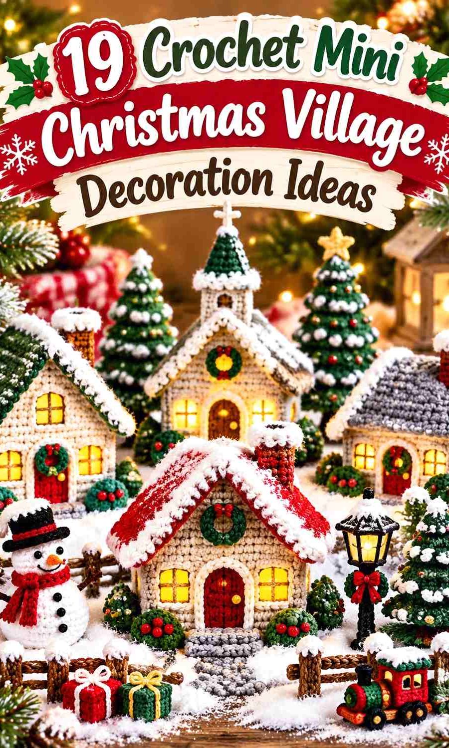
The village does not need nineteen unrelated palettes. A better approach is to repeat a few collection colors in different proportions. Cranberry might be a cottage door, Santa’s coat, and a gift-box ribbon. Forest green can appear on one roof, several trees, and a door wreath. Snow white can run through almost every building while the wall colors change.
The tutorials below support the house, ornament, amigurumi, or Christmas-decoration construction behind each concept. The palettes and village roles are independent adaptations, so follow each creator for the actual crochet construction while planning your colors and placement separately.
Quick List
- Cranberry, Cream, and Pine Crochet Snow-Roof Village Cottage
- Forest Green, Antique White, and Brick Red Crochet Tabletop Christmas House
- Dusty Blue, Cream, and Burgundy Crochet Tiny Gabled Village Cottage
- Gingerbread Brown, Icing White, and Peppermint Red Crochet Village Bakery
- Caramel, Mint, and Candy Pink Crochet Gingerbread Sweet Shop
- Cocoa, Snow White, and Cranberry Crochet Dimensional Candy House
- Cinnamon, Cream, and Sage Crochet Bobble-Roof Gingerbread Cottage
- Oatmeal, Dusty Rose, and Evergreen Crochet Tiny Village House
- Forest Green, Cranberry, and Gold Crochet Mini Village Christmas Tree
- Cranberry, Cream, and Charcoal Crochet Mini Village Santa
- Fawn Brown, Oatmeal, and Berry Red Crochet Mini Village Reindeer
- Burgundy, Cream, and Pine Crochet Mini Stocking Shop Sign
- Sage, Cranberry, and Mustard Crochet Village Gift Box Stack
- Evergreen, Cream, and Berry Red Crochet Mini Door Wreath
- Peppermint Red, White, and Sage Crochet Candy Cane Village Signpost
- Moss Green, Cranberry, and Oatmeal Crochet Village Gnome
- Cocoa, Cream, and Raspberry Crochet Heart-Front Gingerbread House
- Old Gold, Cream, and Forest Green Crochet Village Tree-Top Star
- Dusty Blue, White, and Silver Crochet Village Star Garland
Repeat Snow Colors Across Different Crochet Village Buildings
One of the simplest ways to connect differently colored houses is to repeat the same snow family. Bright white gives dark cranberry, forest green, cocoa, and navy stronger separation, while cream or antique white creates a softer transition against oatmeal, caramel, sage, and dusty pastels.
Snow color is especially useful along rooflines because roofs are visible even when one house sits partly behind another. Repeating similar pale roof trim can connect the street without requiring every wall and door to match.
Give Strong Christmas Colors Specific Village Roles
Red and green become easier to control when each has a job. Cranberry can belong to doors and ribbons, while pine or forest green belongs to trees and wreaths. A third accent such as mustard, gold, dusty blue, or pink can distinguish focal buildings.
At miniature scale, do not give every color equal coverage. A tiny red door can attract as much attention as an entire cream wall. Save the strongest accents for the details you want viewers to notice first.
Use Small Props to Repeat Colors Between Crochet Houses
Trees, gifts, wreaths, stockings, stars, candy canes, Santa, and reindeer help carry colors from one side of a village to the other. If a burgundy cottage feels isolated, a burgundy stocking or gift ribbon elsewhere can reconnect it to the display.
This is more flexible than forcing the next house to use the same wall color. Small props can repeat accents while preserving variety across the village skyline.
1. Cranberry, Cream, and Pine Crochet Snow-Roof Village Cottage

Cranberry gives this narrow cottage a strong wall color, while cream defines the snowy roof and pine creates a compact door or wreath accent. Keep the cream roof treatment consistent if you plan to make several houses in different wall colors; that repeated snow line can visually connect the entire street.
Cranberry Should Stay Visible Beneath the Cream Crochet Roof
Leave enough cranberry wall around the door and windows for the building to retain a clear body color. If cream snow covers too much of the façade as well as the roof, the small cottage can become visually washed out.
Pine Works Best as a Small Accent on Cranberry and Cream
Use pine for a door, wreath, or one narrow trim rather than creating a broad green section. Cranberry should remain the building’s identity, while pine supplies the Christmas detail.
Creator Credit: Kristines Crochets
2. Forest Green, Antique White, and Brick Red Crochet Tabletop Christmas House

Forest green makes this dimensional house a strong anchor building, antique white can cover snowy roof edges, and brick red gives the door or window trim a warmer focal point. Because the house is viewed from more than one angle, repeat the main green and white relationship around the visible sides.
Forest Green Should Carry the Main Crochet House Walls
Let green dominate the largest wall surfaces so the building reads consistently from the front and side. Too many brick-red panels can make a dimensional cottage look patched together rather than deliberately decorated.
Antique White Should Separate Brick Red From Forest Green
Place pale trim where red touches green around doors, roof edges, or windows. The neutral break prevents two strong Christmas colors from competing directly on a small façade.
Creator Credit: AlineCrochet
3. Dusty Blue, Cream, and Burgundy Crochet Tiny Gabled Village Cottage
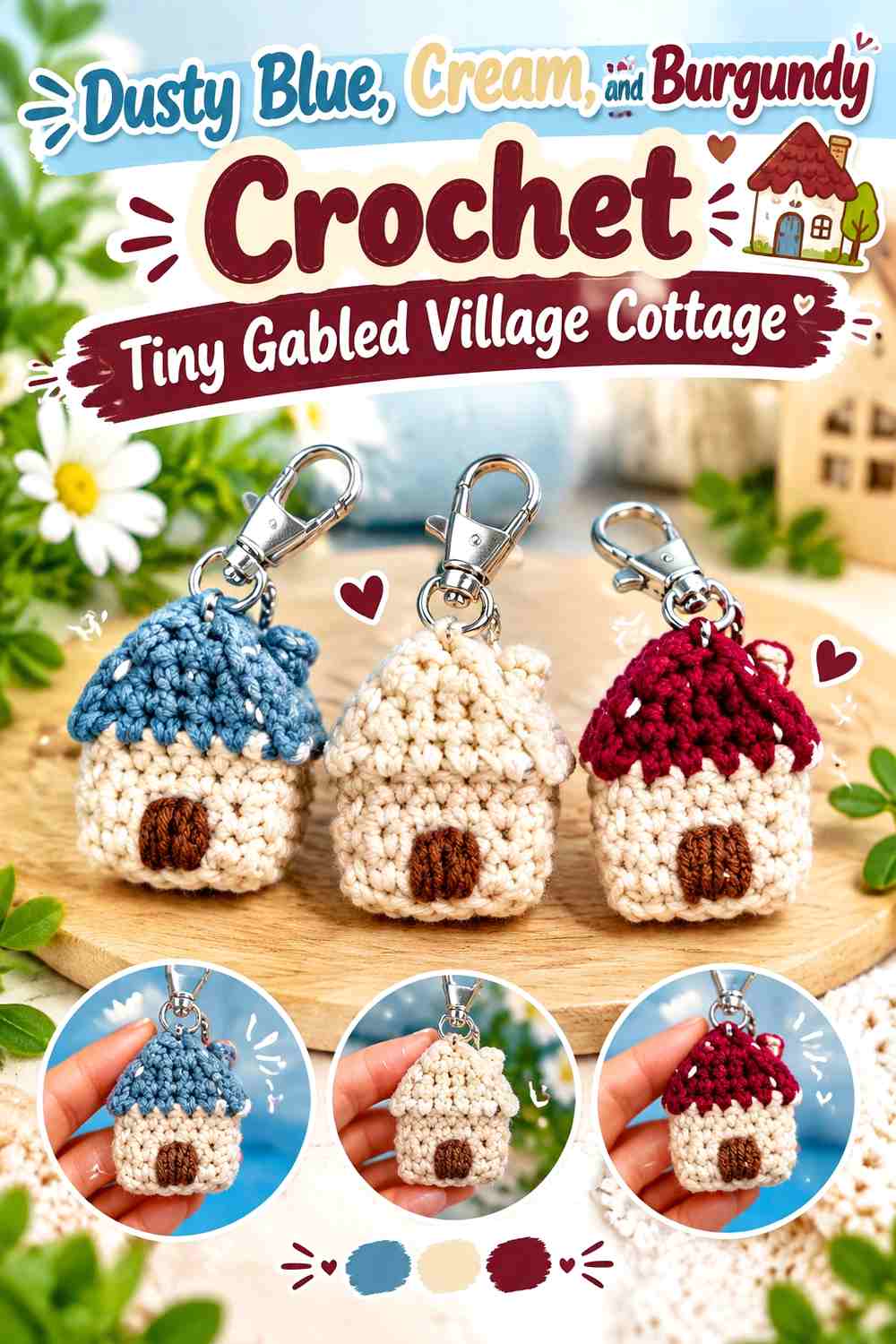
Dusty blue gives a tiny gabled house a winter palette without relying on green. Cream can define the roof and doorway, while burgundy brings one deeper Christmas accent. This works well as a background building because blue contrasts with warmer foreground cottages.
Dusty Blue Needs Cream Along the Crochet Gable
A small house has little room for architectural detail, so a cream roof edge can make the triangular gable much easier to recognize. Keep the blue uninterrupted across most of the wall beneath it.
Burgundy Should Stay Concentrated Against Dusty Blue
Use burgundy for the door, a tiny window accent, or one wreath detail. Its depth makes it visually powerful, so a small amount is enough to give the pale cottage a stronger focal point.
Creator Credit: K-Crochet Holly
4. Gingerbread Brown, Icing White, and Peppermint Red Crochet Village Bakery

A gingerbread-style cottage can become the village bakery or sweet shop, giving the street one building that differs from the ordinary houses. Gingerbread brown should establish the cookie-like walls, icing white should outline the roof, and peppermint red can identify the door or candy decorations.
Gingerbread Brown Should Remain the Main Crochet Bakery Color
Leave brown visible between the roof, windows, and door decorations so the building still reads as gingerbread. Covering every wall section with candy colors reduces the visual distinction between the bakery and the rest of the village.
Peppermint Red Needs Icing White Space on Gingerbread Brown
Use white as a separator around red candy details. The lighter border keeps small peppermint accents readable and stops several warm colors from blending into the brown surface.
Creator Credit: The Crochet Circle
5. Caramel, Mint, and Candy Pink Crochet Gingerbread Sweet Shop
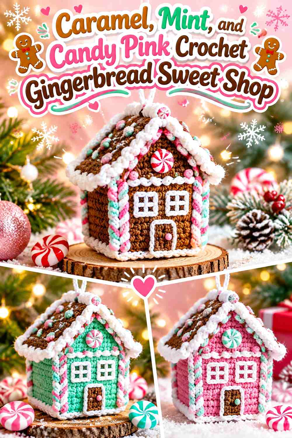
Caramel creates a lighter gingerbread base, mint gives the shop a pastel Christmas accent, and candy pink can mark the doorway, roof sweets, or sign. Keep one pastel dominant rather than scattering equal green and pink decorations across the entire façade.
Caramel Should Frame the Mint Crochet Sweet-Shop Details
Use caramel around the windows and roof decorations so the building still feels like a baked gingerbread structure. Mint works especially well when surrounded by enough neutral wall color to preserve each individual candy shape.
Candy Pink Should Be Smaller Than Mint Against Caramel
A pink door or several roof accents can give the shop a clear focal point without turning the whole building pink. Repeating only a little pink elsewhere keeps the palette connected.
Creator Credit: Jayda InStitches
6. Cocoa, Snow White, and Cranberry Crochet Dimensional Candy House
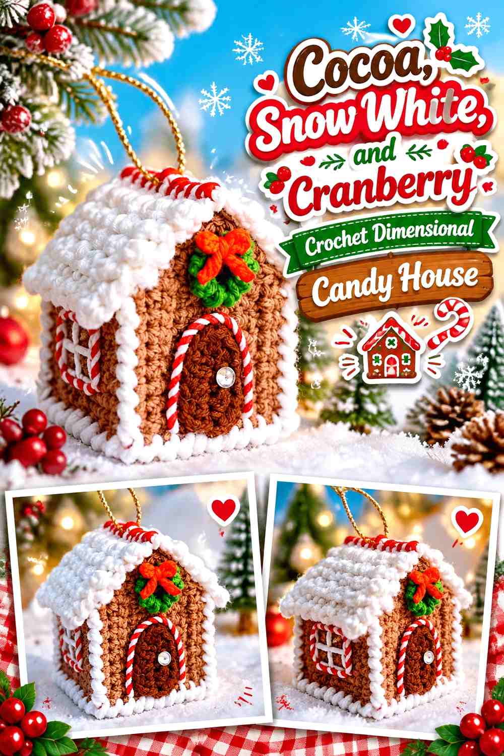
Cocoa creates a dark wall color that makes snowy roof edges highly visible. Cranberry can then appear in the central doorway or candy details. This stronger contrast makes the house useful as a foreground building where the village needs more visual weight.
Cocoa Makes Snow White Crochet Roof Trim More Visible
Use the white where the roof changes direction, along snowy edges, and around major openings. The dark background means you do not need excessive amounts of snow trim to define the architecture.
Cranberry Should Stay Focused on the Cocoa House Front
Concentrate cranberry where viewers are most likely to see it, such as the front door or central decorations. On the side walls, cocoa and white may be enough to keep the dimensional structure clear.
Creator Credit: Cute Crochet
7. Cinnamon, Cream, and Sage Crochet Bobble-Roof Gingerbread Cottage
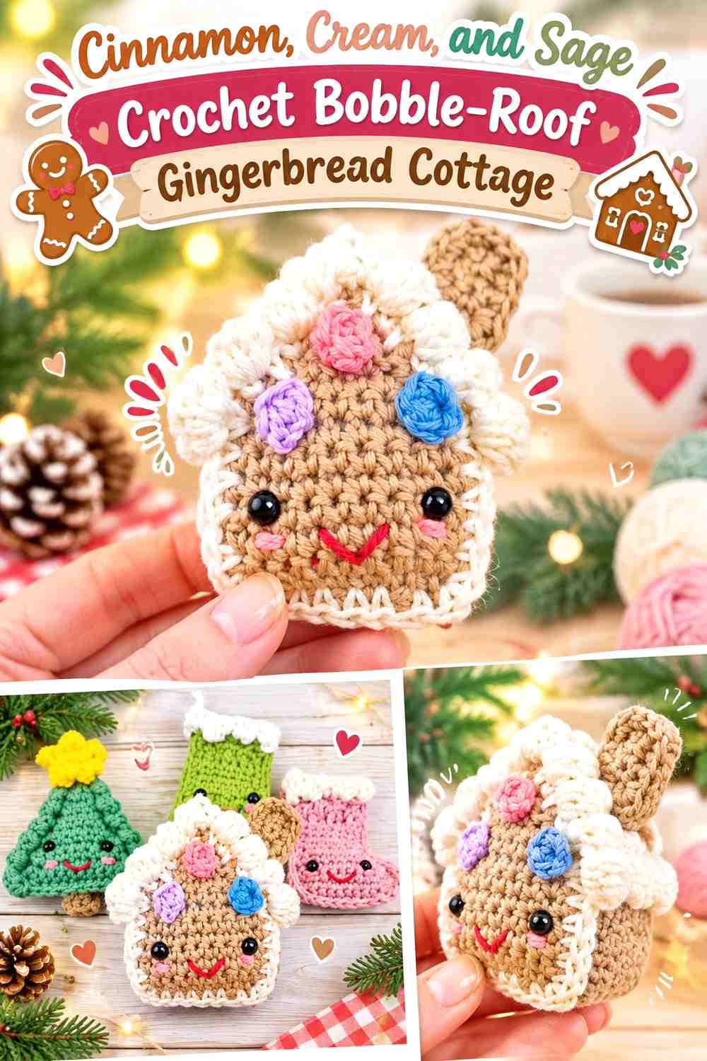
Cinnamon gives the cottage a warm cookie color, cream emphasizes the textured roof, and sage provides a quieter botanical accent. The raised roof detail already attracts attention, so keep its color scheme relatively simple.
Cream Should Emphasize the Cinnamon Crochet Roof Texture
Use cream where bobbles or raised edging need the most visual separation. Avoid covering the entire cinnamon façade with the same pale detailing or the special roof texture will no longer stand out.
Sage Can Soften Cinnamon Around the Crochet Door
A sage door, small wreath, or one repeated decoration creates a muted alternative to bright green. Keep sage secondary to the cinnamon-and-cream relationship so the cottage remains gingerbread-led.
Creator Credit: Crochet with Yarnhild
8. Oatmeal, Dusty Rose, and Evergreen Crochet Tiny Village House

Oatmeal makes a small village house light enough to work in a back row, dusty rose can color the roof or door, and evergreen provides one seasonal accent. The soft wall color is useful when neighboring houses already use dark green or cranberry.
Oatmeal Should Remain Visible Around Dusty Rose Crochet Details
Keep plenty of neutral wall space around the pink roof or door. That prevents a small building from disappearing into other warm-colored decorations in the village.
Evergreen Gives Dusty Rose a Christmas Counterpoint on Oatmeal
Use green for one wreath, tree-like accent, or narrow trim. A small repeat is enough to move the pink-and-oatmeal house into a Christmas palette without creating a full red-and-green treatment.
Creator Credit: Jess Crafting
9. Forest Green, Cranberry, and Gold Crochet Mini Village Christmas Tree

A miniature tree can fill spaces between rooflines and repeat colors from nearby houses. Forest green should dominate the tree body, cranberry can appear as small ornaments or garland points, and gold works best at the top or in a few selected highlights.
Forest Green Should Carry Most of the Crochet Village Tree
Keep the tree unmistakably green and use decorations as small interruptions rather than equal color blocks. This allows the tree to act as a visual connector instead of competing with the houses.
Gold and Cranberry Need Small Repeated Roles on Forest Green
Use one shade for the top focal detail and the other for scattered decoration. Keeping both accents small prevents the tree from becoming more visually complex than the focal buildings around it.
Creator Credit: MJ Carlos
10. Cranberry, Cream, and Charcoal Crochet Mini Village Santa

Santa naturally carries a strong red area, so cranberry can dominate the coat while cream defines the beard and trim. Charcoal should remain confined to boots, belt, or another small detail so it does not interrupt the red-and-white silhouette.
Cranberry Should Make the Crochet Santa Easy to Find in the Village
Place Santa slightly away from a cranberry house or door if possible. Repeating the same red elsewhere in the display is useful, but visible neutral space around the figure keeps him from blending into the architecture.
Cream Needs Clear Separation From Cranberry on the Crochet Santa
The beard, hat trim, and other pale areas help define the character at miniature scale. Keep them grouped rather than scattering tiny cream marks across the entire figure.
Creator Credit: Little Crochet Farm
11. Fawn Brown, Oatmeal, and Berry Red Crochet Mini Village Reindeer

Fawn brown gives the reindeer a softer natural body color, oatmeal can define the muzzle or antlers, and berry red introduces a small Christmas focal point. Position the reindeer where its antlers have visual space instead of placing them directly against a detailed roof.
Fawn Brown Should Keep the Crochet Reindeer Body Cohesive
Use one main brown family across the largest sections. Multiple unrelated browns can make such a tiny animal unnecessarily patchy and weaken the silhouette.
Berry Red Should Stay Smaller Than Oatmeal on the Fawn Reindeer
A nose, collar, or scarf can carry the berry accent. Oatmeal should do more of the structural contrast work around the face and antlers.
Creator Credit: A Menagerie of Stitches
12. Burgundy, Cream, and Pine Crochet Mini Stocking Shop Sign

A mini stocking can become a shopfront prop, workshop sign, or decoration beside Santa’s cottage. Burgundy gives the stocking body depth, cream can define the cuff, and pine can appear in a small hanging accent or nearby greenery.
Burgundy Should Lead the Crochet Stocking Shape
Keep most of the stocking one dark red so its silhouette remains easy to recognize beside a door. Too many color changes can make a tiny stocking resemble a general patchwork ornament.
Cream Should Define Burgundy Before Pine Is Added
Use cream at the cuff or toe to create a clear light break. Pine can then appear as a smaller supporting accent without competing directly with burgundy.
Creator Credit: love.life.yarn. by Amanda Saladin
13. Sage, Cranberry, and Mustard Crochet Village Gift Box Stack
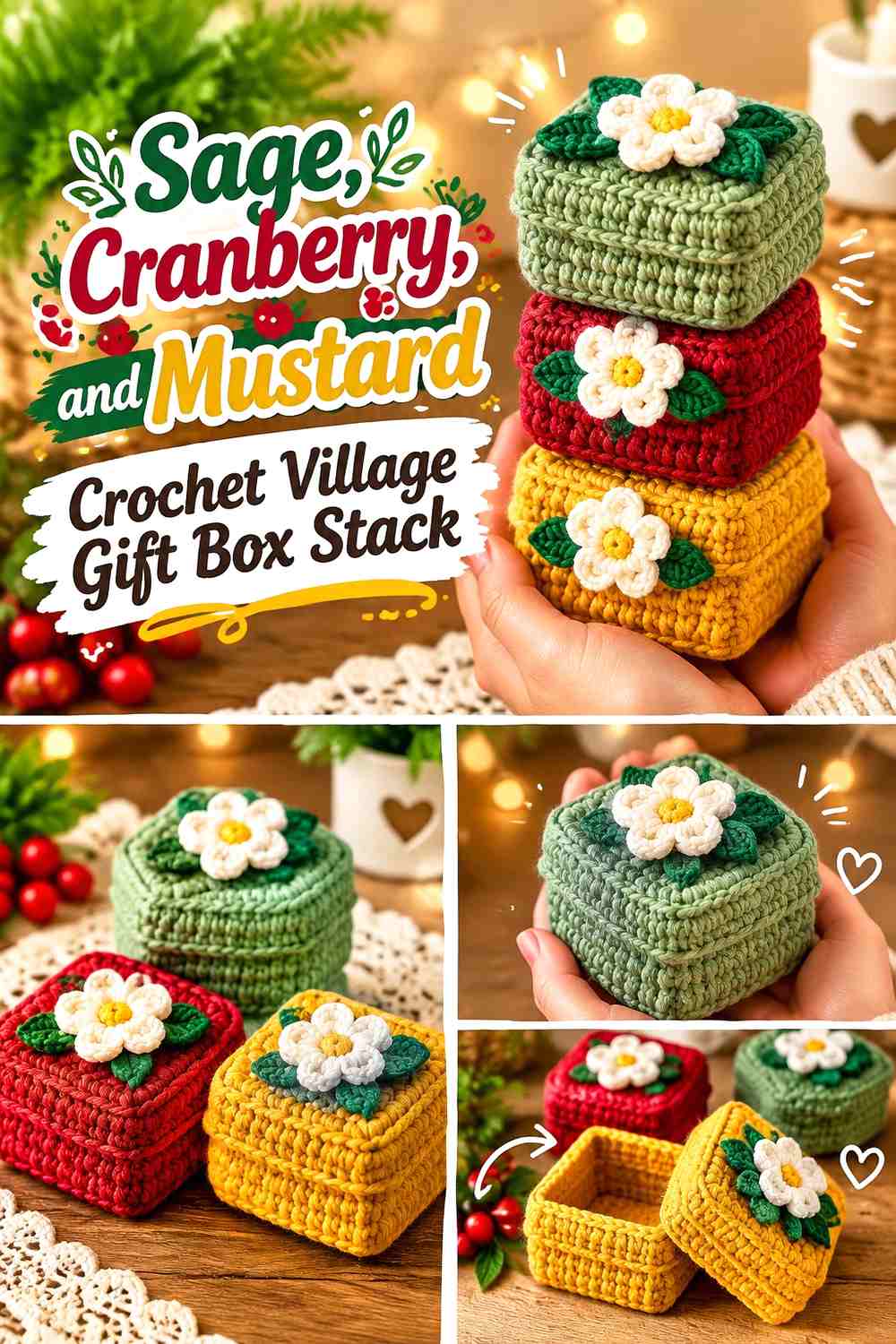
Gift boxes add color at street level where villages can otherwise look empty beneath the rooflines. Sage can dominate the largest box, cranberry can define one ribbon or smaller package, and mustard can provide a warm accent.
Sage Can Keep a Crochet Gift Stack From Becoming Too Red
Use sage for the largest package when the surrounding village already includes cranberry doors, Santa, and red candy accents. The quieter green gives those repeated reds some breathing room.
Cranberry and Mustard Should Have Separate Ribbon Roles
Assign cranberry to one ribbon or box and mustard to another rather than combining both heavily on every package. Clear color ownership makes a tiny gift stack easier to read.
Creator Credit: HjimiCrochet
14. Evergreen, Cream, and Berry Red Crochet Mini Door Wreath

A miniature wreath can make one plain house look festive without requiring another complicated building. Evergreen should lead the ring, cream can supply a lighter bow or snow detail, and berry red should remain a small repeated accent.
Evergreen Should Keep the Crochet Wreath Clearly Circular
Avoid covering most of the ring with red berries or a large bow. Leaving enough uninterrupted green preserves the wreath shape when it is viewed against a tiny cottage door.
Berry Red Needs Cream Space on an Evergreen Wreath
A cream bow or small snowy section can prevent red and green from competing directly. This is particularly useful when the wreath sits on a red or dark-green door.
Creator Credit: Crochet Square & Tutorials
15. Peppermint Red, White, and Sage Crochet Candy Cane Village Signpost
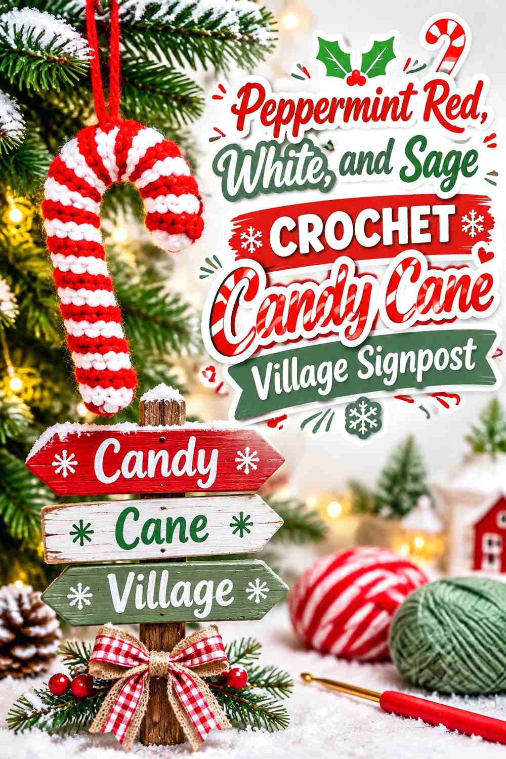
A candy cane can work as a sweet-shop marker, path sign, or foreground Christmas prop. Peppermint red and white should remain the main striped relationship, while sage can connect the prop to nearby trees or wreaths.
Peppermint Red and White Should Stay Balanced on the Crochet Candy Cane
The recognizable spiral depends on both colors remaining visible. If red becomes much wider than white, the prop may read as a curved red ornament rather than a candy cane.
Sage Should Stay Separate From the Peppermint Red and White Stripes
Use sage at the base, in a tiny bow, or in surrounding greenery instead of adding it directly into the stripe sequence. This preserves the candy-cane identity while still connecting it to the village palette.
Creator Credit: Made by Phia
16. Moss Green, Cranberry, and Oatmeal Crochet Village Gnome

A small gnome can stand near a cottage door or tree cluster and introduce another character without duplicating Santa. Moss green can lead the hat or body, cranberry can provide one festive contrast, and oatmeal works well for the beard or neutral section.
Moss Green Should Give the Crochet Gnome a Different Role From Santa
Keeping green dominant separates the gnome visually from a cranberry Santa figure. This distinction helps two small characters remain readable even when displayed close together.
Oatmeal Should Separate Moss Green From Cranberry
Use the light neutral around the beard, nose area, or another central section. That prevents the two saturated Christmas colors from touching across too much of the tiny figure.
Creator Credit: naztazia
17. Cocoa, Cream, and Raspberry Crochet Heart-Front Gingerbread House
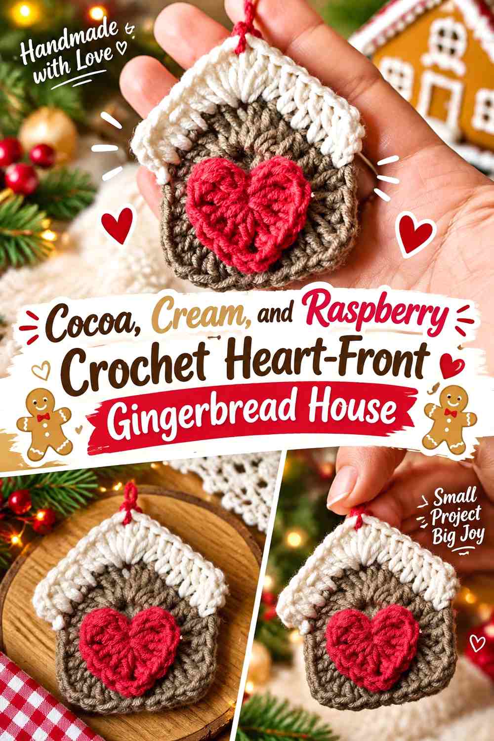
This gingerbread house can become a second specialty building without repeating the bakery palette exactly. Cocoa gives the structure depth, cream defines the icing, and raspberry creates a softer focal heart or door than classic bright red.
Cocoa Should Frame the Cream Crochet Gingerbread Details
Keep the wall sufficiently dark and visible so pale icing has a clear edge. The cream should emphasize the architecture rather than cover most of the house body.
Raspberry Should Stay Focused on the Cocoa House Center
A central heart, door, or one group of candy details is enough. Restricting raspberry to the front focal area gives this building its own identity within a row of gingerbread structures.
Creator Credit: crochet with emma
18. Old Gold, Cream, and Forest Green Crochet Village Tree-Top Star

A star can crown the largest village tree or sit above a centerpiece building. Old gold creates a warmer focal color than bright yellow, cream can define an embroidered or edged detail, and forest green connects the star to the tree below.
Old Gold Should Remain the Main Crochet Star Color
Keep most of the five-point shape gold so it reads immediately at the top of the display. Large green sections can weaken the contrast between the star and the tree supporting it.
Cream Can Sharpen Old Gold Against Forest Green
A small cream embroidered detail, edge, or center gives the gold additional definition against a dark tree. Keep the pale section narrow so the star remains gold-led.
Creator Credit: Passionate Crafter
19. Dusty Blue, White, and Silver Crochet Village Star Garland

A second star treatment can work horizontally across the village rather than at the top of a tree. Dusty blue gives the stars a frosty direction, white creates separation between repeats, and silver can appear as a restrained highlight in the hanging arrangement.
Dusty Blue Can Repeat Across the Crochet Village Garland
Use the same blue through most of the stars if the garland needs to connect houses with different wall colors. Repetition is useful here because the garland is acting as a visual bridge across the display.
White and Silver Should Support Dusty Blue Instead of Competing
Keep white at borders, joining areas, or alternate small stars and reserve silver for a limited highlight. Too many equally bright pale colors can flatten the shape of each individual star.
Creator Credit: coldpaste
How to Coordinate All 19 Crochet Christmas Village Decorations
A traditional village can use cranberry, forest green, cream, and gingerbread brown as its recurring colors. Put cranberry on several doors and character details, forest green on trees and wreaths, and cream across snowy roofs. The repetition will connect houses whose wall colors range from cocoa to blue.
For a softer village, shift some of those roles toward dusty rose, sage, dusty blue, oatmeal, and antique white. Keep one deeper accent—burgundy, cranberry, or forest green—so windows, doors, figures, and tiny props do not disappear into an all-pastel display.
You also do not need all nineteen pieces at equal visual strength. Let one or two houses carry the most detailed palettes, then surround them with quieter cottages, trees, gifts, wreaths, and figures. That color hierarchy makes the village easier to read from across the room.
Conclusion
A crochet mini Christmas village feels coordinated when colors repeat with purpose rather than when every building matches. Snow white or cream can connect the rooftops, cranberry can move between doors and characters, and forest green can appear in trees, wreaths, and small accents.
Start with the main buildings and establish their wall and roof colors first. Then use Santa, reindeer, gifts, wreaths, stockings, candy canes, and stars to repeat accents through the empty spaces between houses. This allows the props to solve color-balance problems instead of simply adding more decoration.
Use the linked creator tutorials for exact construction, shaping, assembly, and finishing. When mixing projects from different tutorials, compare the finished pieces before making multiples because village scale can change with yarn, hook choice, tension, and construction.
Frequently Asked Questions
How many colors should I use in a crochet mini Christmas village?
A full village can contain many colors, but repeating three to five core shades usually makes it easier to coordinate. Cream, cranberry, forest green, brown, and one optional accent such as dusty blue or gold can appear in different proportions throughout the display.
Do all crochet village roofs need to be the same color?
No. A repeated snow edge can provide enough consistency even when roof colors differ. For example, one roof can be cranberry, another green, and another brown while all three use the same cream snow trim.
How can I keep small crochet village windows and doors visible?
Make sure they differ sufficiently from the wall around them. A cream border can separate a cranberry door from a brown wall, while a darker burgundy door can provide definition on an oatmeal cottage.
Can pastel colors work in a crochet Christmas village?
Yes. Dusty blue, blush, mint, sage, lavender, and soft pink can work well when balanced with snowy neutrals and at least one deeper shade. Without enough value contrast, small doors and windows may visually disappear.
How can I make houses from different crochet tutorials look coordinated?
Repeat a few color roles rather than copying one complete palette. Use the same snow shade on roofs, one recurring green for wreaths and trees, and one recurring red for doors, ribbons, and Santa details.
Should every crochet village decoration be miniature?
They should look reasonably proportional when displayed together, but they do not need mathematically exact scale. Finish one main house first and compare later pieces directly with it before making multiples.
Where should the strongest colors go in a mini Christmas village?
Put them on important focal details such as a centerpiece door, Santa’s coat, one bakery façade, ribbons, or selected roof accents. Quieter creams, browns, greens, and blues can cover larger areas so the village does not become visually crowded.