A personalized crochet dog blanket works best when the name is planned as part of the blanket instead of being squeezed into an empty corner at the end. Letter color, background value, border placement, and surrounding motifs all affect whether the dog’s name stays readable once the blanket is folded, draped over a crate, or spread across a favorite resting spot.

The personalization method can change the color plan too. A large tapestry-style name needs strong contrast across a broad section, while surface-crochet lettering can sit over an otherwise finished blanket. Bobble letters depend more on texture and shadow, and a monogram can use a stronger accent because it occupies less space than a full name.
For a dog-use blanket, keep personalization flat and securely finished. Paw prints, bones, initials, and name details can all be worked into the fabric or attached securely, but loose tassels and easily pulled appliqués deserve extra caution around dogs that chew or paw at bedding.
Quick List
- Navy and Cream Centered-Name Crochet Dog Blanket
- Sage Green and Ivory Corner-Name Crochet Dog Blanket
- Charcoal and Mustard Paw-Band Crochet Dog Blanket
- Teal and Oatmeal Filet-Name Crochet Dog Blanket
- Rust and Cream C2C Name-Panel Crochet Dog Blanket
- Burgundy and Blush Bobble-Name Crochet Dog Blanket
- Forest Green and Camel Monogram Crochet Dog Blanket
- Dusty Blue and Cream Bone-and-Name Crochet Dog Blanket
- Chocolate Brown and Mint Gingham Crochet Dog Blanket
- Plum and Mauve Tonal-Name Crochet Dog Blanket
- Terracotta and Oatmeal Surface-Name Crochet Dog Blanket
- Black and Cream Paw-Print Crochet Dog Blanket
- Denim Blue and Mustard Granny-Stripe Crochet Dog Blanket
- Moss Green and Sand Initial-Corner Crochet Dog Blanket
- Cranberry and Cream Border-Name Crochet Dog Blanket
Give the Dog’s Name More Contrast Than the Blanket Texture
A dog’s name needs enough light-dark separation to remain readable against crochet texture. Two attractive colors can still merge when their values are similar, especially across waffle stitches, bobbles, granny clusters, or thick blanket yarn.
Compare the letter yarn and background side by side before committing to the whole name. If the word becomes difficult to read in grayscale, deepen the background, lighten the letters, or place a quieter panel behind the name.
Decide Where the Name Will Be Seen on the Dog Blanket
A centered name works when the blanket is usually spread flat, but a lower-corner name may remain more visible when the blanket is draped over a crate or bed. A horizontal name band can stay readable after partial folding, while a large central motif may disappear once the dog curls up on it.
Plan the lettering before the border too. A wide border changes the available visual space and can make an already-large name feel crowded.
Keep Personalized Crochet Details Practical for Dog Use
Flat lettering generally interferes less with everyday use than bulky or dangling decoration. If you add separate crochet letters, paws, or bones, attach them securely and check them regularly for loose edges.
Dogs that actively chew blankets need closer supervision regardless of the color scheme or personalization method. If yarn starts pulling free, remove the blanket rather than treating the decorative detail as purely cosmetic.
1. Navy and Cream Centered-Name Crochet Dog Blanket
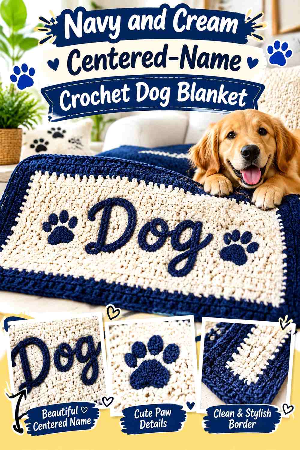
Navy gives this personalized blanket a strong, quiet background while cream makes a full dog name easy to recognize from across the room. Keep navy across most of the blanket and place the cream name through the center or slightly below center. A narrow cream border can repeat the lettering without competing with it.
Cream Gives the Navy Crochet Dog Name Maximum Separation
For a longer dog name, use cream across the entire word rather than changing letter colors halfway through. Consistent lettering makes the name easier to read and prevents the personalization from turning into another multicolor motif.
Leave enough navy around the letters that the word has clear negative space on all sides.
Navy Should Stay Visible Around the Cream Personalized Name
Do not let a wide cream border, cream paws, and cream central name all occupy equal visual weight. If the name is the focal point, keep the border narrower and use paw details sparingly.
This maintains a navy-led blanket instead of gradually converting the project into an equal two-color design.
Creator Credit: Cat Kemble
2. Sage Green and Ivory Corner-Name Crochet Dog Blanket
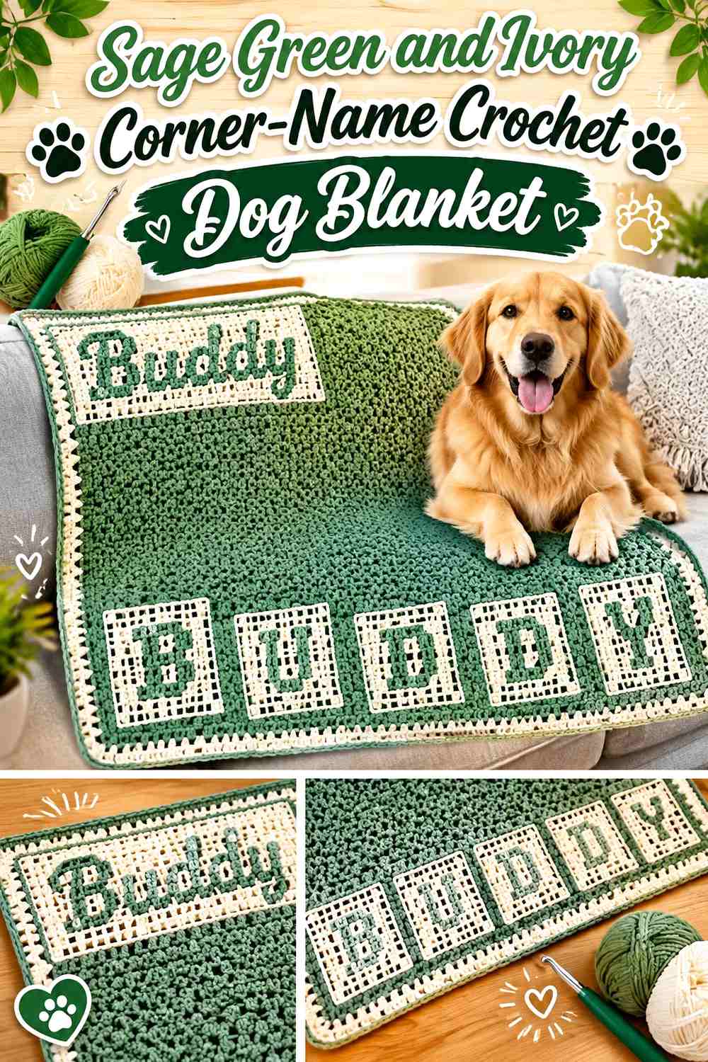
Sage and ivory suit a softer personalized blanket where the name does not need to dominate the entire surface. Let sage cover the main field and place the dog’s name in ivory near one lower corner, then repeat ivory in a restrained outer edge.
Ivory Keeps a Sage Green Corner Name Readable
Corner lettering has less room around it than a central name, so contrast becomes important. Keep the ivory letters clearly separated from the border rather than allowing the word to run directly into the edging.
That small gap helps the name remain recognizable as its own design element.
Sage Green Gives Ivory Personalized Letters More Visual Space
Avoid filling the remaining sage area with several equally strong motifs. One or two flat paw details can work, but a quieter body keeps attention on the dog’s name.
For longer names, increase the available name area rather than squeezing letters closer together solely to preserve a small corner placement.
Creator Credit: Lulyana Crochet
3. Charcoal and Mustard Paw-Band Crochet Dog Blanket
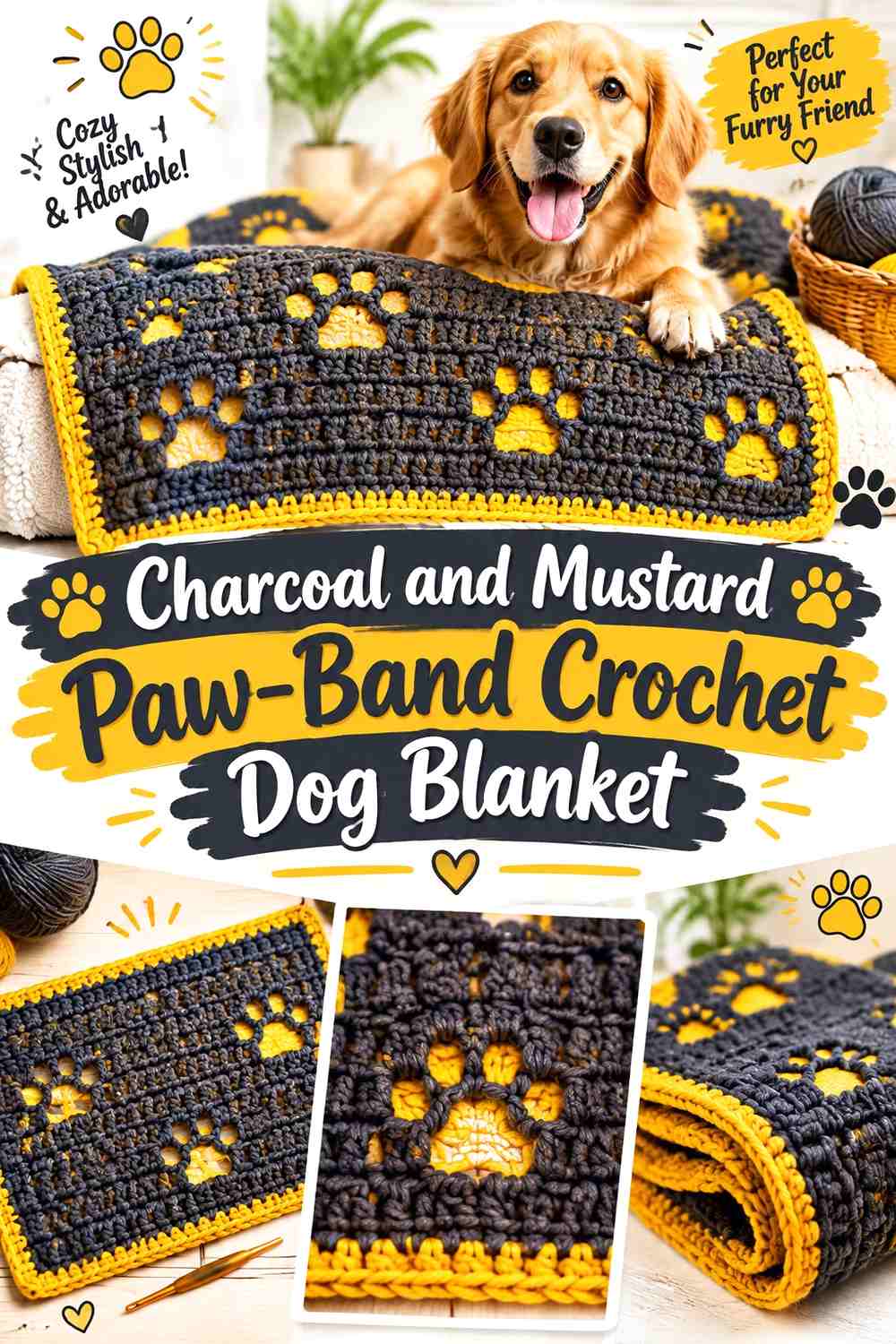
Charcoal creates a dark neutral field, while mustard can combine the dog’s name and paw motifs into one horizontal personalized band. This arrangement is useful when you want the name to remain visible even if part of the blanket is folded back.
Mustard Can Connect the Charcoal Dog Name and Paw Prints
Use mustard consistently for the lettering and a limited number of paws so the personalized band reads as one design. If each paw uses another color, the name can lose priority.
Keep the paw motifs smaller than the letters when the dog’s name should remain the main feature.
Charcoal Should Frame the Mustard Personalized Band
Allow charcoal to continue above and below the mustard section. That darker breathing room creates a strong frame and prevents a wide personalized band from taking over the entire blanket.
A charcoal outer border also helps contain the brighter mustard accent.
Creator Credit: Kristin Omdahl
4. Teal and Oatmeal Filet-Name Crochet Dog Blanket
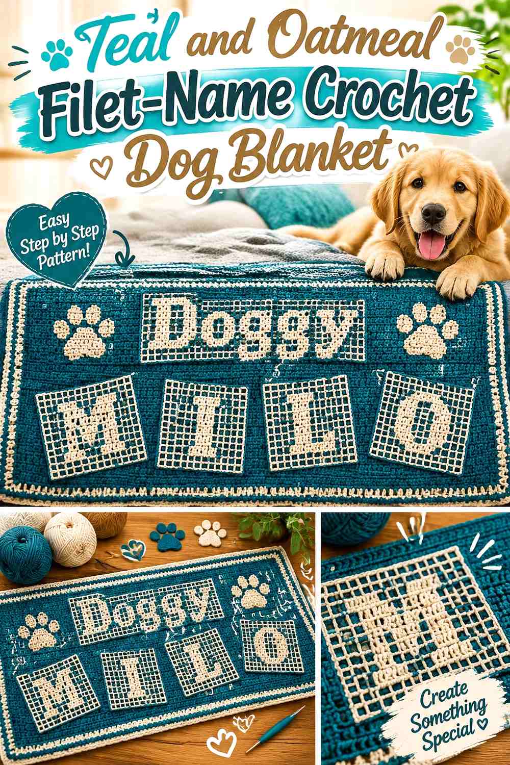
Teal and oatmeal can support a more open, graphic personalization. Let teal establish the larger blanket field while a name section uses oatmeal to make the letter shapes or surrounding panel easier to identify.
Oatmeal Makes the Teal Filet-Style Dog Name Easier to Follow
If the lettering relies partly on open and filled areas rather than only color, keep the surrounding color treatment simple. Oatmeal can frame the name panel without introducing additional stripes through the same section.
This prevents color changes from competing with the letter structure.
Teal Can Separate the Oatmeal Name Panel From the Border
Repeat teal between the personalized section and outer edge instead of running oatmeal continuously from the letters to the border. That teal break keeps the name panel visually contained.
If you use oatmeal elsewhere, a narrow edge is usually enough to connect the palette.
Creator Credit: Lulyana Crochet
5. Rust and Cream C2C Name-Panel Crochet Dog Blanket
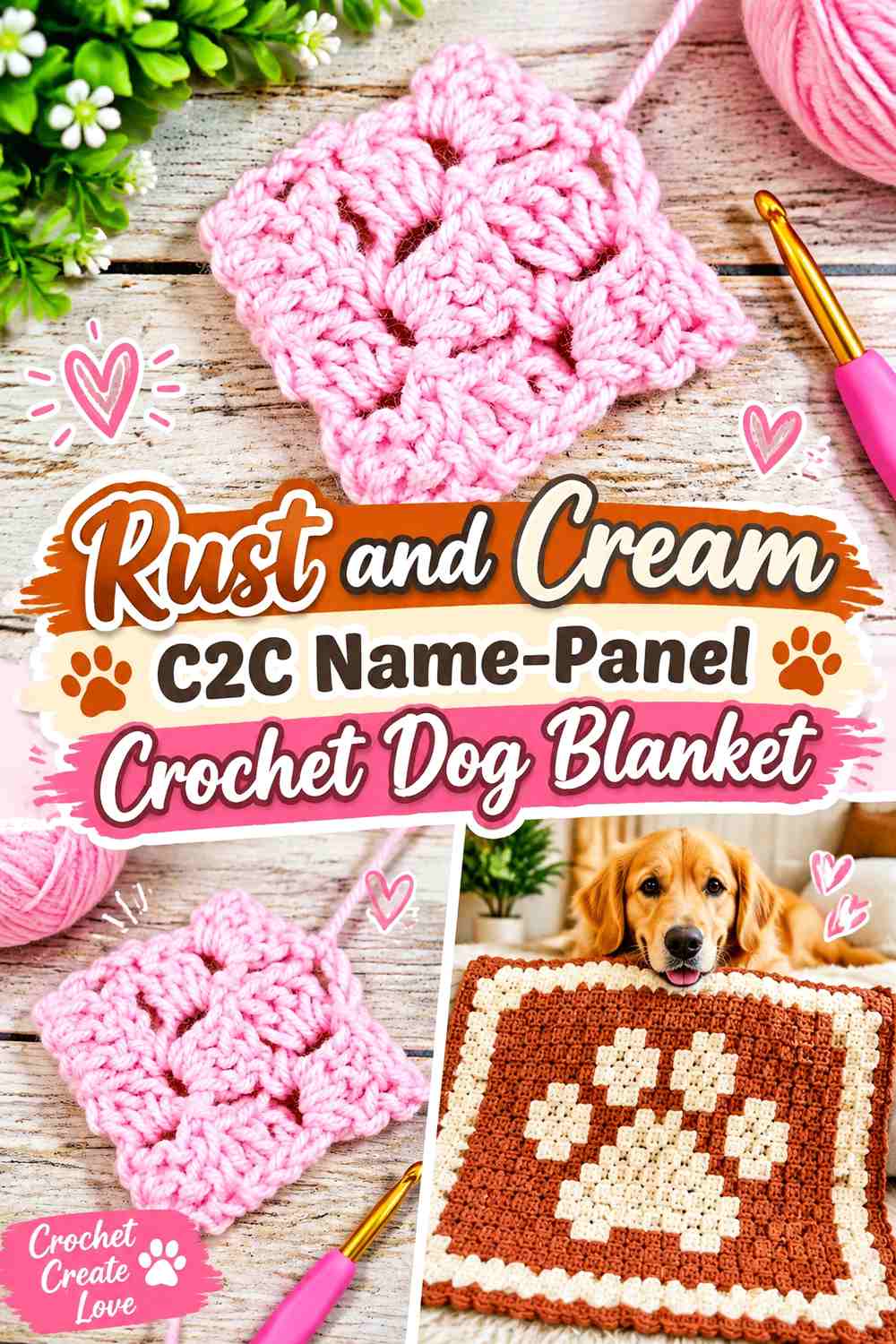
Rust provides a warm background for a cream pixel-style name panel. Corner-to-corner color blocks can make letters look bold, so this design benefits from a simple two-color hierarchy rather than several decorative shades around the word.
Cream Can Form Clear Block Letters Against Rust
Plan the full dog’s name as one visual unit and check whether every letter remains identifiable at the intended scale. Short names can tolerate larger block letters, while longer names may require a differently proportioned panel.
Keep cream concentrated in the lettering if you want the name to remain the strongest contrast.
Rust Should Continue Around the Cream C2C Name
A rust frame around all sides of the name helps prevent the word from appearing pressed against the blanket edge. This is particularly useful for block-based lettering, where the personalization already has a geometric appearance.
A cream outer border is optional; if used, keep it visually lighter than the central name treatment.
Creator Credit: Nicki’s Homemade Crafts
6. Burgundy and Blush Bobble-Name Crochet Dog Blanket
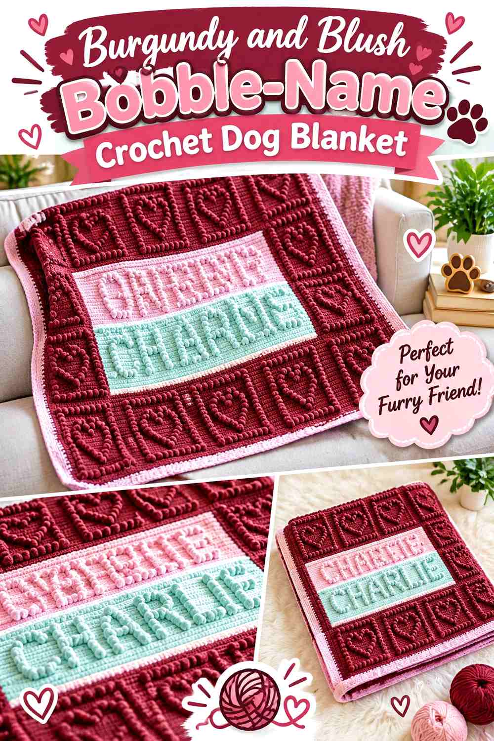
Burgundy and blush create a tonal berry palette where texture can do part of the lettering work. Use burgundy for the broad blanket field and blush for raised name details when you want the personalized section to feel softer than cream-on-dark contrast.
Blush Helps Burgundy Bobble Letters Stand Apart
Bobble lettering already introduces shadows and raised texture, so it does not need a complicated surrounding color pattern. A consistent blush name against burgundy gives both texture and color a clear job.
Check the word from farther away; texture that looks obvious up close may read more subtly across the room.
Burgundy Keeps the Blush Personalized Name From Becoming Too Busy
Keep the burgundy section immediately surrounding the letters relatively plain. Placing stripes, paws, and another textured stitch directly beside bobble letters can make the central word harder to identify.
Move secondary motifs toward the corners or border instead.
Creator Credit: Yarnoculous
7. Forest Green and Camel Monogram Crochet Dog Blanket
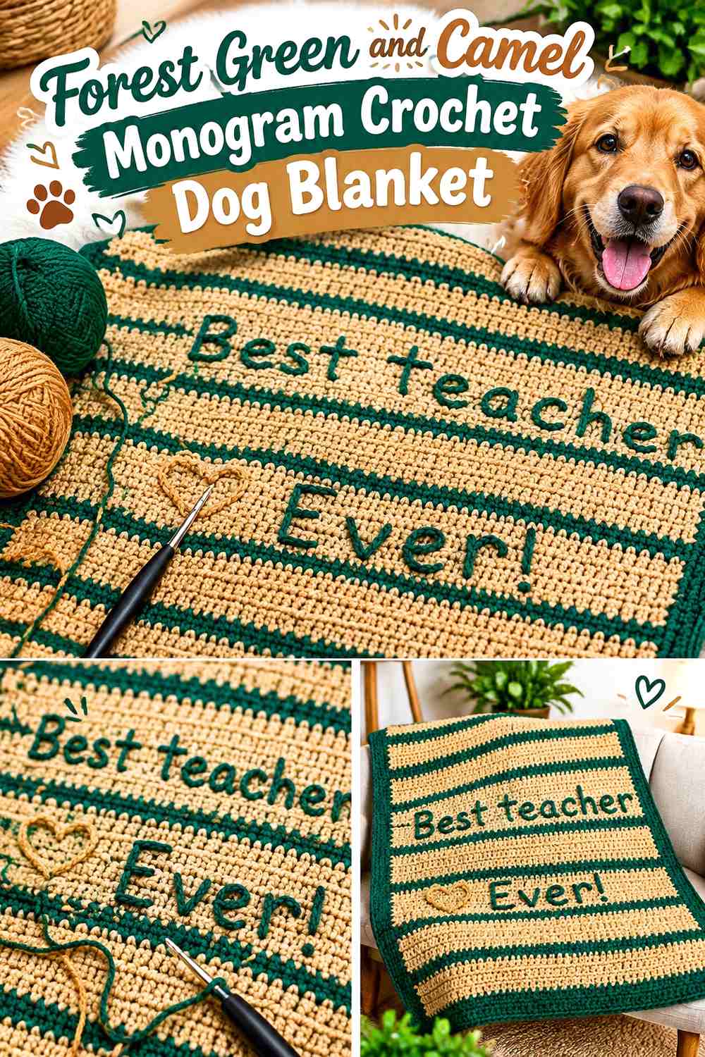
Forest green and camel work well when you want both an initial and the dog’s full name. Let a large camel monogram become the main personalization, then place the smaller full name nearby or along the lower edge.
Camel Can Make a Forest Green Dog Monogram the Main Focal Point
A single large initial can tolerate more visual weight than a full line of letters. Give the monogram enough scale to look intentional, then keep the full name smaller so the two text elements do not compete.
Using camel for both creates continuity.
Forest Green Needs Open Space Around the Camel Full Name
If the monogram occupies the center, place the smaller name where it still has uninterrupted green behind it. Avoid putting the full name over stripes or a heavily textured motif.
That separation helps readers understand the initial and name as two levels of the same personalized design.
Creator Credit: GoodKnitKisses
8. Dusty Blue and Cream Bone-and-Name Crochet Dog Blanket
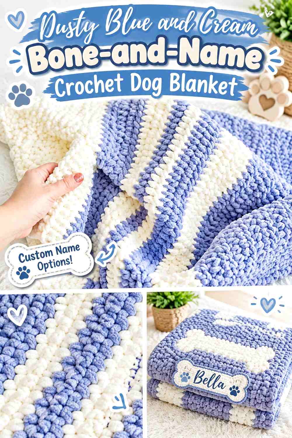
Dusty blue gives this dog blanket a softer background, while cream can form the name and one or two bone motifs. The important decision is keeping the bone secondary to the personalized text rather than allowing novelty motifs to dominate.
Cream Can Link the Dusty Blue Dog Name to a Bone Motif
Place a small cream bone beside or beneath the dog’s name rather than scattering bones across the entire blanket. Repeating the same cream creates a recognizable pet theme without adding another color.
A longer name may look cleaner with the bone moved to a corner.
Dusty Blue Should Remain Quiet Behind the Cream Personalized Details
Avoid heavily alternating blue-and-cream stripes in the exact area where the letters sit. The name needs a relatively consistent background to stay legible.
You can introduce more color variation beyond the name zone if the blanket otherwise feels too plain.
Creator Credit: Bella Coco
9. Chocolate Brown and Mint Gingham Crochet Dog Blanket
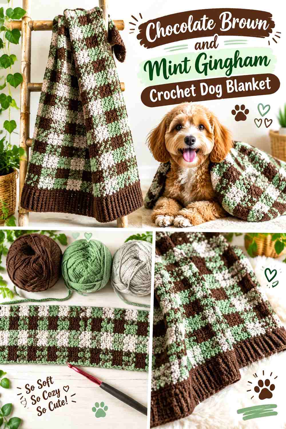
Chocolate and mint create a stronger patterned blanket, so the personalized name needs a planned resting place. Instead of placing letters over the busiest checked area, reserve a quieter mint or chocolate panel for the dog’s name.
Mint Can Give a Chocolate Gingham Dog Name a Clear Panel
A mint name panel interrupts the check pattern just enough to provide a readable background. Use chocolate lettering inside that area so the text remains tied to the main blanket palette.
Keep the panel proportionate to the name rather than making it span the whole blanket automatically.
Chocolate Can Repeat the Personalized Mint Panel in the Border
A chocolate border helps connect the lettering back to the gingham body and gives the outer edge more definition. If mint already appears heavily in the checks, avoid adding another broad mint border.
That keeps the name panel from losing its special role.
Creator Credit: Daisy Farm Crafts
10. Plum and Mauve Tonal-Name Crochet Dog Blanket
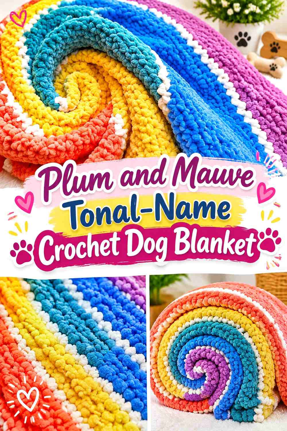
Plum and mauve create a subtler personalized design where the dog’s name appears through tonal contrast rather than a dramatic dark-light jump. This approach works best when the letters are large enough to remain readable despite the softer difference.
Mauve Needs Enough Value Contrast Against the Plum Dog Name Background
Test the two yarns together before committing to a long name. If mauve disappears against plum in grayscale, use a lighter mauve rather than merely thickening every letter.
The goal is soft contrast, not invisible personalization.
Plum Can Keep Mauve Personalized Letters Looking Cohesive
Use plum across most of the blanket and reserve mauve for the name plus one small border detail. Repeating mauve too frequently can reduce the name’s importance.
A narrow mauve edge is enough to make the accent feel intentional.
Creator Credit: Hooked by Robin
11. Terracotta and Oatmeal Surface-Name Crochet Dog Blanket
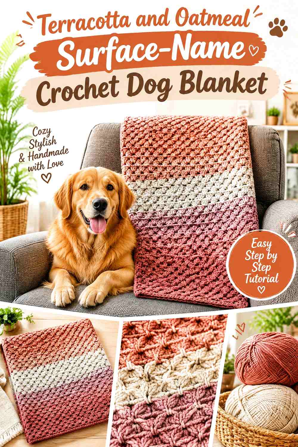
Terracotta provides a warm blanket base, while oatmeal is useful for lettering added over the finished surface. This approach lets you settle the blanket’s overall texture and dimensions before deciding exactly where the dog’s name belongs.
Oatmeal Can Make a Terracotta Surface-Crochet Name Flexible
Because surface lettering is added to an existing fabric, test the name placement visually before committing. A centered word, lower corner, or diagonal name can produce very different balance on the same terracotta background.
Oatmeal gives enough contrast for the final lettering to remain visible without introducing a bright white accent.
Terracotta Texture Should Not Hide the Oatmeal Dog Name
If the blanket surface is heavily raised, choose the flattest available section for the lettering. Highly pronounced ridges can distort freeform curves or make thinner letter strokes harder to follow.
Keep the area behind the name visually simpler than the surrounding blanket whenever possible.
Creator Credit: The Loopy Lamb
12. Black and Cream Paw-Print Crochet Dog Blanket
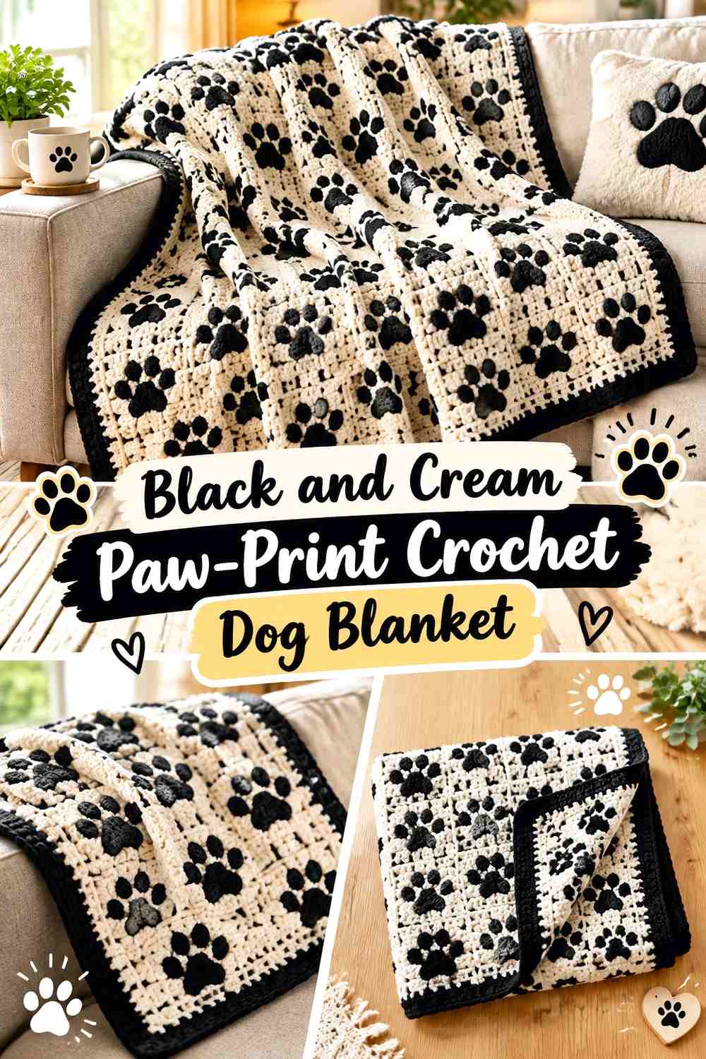
Black and cream give the strongest graphic contrast in this collection. Use cream for the dog’s name and selected paw prints against a black field, or reverse the balance if you want a lighter overall blanket.
Cream Can Keep the Black Crochet Dog Name Immediately Readable
A full cream name needs little extra decoration against black. Leave enough dark space between the letters and nearby paws so the word does not merge into one large cream graphic.
For especially short names, slightly larger lettering can help fill the blanket without adding unnecessary motifs.
Black Can Separate Cream Paw Prints From the Personalized Name
Keep black gaps between the name and each paw. That negative space is what allows the reader to see several deliberate elements rather than one irregular light block.
If the paws form a border, reduce their size so they frame rather than compete with the center.
Creator Credit: Littlejohn’s Yarn
13. Denim Blue and Mustard Granny-Stripe Crochet Dog Blanket
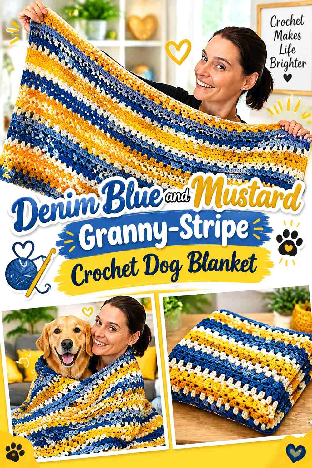
Denim blue and mustard suit a striped blanket where the name needs its own calmer section. Let denim dominate the stripes and reserve mustard for selected bands plus the personalized lettering.
Mustard Can Connect the Denim Blue Dog Name to Selected Stripes
Instead of using mustard in every stripe, repeat it at wider intervals and again in the dog’s name. This creates a direct relationship between the lettering and blanket pattern.
A solid denim section behind the name will keep the mustard letters easier to read.
Denim Blue Should Create a Quiet Personalized Name Zone
Pause or simplify the stripe pattern where the dog’s name appears. Continuing multiple stripe colors directly behind the text may break the letter shapes.
Return to the full stripe rhythm outside the personalized section.
Creator Credit: Jayda InStitches
14. Moss Green and Sand Initial-Corner Crochet Dog Blanket
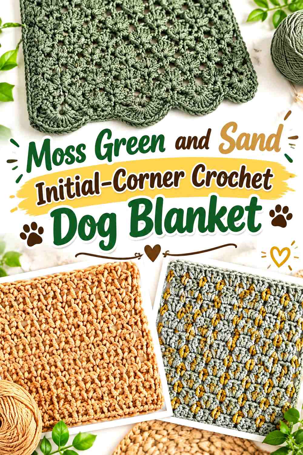
Moss and sand create an earthy personalized blanket where a large corner initial can be paired with the full dog name along one edge. Moss should lead across the body while sand provides the lighter text.
Sand Can Make a Moss Green Corner Initial Easy to Identify
Keep the initial broad and simple enough that it remains recognizable when the blanket is folded. A corner monogram can disappear more easily than a central one, so strong value separation helps.
Repeat the same sand in the full name rather than introducing another lettering color.
Moss Green Gives the Sand Edge Name a Consistent Background
If the full name runs near one side, maintain moss directly behind it instead of placing a contrasting border through the letter area. Begin the border beyond the name or use the same moss along that section.
This prevents the text from crossing multiple background colors.
Creator Credit: TL Yarn Crafts
15. Cranberry and Cream Border-Name Crochet Dog Blanket
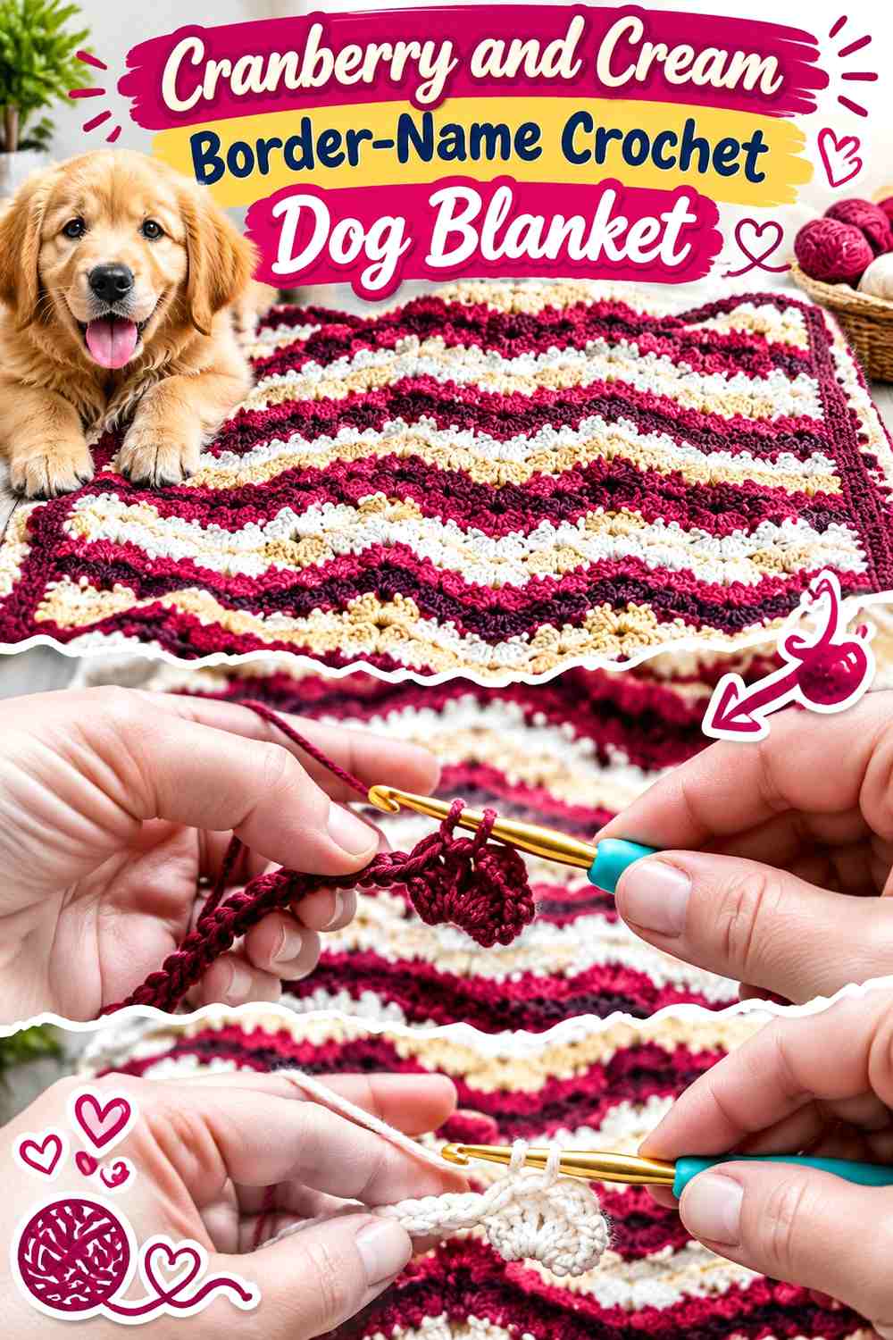
Cranberry and cream work well for a personalized blanket where the dog’s name becomes part of a broader border design. Let cranberry dominate the center and use cream for a name positioned along one end, framed by matching edge details.
Cream Can Turn the Cranberry Dog Name Into Part of the Border
Place the name in a dedicated cream-on-cranberry band near one end rather than forcing lettering around every side. A single readable orientation is easier to use than repeating the dog’s name around the entire perimeter.
Small cream paws can balance the opposite end if the blanket needs another personalized reference.
Cranberry Should Stay Dominant Around the Cream Name Border
Keep most of the interior cranberry and limit cream to the name band and restrained edging. If cream occupies a very wide border on all four sides, the name can become less distinctive.
The personalization works better when cream is concentrated where the word actually needs contrast.
Creator Credit: The Crochet Crowd
Which Personalized Crochet Dog Blanket Style Should You Choose?
For maximum name readability, navy and cream, black and cream, charcoal and mustard, or cranberry and cream provide strong value contrast. These combinations suit larger block letters, paw-and-name graphics, and personalized bands.
For softer personalization, sage and ivory, plum and mauve, dusty blue and cream, or forest green and camel let the lettering blend more gently with the blanket. Make the letters larger when using lower-contrast tonal palettes.
Choose C2C or tapestry-style colorwork when you want the name built into the blanket itself. Surface crochet is useful when you want to decide on the dog’s name placement after the main blanket is finished, while bobble lettering emphasizes texture as much as color.
Conclusion
A personalized crochet dog blanket becomes more useful visually when the dog’s name, color scheme, and blanket structure are planned together. Start by deciding whether the name should dominate the center, occupy a quiet corner, sit inside a horizontal band, or work alongside paws, bones, or a monogram.
Strong combinations such as navy and cream or black and cream keep names highly visible. Sage and ivory, plum and mauve, or chocolate and mint create softer alternatives, but they need more careful value checking.
Most importantly, keep the personalization practical for the dog that will actually use the blanket. Flat, securely finished lettering is easier to manage than loose decorative pieces, and any crochet bedding should be checked regularly if the dog tends to scratch, pull, or chew fabric.
Frequently Asked Questions
What Color Should a Dog’s Name Be on a Crochet Blanket?
Choose a letter color that is clearly lighter or darker than the background. Cream on navy, mustard on charcoal, and oatmeal on terracotta create obvious separation, while tonal combinations such as mauve on plum create a quieter effect.
Where Should I Put a Name on a Crochet Dog Blanket?
A centered name is most visible when the blanket is spread flat. Lower-corner names work well when you want subtler personalization, while horizontal name panels can remain recognizable when part of the blanket is folded or draped.
How Can I Tell Whether Crochet Name Letters Have Enough Contrast?
Place the two yarn colors together and view them from a distance. A grayscale photo is also useful because it removes hue and shows their relative lightness. If the word disappears, increase the value difference before making the entire name.
Can I Add the Dog’s Name After the Crochet Blanket Is Finished?
Yes. Surface crochet is one option for adding lettering to an existing crochet surface. Plan the position first and make sure the underlying texture gives the letter shapes enough definition.
Should Paw Prints Match the Crochet Dog Blanket Name?
Using the same accent color for paws and lettering creates an easy connection, but the paws should normally remain secondary if the dog’s name is meant to be the main personalized feature.
Can I Use Bobble Letters for a Personalized Dog Blanket?
Bobble lettering can create a tactile name, but the surrounding blanket should stay visually restrained so the raised letters remain readable. For a dog-use blanket, regularly check any heavily textured area for snagging or pulled yarn.
Are Crochet Appliqué Letters Suitable for a Dog Blanket?
They can be used when they are attached securely, but flat lettering worked into or onto the fabric reduces loose edges. For dogs that chew or aggressively paw at bedding, simpler integrated personalization is the more practical direction.